Page 1 of 2
Bicycle Gold Member Project
Posted: Tue Apr 12, 2016 12:16 pm
by jerichoholic
For anyone not aware the USPC is currently working on a new 808 member's deck. Any current gold members who participate in any part of the process will get the deck free when it is produced. It seems their current timeline is to have the art done and revealed by the end of May. The art will be done by an artist named Georgia Young. Currently members have submitted themes and 3 potential themes were selected; astronomy, medieval/knight, and Hollywood/art deco. At the moment the USPC is holding a vote for the theme and currently astronomy is leading the pack and medieval/knight is not far behind. Members will be able to vote on the ace of spades May 9-12, the card back during May 18-22, and the pips during May 27-31.
Personally I think this is a pretty cool thing for the USPC to do.

Re: Bicycle Gold Member Project
Posted: Tue Apr 12, 2016 12:27 pm
by ecNate
jerichoholic wrote:At the moment the USPC is holding a vote for the theme and currently astronomy is leading the pack and medieval/knight is not far behind.
Ugh, I would pick the INVERSE order of that. Somebody vote 10x for me!

It is neat that they are doing something with this again and getting involvement to make more decks. Sad it's now limited to gold members, which is based on volume of purchases, instead of a standard membership fee like before though.
Re: Bicycle Gold Member Project
Posted: Tue Apr 12, 2016 12:51 pm
by jerichoholic
Actually I believe the deck will be available to all members but only gold get to vote and get one free.
Re: Bicycle Gold Member Project
Posted: Tue Apr 12, 2016 1:50 pm
by Räpylätassu
There can be never enough Art Deco decks because there can never be enough Art Deco.
Give Art Deco some more love.
Re: Bicycle Gold Member Project
Posted: Tue Apr 12, 2016 3:18 pm
by chach
Art Deco was my theme suggestion, and while it pretty much has no chance to win I still voted for it. Probably should've voted for Astronomy though as I'd rather see that than knights
Re: Bicycle Gold Member Project
Posted: Tue Apr 12, 2016 3:37 pm
by ecNate
Did they have any more details or art work samples? Just going off a theme isn't really much to vote on here, all can be awesome or total crap depending on implementation.
I do realize it will be made available to all, but sad only gold members get to vote (I suppose they should have some benefits, but if you want to sell to the entire group...), so please keep us peons updated on what happens.
Re: Bicycle Gold Member Project
Posted: Tue Apr 12, 2016 3:57 pm
by CBJ
Re: Bicycle Gold Member Project
Posted: Tue Apr 12, 2016 4:06 pm
by PrincessTrouble
ecNate wrote:Did they have any more details or art work samples?
Nope.
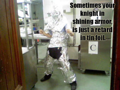
I was thinking the knight/medieval theme would be cool if they did some sort of armor (or armored knight) for the backs and gave it the MetalLuxe treatment on the armor. I have a feeling I'm dreaming too big, though. Imagining a knight in shining armor but will end up a with a retard in tin foil. LOL

Re: Bicycle Gold Member Project
Posted: Thu Apr 14, 2016 8:51 am
by PrincessTrouble
Astronomy is in the lead this morning.
Re: Bicycle Gold Member Project
Posted: Fri Apr 15, 2016 8:34 am
by PrincessTrouble
And Astronomy won by one vote.
Re: Bicycle Gold Member Project
Posted: Fri Apr 15, 2016 8:41 am
by ecNate
PrincessTrouble wrote:And Astronomy won by one vote.
So disappointing art deco wasn't even close, but any of these themes has the potential to be awesome if done right.
Hmmm, astronomy one by only one vote huh? Sounds like a conspiracy to me by those with a vested interest, probably:

Re: Bicycle Gold Member Project
Posted: Tue May 10, 2016 8:24 am
by Michelle
Where can we go to vote on the Ace of Spades? I became a gold member after the initial voting round and I didn't receive any email.
Re: Bicycle Gold Member Project
Posted: Tue May 10, 2016 8:29 am
by vasta41
Michelle wrote:Where can we go to vote on the Ace of Spades? I became a gold member after the initial voting round and I didn't receive any email.
Here I think:
http://bicycleplayingcards.cmail19.com/ ... hihcuhk-n/" onclick="window.open(this.href);return false;" onclick="window.open(this.href);return false;
Re: Bicycle Gold Member Project
Posted: Tue May 10, 2016 8:32 am
by Michelle
Thanks for the link! I voted, hopefully I'm eligible.

Re: Bicycle Gold Member Project
Posted: Tue May 10, 2016 8:33 am
by PrincessTrouble
I just now got the email to vote, so I would check your inbox again in a little bit.
I voted for Idea 2. I don't like the idea of a "face" on the ace, so I discounted Idea 1. And Idea 3 is too rough for me to imagine.
Re: Bicycle Gold Member Project
Posted: Tue May 10, 2016 8:36 am
by Michelle
Same, it resembles a king too much. I also voted for the second.
I just got the confirmation email for my vote so at least I know it registered.
Re: Bicycle Gold Member Project
Posted: Tue May 10, 2016 8:37 am
by vasta41
PrincessTrouble wrote:I just now got the email to vote, so I would check your inbox again in a little bit.
I voted for Idea 2. I don't like the idea of a "face" on the ace, so I discounted Idea 1.
I agree. I don't even understand how that's an option? If there's a FACE on a card, it should be a FACE card... self explanatory.
Re: Bicycle Gold Member Project
Posted: Tue May 10, 2016 2:40 pm
by LouCipherr
Yeah, I almost feel like #2 was the only one that was going to make from the start. #1 and #3 seemed to be there as just "other options" and weren't as fleshed-out as #2.
I can't imagine anyone picking #3, and as everyone has already said, #1 looked more like a court card than an ace with the face on it.
Re: Bicycle Gold Member Project
Posted: Tue May 10, 2016 4:17 pm
by Trungbreezy
Idea 3 was definitely a no for me on the ace of spade.
Re: Bicycle Gold Member Project
Posted: Tue May 10, 2016 6:56 pm
by cherrynukacola
I was actually a bit tempted to vote for number 3, as it was the most "on theme", but it was also a little cheesy, so I voted for number 2 instead.
Re: Bicycle Gold Member Project
Posted: Tue May 10, 2016 7:05 pm
by Gareth
#3 reminds me of the perspective deck. Looked rubbish there, not much better here. Very little detail.
I felt the crowns on the first two designs seem out of place - it's like Georgia is trying to make a face card for the Ace (as Vasta41 said).
A vote for #2 seems only logical - it's interesting that we all seemed to do the same. The 808 idea is interesting, but the spade itself needs to be made the centrepiece - very plain. Of course, the 'all seeing eye' thing is here.. not sure about it's astronomical links.
In summary, none of this is making me optimistic about the design of this deck - I know it's only a rough concept as this stage. These designs remind me of something I might come up with if someone forced me to design a deck - and that ain't a good thing! Hoping we see a cohesive finished design (and deck) at the end of all this.
Re: Bicycle Gold Member Project
Posted: Thu May 12, 2016 2:18 am
by jsantafe
Everytime I see this thread title, I can't help but think of this:

Re: Bicycle Gold Member Project
Posted: Tue May 24, 2016 9:43 am
by PrincessTrouble
Card back voting is underway.
Re: Bicycle Gold Member Project
Posted: Tue May 24, 2016 9:14 pm
by cherrynukacola
What did everyone vote for the back? I think I went for option 3. Thought the back designs were generally much better than the ace designs.
Re: Bicycle Gold Member Project
Posted: Wed May 25, 2016 2:24 am
by rousselle
1 and 3 were the stand-outs for me (although 2 could have been great if it had been sufficiently developed). In the end, I chose 1. But, yeah, 3 was a good choice, too.
Re: Bicycle Gold Member Project
Posted: Thu May 26, 2016 12:16 pm
by Michelle
I really loved #1. The last few seemed too plain to me, but maybe I just like more non-abstract designs.

Re: Bicycle Gold Member Project
Posted: Sat Jun 04, 2016 9:23 am
by vasta41
Pip voting time now. I'm on the fence between 2 and 3. Which one do you like better?


Re: Bicycle Gold Member Project
Posted: Sat Jun 04, 2016 9:40 am
by shermjack
I choose 2, thought it was much more interesting
Re: Bicycle Gold Member Project
Posted: Sat Jun 04, 2016 4:52 pm
by chach
I went for #3 as I wasn't sure which aspect they're after with #2. Plus the second option just seemed a bit "too much" for what is shaping up to be a nice deck.
Re: Bicycle Gold Member Project
Posted: Sat Jun 04, 2016 5:16 pm
by rousselle
chach wrote:I went for #3 as I wasn't sure which aspect they're after with #2. Plus the second option just seemed a bit "too much" for what is shaping up to be a nice deck.
Likewise.


