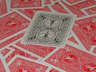
Cards don't thrill me at all. Having the traditionally black pips and numbers lighter than the traditionally red ones is irksome.
Gold is a lousy color choice on a white background when something has to be read - like the indices.
The creator bio and previous history are not encouraging. He should "PURSUE" an editor to "peruse" his writing. If his writing exhibits the attention to detail he has for his work, then I would really be concerned.
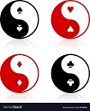
Artistically and design-wise, I think it had a lot of potential. The colors and details remind me of Thai art - I like the take on the heart. That king, though. At first glance at the indices, it was a bit difficult to identify if it was a club or a spade. I also wish the artist pursued the same Southeast Asian-esque perspective when he embellished the courts. Would have made them much more interesting.
This is his 5th Playing Card KS in a span of about 7 weeks. Feels like someone is throwing stuff against the wall in the hopes that something will finally stick. Maybe he should spend a little more time to polish things up. For now, too many red flags - easy pass.
The Meridian deck has already been cancelled. I don't know what's up with this guy but he needs to settle down and stick with one design, if he is indeed serious.
flashcards wrote:The Meridian deck has already been cancelled. I don't know what's up with this guy but he needs to settle down and stick with one design, if he is indeed serious.
"...that does not matter when someone wants to peruse (sic) their dreams."
Perusing and interpreting dreams has a long history of practice! LOL
His design for this deck has a lot of potential, though. I really like the Southeast Asian vibe. I think he needs to get feedback first before launching a campaign, to perfect the look of his deck. Has anybody invited him to post his WIPs here?