Page 1 of 1
Usagi Playing Cards
Posted: Thu Jul 02, 2015 7:34 am
by volantangel
Re: Usagi Playing Cards
Posted: Thu Jul 02, 2015 1:01 pm
by sinjin7
When the Buck twins stop making failed TV pilots and give up on acting careers, maybe they'll notice their S&M court cards are getting ripped off. . .
Re: Usagi Playing Cards
Posted: Thu Jul 02, 2015 2:10 pm
by Räpylätassu
I think minimal decks are just fine. BUT. There has to be something, some detail, perhaps a good color, perhaps a good logo, perhaps a good back design, something, that "makes the deck." There is no such thing here. There is no reason for this deck to exist.
Morales Saturn playing cards got a lot of hate here. I think it was a minimal done right, simply because of the very nice light-blue color used in the back design. That was the one thing that "made the deck."
Basically, in a good minimal deck, there has to be the one (or two) detail(s) it leans on. A minimal deck without that detail is missing the point of card collecting. I think we all started to collect, because we wanted cards that were in a some way different than the average deck. So when a minimal deck dosn't have that detail, it becomes the average deck, there just isn't anything special there.
That's my take on this minimal trend cancer-like-bull****
Re: Usagi Playing Cards
Posted: Thu Jul 02, 2015 3:08 pm
by vasta41
Räpylätassu wrote:There is no reason for this deck to exist.
My thoughts exactly.
Re: Usagi Playing Cards
Posted: Thu Jul 02, 2015 4:23 pm
by PrincessTrouble
The Existential deck.

Re: Usagi Playing Cards
Posted: Thu Jul 02, 2015 8:40 pm
by Mirror
Räpylätassu wrote:Basically, in a good minimal deck, there has to be the one (or two) detail(s) it leans on. A minimal deck without that detail is missing the point of card collecting. I think we all started to collect, because we wanted cards that were in a some way different than the average deck.
There we go, thank you, this was what I was waiting for. You are right, my deck does miss the point of card collecting. That's because collector's aren't the audience I was going for in the first place. I know very well that this deck probably does not appeal to most collectors. It doesn't have to. Tastes are different and I didn't make these with collectors in mind, so your reaction does not come as a huge surprise to me.
Let me just re-introduce myself really quickly (since I have not been very active on these forums recently): My name is Julian Stiber, I'm from south Germany and I'm the person behind this Project and Usagi Playing Cards. If you have any questions about the deck, please feel free to ask, I'll check this thread every now and then to answer everything

Also, thanks volant for posting this, I hadn't thought of posting it myself since, like I said, I haven't visited UC in a while.
Re: Usagi Playing Cards
Posted: Thu Jul 02, 2015 9:11 pm
by MagikFingerz
True, not all decks are made with collectors in mind, but I don't see what makes them good for cardists either. The logo (if you could call it that) is far from as visually appealing or easily recognizable as JNuggs/Wynns etc, and the dotted pattern seems like it would only make the backs blend into each other rather than stand out and enhance flourishes. Just another cardist's opinion.
And I would like to hear your response to Sinjin's post, which you so conveniently ignored.
Re: Usagi Playing Cards
Posted: Fri Jul 03, 2015 12:00 am
by volantangel
Mirror why don't you just use the wynn's style with your rabbit logo since that's apparently what cardists like.
For now it just reminds me of
http://www.supremenewyork.com/
Re: Usagi Playing Cards
Posted: Fri Jul 03, 2015 12:52 am
by sinjin7
MagikFingerz wrote:True, not all decks are made with collectors in mind, but I don't see what makes them good for cardists either. The logo (if you could call it that) is far from as visually appealing or easily recognizable as JNuggs/Wynns etc, and the dotted pattern seems like it would only make the backs blend into each other rather than stand out and enhance flourishes. Just another cardist's opinion.
And I would like to hear your response to Sinjin's post, which you so conveniently ignored.
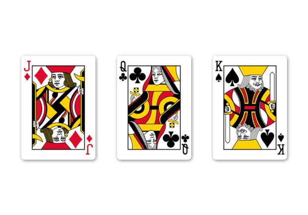
I don't want to come down too hard on Mirror. Now that I know its Julian that's behind this deck, it makes a little more sense to me. He's never been shy in defending the S&M series and we know they're his favorite decks. So I guess its not surprising that he would fashion his courts just like the Buck's, and even the polka dots are referential to the dots on S&M v4+ in a subconscious way.
But if this is a cardistry-centric deck, I have to agree with Kai and Tom in that Mirror could've gone in different directions. I would've liked a bolder, more dynamic design with thinner borders, embellishments in the corners, and a circular design element in the center of the back. This seems more minimal to me than cardistry.
Re: Usagi Playing Cards
Posted: Fri Jul 03, 2015 1:13 am
by volantangel
Mirror let us help, I'm sure we can come up with a cardistry centered deck that isn't a wynn ripoff or a geometric deck.
Re: Usagi Playing Cards
Posted: Fri Jul 03, 2015 2:05 am
by Räpylätassu
I am sorry that I was a "bit" harsh earlier, that isn't going to help in any means. I got a bit carried away. Sorry about that. In this message I try to be more reasonable and give good critigue rather than just hate
But I still think you should make the design so that it has a one strong element in it. But to the courts. I would say that work on the coloring. If you want to do it that way, make the colors look good and think more about the placeing of it. I got to say though, there is nothing wrong with that Queen of Clubs, but that King of Spades look quite horrible. Look at the crown, it just looks silly. You know what would be cool and something nobody has done yet? Those S&M looking courts but with the colors shade changing from lighter to darker as it goes to the center. That would be tricky, but done right, man that would be 1. simple 2. effective as hell.
Also change the back design to match the courts. Now they feel like there are two different decks, the back design and the courts. There is no on going theme between them. So I would say that make the back design lighter, get rid of the black and make it look fresh. Or change the courts to darker tone, if you want this to be darker deck. I think it would make an awesome back design if you did like a hand-painted looking yellow-red abstract mixture. Some nice patern there, or with a totally new color (green?) you make a better, bold looking douple logo. That would really stand out, yet being classic. That would look pretty great!
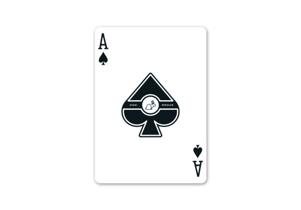
Also work on the Ace of Spades. I actually think that rabbit logo in it could work, but work on the shape of the spade, that is a bit dull.
These are just my general ideas though. Trust your own instinct and mind, but remember to listen to council and help. I know you can do better than this design! Now design the best looking cardistry deck ever, go to my earlier message and give it a big middlefinger!
Re: Usagi Playing Cards
Posted: Fri Jul 03, 2015 4:46 am
by Mirror
sinjin7 wrote:When the Buck twins stop making failed TV pilots and give up on acting careers, maybe they'll notice their S&M court cards are getting ripped off. . .
I wouldn't call it a ripoff. I didn't just copy and paste the Smoke and Mirror Courts onto my Cards (I don't have the files required anyways) but went and made every one of them myself with copying nothing but the pips, faces and hands.
volantangel wrote:Mirror why don't you just use the wynn's style with your rabbit logo since that's apparently what cardists like.
For now it just reminds me of
http://www.supremenewyork.com/
I did try that, actually, and with a lot of designs it looked really good, no, better than the text banner! I tried to tweak it a few times to get it to fit the Usagi Logo but with this dotted design it just never appealed to me. I feel like the dotted design needs contrast, not only in color (therefore the red) but also in shape. Lots of circles with even more, bigger circles didn't look appealing.
MagikFingerz wrote:True, not all decks are made with collectors in mind, but I don't see what makes them good for cardists either. The logo (if you could call it that) is far from as visually appealing or easily recognizable as JNuggs/Wynns etc, and the dotted pattern seems like it would only make the backs blend into each other rather than stand out and enhance flourishes. Just another cardist's opinion.
About the text banner being less visually appealing, well, that's personal preference. I do prefer my rabbit logo but couldn't use it in this one for reasons stated above. Now about the cardistry aspect. It is true that there are decks out there that make flourishes a lot better looking, my favorite still being the Tally-Ho Circle back, nothing has beaten this design in terms of "decks looking good in motion" in my opinion. I think that my deck could be seen more like a "fashion deck" if you can call it that. It is (clearly) inspired by clothing and some of the other designs I made and have planned to make are as well. I also have a radial, more cardistry oriented decks planned but these aren't finished yet. I started out with the campaign for this design because it is the one most people had already seen in social media, it's the one I was asked to do by a few people. I want to use this deck as a starting point for my brand because I have more to come.
I actually had the slogan "made for cardistry" on the box at one point but I took it away because I felt like that's not quite fitting if you look at other decks that follow the "designed / made for cardistry" formula a lot more than I did.
Re: Usagi Playing Cards
Posted: Fri Jul 03, 2015 9:20 am
by Mirror
sinjin7 wrote:I would've liked a bolder, more dynamic design with thinner borders, embellishments in the corners, and a circular design element in the center of the back. This seems more minimal to me than cardistry.
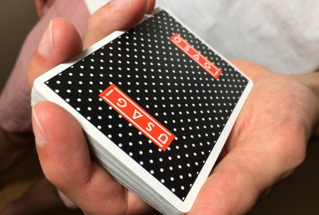
About the borders: The actual photographs show a prototype deck which is sadly off centered. The actual deck will have the thinnest borders Legends can produce which is about 2.2 mm.
Re: Usagi Playing Cards
Posted: Fri Jul 03, 2015 10:40 am
by sprouts1115
I try not to say anything on the art of card and recently the political aspects any cards, but focus theme and function of the cards. That quarter white circle needs to show up more.... I see black where there should not be any. Make it pop out..