


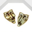
Please feel free to leave comments on the style and layout, this is a new look at the design of the card face.


+1 for this ideaEoghann wrote:Uncle's gonna LOVE these! One suggestion I'd make is to keep the index font consistent. The more legible the better.
Yup, that's right. Keep the sans serif throughout all the indexes.Pixel Initiative wrote:You mean such as the K in this, would you have this as the sans serif plain font like the numbers?


This. I like this deck. But, unfortunately, the indexes are unplayable for any game with more than 2 cards in hand. I hope they will be rethink. For now, it would be a pass for me. The design doesn't just need to look good, it must be usable.StanKindLee wrote:I would also suggest tightening up the font and the suit marker to a more vertical rather than horizontal alignment, so that the card spread while holding your cards does not need to be any widen than necessary.

I agree with Eoghann here. Keep it simple. The sans serif looks just fine. Liked the tucks okay but you hooked me, pun intended, on the faces. I'll be in!Eoghann wrote:Uncle's gonna LOVE these! One suggestion I'd make is to keep the index font consistent. The more legible the better.

Oh i wasnt referring to that, i was talking about the general border of the cards. However since we are talking about it, i understand the reason for why the indices should be arranged vertically, but it leaves your quarter circle unbalanced. Im still not quite sure which version i prefer, but my feeling is that not too many people will be pulling this particular deck out for poker, but they get it more for the fishy designPixel Initiative wrote:I get what Tom meant though, he doesn't mean the full border just the difference that he spotted between the corner detail on my ace and other numbers. There was a slight difference and shifting the corner detail slightly will make it easier for poker players who want to peek at the card corners.
Users browsing this forum: Bing [Bot], Fenrir, niktok and 15 guests