Your avatar is PERFECT for such a statement! What is that from BTW?
For some reason Hotcakes was the first Uusi deck that I jumped in on, just usually not my style somehow? This one is interesting though, thanks for the heads up.
And well that's the beauty of UUSI. Their decks are completely different from each other. So if one isn't to your liking, there's bound to be one that is.
Oh I am so in on this. Going deep, may have to remortgage the house.
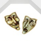
Also, Harley is one of my favorite DC characters, even though she just appears to be the biggest ditz in the world on the surface, her character is extremely complex. Former psychologist falls in love with her patient, turning psychotic herself. Unrequited love, lust for life and violence. Just an awesome character and her new comic series (well two series if you count New Suicide Squad as well) is pretty sweet too now that she's no longer with the Joker.
sprouts1115 wrote:The transition of the arm is not quite right. I think they can do better. The QoH has a flower. I like close to traditional courts...
I don't know if you can verbalise it, but what do you mean? Are you saying it just "looks" weird, or is it technically wrong?
One Deck at a Time.... One Deck at a Time... One Deck at a Time...
The amount of ulnar deviation (sideways tilting of the wrist away from the thumb) isn't excessive compared to normal range of motion, so I don't see anything wrong with that.
What might be a cause of some "weirdness" though is that the arm for the upside-down part starts at the left side. As we all know from discussions of back design elements, the eyes usually start at the top left and moves towards the right, so maybe if just the arms were mirrored it would look "better".
Part of the weirdness for me is how the hand is drawn. That's not a natural grip. Go ahead and grab anything while making it look like that. You'll see. The pinky is tucked in a very unnatural angle. You could get away with obscuring the thumb because it can naturally tuck that way. But you have to go out of your way to make the pinky disappear like that.
Overall I think the art style looks great, but there are several things wrong with the arm:
The grip looks like she's holding a baseball bat (or something more suited to Hotcakes) instead of a dainty flower
The hands are just weird - she only has three freakin' knuckles and fingers!
Whilst the angle of the wrist id plausible, if you follow the line of teh arm from wrist to elbow there's quite a worrying bend. I guess Rickets was rife in the dark ages...
The opposite arm appears from nowhere - if there were a way to make the arm look like it comes from the right shoulder maybe... or an extra swoop of cloak to hide that floating elbow... I dunno... something...
the middle transition itself looks fine to me though...
montecarlojoe wrote: she only has three freakin' knuckles and fingers!
There are four fingers plus the thumb which I assume is tucked within her fist. I made the gripping motion that the queen was doing and three knuckles seems about right. The knuckle of the pinkie finger doesn't pop out as much when you try to tuck it in but it could use some work.
Looking at the picture again, I see what you mean. I guess it's a matter of perspective. But yeah, some rework is in order.
Hey everybody -
Thanks so much for starting a thread on the Uusi Classic deck design! (thanks for posting Eoghann!) We were just on our way over here today to let everybody know about an Uusi Classic gilded deck giveaway on our FB page. The giveaway will happen on this Thursday on our page with the usual "like" to enter the contest. The giveaway winner will be announced during the KS project, in our first update.
Q of H's hands:
In regards to the discussion on the Q of H's hand position – we take photos at the studio of each others hands modeling the position we are looking for. That is actually the way it looked in the photo we took. Yashi had a pretty good read on it - although what Linnea has reworked ( I believe Montecarlojoe pointed it out) is the position of the stem of the flower in the Queens hand. It has been moved closer to the end of her fingers to more accurately portray how it should look in her hand. In regards to the comments on the position of the wrist – these are very expressionistic postures typical of renaissance painting – the era that influenced the imagery in this deck. I believe Annie put the reworked image of the Q of H on our website homepage this morning. You will also notice if you go there that we changed the font from a sans serif to a classic serif playing card font. Tweaks like this always happen in the last few weeks before our projects as the artwork is being dropped into place and getting your feedback on things like this has always very valuable to us.
Hope to see you over on our FB on Thursday for the Uusi Classic Gilded Deck Giveaway and if you make it over there you will also get a chance to see the card back for the deck!.
Peter, I checked out the FB page but found no peek at the card back. Can we see, please?
>Mike<"You can't please everyone, so you've got to please yourself" They say "Ignorance is bliss". Obviously, some people are much happier than others...
Members are encouraged to Show Us Your Cards! ♠ ♥ ♣ ♦ Our UC2021 Decks entitled "Odd Fellows" by Lorenzo Gaggiotti / @Stockholm17
Coming soon: AKA
«Eighth Annual Decks» ♠ ♥ ♣ ♦ UC members help maintain Portfolio52
THE Playing Card Database Online
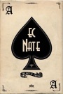
Contact ecNate for details and access ♠ ♥ ♣ ♦ UC2019 "Seventh Annual Decks"
by Montenzi Design
Funded 207% on KS: HERE ♠ ♥ ♣ ♦
>>> UC Deck Sales <<< Insert disclaimer here...
All information posted as fact is accurate at the time of posting to the best of my knowledge.
This is bittersweet - its the last deck of the series. It was impressive how tight of a ship Uusi ran for all their deck campaigns, and remained class acts throughout the whole process. Peter and Linnea execute the best court cards in the industry, and these look to be no exception. I love the irregular back border, but I'm going to channel Magikfingerz and suggest that maybe they can make the border a bit narrower. Can't wait to see the rest of the deck!
sinjin7 wrote:This is bittersweet - its the last deck of the series. It was impressive how tight of a ship Uusi ran for all their deck campaigns, and remained class acts throughout the whole process. Peter and Linnea execute the best court cards in the industry, and these look to be no exception. I love the irregular back border, but I'm going to channel Magikfingerz and suggest that maybe they can make the border a bit narrower. Can't wait to see the rest of the deck!
I agree. That is a thick white border. USPCC requires a white border with gilding. UUSI has made one without a border. Why stop. I would make another one gilded without a border. The bar is set this high.
Would be awesome! The Pagan's gilded versions do look beyond compare. The problem (if I read Jackson right) is that the USPCC gilding process would melt the ink around the border area of the card. Not sure how "deep" around each edge...
>Mike<"You can't please everyone, so you've got to please yourself" They say "Ignorance is bliss". Obviously, some people are much happier than others...
Members are encouraged to Show Us Your Cards! ♠ ♥ ♣ ♦ Our UC2021 Decks entitled "Odd Fellows" by Lorenzo Gaggiotti / @Stockholm17
Coming soon: AKA
«Eighth Annual Decks» ♠ ♥ ♣ ♦ UC members help maintain Portfolio52
THE Playing Card Database Online
Contact ecNate for details and access ♠ ♥ ♣ ♦ UC2019 "Seventh Annual Decks"
by Montenzi Design
Funded 207% on KS: HERE ♠ ♥ ♣ ♦
>>> UC Deck Sales <<< Insert disclaimer here...
All information posted as fact is accurate at the time of posting to the best of my knowledge.
Yes, they do. I don't think thinner borders or no borders will affect their gilding process. The Pagan decks were borderless and they had no problems gilding those.
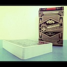
Does anyone know if the Ultimate Deck by Stranger & Stranger is manufactured by USPCC? It doesn't say on the box, but I assumed they were, since D&D's decks are by USPCC, there was no mention of a new printer, and the uncut sheets look like they come from USPCC (I don't have one personally, though). The Ultimate deck is full bleed and in full color on both sides of the deck, but there is a gilded version, and *if* it does come from USPCC, it seems they are able to gild decks without melting the ink around the border of the cards (unless they outsourced the gilding to someone else that one time).


What is that from BTW?