UnitedCardists.com and Windows "Themes"
Posted: Sun Oct 13, 2013 10:36 pm
I posted the following on another forum I frequent, but it is about this forum, so I am reposting it here:
======================================================================
I have, in recent days, been experimenting a bit with the "Themes" which come with Windows 7.
I did so because using the default theme, I frequently had difficulty seeing certain things on various web pages, particularly the "text input" boxes/prompts such as those used on the Google Advanced Search page, which are evidently a very light blue (outline) against a white, or off-white background.
I would frequently get to a web page which would say something like "Enter your Name and Password", with prompts for "Name" and "Password", but, since I could not make out the outline of the "input boxes", I could not tell if the boxes were to the right of, left of, above or below the prompts. Sometimes, tapping the Tab key would give me a visible text-input cursor, but not always. I would then have to drag the mouse cursor all around, watching for it to turn from an arrow into the "bone" text input cursor.
...which brings up another, related issue: Since the damned mouse cursor was, again, a light blue or grey outline with a white or off-white background, I often could not see it! either, and would just roll the mouse around at random, hoping I would mouse-over an element which would react to it, telling me where the mouse cursor was.
This was all VERY frustrating, and I thought that perhaps Windows Themes could help, as I recalled that some of the themes were specifically designed to aid people having trouble with the default, low-contrast color scheme.
I tried the various "High contrast" themes, and they all helped tremendously with both of the issues described above (I can easily see input boxes and the mouse cursor), but - of course! - cause other problems:
1. On some sites/pages, certain elements, evidently not designed with various themes in mind, just vanish with the High-contrast themes I've tried.
For example: I spend a fair amount of time on the forum of unitedcardists.com.
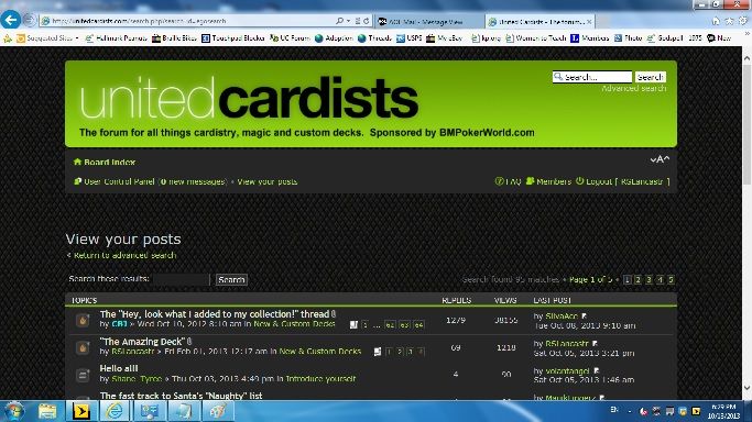
Here is a screen cap of their main page, with the default Windows 7 theme in place:
Here it is again, with one of the Black High-contrast themes:
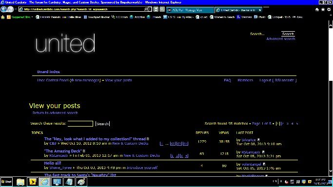
See how the "CARDISTS" portion of the banner just vanishes? So do other elements of other pages there, such as "Enter Reply" buttons and the like.
Another example:
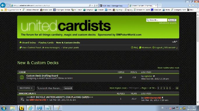
Here is the page viewing one of their subforums, using the default Theme:
...and here it is again, using the High-Contrast Theme:
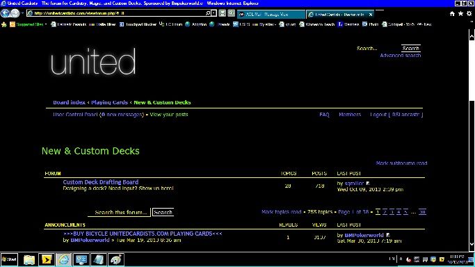
Note that not only is half of the banner graphic missing, but so are the buttons (such as "New Topic") halfway down the left side of the page.
I want to point this out to the mods/admin of the site, but am hoping to also give them a link to a page somewhere with tech advice on creating graphics which will workregardless of what Windows Theme a site visitor is using.
Thoughts?
======================================================
I have yet to get any replies to the above on the other forum, so am posting it here on UC.
The "High-contrast" Windows Themes are used by many people with vision problems, so it would be great if UC was compatible with those themes. I don't know what all that would entail, but I am looking into it.
======================================================================
I have, in recent days, been experimenting a bit with the "Themes" which come with Windows 7.
I did so because using the default theme, I frequently had difficulty seeing certain things on various web pages, particularly the "text input" boxes/prompts such as those used on the Google Advanced Search page, which are evidently a very light blue (outline) against a white, or off-white background.
I would frequently get to a web page which would say something like "Enter your Name and Password", with prompts for "Name" and "Password", but, since I could not make out the outline of the "input boxes", I could not tell if the boxes were to the right of, left of, above or below the prompts. Sometimes, tapping the Tab key would give me a visible text-input cursor, but not always. I would then have to drag the mouse cursor all around, watching for it to turn from an arrow into the "bone" text input cursor.
...which brings up another, related issue: Since the damned mouse cursor was, again, a light blue or grey outline with a white or off-white background, I often could not see it! either, and would just roll the mouse around at random, hoping I would mouse-over an element which would react to it, telling me where the mouse cursor was.
This was all VERY frustrating, and I thought that perhaps Windows Themes could help, as I recalled that some of the themes were specifically designed to aid people having trouble with the default, low-contrast color scheme.
I tried the various "High contrast" themes, and they all helped tremendously with both of the issues described above (I can easily see input boxes and the mouse cursor), but - of course! - cause other problems:
1. On some sites/pages, certain elements, evidently not designed with various themes in mind, just vanish with the High-contrast themes I've tried.
For example: I spend a fair amount of time on the forum of unitedcardists.com.
Here is a screen cap of their main page, with the default Windows 7 theme in place:
Here it is again, with one of the Black High-contrast themes:
See how the "CARDISTS" portion of the banner just vanishes? So do other elements of other pages there, such as "Enter Reply" buttons and the like.
Another example:
Here is the page viewing one of their subforums, using the default Theme:
...and here it is again, using the High-Contrast Theme:
Note that not only is half of the banner graphic missing, but so are the buttons (such as "New Topic") halfway down the left side of the page.
I want to point this out to the mods/admin of the site, but am hoping to also give them a link to a page somewhere with tech advice on creating graphics which will workregardless of what Windows Theme a site visitor is using.
Thoughts?
======================================================
I have yet to get any replies to the above on the other forum, so am posting it here on UC.
The "High-contrast" Windows Themes are used by many people with vision problems, so it would be great if UC was compatible with those themes. I don't know what all that would entail, but I am looking into it.