Page 1 of 1
"EMPEROR" Luxury Playing Cards
Posted: Wed Mar 13, 2013 4:00 pm
by LiquidSleight
Hey guys! I wanted to be a little ambitious with my next project, so here's the result of that mind-push.
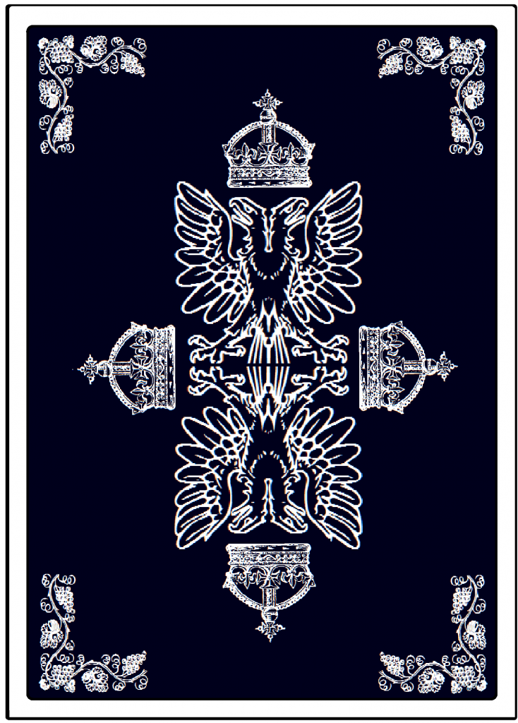
I call them the "EMPEROR" Playing Cards, and I think the tuck looks really nice. The back design is not finished yet, and I plan on putting a subtle pattern behind the main designs. I also did my best to make the letters and accents appear to the eye like silver foil; turned out better than I thought. Enjoy, and I would appreciate your feedback. CONSTRUCTIVE CRITICISM ONLY, please.
Link:
http://s1307.beta.photobucket.com/user/ ... 0.png.html" onclick="window.open(this.href);return false;" onclick="window.open(this.href);return false;" onclick="window.open(this.href);return false;
Here are the black Aces:
Link:
http://s1307.beta.photobucket.com/user/ ... 1.png.html" onclick="window.open(this.href);return false;
The red Aces:
Link:
http://s1307.beta.photobucket.com/user/ ... 3.png.html" onclick="window.open(this.href);return false;
And the Joker:
http://s1307.beta.photobucket.com/user/ ... 8.png.html" onclick="window.open(this.href);return false;
Re: "EMPEROR" Luxury Playing Cards
Posted: Wed Mar 13, 2013 7:56 pm
by DukeBoy
I like the start to the deck. If you are going to title the Aces then you would need to do the spade too. Move the deck name under the card name on one line. Flourishers will like the corner spots on the back. Keep it up.
Re: "EMPEROR" Luxury Playing Cards
Posted: Thu Mar 14, 2013 4:45 pm
by LiquidSleight
Thanks for the input. I finished the back design and adjusted the line on the left side of the deck; apparently I cannot have both the distributor and the USPCC on the same deck. The first link is with the title in the normal place; the second has the "on the bottom" idea, and the third is the back design minus the foil (what would actually be on the card).
Standard Box:
http://s1307.beta.photobucket.com/user/ ... d.png.html" onclick="window.open(this.href);return false;
With Adjusted Title:
http://s1307.beta.photobucket.com/user/ ... a.png.html" onclick="window.open(this.href);return false;
Playing Card Back Design:
http://s1307.beta.photobucket.com/user/ ... 8.png.html" onclick="window.open(this.href);return false;
Thanks for checking it out!
Re: "EMPEROR" Luxury Playing Cards
Posted: Thu Mar 14, 2013 6:28 pm
by Russell
The line weights on the clip-art dont match up, try thickening them up.
Please tell me the wavy pattern on the tuck box is for demonstration purposes only... to simulate silver foil?
Re: "EMPEROR" Luxury Playing Cards
Posted: Thu Mar 14, 2013 7:02 pm
by LiquidSleight
I'm not sure what you mean by "line weights". And yes, the wavyness is to SIMULATE SILVER FOIL ONLY. It is NOT part of the design.
Re: "EMPEROR" Luxury Playing Cards
Posted: Thu Mar 14, 2013 9:31 pm
by Russell

The crown clip art is very detailed and has thin 'lines', compared to the eagle clipart with thicker line weight.
Also, you need to buy some higher resolution sources, those are very pixelated.
Re: "EMPEROR" Luxury Playing Cards
Posted: Fri Mar 15, 2013 3:39 am
by Sharpie
And the eagle tail feathers/lines don't match up.
Otherwise, I'm liking the simplicity so far.
Re: "EMPEROR" Luxury Playing Cards
Posted: Fri Mar 15, 2013 8:19 am
by MagikFingerz
Russell wrote:
The crown clip art is very detailed and has thin 'lines', compared to the eagle clipart with thicker line weight.
Also, you need to buy some higher resolution sources, those are very pixelated.
Just to make sure: you
are poking fun at him, right?
Re: "EMPEROR" Luxury Playing Cards
Posted: Fri Mar 15, 2013 2:24 pm
by Sharpie
MagikFingerz wrote:Russell wrote:
The crown clip art is very detailed and has thin 'lines', compared to the eagle clipart with thicker line weight.
Also, you need to buy some higher resolution sources, those are very pixelated.
Just to make sure: you
are poking fun at him, right?
Don't think he is...
I concur with his assessment on both counts.
Re: "EMPEROR" Luxury Playing Cards
Posted: Fri Mar 15, 2013 9:52 pm
by LiquidSleight
First of all, I appreciate your thoughts, and I understand. Second of all, that's NOT clip-art, and third, I'm doing all of my designs in Microsoft Paint because that's all I have; this isn't going to turn out perfect.
Re: "EMPEROR" Luxury Playing Cards
Posted: Sun Mar 17, 2013 5:09 am
by Lotrek
Even if it isn't clipart, it looks like clipart. And an emperor would never accept such garment.

BTW, I like the spades pip.
Re: "EMPEROR" Luxury Playing Cards
Posted: Wed Mar 20, 2013 11:23 am
by Ryric
LiquidSleight wrote:First of all, I appreciate your thoughts, and I understand. Second of all, that's NOT clip-art, and third, I'm doing all of my designs in Microsoft Paint because that's all I have; this isn't going to turn out perfect.
I have to think GIMP or Paint.net would be a better tool.
Re: "EMPEROR" Luxury Playing Cards
Posted: Wed Mar 20, 2013 12:55 pm
by Russell
LiquidSleight wrote:Second of all, that's NOT clip-art,
Crown -
http://www.polyvore.com/crown_clipart/thing?id=19541379" onclick="window.open(this.href);return false;
Vines -
http://www.briarpress.org/899" onclick="window.open(this.href);return false;
Eagle -
http://www.alternatehistory.com/discuss ... tcount=109" onclick="window.open(this.href);return false;

- balls_fc.jpg (158.81 KiB) Viewed 2561 times
Re: "EMPEROR" Luxury Playing Cards
Posted: Wed Mar 20, 2013 2:39 pm
by volantangel
HAHAHAHA Russ you actually spent time looking for these !?!
Re: "EMPEROR" Luxury Playing Cards
Posted: Wed Mar 20, 2013 5:21 pm
by LiquidSleight
Wow...I didn't realize they were clip-art somewhere else. I found them as a font, and adjusted them as needed. Thanks for the info; I really appreciate your diligence.
Re: "EMPEROR" Luxury Playing Cards
Posted: Wed Mar 20, 2013 10:11 pm
by Russell
volantangel wrote:HAHAHAHA Russ you actually spent time looking for these !?!
I have to keep myself busy between shipping decks.
Re: "EMPEROR" Luxury Playing Cards
Posted: Wed Mar 20, 2013 10:31 pm
by DukeBoy
LiquidSleight wrote:Wow...I didn't realize they were clip-art somewhere else. I found them as a font, and adjusted them as needed. Thanks for the info; I really appreciate your diligence.
What letter would I push in your font to get the Crown?
Re: "EMPEROR" Luxury Playing Cards
Posted: Wed Mar 20, 2013 11:41 pm
by LiquidSleight
The font is called "Cornucopia of Ornaments", and you press "W".
Re: "EMPEROR" Luxury Playing Cards
Posted: Thu Mar 21, 2013 8:56 am
by Strag
LiquidSleight wrote:The font is called "Cornucopia of Ornaments", and you press "W".
And you don't consider that clip art?
Re: "EMPEROR" Luxury Playing Cards
Posted: Thu Mar 21, 2013 10:39 am
by MagikFingerz
Isn't the definition of clip art: art that has been taken (cut or "clipped") from somewhere else?
Re: "EMPEROR" Luxury Playing Cards
Posted: Thu Mar 21, 2013 10:56 am
by LiquidSleight
*sigh* You know what, fine. Let's just call it clip-art and be done with it. I didn't post my art so that we could create petty arguments. I wanted constructive criticism and THAT'S ALL. Does that sound okay to you?
Re: "EMPEROR" Luxury Playing Cards
Posted: Thu Mar 21, 2013 11:08 am
by MagikFingerz
LiquidSleight wrote:*sigh* You know what, fine. Let's just call it clip-art and be done with it. I didn't post my art so that we could create petty arguments. I wanted constructive criticism and THAT'S ALL. Does that sound okay to you?

