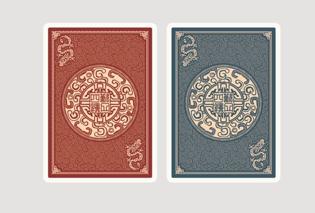
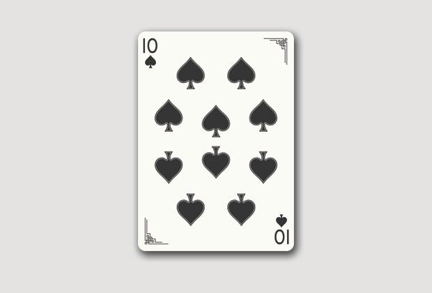
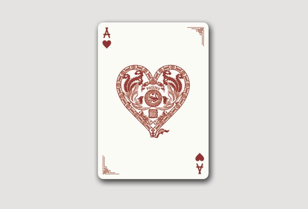
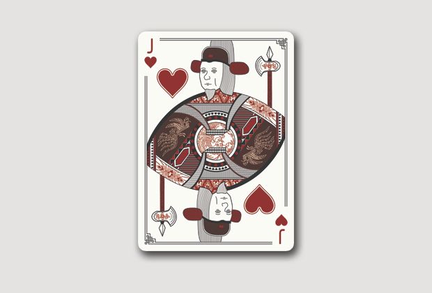
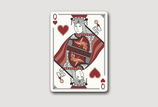
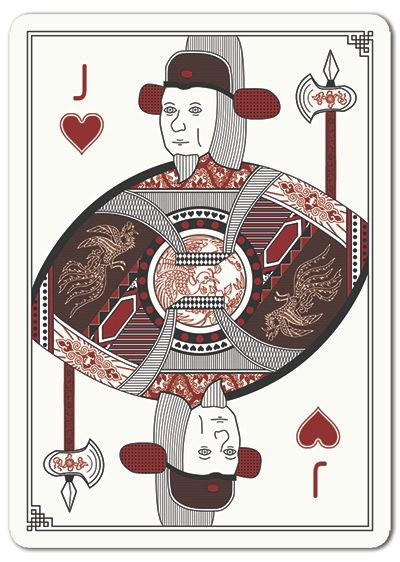
Sishou Deck Design
- alvinhy
- ✔ VERIFIED Designer
- Posts: 180
- Joined: Sat Jan 05, 2013 1:29 pm
- Has thanked: 3 times
- Been thanked: 32 times
Sishou Deck Design
Hello everyone,
I am a freelance designer and interior designer. In my free time I was able to produce a design for a deck of playing cards. I plan to launch this on Kickstarter but I would be needing a few comments from the experts (you guys) in the playing card lovers point of view.
The theme
I chose this oriental theme because I am Chinese myself. Having to live in the UK for a while I have been absorbing different styles of design. Using mutual colours and the stereotype red for Chinese comes out pretty appealing.
Inspiration
You wonder where I get the inspiration for the SiShou deck. Well SiShou means 4 beasts in Chinese. There are 4 legendary beasts in Chinese history. Using them as an iconic figure to create the design.
Please tell me how I can improve this deck before I launch it. I hope you enjoy the design!
Here goes nothing!
- Oswin
- Member
- Posts: 215
- Joined: Wed Oct 24, 2012 11:45 am
- Magician: Yes
- Decks Owned: 0
- Location: France
- Has thanked: 2 times
- Contact:
Re: Sishou Deck Design
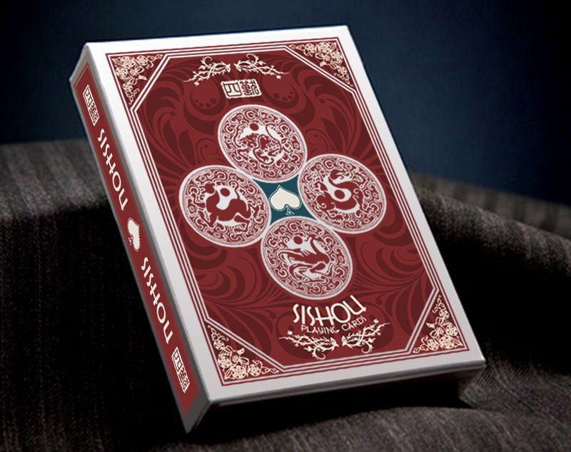
Pretty nice cards. I love your back, but i will love an symetrical.
Continue, you are in the right way
"Le temps passe, mais les oeufs durs !" - Daniel Prévost
- alvinhy
- ✔ VERIFIED Designer
- Posts: 180
- Joined: Sat Jan 05, 2013 1:29 pm
- Has thanked: 3 times
- Been thanked: 32 times
Re: Sishou Deck Design
Just a question, do all playing card lovers like symmetrical??Oswin wrote:Pretty nice cards. I love your back, but i will love an symetrical.
Continue, you are in the right way
I shall see what people think about it and see if I should change the design a bit.
Thanks for your comment!
- MagikFingerz
- Site Admin
- Posts: 7812
- Joined: Mon Sep 24, 2012 7:32 pm
- Cardist: Yes
- Collector: Yes
- Player: Yes
- Magician: Yes
- White Whale: Sawdust and Delicious + uncuts
- Location: Norway
- Has thanked: 1808 times
- Been thanked: 1564 times
- Contact:
Re: Sishou Deck Design
Great work!
Yes, I think most people prefer backs to be "symmetrical", or two-way as it's usually called. In your case, it's really just the very center part that needs to be done something about. I also recommend making the borders thinner
Re: Sishou Deck Design
Very cool design!
The only thing I'd change is making the borders thinner on the back.
Re: Sishou Deck Design
Really nice deck, especially if you were able to do that in your free time!!!
I think you'll have no issues having a successful pledge on KickStarter.
Re: Sishou Deck Design
I like it! I'll definitely pledge for it. Any thoughts about doing a color variant with it to make it a set? Maybe a Gold Metallic or Bright Yellow...keeping with sterotypical Chinese coloring
BTW, The Ace looks wonderful and I love the font you chose for the pips
- volantangel
- Moderator
- Posts: 3607
- Joined: Tue Nov 13, 2012 2:06 am
- Collector: Yes
- Player: Yes
- Decks Owned: 350
- Location: Singapore
- Has thanked: 219 times
- Been thanked: 297 times
Re: Sishou Deck Design
I think something can definitely be done for it to be two way, but it is looking good atm !! Its like going to a traditional chinese wedding
the pips reminds me of the lumberjack pips, but a neater, smarter version..
My Collection = Playing Cards + Photography
- alvinhy
- ✔ VERIFIED Designer
- Posts: 180
- Joined: Sat Jan 05, 2013 1:29 pm
- Has thanked: 3 times
- Been thanked: 32 times
Re: Sishou Deck Design - Updated Jan 6th
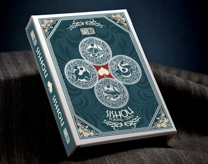
I have updated the back to be a two way deck!
let me know what you think!
- volantangel
- Moderator
- Posts: 3607
- Joined: Tue Nov 13, 2012 2:06 am
- Collector: Yes
- Player: Yes
- Decks Owned: 350
- Location: Singapore
- Has thanked: 219 times
- Been thanked: 297 times
Re: Sishou Deck Design - Updated Jan 6th
The new one definitely looks better, plus the dragon in the corners would look good in fans, esp giant fansalvinhy wrote:I have updated the back to be a two way deck!
let me know what you think!
My Collection = Playing Cards + Photography
- MagikFingerz
- Site Admin
- Posts: 7812
- Joined: Mon Sep 24, 2012 7:32 pm
- Cardist: Yes
- Collector: Yes
- Player: Yes
- Magician: Yes
- White Whale: Sawdust and Delicious + uncuts
- Location: Norway
- Has thanked: 1808 times
- Been thanked: 1564 times
- Contact:
Re: Sishou Deck Design - Updated Jan 6th
Love it!alvinhy wrote:I have updated the back to be a two way deck!
let me know what you think!
- walrus
- Moderator
- Posts: 2365
- Joined: Mon Sep 24, 2012 6:02 pm
- Has thanked: 44 times
- Been thanked: 33 times
Re: Sishou Deck Design - Updated Jan 6th
A very nice look. I am all in on these. Having spent some time in China I appreciate there culture. Although known for all the cheap plastic stuff they produce some wonderful things up in that piece. I brought back some art, some of which is antique, (risking a big fine). Beautiful stuff. Please keep us updated.
- alvinhy
- ✔ VERIFIED Designer
- Posts: 180
- Joined: Sat Jan 05, 2013 1:29 pm
- Has thanked: 3 times
- Been thanked: 32 times
Re: Sishou Deck Design - Updated Jan 6th
Glad you liked the culture there! Although Im from Hong Kong which is more international compared to mainland China.walrus wrote:A very nice look. I am all in on these. Having spent some time in China I appreciate there culture. Although known for all the cheap plastic stuff they produce some wonderful things up in that piece. I brought back some art, some of which is antique, (risking a big fine). Beautiful stuff. Please keep us updated.
I will keep this post updated till the launch on kickstarter
- Oswin
- Member
- Posts: 215
- Joined: Wed Oct 24, 2012 11:45 am
- Magician: Yes
- Decks Owned: 0
- Location: France
- Has thanked: 2 times
- Contact:
Re: Sishou Deck Design - Updated Jan 6th
The modifications are good ! thanks
"Le temps passe, mais les oeufs durs !" - Daniel Prévost
Re: Sishou Deck Design - Updated Jan 6th
And I see you made the borders thinner! The updated backs look much better.
- volantangel
- Moderator
- Posts: 3607
- Joined: Tue Nov 13, 2012 2:06 am
- Collector: Yes
- Player: Yes
- Decks Owned: 350
- Location: Singapore
- Has thanked: 219 times
- Been thanked: 297 times
Re: Sishou Deck Design - Updated Jan 6th
Hmm is there any particular reason why the center of the red box is teal and the teal box red? I think it would work better with just the original colours..
My Collection = Playing Cards + Photography
-
- Member
- Posts: 73
- Joined: Wed Sep 26, 2012 4:55 pm
Re: Sishou Deck Design - Updated Jan 6th
I like what you are doing with the deck. Looking good. Thin out the borders and go with USPCC
- MagikFingerz
- Site Admin
- Posts: 7812
- Joined: Mon Sep 24, 2012 7:32 pm
- Cardist: Yes
- Collector: Yes
- Player: Yes
- Magician: Yes
- White Whale: Sawdust and Delicious + uncuts
- Location: Norway
- Has thanked: 1808 times
- Been thanked: 1564 times
- Contact:
Re: Sishou Deck Design - Updated Jan 6th
Actually, I like it like that (isn't that a song?).volantangel wrote:Hmm is there any particular reason why the center of the red box is teal and the teal box red? I think it would work better with just the original colours..
- alvinhy
- ✔ VERIFIED Designer
- Posts: 180
- Joined: Sat Jan 05, 2013 1:29 pm
- Has thanked: 3 times
- Been thanked: 32 times
-
- Member
- Posts: 104
- Joined: Mon Nov 12, 2012 11:52 pm
Re: Sishou Deck Design - LAUNCHING on 13.1.13
absolutely stunning! i cant say enough good things about this deck, this is an automatic pledge for me the second it goes on kickstarter
the ONLY thing id suggest, is metallic gold inks for the beige(or is it tan?) so it pops out red/blue and gold. and i would stick with the way you made your pips originally, not the one you posted (jack of hearts) since its waay too far from the corner and the closer to the corner the better, since it shows beatifully in fans... and since you made that border, even reverse fans will look just as cool!
if you did this on your free time, man i have a feeling your going to be doing great things
- alvinhy
- ✔ VERIFIED Designer
- Posts: 180
- Joined: Sat Jan 05, 2013 1:29 pm
- Has thanked: 3 times
- Been thanked: 32 times
Re: Sishou Deck Design - LAUNCHING on 13.1.13
Hey thanks for the reply, the first post was actually updated version of the pips.darkinertia wrote:absolutely stunning! i cant say enough good things about this deck, this is an automatic pledge for me the second it goes on kickstarter
the ONLY thing id suggest, is metallic gold inks for the beige(or is it tan?) so it pops out red/blue and gold. and i would stick with the way you made your pips originally, not the one you posted (jack of hearts) since its waay too far from the corner and the closer to the corner the better, since it shows beatifully in fans... and since you made that border, even reverse fans will look just as cool!
if you did this on your free time, man i have a feeling your going to be doing great things
After a lot of feed back the deck has changed dramatically since the first designs thanks to you all!
This project will be launched on 13 or a day before so stay tuned =D
-
- Member
- Posts: 2424
- Joined: Mon Oct 01, 2012 3:11 pm
- Collector: Yes
- Player: Yes
- White Whale: None
- Decks Owned: 0
- Has thanked: 240 times
- Been thanked: 986 times
Re: Sishou Deck Design - LAUNCHING on 13.1.13
Sweet, I really hope you have some good levels for us International backersalvinhy wrote: Hey thanks for the reply, the first post was actually updated version of the pips.
After a lot of feed back the deck has changed dramatically since the first designs thanks to you all!
This project will be launched on 13 or a day before so stay tuned =D
- Lotrek
- ✔ VERIFIED Designer
- Posts: 1684
- Joined: Sat Dec 08, 2012 11:39 am
- Has thanked: 1452 times
- Been thanked: 2057 times
- Contact:
Re: Sishou Deck Design
I think court cards need more work. The Chinese motifs seem just thrown on the clothes. They should be more functional I believe.
"Bite more than you can chew and then chew it"
----------------------------------------------------------
fb: https://www.facebook.com/oathplayingcards/
website: https://www.oathplayingcards.com/
twitter:@OathPCC
----------------------------------------------------------
fb: https://www.facebook.com/oathplayingcards/
website: https://www.oathplayingcards.com/
twitter:@OathPCC
- Oswin
- Member
- Posts: 215
- Joined: Wed Oct 24, 2012 11:45 am
- Magician: Yes
- Decks Owned: 0
- Location: France
- Has thanked: 2 times
- Contact:
Re: Sishou Deck Design
I don't think, remember the simple deck on KS....Lotrek wrote:I think court cards need more work. The Chinese motifs seem just thrown on the clothes. They should be more functional I believe.
"Le temps passe, mais les oeufs durs !" - Daniel Prévost
- Lotrek
- ✔ VERIFIED Designer
- Posts: 1684
- Joined: Sat Dec 08, 2012 11:39 am
- Has thanked: 1452 times
- Been thanked: 2057 times
- Contact:
Re: Sishou Deck Design
I don't mean they should be more elaborate. They could be even simpler. They just seem to me a bit thrown there. But all these things are after all, a matter of taste!
"Bite more than you can chew and then chew it"
----------------------------------------------------------
fb: https://www.facebook.com/oathplayingcards/
website: https://www.oathplayingcards.com/
twitter:@OathPCC
----------------------------------------------------------
fb: https://www.facebook.com/oathplayingcards/
website: https://www.oathplayingcards.com/
twitter:@OathPCC
- alvinhy
- ✔ VERIFIED Designer
- Posts: 180
- Joined: Sat Jan 05, 2013 1:29 pm
- Has thanked: 3 times
- Been thanked: 32 times
Re: Sishou Deck Design
ah I will go back and review those designs. But the concept comes from the actual gowns the emperor wears.
-
- Member
- Posts: 104
- Joined: Mon Nov 12, 2012 11:52 pm
Re: Sishou Deck Design
yeah i think it looks great as it is
btw, is the main ace card with the design going to be the ace of hearts or spades? or will all ace cards have the big design?
- alvinhy
- ✔ VERIFIED Designer
- Posts: 180
- Joined: Sat Jan 05, 2013 1:29 pm
- Has thanked: 3 times
- Been thanked: 32 times
Re: Sishou Deck Design
Hey, the Aces will have their own beast to their design.darkinertia wrote:yeah i think it looks great as it is
btw, is the main ace card with the design going to be the ace of hearts or spades? or will all ace cards have the big design?
You can check out more sneak peaks from my facebook page or twitter
facebook.com/alvincheunghy
twitter.com/alvincheunghy
Who is online
Users browsing this forum: No registered users and 2 guests