Page 1 of 3
Vol 2. Sisterhood of Blood - 52 Ravens
Posted: Sun May 28, 2017 9:07 am
by 52Ravens
Hey all
I'm back once again for you all to cast your eyes over the design process of Volume 2 of the Sisterhood of Blood playing cards. More of the same regarding style but with a couple of tweaks. All new courts, back and case design to step it away from Volume 1, but not too far that they don't feel part of the same series.
The court cards are close to final layouts and I'm about ready to get some feedback. But before I start showing sets of Jack, Queens and Kings, I wanted to start with the below, red or no red?

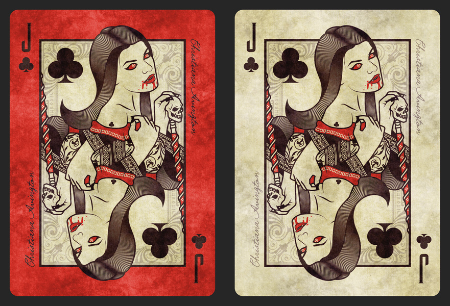
My main two concerns are that the red could make it hard to read the black pips and that they could look too similar to Lorenzo's Requiem with the red and cream/paper. What do you guys think?
As always, all constructive feedback is gratefully appreciated and often rewarded with being able to name these beautiful creatures.
Re: Vol 2. Sisterhood of Blood - 52 Ravens
Posted: Sun May 28, 2017 10:07 am
by RichK
I passed on this only because it was vampires. Art was great, just not my thing, sorry.
The red border helps make the red on the woman pop out more but the index is harder to read. Easier to read without red. And I wonder how you'd handle the hearts/diamonds with red border.
I don't think it would be similar to Requiem since they are deeper red with bluer center area with lots of insane stuff going on with the courts. This Jack has sucked blood but doesn't have much chaos/busyness/action in her pose whereas I feel like I just interrupted something happening in Requiem.
Re: Vol 2. Sisterhood of Blood - 52 Ravens
Posted: Sun May 28, 2017 3:16 pm
by MagikFingerz
I think the red is fine, and it differentiates Vol 2 even more from Vol 1, which is good imo. Indices aren't much harder to read, and like Rick said the red is quite a different shade than Requiem.
Hearts/Diamonds could perhaps have a black outline around the pips?
Another thing is: Will the back design match the red face cards?
Re: Vol 2. Sisterhood of Blood - 52 Ravens
Posted: Sun May 28, 2017 4:28 pm
by Räpylätassu
First of all: The words I saw aloud when I saw this thread were "You got to be f*cking kidding me" while the inside of my head shoouted "YEEEEEEEEEEEES!!!!" So I am pretty fricking excited about this.
Oh and red. Red all the fricking way.
Re: Vol 2. Sisterhood of Blood - 52 Ravens
Posted: Mon May 29, 2017 3:32 am
by guru
As mentioned above, I believe red works fine and can act as a strong differentiator with Vol I and any other similar themed decks. You may need to work with Expert (in case you're going with them again) to see how closely they can replicate the Red as on screen and what does a better "Red" in print looks like for this deck.
Re: Vol 2. Sisterhood of Blood - 52 Ravens
Posted: Mon May 29, 2017 1:18 pm
by rousselle
Red.
And, I recommend that you try a thin beige border around the index pips (beige as in, match the background color of the interior) and, as was suggested above, some kind of border around the red pips, as well.
You know I'm backing this one.

Re: Vol 2. Sisterhood of Blood - 52 Ravens
Posted: Tue May 30, 2017 12:45 pm
by 52Ravens
Thanks for the feedback guys. I'll take another look and get some new previews sorted before showing the rest of the courts
Re: Vol 2. Sisterhood of Blood - 52 Ravens
Posted: Wed May 31, 2017 2:26 pm
by JacksandJokers
Agree with others - Love the Red.
Re: Vol 2. Sisterhood of Blood - 52 Ravens
Posted: Wed May 31, 2017 5:10 pm
by vedus
I'll be the outlier.
I don't like the red or the texture on the border as much as I'd prefer a clean solid colour border, but that's a general personal preference. I still dig them despite that.
Re: Vol 2. Sisterhood of Blood - 52 Ravens
Posted: Thu Jun 01, 2017 1:05 pm
by 52Ravens
Hey!
Thanks for all the feedback, really appreciate it. I'll hand out naming rewards once I get this finalised and you've actually seen the courts!
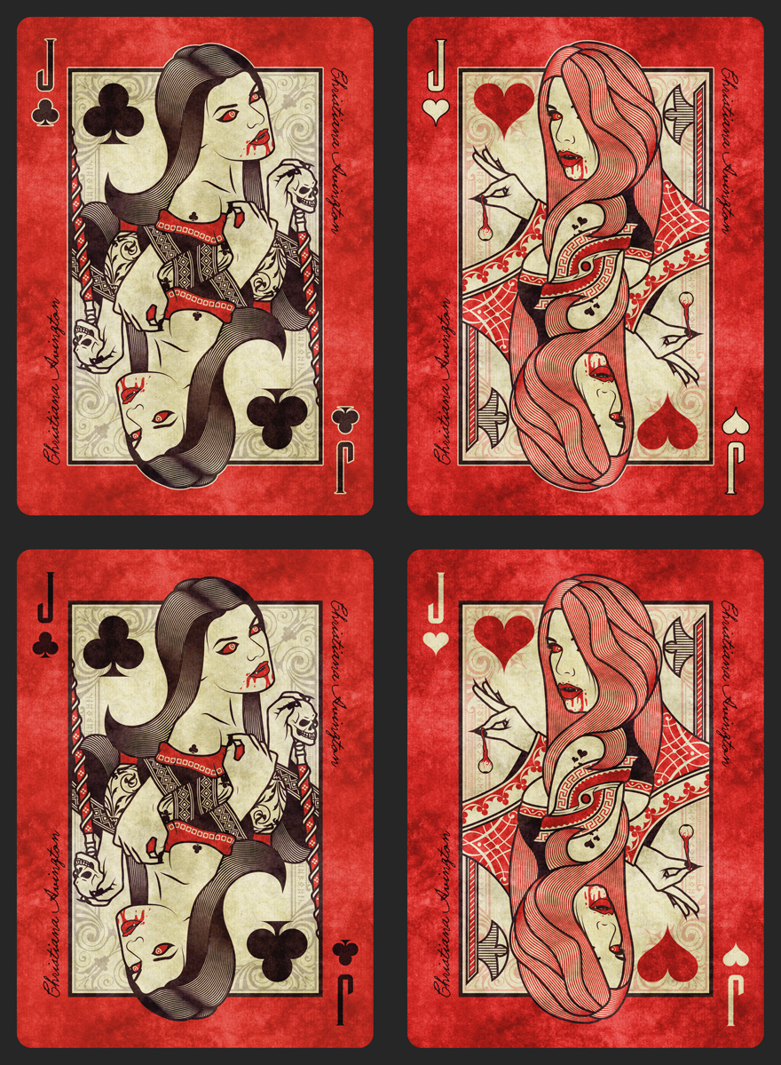
I've been having a play around and below are two sets of examples. The top ones have a key line around the indexes and the bottom ones are without. Personally I think the key line ones are a little fussy to read and are heading towards the tacky side of design. Let me know your thoughts. I like the second row myself and I'm leaning that way, its going to take a lot of convincing otherwise
Once we have this, I'll post the Jacks.
RichK wrote:I passed on this only because it was vampires.
I think I remember you saying before but totally appreciate the input for design

MagikFingerz wrote:Another thing is: Will the back design match the red face cards?
Yes, wanting to carry the red around to the front so needed to make sure this was right before I started finalising the back.
vedus wrote:I'll be the outlier.
I had a go at plain colours and no textures but it didn't suit the theme and took it too far away from volume one. I'm always happy to have apposing views, it helps to second guess ideas and thoughts. Remember, you can't please everyone, so if you're surrounded by people only telling you "YES!", someone is lying
Guess that makes me a glass half empty type of guy!
Re: Vol 2. Sisterhood of Blood - 52 Ravens
Posted: Thu Jun 01, 2017 1:42 pm
by ecNate
I wasn't a big fan of the red border as it seemed to be an after thought and caused the image to stick out (both in a good 'pop' way, but also just distracting). My initial thought was to try making the entire back red instead of the court background being tan. However, I think the key lines help a ton with this on the center image. I suggest you keep that, even if you remove from the indicies. Regarding those, I think it does add something and isn't tacky, but certainly is more appealing on the suit than 'J'. I would vote to keep them all, but certainly keep the one around the court image box and possibly also the suit. However, then the question would be how this would look on number cards if the pips there do/don't have the same treatment. That may help you decide what to do here as well.
Re: Vol 2. Sisterhood of Blood - 52 Ravens
Posted: Thu Jun 01, 2017 11:07 pm
by rousselle
I prefer the first row, with the key lines.
However, I don't dislike the second row. I just *prefer* the first row.
I like the way this is coming along.
Re: Vol 2. Sisterhood of Blood - 52 Ravens
Posted: Fri Jun 02, 2017 3:15 am
by flashcards
I think the top JoH is the way to go. The red borders are awesome. The key lines around the figures help them pop. It is almost a 3-D effect. I like the indices without the key lines as they don't have the same effect as with the figures. I personally like the white heart at the corner and the red heart in the white area. I don't know if that would be a problem for those that use them for actually games but from an aesthetic point of view, they work well. I like the way this project is heading as well. It is so much better than a recolor and is going to be different enough to justify the additional purchase. Nice job.
Re: Vol 2. Sisterhood of Blood - 52 Ravens
Posted: Fri Jun 02, 2017 6:41 am
by montecarlojoe
First row for me too - have you considered going whole hog and using red stock...?
Re: Vol 2. Sisterhood of Blood - 52 Ravens
Posted: Fri Jun 02, 2017 8:35 am
by vedus
Continually on the outside on this one. The second row runs a bit better for my eye.
Re: Vol 2. Sisterhood of Blood - 52 Ravens
Posted: Sat Jun 03, 2017 8:11 am
by 52Ravens
Wow, I really didn't think it would be this difficult
The top row really doesn't do it for me with the key line around the indices, but I think I'll keep it around the characters as an extra border between the back and red as mentioned by a few others. It might not be the clearly popular choice but I've got to stick with my gut feeling.
I appreciate all the feedback, it really does help me to battle through ideas.
Jack designs coming tomorrow

rousselle wrote:I don't dislike the second row. I just *prefer* the first row.
I know what you're saying, its the other way round for me haha
montecarlojoe wrote:have you considered going whole hog and using red stock...?
I have thought of it but I'd loose the texture effect, which would take it just a step too far away from Vol 1 I think
Re: Vol 2. Sisterhood of Blood - 52 Ravens
Posted: Sat Jun 03, 2017 8:53 am
by TGunitedcardists
Top row/first row.
Re: Vol 2. Sisterhood of Blood - 52 Ravens
Posted: Sun Jun 04, 2017 5:45 am
by 52Ravens
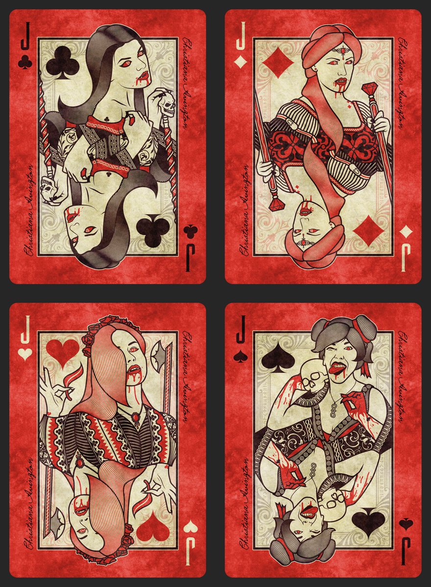
Hey Guys, below are the Jacks from Vol 2.
Feel free to go to town on the layouts, constructive feedback will be rewarded if it develops the design, with naming of the vampires
Once we are all good with the Jacks I'll post the Queens
Thanks!
Re: Vol 2. Sisterhood of Blood - 52 Ravens
Posted: Sun Jun 04, 2017 12:00 pm
by Räpylätassu
I love all of them except that herp derp Jack of Spades
But all other three are great work!
Re: Vol 2. Sisterhood of Blood - 52 Ravens
Posted: Mon Jun 05, 2017 2:59 am
by flashcards
There is something about the white indices that catches my eye and makes it jump to the figure...in a good way, of course. The black indices don't seem to do that although I don't think that is a necessarily bad, just interesting. I like the idea of red stock but I understand your desire for continuity. I don't mean to pile on but the skull on the Jack of Spades looks like it is wearing glasses. Otherwise, every thing is looking good.
Re: Vol 2. Sisterhood of Blood - 52 Ravens
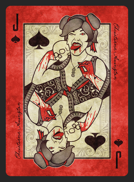
Posted: Sat Jun 10, 2017 10:51 am
by 52Ravens
Hey!
An updated JoS as flashcards was right, it looked a little like the skull had glasses on. Hopefully its tweaked enough to not look like that now
Let me know if you guys spot anything else, if not, I'll post the the Queens.
Thanks for all the input!
Räpylätassu wrote:I love all of them except that herp derp Jack of Spades

This is Isabel from volume 1. If you backed the book you'll find out why she looks a little crazy once the rewards are fulfilled haha
flashcards wrote:...the skull on the Jack of Spades looks like it is wearing glasses.
Thanks for this, I'll PM you regarding naming one
Re: Vol 2. Sisterhood of Blood - 52 Ravens
Posted: Sat Jun 17, 2017 3:24 am
by 52Ravens
Hey!
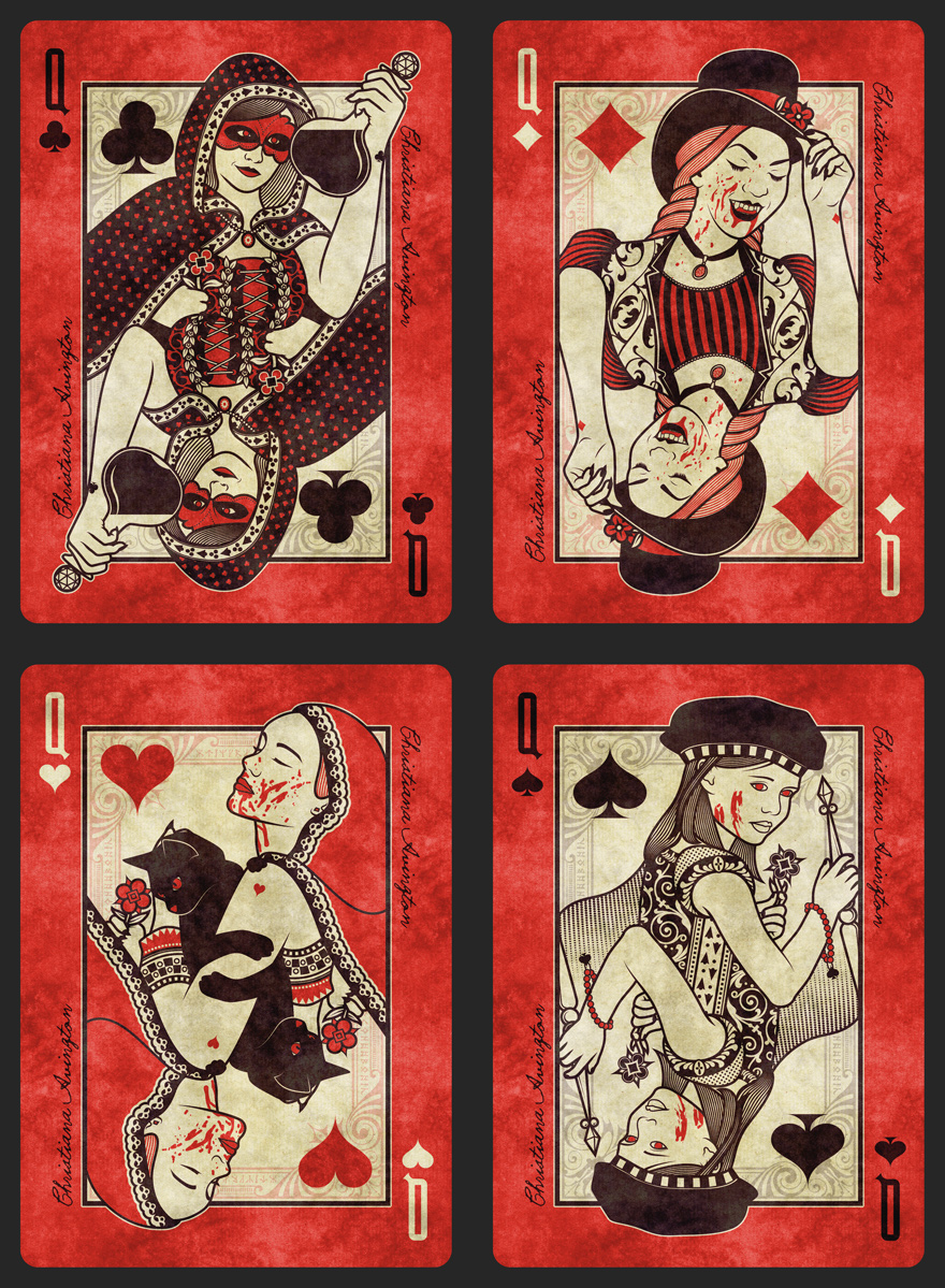
Below I have the Queens to show from Vol 2 of the Sisterhood of Blood.
Once again please feel free to go to town on the layouts, and constructive feedback will be rewarded if it develops the design, with naming of the vampires

Thank you!
Re: Vol 2. Sisterhood of Blood - 52 Ravens
Posted: Tue Jun 20, 2017 5:13 am
by flashcards
In the QoD, instead of it looking like the figure has one arm visible like the others, it looks like she has two arms. The one on the left looks like it is coming from her shoulder but is shortened; like it is missing its upper arm. Makes it look like she has broad shoulders and a deformed left arm. Maybe you could angle her more and put her in profile like the other figures and get rid of the (disturbing) illusion. It feels like there is too much white space so perhaps placing it at an angle with solve that issue as well.
In the QoC, I can't quite figure out what is holding the flower. It looks almost like a sock puppet with out features- in other words, a sock with a hand in it. Dammit, now I can't unsee it.
On the other hand (no pun intended), the QoH is executed quite nicely. The two arms blending into one creates a pleasant optical illusion that takes a while to figure out.
I also like the way the suits are worked into the figures as tattoos or bracelet charms. Makes for a subtle Easter egg kind of like the bunny head on the Playboy covers. Over all I really like what I've seen and I think the red border is absolutely the right choice.
Re: Vol 2. Sisterhood of Blood - 52 Ravens
Posted: Fri Jun 23, 2017 2:12 pm
by 52Ravens
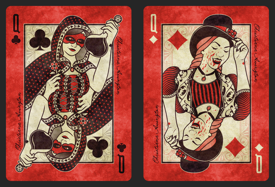
Hey!
Updated QoD and QoC to take a look at. I was going to say that the QoD was ok, but the more I looked at it, the more I questioned it so hopefully this fits better now. The QoC now no longer works for Jim Henson
Thanks once again, please feel free to give feedback on the Jacks and Queens. Constructive feedback will be rewarded if it develops the design, with naming of the vampires
Kings will be posted soon
Re: Vol 2. Sisterhood of Blood - 52 Ravens
Posted: Fri Jun 23, 2017 4:28 pm
by flashcards
I don't know. The QoD still looks odd to me. Anybody else have an opinion?
Re: Vol 2. Sisterhood of Blood - 52 Ravens
Posted: Sat Jun 24, 2017 3:36 pm
by max
I love your design, Kirk, congratulations!
Regarding the red or not... Why not keeping the same beige border (so indexes won't be a problem) and try the red background "inside"?
Just an idea.. Anyway, I will love the deck whatever you decide to do...
Good luck
Re: Vol 2. Sisterhood of Blood - 52 Ravens
Posted: Mon Jun 26, 2017 7:04 am
by pablo
I say splatter the borders with red, instead of just be fully red, like a bloody frame. Andaybe when you fan the deck it spells soemthing out.
Enviado desde mi Aquaris_M4.5 mediante Tapatalk
Re: Vol 2. Sisterhood of Blood - 52 Ravens
Posted: Fri Jun 30, 2017 11:43 am
by 52Ravens
Hey!
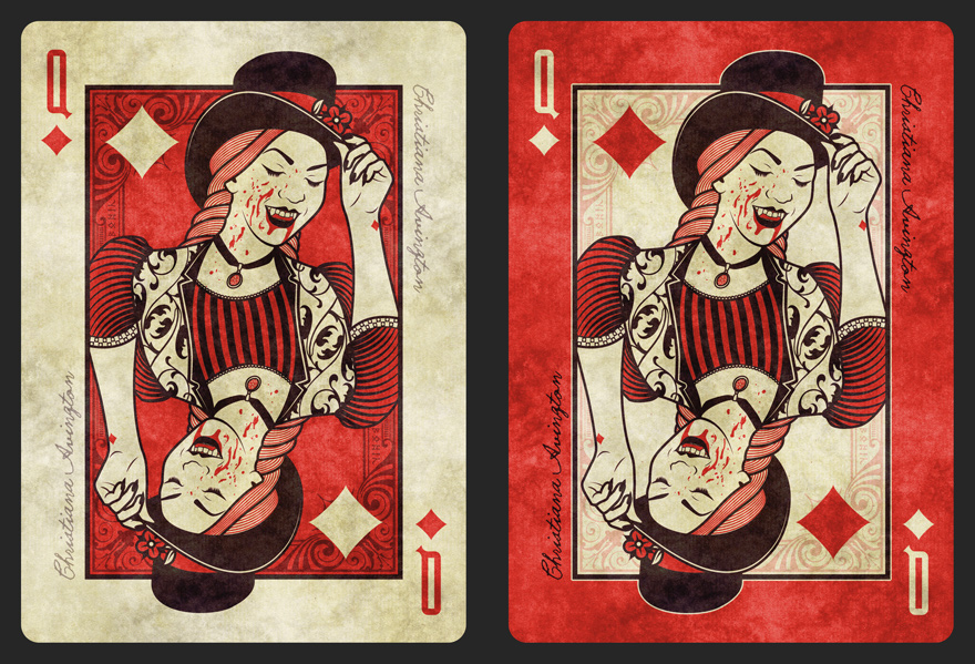
As suggested by MAX
max wrote:Why not keeping the same beige border and try the red background "inside"?
See below the results, I really like it, what do you guys think? Its a small step away from Volume 1 though its enough to be different and set it aside, but is it too much red too close to the character?
Thanks Max, I'll PM you regarding naming a card
Please feel free to give feedback on the Jacks, Queens and the red border. Constructive feedback will be rewarded if it develops the design, with naming of the vampires
pablo wrote:I say splatter the borders with red
I did try it while testing Max's idea but it mixed too much with the pips and I couldn't get it to work, Thanks for the idea though
Re: Vol 2. Sisterhood of Blood - 52 Ravens
Posted: Sat Jul 01, 2017 12:30 am
by NineLives
Both look good - though I really like red on the inside! It allows skin (hands/faces) to stand out and makes the centre feel more complete. Nice
Re: Vol 2. Sisterhood of Blood - 52 Ravens
Posted: Sat Jul 01, 2017 3:04 am
by flashcards
I have to agree. I really liked the red border but I have to admit, the red inside does look better. Perhaps a deck of each with different color backs? Great, I'm already costing myself more money on this project and it's not even done yet