Page 1 of 3
Wild West Playing Card Project
Posted: Sat May 20, 2017 1:30 am
by Jamm Pakd Cards
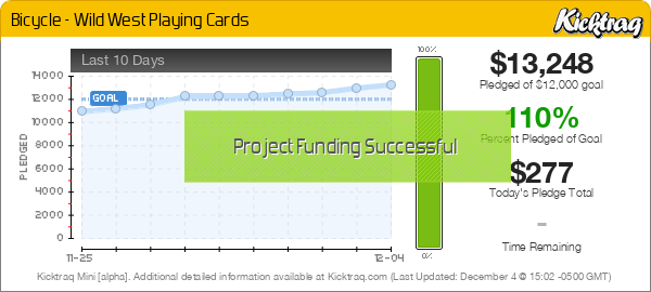
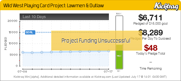
**This has been relaunched. Editing this OP with the kickup for the new campaign.

Hey Everyone,
Hope all is well. I had some delays but I am happy to announce that my Wild West Playing Card Project is finally ready to launch in June! We have completed the art work on the cards. Each deck will have all custom faces and backs. The Lawmen deck will depict Historical Wild West law legends and the Outlaw deck will depict Historical Wild West outlaw legends. Here are a few pics of the face cards and tuck boxes. Let me know what you think.
I wanted the images of the cards depict the real historical figures but I wanted to still have the "playing card" feel to the portraits.
Little Background on some of the Legends in the deck:
King of Clubs - James Butler "Wild Bill" Hickok of the Lawmen Deck of the Wild West Playing Card Project.
"Wild Bill of the American Old West is known for his skills as a scout, lawman, gunfighter and gambler. He was a professional gambler who was involved in several notable shootouts. In 1876, Hickok was shot from behind and killed while playing poker in a saloon. The poker hand he supposedly held at his death has become known as the dead man's hand. There are a few hands that were suspected of being the Dead Man's hand but the most widely accepted was black aces and black eights." per Wikipedia
Outlaw Deck's King of Spades: Jesse James.
Jesse James was an American outlaw, bank and train robber, gang leader and was the most famous member of the James-Younger Gang. The James brothers were most active as members of their own gang from around 1866 until 1876.

Re: Wild West Playing Card Project
Posted: Sat May 20, 2017 1:29 pm
by shaitani
I'm very interested to see the remaining artwork, I really like the style.
One early tuck critique though.
One of those tuck titles is plural and the other is singular (Lawmen vs Outlaw), you might want to consider making it "Lawman".
Re: Wild West Playing Card Project
Posted: Sun May 21, 2017 7:20 am
by Stepchild
Currently reads a bit as Owlsaw as well, no?
Re: Wild West Playing Card Project
Posted: Sun May 21, 2017 8:04 am
by Stepchild
I think actually the plural is much more natural for this concept: Lawmen & Outlaws.
Suspect Outlaw was chosen instead just to keep each word at six letters?
I really do think there's a problem with the way the Outlaw script reads visually and I'd rework it as Outlaws both for matching sense with Lawmen and for readability.
Re: Wild West Playing Card Project
Posted: Sun May 21, 2017 9:06 pm
by Jamm Pakd Cards
shaitani wrote:I'm very interested to see the remaining artwork, I really like the style.
One early tuck critique though.
One of those tuck titles is plural and the other is singular (Lawmen vs Outlaw), you might want to consider making it "Lawman".
Thanks for the suggestions, Yes I had been going back in forth for sometime about which way to go with it. Through conversation and emails with my Artist during this project it always seemed like we would refer to the decks as "Lawmen" and "Outlaw" decks. It just seemed to flow better. So we decided to stick with what was flowing. Thanks for the points, I really appreciate it. What are your thoughts on changing it to Lawman? as you suggested. We did also like how the titles were the same at 6 letters so we would not want to add an S to the end of Outlaw.
Re: Wild West Playing Card Project
Posted: Sun May 21, 2017 9:08 pm
by Jamm Pakd Cards
Stepchild wrote:Currently reads a bit as Owlsaw as well, no?
The top of the T extends over the letters.

Re: Wild West Playing Card Project
Posted: Sun May 21, 2017 9:10 pm
by Jamm Pakd Cards
Stepchild wrote:I think actually the plural is much more natural for this concept: Lawmen & Outlaws.
Suspect Outlaw was chosen instead just to keep each word at six letters?
I really do think there's a problem with the way the Outlaw script reads visually and I'd rework it as Outlaws both for matching sense with Lawmen and for readability.
You are correct on the six letters as well I had been going back in forth for sometime about which way to go with it. Through conversation and emails with my Artist during this project it always seemed like we would refer to the decks as "Lawmen" and "Outlaw" decks. It just seemed to flow better. So we decided to stick with what was flowing.
Thanks for your suggestions as suggested on a a previous post What are your thoughts on changing it to Lawman? We did also like how the titles were the same at 6 letters so we would not want to add an S to the end of Outlaw.
Re: Wild West Playing Card Project
Posted: Mon May 22, 2017 1:16 pm
by shaitani
"Lawmen and Outlaws" reads better to me than my suggestion of "Lawman and Outlaw", but keeping it at 6 letters is way more important because of the visual symmetry.
As for the original vs my suggestion, I prefer mine because the logical symmetry is important to me personally.
That said, I do understand why it's not a mistake per se and more of an artistic decision to go with plural on one and singular on the other.
Lastly, I have one other option just as a thing to consider if you're looking for more alternatives:
Outlaw can be made plural'ish by putting the word "The" in front of it. This creates a different visual asymmetry in that it would be "Lawmen" and "The Outlaw", but maybe you could put "The" on top really small or something. The reason this asymmetry works logically is because Lawmen are all on the same side, vs The Outlaw is generally working for their own independent gain. And one final alternative which might be my favorite in spite of what I just said is "The Lawman" and "The Outlaw". Which to me is logically symmetric, visually symmetric, and reads better than most of the other combinations.
Re: Wild West Playing Card Project
Posted: Mon May 22, 2017 1:50 pm
by Stepchild
The supposed visual symmetry of six letters is IMO over-valued, but even if it were indispensable, I think it's entirely undermined here by the huge T. If visual symmetry between the decks was a serious concern, why would that even be done? When I look at the "As" here, the question answers itself, and not in a good way -- we couldn't make it look like a "T" any other way. Ok, but you broke the readability. And the symmetry.
Re: Wild West Playing Card Project
Posted: Mon May 22, 2017 4:57 pm
by shaitani
Stepchild wrote:The supposed visual symmetry of six letters is IMO over-valued, but even if it were indispensable, I think it's entirely undermined here by the huge T. If visual symmetry between the decks was a serious concern, why would that even be done? When I look at the "As" here, the question answers itself, and not in a good way -- we couldn't make it look like a "T" any other way. Ok, but you broke the readability. And the symmetry.
I have to agree with the complaint regarding the T in general. It doesn't seem to be adding to the design at all and it is asymmetric.
Stepchild, the reason I put value in the symmetry of number of letters is because more letters means smaller total width (or spacing) for each individual letter, in this case causing Outlaws to squish the letters closer together making it harder to read.
Re: Wild West Playing Card Project
Posted: Tue May 23, 2017 8:39 pm
by Jamm Pakd Cards
thanks for your feedback I really appreciate it. I will put these suggestions in consideration.
Re: Wild West Playing Card Project
Posted: Wed May 31, 2017 11:29 pm
by Jamm Pakd Cards
"Cigar" Style card box that will hold two decks! Just got the prototype and it is going to be awesome! There will be a brown edition and the Black Limited Edition.
Re: Wild West Playing Card Project
Posted: Thu Jun 01, 2017 3:42 am
by flashcards
Nice. I don't usually go for Limited Editions but I think the box looks awesome. Since I do cowboy action shooting, I really like the theme of this deck and am looking forward to your campaign.
Re: Wild West Playing Card Project
Posted: Thu Jun 01, 2017 6:06 am
by vasta41
flashcards wrote:Nice. I don't usually go for Limited Editions but I think the box looks awesome. Since I do cowboy action shooting, I really like the theme of this deck and am looking forward to your campaign.
I also don't normally go for LE's nor special boxes or add-ons but that box is sweet! And since I love cigars this might be a must-have for me. Kind of wish it said something cooler than "limited edition" across the banner but it's still awesome looking.
Re: Wild West Playing Card Project
Posted: Thu Jun 01, 2017 12:14 pm
by shaitani
Yeah, we don't see the two-deck boxes very often. Vintage decks all seem to come in pairs like this, but nowadays everyone is trying to sell either the three-deck box or the one-deck fancy boxes. This is refreshing, and I'll probably pick one up as well.
+1 to vasta41's comment, I also would like to something other than "Limited Edition" on the front.
Imagine seeing a black box on it that just says 'limited edition', like limited edition of what?
Re: Wild West Playing Card Project
Posted: Fri Jun 02, 2017 11:55 am
by Jamm Pakd Cards
flashcards wrote:Nice. I don't usually go for Limited Editions but I think the box looks awesome. Since I do cowboy action shooting, I really like the theme of this deck and am looking forward to your campaign.
That is awesome! Glad you like the project! That is cool you do cowboy action shooting!
Re: Wild West Playing Card Project
Posted: Fri Jun 02, 2017 11:59 am
by Jamm Pakd Cards
vasta41 wrote:flashcards wrote:Nice. I don't usually go for Limited Editions but I think the box looks awesome. Since I do cowboy action shooting, I really like the theme of this deck and am looking forward to your campaign.
I also don't normally go for LE's nor special boxes or add-ons but that box is sweet! And since I love cigars this might be a must-have for me. Kind of wish it said something cooler than "limited edition" across the banner but it's still awesome looking.
Thank you! Glad you like it! I will also have a brown box that will state Wild West in place of the Limited Edition.
Re: Wild West Playing Card Project
Posted: Fri Jun 02, 2017 12:00 pm
by vasta41
Jamm Pakd Cards wrote:vasta41 wrote:flashcards wrote:Nice. I don't usually go for Limited Editions but I think the box looks awesome. Since I do cowboy action shooting, I really like the theme of this deck and am looking forward to your campaign.
I also don't normally go for LE's nor special boxes or add-ons but that box is sweet! And since I love cigars this might be a must-have for me. Kind of wish it said something cooler than "limited edition" across the banner but it's still awesome looking.
Thank you! Glad you like it! I will also have a brown box that will state Wild West in place of the Limited Edition.
MUCH better! Will it be the same cigar style?
Re: Wild West Playing Card Project
Posted: Fri Jun 02, 2017 12:07 pm
by Jamm Pakd Cards
shaitani wrote:Yeah, we don't see the two-deck boxes very often. Vintage decks all seem to come in pairs like this, but nowadays everyone is trying to sell either the three-deck box or the one-deck fancy boxes. This is refreshing, and I'll probably pick one up as well.
+1 to vasta41's comment, I also would like to something other than "Limited Edition" on the front.
Imagine seeing a black box on it that just says 'limited edition', like limited edition of what?
Thanks, I am glad you like the box. I have been working on getting a two deck box for a long time. I have been Trying to get it constructed to my specifications and it has taken a lot of work. I finally found a place in the Wild West of Arizona

where they are going to hand make them and at a reasonable price. I usually play poker once a week at a home game and we always use two decks and I have them in some type of tin case. I wanted to make a cool box for functionality and to put on display. I will also have a brown box that says Wild West at the top.
Re: Wild West Playing Card Project
Posted: Sat Jun 03, 2017 3:02 pm
by Jamm Pakd Cards
vasta41 wrote:Jamm Pakd Cards wrote:vasta41 wrote:flashcards wrote:Nice. I don't usually go for Limited Editions but I think the box looks awesome. Since I do cowboy action shooting, I really like the theme of this deck and am looking forward to your campaign.
I also don't normally go for LE's nor special boxes or add-ons but that box is sweet! And since I love cigars this might be a must-have for me. Kind of wish it said something cooler than "limited edition" across the banner but it's still awesome looking.
Thank you! Glad you like it! I will also have a brown box that will state Wild West in place of the Limited Edition.
MUCH better! Will it be the same cigar style?
Yes, same style but different color.
Re: Wild West Playing Card Project
Posted: Wed Jun 07, 2017 8:59 pm
by Jamm Pakd Cards
I had a sample deck made for the Wild West Decks. I created a black backed card for a "cut card". I made it black and it looks really good. I am thinking of making the Outlaw Deck Black instead of my Gold version. I will probably make some tweaks on the Black Card but this is a rough draft but it convey the card as majority black. What do you guys think? Let me know. Thanks
Re: Wild West Playing Card Project
Posted: Thu Jun 08, 2017 4:11 am
by flashcards
I'm all for the black. I like the gold accents on the back. Maybe you could find a way to add a couple more to balance things out without turning it into the gold back. Use the gold as the cut card.
Re: Wild West Playing Card Project
Posted: Thu Jun 08, 2017 6:13 am
by vasta41
I think I'd like the black one more if there were just a few more gold accents. Like maybe if the guns were gold? I know this might be a pipe dream but if there were a few more gold touches on the back then this deck would be a perfect candidate for metallic ink or even better- metalluxe!! Just dreaming...
Re: Wild West Playing Card Project
Posted: Thu Jun 08, 2017 9:06 am
by RichK
Is it my 48 year old eyes or are the outlaw and guns crisp defined lines and the corner element a very subtle blur to push them into the background?
I'll highlight the "thumbs up" appearance from the guns hammers too so you can see it if you haven't already.
Re: Wild West Playing Card Project
Posted: Thu Jun 08, 2017 9:32 am
by shermjack
RichK wrote:Is it my 48 year old eyes or are the outlaw and guns crisp defined lines and the corner element a very subtle blur to push them into the background?
I'll highlight the "thumbs up" appearance from the guns hammers too so you can see it if you haven't already.
I noticed that too (my eyes are a little older than yours) and it actually give it a 3D look where the outlaw and guns kinda pop out...a cool effect

I agree with everyone that the black back is the better of the two, but some gold accents might make it even better.
Re: Wild West Playing Card Project
Posted: Thu Jun 08, 2017 11:56 am
by RichK
Looks like two thumbs up to me.
Re: Wild West Playing Card Project
Posted: Thu Jun 08, 2017 12:53 pm
by shaitani
I'm with everyone that the best possible version is if the black one is given better gold.
In my own head I'm imagining a gold border, and silver foil amongst the gray and white within the borders.
I don't think gold guns is the way to go, because it would concentrate too much focus into a weird rectangular shape in the middle of the design.
Quick photoshop-mockup of what it looks like with a gold border for the sake of conversation:

Re: Wild West Playing Card Project
Posted: Fri Jun 09, 2017 5:28 pm
by Jamm Pakd Cards
Thanks for all of your input, these are great ideas and suggestions! I will keep everyone posted on what color I will go with. tough choices so thank you for your insight. Great to hear from potential backers, I want everyone to really enjoy this deck project.
Re: Wild West Playing Card Project
Posted: Fri Jun 09, 2017 5:30 pm
by Jamm Pakd Cards
shaitani wrote:I'm with everyone that the best possible version is if the black one is given better gold.
In my own head I'm imagining a gold border, and silver foil amongst the gray and white within the borders.
I don't think gold guns is the way to go, because it would concentrate too much focus into a weird rectangular shape in the middle of the design.
Quick photoshop-mockup of what it looks like with a gold border for the sake of conversation:

I like this idea, thanks for the mock up. I will explore this some more.
Re: Wild West Playing Card Project
Posted: Fri Jun 09, 2017 5:32 pm
by Jamm Pakd Cards
RichK wrote:Is it my 48 year old eyes or are the outlaw and guns crisp defined lines and the corner element a very subtle blur to push them into the background?
I'll highlight the "thumbs up" appearance from the guns hammers too so you can see it if you haven't already.
its actually my phone pic or my shaky hands that is causing the blurry effect. everything is crisp on the actual card.

