rousselle wrote:I'll chime in here, as I'm also someone who might normally pledge for this deck but am not doing so.
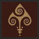
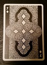
So, why might I "normally" back this kind of deck? I find the pattern on the back appealing, and I like customized courts.
But, why am I not? Because there's nothing particularly special about the customized courts. Nothing pops out at me. The colors are washed out and dull. The theme here doesn't resonate for me.
I tend to favor either very strong themes or designs. Decks that have had themes that have resonated with me include Chris Ovdyenko's "Calaveras" (not colorful, but not washed out, either!), Steve Minty's "Muertos", or the Edgy Brothers' "Dia De Los Muertos" decks -- while I have no direct experience or attachment to the Day of the Dead celebrations, as such, I find all three decks to be very involving interpretations of the Day of the Dead theme. RJ Tomlinson's "Unrest" series of decks also maintained consistent themes of historical conflicts (I *was* a history major in college) that were presented in era-appropriate designs. I've never been to Venice, but Lotrek's passion for his subject matter produced artwork that sang of the mysteries and excitement of "Venexiana." Jackson Robinson's "Federal 52" series combined both strong thematic elements (money) with strong design elements (money.) And there's Uusi, who hit it out of the proverbial ballpark when it comes to fantastic design in their Royal Optik decks. Muted colors *can* work. Rick Davidson and Paul Carpenter have used muted colors to great effect in their Origins and Signature decks, respectively.
While the Nouveau decks are thematically *consistent*, they are not thematically *strong*. The designs, while being decent, do not grab me. There's nothing particularly wrong with these decks, per se, but there's not enough going on to really jump out at me as being particularly right, either. I like the design (in general) of the backs, but what if they used color more effectively (as in Randy Butterfield's Draconian decks, or Johnny PowPow's Occults)? The illustrated courts are fine, but what if there were more passion or mystery in the facial expressions? What if the colors made bolder statements? If such ideas are counter to the style of what you were going for (I'm not familiar with the "nouveau" style in the least, so I have no sense of what it's supposed to be), then perhaps this is just a case of this not being a theme that resonates with me. (I don't tend to find "cthulu" or pirate decks particularly interesting, even though those have been very popular themes; not all themes will appeal to all collectors.)
Just some thoughts. I nonetheless wish you success with your future projects! You obviously have some talent; now you just need to zero in on your target.
Thank you rousselle for your opinion

I think that here taste comes into play, mainly because of the style (aside from the quality of the design, of course). Though I personally like this style and the theme we picked for this deck, I'm also aware that probably it wasn't the best choice to start. We should have decided on a theme with a bigger fanbase among magicians, cardists and collectors (or in general). As for the style and colors, though I probably didn't manage to perfectly transmit the Art Nouveau essence, it's true that it's characterized by the use of muted colors.
I don't think we can compare our deck with the ones you mentioned because the styles are just way too different, but as I said before, it's true that this theme wasn't the best choice, at least for our first deck.
Btw, I really like Edgy Brothers' Dia de los muertos decks. In fact all the decks you mentioned are hands down amazing. I can't say anything about your opinion on them because you're absolutely right
Knowing is not enough; we must apply. Willing is not enough; we must do - Johann Wolfgang Von Goethe