Page 2 of 4
Re: The Lumberjacks - 2nd edition
Posted: Tue Oct 14, 2014 10:33 am
by Kleetz
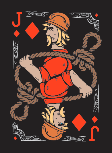
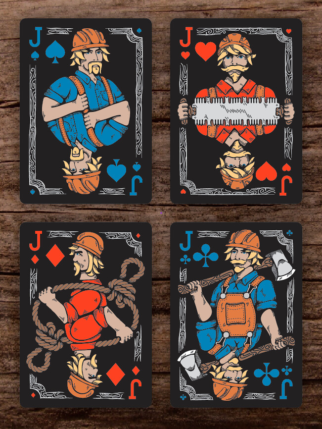
I did some modifying to the Jack of Diamonds. Flipped him to face the other way and to use up some white space I changed the knot from the fisherman's knot to an alpine butterfly knot. Butterfly knots are used by climbers. Earlier lumberjacks (maybe even current lumberjacks) used to climb trees to top them.
Here's the new version:
Re: The Lumberjacks - 2nd edition
Posted: Tue Oct 14, 2014 11:10 am
by volantangel
Yup the newer jack looks better ! Good call !
Re: The Lumberjacks - 2nd edition
Posted: Tue Oct 14, 2014 1:35 pm
by Kleetz
Thanks! I'll have the King of Diamonds ready next. I'd love some more comments / suggestions.
Re: The Lumberjacks - 2nd edition
Posted: Fri Oct 17, 2014 12:05 pm
by Kleetz
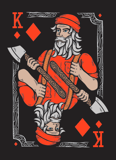
Finished up the King of Diamonds:
Re: The Lumberjacks - 2nd edition
Posted: Sun Oct 19, 2014 11:20 pm
by UtterFool
I like the art style you are going with here.
This deck is loosing some of the whimsy that the first deck had though.
Because of this I think it may be harder to fund.
It now goes even more into a niche market. IMO
I have one request... Could you not make it a black deck?
Try some of the pictures with a white background.
I am completely sick of black decks.
Even more so than zombie decks.
Re: The Lumberjacks - 2nd edition
Posted: Mon Oct 20, 2014 12:52 am
by volantangel
Well I for one think that black works really well with this deck, its the only way to make the bright colours of the courts stand out and acheive enough contrast.
ps. i think you can go a little easier on the lines under the KoD's left eye, a little too much shadow there imo.
Re: The Lumberjacks - 2nd edition
Posted: Mon Oct 20, 2014 9:56 am
by Kleetz
UtterFool wrote:I like the art style you are going with here.
This deck is loosing some of the whimsy that the first deck had though.
Because of this I think it may be harder to fund.
It now goes even more into a niche market. IMO
I have one request... Could you not make it a black deck?
Try some of the pictures with a white background.
I am completely sick of black decks.
Even more so than zombie decks.
Really!? I've seen a few blacks decks here and there but not enough to be tired of it (personally). I think "parchment paper" is way more common than black. To each his though.
On the "whimsy" topic, yes you are correct there, but I intended for this deck to be a little more serious than the previous.
volantangel wrote:Well I for one think that black works really well with this deck, its the only way to make the bright colours of the courts stand out and acheive enough contrast.
ps. i think you can go a little easier on the lines under the KoD's left eye, a little too much shadow there imo.
Volantangel hit it on the head, I chose black because it really makes those colors "pop"... for lack of a better word. I will do some modifications to the King today and fix that shadow along with some other little things.
The first version of the Queen of Spades will be ready today as well.
Thanks for the comments guys, keep em coming!
Re: The Lumberjacks - 2nd edition
Posted: Wed Oct 22, 2014 3:20 pm
by Kleetz
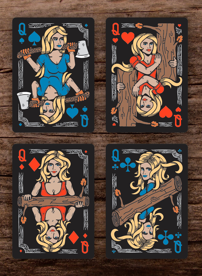
Worked on the Queen of Spades these past two days. She still needs a few modifications (I think that left hand is too big) but overall, she's about done.
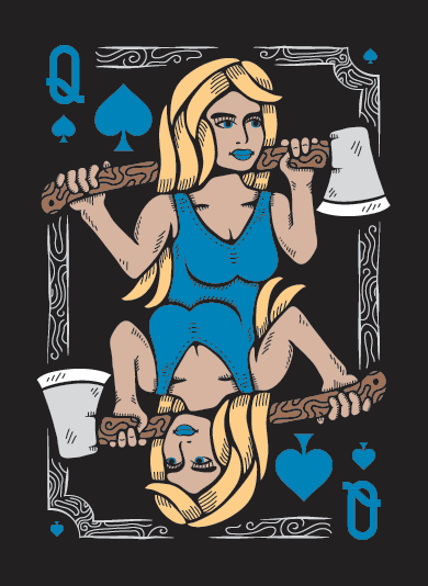
Haha, it may be too much (the tank top) and not lumberjack accurate, but for now, that's what she's going to wear. I may mess around and put her into a long sleeve. Also... Boobs

Re: The Lumberjacks - 2nd edition
Posted: Thu Oct 23, 2014 12:33 pm
by Kleetz
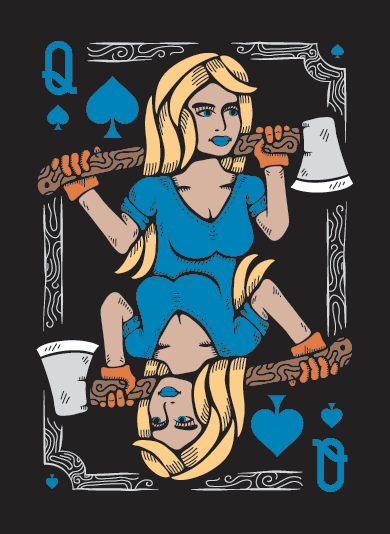
Okay, so I gave her some gloves and a long sleeve shirt that's been rolled up. I think this helped her out a bunch.
Here are all the queens together with the corners cut to better illustrate what the cards will really look like. AND if you have some cards laying around, click to view this image full size and put one up to your screen and see that these are about 100% of the size.
Re: The Lumberjacks - 2nd edition
Posted: Wed Oct 29, 2014 9:29 am
by Kleetz
Got a little tied up at work these past few days and couldn't do more work on the Lumberjacks

I'll have new cards ready soon!
Re: The Lumberjacks - 2nd edition
Posted: Mon Nov 10, 2014 11:14 am
by Kleetz
Sorry I haven't been as active as I like to be on here, but work got a little busy. Good news is, I 've been working on the Lumberjacks again! I have a new Jack of Spades coming (doing final tweaks and details) I'll post him up soon.
As I've been working on that I've also been looking at the Suicide King and He just doesn't portray the suicide aspect as much as I want him to. So, I re-worked him a bit. Here's the latest:
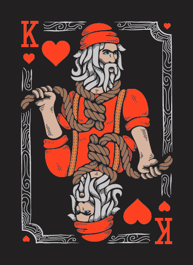
Lend me your thoughts!
Re: The Lumberjacks - 2nd edition
Posted: Mon Nov 10, 2014 4:17 pm
by Kleetz
As promised, the Jack of Spades. I choose not to give him an ax or saw or rope. Just a smug look!
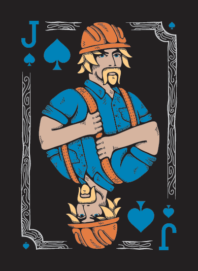
Here are all the Jacks together. **Take this loosely** if you have cards laying around next to you, hold on up and you'll see that these are about 100% or the size.
Re: The Lumberjacks - 2nd edition
Posted: Mon Nov 10, 2014 5:44 pm
by sprouts1115
Kleetz - Jacks look good. Usually, all courts have a symbol or weapon not just a smug look. But you can do that if you want too. It's fun breaking the rules. Noticed your diamond needs to a bit bigger and your club need some more meat on it to match the Spade and Heart in the upper right corner.

- Screenshot 2014-11-10 16.31.27.png (17.87 KiB) Viewed 1942 times
So, you got me curious what is your back of card going to be like? Obviously, It's going to be black with a black border. Try to make that black border thinner than the grey border you have above in your courts. In fact, you have the skeleton of your back in your court frame. The Spade, Heart, Diamond, and Club would have be something else. I've notice ppl lately have be putting a circle in there. Hell, why not use a leaf. It will show up in the fan. In your last deck, you have a leaf in the fan.
Re: The Lumberjacks - 2nd edition
Posted: Tue Nov 11, 2014 9:11 am
by pcggamer
Love how the artwork is coming along. I have to say I like the second version of the king of hearts. Something about chopping of his hand appeals a bit more than hanging himself in a lumberjack way. Can't wait to see more!
Re: The Lumberjacks - 2nd edition
Posted: Tue Nov 11, 2014 11:41 am
by Kleetz
sprouts1115 wrote:Kleetz - Jacks look good. Usually, all courts have a symbol or weapon not just a smug look. But you can do that if you want too. It's fun breaking the rules. Noticed your diamond needs to a bit bigger and your club need some more meat on it to match the Spade and Heart in the upper right corner.
So, you got me curious what is your back of card going to be like? Obviously, It's going to be black with a black border. Try to make that black border thinner than the grey border you have above in your courts. In fact, you have the skeleton of your back in your court frame. The Spade, Heart, Diamond, and Club would have be something else. I've notice ppl lately have be putting a circle in there. Hell, why not use a leaf. It will show up in the fan. In your last deck, you have a leaf in the fan.
Thanks! I'll take a look into it, but I did size them all relative to one another before putting them on the cards. The back design is currently up in the air. So many ways to take it! I haven't begun working on any particular direction yet. I want to finish all of the court cards first, then move to the back design and then onto the tuck.
So you're saying on the back design, instead of using the four pips at the corners use leafs? If so, that's a pretty good idea. One that I will be exploring.
pcggamer wrote:Love how the artwork is coming along. I have to say I like the second version of the king of hearts. Something about chopping of his hand appeals a bit more than hanging himself in a lumberjack way. Can't wait to see more!
Thanks gamer! When I first made those versions I too also liked the chopping / slicing one. But looking at it and thinking to myself they seem a bit emo. While it does fit the build, I think hanging does too. There are a lot of trees in the forest and many lengths of rope to be had!
Re: The Lumberjacks - 2nd edition
Posted: Tue Nov 11, 2014 8:32 pm
by sprouts1115
@Kleetz - Yes leaf or a stump with an axe on it. Whatever the symbol for your company is. Looking Forward to see the back of card....
Re: The Lumberjacks - 2nd edition
Posted: Wed Nov 12, 2014 4:24 pm
by Kleetz
sprouts1115 wrote:@Kleetz - Yes leaf or a stump with an axe on it. Whatever the symbol for your company is. Looking Forward to see the back of card....
Thanks, it's coming soon! I'm finishing up the King of Spades now. I'll probably post him up tomorrow.
Re: The Lumberjacks - 2nd edition
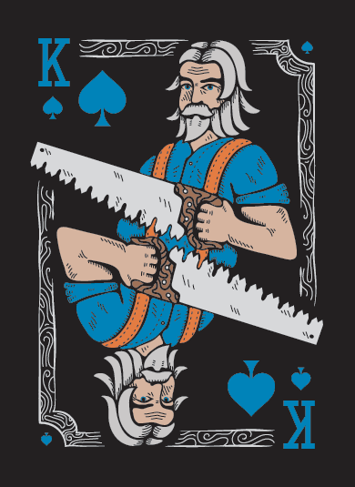
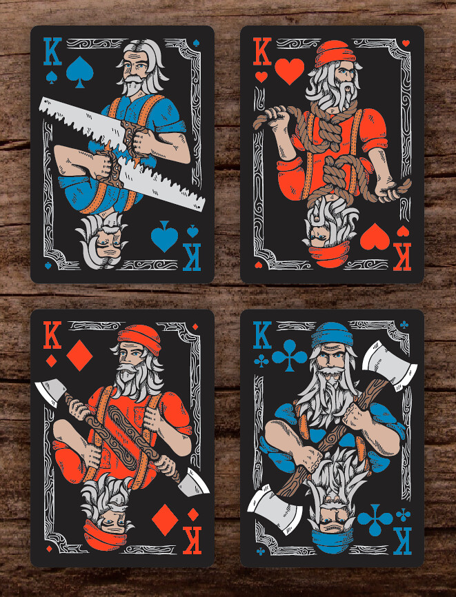
Posted: Thu Nov 13, 2014 12:28 pm
by Kleetz
Finished up the King of Spades last night. He'll be the only king holding a saw. The tooth pattern on the saw is called "The Great American".
Here's a shot of all the Kings:
Re: The Lumberjacks - 2nd edition
Posted: Tue Nov 18, 2014 3:47 pm
by Kleetz
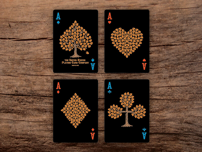
Spent the day yesterday designing the Ace of Spades. There were (and still are) so many directions that this card can go in (this is one), but I started thinking "why is the Ace of Spades different from all the other Aces?" I didn't know. So, I did some digging around. For those of you who may not know it's actually kinda cool.
In the olden days, you couldn't sell a deck of playing cards without showing a tax stamp that indicated that you paid a tax to sell it. So, card makers put the tax stamp on the Ace of Spades. Later, this law was removed, but because card makers and people were so used to using / seeing the stamp, it stuck.
Anyway, history lesson aside, here it is:
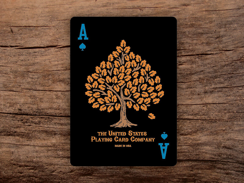
My plan is to have four custom Aces. The Ace of Spades as you see it here, the Ace of Clubs receiving the same type of design treatment (making the pip into a tree) and the Ace of Hearts and Diamonds represented with forward facing logs from cut down trees.
Re: The Lumberjacks - 2nd edition
Posted: Tue Nov 18, 2014 4:13 pm
by Eoghann
It's just a matter of personal preference, but I'm not crazy about the courts. But that ace is lovely!
Re: The Lumberjacks - 2nd edition
Posted: Tue Nov 18, 2014 5:15 pm
by Kleetz
Eoghann wrote:It's just a matter of personal preference, but I'm not crazy about the courts. But that ace is lovely!
I understand, any particular reason? Thanks for the comment!
Re: The Lumberjacks - 2nd edition
Posted: Tue Nov 18, 2014 5:27 pm
by Eoghann
It's just not a style I'm into I suppose. I really liked your first deck! I really liked the clean design it had. Like in your avatar as well. Compared the the darkness of this new one. Also, I think it's mainly the way the hair is drawn. Kind of reminds me of tentacles, bananas or play doh. It's not so bad on the Jacks, but the beard on the Kings can get overwhelming.
Re: The Lumberjacks - 2nd edition
Posted: Tue Nov 18, 2014 10:18 pm
by Yashi
Eoghann wrote:It's just not a style I'm into I suppose. I really liked your first deck! I really liked the clean design it had. Like in your avatar as well. Compared the the darkness of this new one. Also, I think it's mainly the way the hair is drawn. Kind of reminds me of tentacles, bananas or play doh. It's not so bad on the Jacks, but the beard on the Kings can get overwhelming.
The style is certainly different but I like it. If every deck was going to have that kind of style then it becomes a problem

I'm liking the ace. I used to have a problem with the proportions of your court cards but I see that's taken care of. Oh, and I love it when designers stray away from the usual red and black pips.
Re: The Lumberjacks - 2nd edition
Posted: Wed Nov 19, 2014 6:34 am
by pcggamer
I really love the Ace of Spades, can't wait to see the other aces. I kinda agree with each and about the hair on the kings, it does remind me of tentacles. Looking great so far.
Re: The Lumberjacks - 2nd edition
Posted: Wed Nov 19, 2014 4:30 pm
by Kleetz
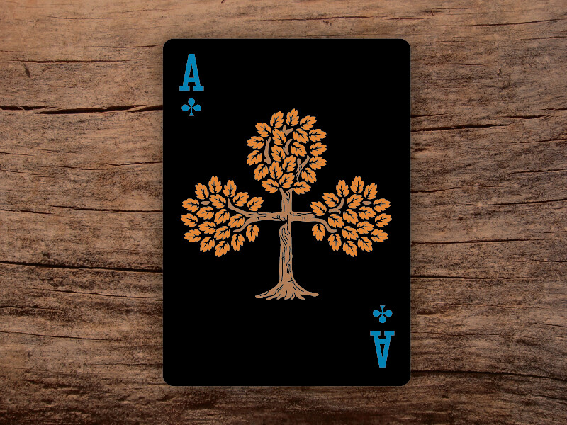
pcggamer wrote:I really love the Ace of Spades, can't wait to see the other aces. I kinda agree with each and about the hair on the kings, it does remind me of tentacles. Looking great so far.
Thanks! I have the Ace of Clubs and Hearts completed too!
Here's the Ace of Clubs:
Re: The Lumberjacks - 2nd edition
Posted: Wed Nov 19, 2014 6:13 pm
by sprouts1115
@Kleetz - Nice aces. I hope you put the leaf in your aces on your back of card somehow. It would tie it together.
Can I say it? I guess what ppl are saying is:
<Mod edit, EXTREME HORROR>
Don't kill the messenger. Personally, Your intestinal lining hair is fine with me. That is a joke. YOu are the artist. It's part of your theme and it seems fine to me. I have accepted it.
I'm looking more at what your courts are holding...
Re: The Lumberjacks - 2nd edition
Posted: Wed Nov 19, 2014 6:45 pm
by Kleetz
Man, that's just scary to look at.
Re: The Lumberjacks - 2nd edition
Posted: Thu Nov 20, 2014 4:37 pm
by Kleetz
Okay, here we go! All of the Aces are done. All of the Court cards are done. All of the number cards are done! The back design is done. What's next?
I still need a tuck design (next on the list), 2 jokers and a gaff card. After which, I will begin the whole process with Bicycle. Assuming that there won't be any roadblocks (unlikely) I'd say there's a month before these hit Kickstarter. In that time, I will need to print and cut mockups, photograph scenes, make a video, build the kickstarter page, and edit the current lumberjack site. And I'm sure I'm forgetting something.
So there's still a little work to be done... a little

Here are the Ace of Hearts, Diamonds, and all four together:
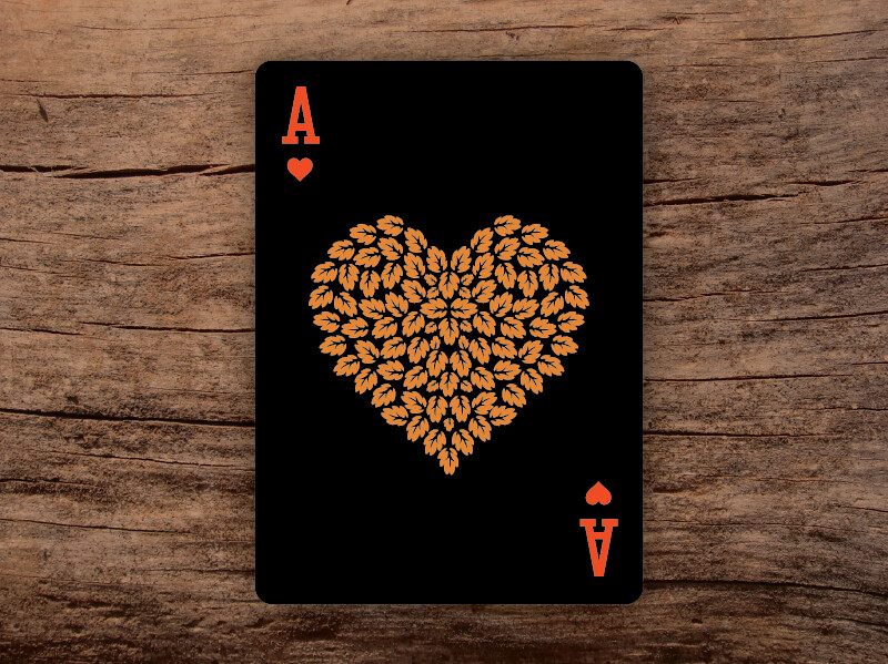
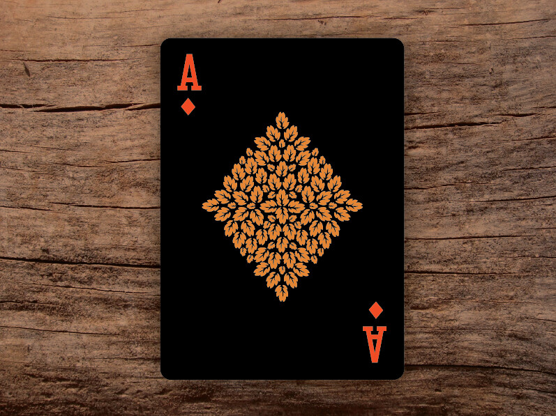
Notice I modified the bottom of the spade (tucked upwards to really bring out the form of the spade)
Back design will be up tomorrow followed by the tuck.
Re: The Lumberjacks - 2nd edition
Posted: Fri Nov 21, 2014 9:58 am
by Yashi
Kinda strange how the AoC is a tree while the AoD and AoH aren't. Still looks good though.
Re: The Lumberjacks - 2nd edition
Posted: Fri Nov 21, 2014 12:35 pm
by Kleetz
Yashi wrote:Kinda strange how the AoC is a tree while the AoD and AoH aren't. Still looks good though.
So the concept there is because the AoS and AoC have stems, they are trees. The AoH and AoD don't have stems, so they are piles of leaves (from trees that have been cut).