Page 2 of 3
Re: re-design ALPHA Deck
Posted: Sat Apr 19, 2014 12:49 pm
by zev hoover
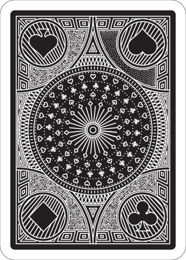
with the suits being where they are, a subtle one way element is not really necessary, and as you said is almost useless in the middle.
as for the dots, I think the dots on a rider back (for example) look much cleaner, but that could be partially ink bleeding. I think it is also how they sort of wrap around the objects around them, and are not just a smattering.
Re: re-design ALPHA Deck
Posted: Sat Apr 19, 2014 12:56 pm
by MagikFingerz
zev hoover wrote:with the suits being where they are, a subtle one way element is not really necessary, and as you said is almost useless in the middle.
as for the dots, I think the dots on a rider back (for example) look much cleaner, but that could be partially ink bleeding. I think it is also how they sort of wrap around the objects around them, and are not just a smattering.
True. Hopefully the suits in the corners will be removed/replaced.
As for the dots, it shouldn't be a problem to make a few quick mock-ups for comparison.
Re: re-design ALPHA Deck
Posted: Sat Apr 19, 2014 5:26 pm
by zev hoover
ok, on further inspection the thing in the middle IS semiotical oops. just doesn't look like it. my bad. I am working on a mock up of the dots.
Re: re-design ALPHA Deck
Posted: Mon Apr 21, 2014 5:48 pm
by zev hoover
sorry for being so long, here it is. I replaced the upper right dots with ones I prefer. just preference really though.

Re: re-design ALPHA Deck
Posted: Tue Apr 22, 2014 3:23 pm
by Valerio
They actually do look better!

I'll try to do something similar.
Re: re-design ALPHA Deck
Posted: Tue Apr 22, 2014 8:30 pm
by Valerio
another shot...
4 diferent kinds of "dotting" tecnique...
Wich one is the best?!?!?
Re: re-design ALPHA Deck
Posted: Tue Apr 22, 2014 8:31 pm
by Eoghann
Top right.

Re: re-design ALPHA Deck
Posted: Tue Apr 22, 2014 8:35 pm
by MagikFingerz
Top left spade definitely looks best, though I have to admit that zev's mock-up looks even better. Maybe use something like that and have the pips be white?
Btw, I think you've made the center piece too busy, it was better before IMO. The simpler one would also fit more with the "starry night" type of background that zev made.
Re: re-design ALPHA Deck
Posted: Tue Apr 22, 2014 8:49 pm
by Eoghann
I second the less busy center. It gets pretty lost with the new design. Stood out more before.
Re: re-design ALPHA Deck
Posted: Tue Apr 22, 2014 8:50 pm
by Valerio
yeah sry forgot to say that the center is the same as the old one this is just a try for the dos...
Re: re-design ALPHA Deck
Posted: Tue Apr 22, 2014 11:03 pm
by Valerio
Another Try....
Have a look at the center... the other one comes out to be to small in the printed version...
Working on the zev point design...
Re: re-design ALPHA Deck
Posted: Tue Apr 22, 2014 11:19 pm
by zev hoover
I like the newest version, but it is kind of even density, if you know what I mean. I think you should make the dots sparser, and make the pips in the dot fields white (or black in the inverted version).
still not sure I prefer this layout to the old one, but I cant really think what you would put in the corners with that 4 cercle design.
also, I would go back to the first center design. I think even less dense is better. also I recommend looking at the dot fields on a Bicycle rider back, something like that would look fantastic. it was sort of what I was going for.
Re: re-design ALPHA Deck
Posted: Wed Apr 23, 2014 8:17 am
by Valerio
Have a look at the aces...
Ace of spades, Death
Ace of clubs, Knowledge
Ace of hearts, Love
Ace of Diamonds Ambition.
Re: re-design ALPHA Deck
Posted: Wed Apr 23, 2014 8:54 am
by volantangel
Nice aces, but i think the words can definitely be bigger if you want them there, its close to unreadable.
Re: re-design ALPHA Deck
Posted: Wed Apr 23, 2014 10:23 am
by zev hoover
also I think you could get a better font. something slightly vintage, to match the rest of the design.
Re: re-design ALPHA Deck
Posted: Wed Apr 23, 2014 10:29 am
by Valerio
You mean for the words or the A ??
Re: re-design ALPHA Deck
Posted: Wed Apr 23, 2014 10:56 am
by volantangel
I think he meant the A, which i agree as well, tonnes of better font out there for your choosing
Re: re-design ALPHA Deck
Posted: Wed Apr 23, 2014 11:17 pm
by zev hoover
yup, the A. the words are a little plain, but I like them. have a look at the Misc. Goods Co. font. something with some big serifs would look great.
Re: re-design ALPHA Deck
Posted: Fri Apr 25, 2014 6:49 am
by lolo
Valerio wrote:Working on the zev point design...
There are blanck spaces near your diamonds pips...
Valerio wrote:Have a look at the aces...
The aces design looks great ! Perhaps designing ace of spade more specificly from the design of other aces could add value to the deck.
I don't like phrases (or words) on cards except for ace of spade (and eventually jokers) where a phrase could underline the theme. Here, i don't see the relation between the name/theme of the deck and the phrases. IMHO, these phrases add nothing to your theme/deck. But there are counter-examples ("black book of cards" or "Different Deck") where phrases or words **do** the design...
Re: re-design ALPHA Deck
Posted: Mon Apr 28, 2014 8:22 am
by Valerio
Hi guys no updates yet but a question...
Do you know someone who can contact the bycicle team?
I'm deciding if printng the cards whit Modiano or Bycicle.
I tryed to contact Bycicle from the contact form in their website but they didn't answer yet and it has been a couple of weeks now.
Maybe some artists who already printed with them...
Do you know if it normally takes more?!?
Re: re-design ALPHA Deck
Posted: Mon Apr 28, 2014 8:35 am
by Eoghann
If I'm not mistaken, to start with you need a US bank account to even begin dealing with them. Or a sponsor or middle man located in the US. I could be wrong.
Re: re-design ALPHA Deck
Posted: Mon Apr 28, 2014 11:47 am
by Valerio

That will complicate everything.
Is there someone who knows for sure?
In the contact form it says that to receive an answer the design has to be complete.
I prefer to know if it's possible to print with em before designing the tuck box as it will be different from the modiano one!
Thank you anyway.
Re: re-design ALPHA Deck
Posted: Mon Apr 28, 2014 12:31 pm
by Eoghann
Maybe Lorenzo or Lotrek can help you out. They're in Sweden and Greece respectively, and they went with USPCC. Send them a PM. Maybe even Mike (our admin) has some insider info.
Re: re-design ALPHA Deck
Posted: Mon Apr 28, 2014 10:23 pm
by Valerio
I contact Lotrek and lorenzo and we had a chat in Italian, good to speak your own languare in forum.

I can print with bycicle. Just have to contact them for the details.
The problem is that now I'm more confused than I was before.
These are the choices I can make.
modiano
minimum order: 2000 decks 4.40 dollar per deck
The quality is very high as it is one the oldest and more expereanced printers in the world. Not well know outside italy or europe.
USPCC
minimun order 2500 decks. don't know the price, if someone could help out?
Most famous on kickstarter at least. quality we know.
EPCC
Don't know anything about that except that it's cheaper compared to USPCC
MPC
no minimum order so the project will always get fouded...
Got my prorotipe deck from them the quality is excellent compared to the price of course but i don't know how appereable can they be when it comes to kickstarter.
What do you think?
I Could make some stretch goals in the project for better printers...
What do you think? I'm very confused...
Re: re-design ALPHA Deck
Posted: Mon Apr 28, 2014 10:45 pm
by volantangel
Valerio, I wouldnt have stretch goals for printers, you should decide and stick to one. One piece of advice i would have with designers is to have their first deck printed by USPCC, as they are the most trusted printer out of the bunch, not necessarily the best but definitely the most trusted. Recently EPCC has gained popularity, but there is still in my opinion a gap between the two. Start off with a higher goal, at the rate the design is coming along, if you can get the word out right, 20k or more is not out of the question.
Re: re-design ALPHA Deck
Posted: Mon Apr 28, 2014 11:42 pm
by Valerio
You might be right... but 20 k seems really a lot to me.

They are not answering to my emails though...
Anyway. An update on the design.
King dadiv with the sword he took from golia and his favourite instrument, The arp.
I would like to have some sugestiond on putting or not the name on the cout cards, as it is a hystorical deck it might be helpfull for better understanding the design purpose.
The joker.
Re: re-design ALPHA Deck
Posted: Mon Apr 28, 2014 11:55 pm
by Eoghann
I would say keep the court names, definitely lose the Batman cliche. It's way beyond a quote now.

Re: re-design ALPHA Deck
Posted: Tue Apr 29, 2014 3:51 am
by lolo
Valerio wrote:
King dadiv with the sword he took from golia and his favourite instrument, The arp.
I would like to have some sugestiond on putting or not the name on the cout cards, as it is a hystorical deck it might be helpfull for better understanding the design purpose.
The joker.
The font you chose for index is very nice ! The size of pip and the size of the letter doesn't seem match well...
For the king : Is "King" necessary before "David" ? The card itself is about a king. David only could be more simple and clear.
I know, i know, i have an obsession about phrases on cards but could you explain the reason of the phrase on the joker ? I don't understand...
Re: re-design ALPHA Deck
Posted: Tue Apr 29, 2014 4:15 am
by volantangel
I think perhaps having a card listing down the characters of the courts would be better than having the names on the court cards itself. Something like what the Icelandic Air deck has done.
I think the court of King David looks more like a statue rather than a portrait. And id lose the straight lines on the shoulders if i were you.
lolo: the King in King David is usually there because David is a very common name, whilst King David only refers to one man which i why i think its good to have there although yes the court is a king.
Re: re-design ALPHA Deck
Posted: Tue Apr 29, 2014 6:24 am
by montecarlojoe
The quote on the Joker is something Alfred says about the Joker in The Dark Knight.
The name looks ok to me - its a call back to Jacob's bible cards and similar - but you'd need it in both corners to keep the two-way design.
