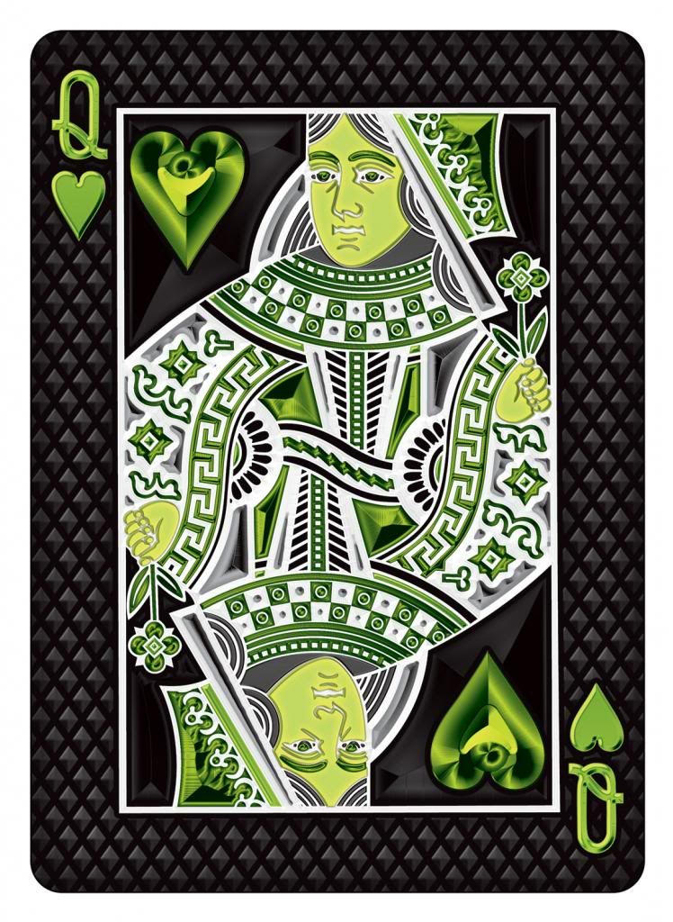
Bicycle UnitedCardists Deck
Re: Bicycle UnitedCardists Deck (Poll added & Pictures Add
Do you think you could make the borders a little bit thinner?
Re: Bicycle UnitedCardists Deck (Poll added & Pictures Add
This!BMPokerworld wrote:Check out the Gaff Card:
I am very excited that a possible V2 would have this for all face cards. I love the way everything has a lot of depth.
Very attractive artwork.
I keep looking at it as I type this and it gets better and better. Those greens are amazing.
- RandyButterfield
- ✔ VERIFIED Designer

- Posts: 597
- Joined: Tue Sep 25, 2012 12:55 pm
- Location: Indianapolis, IN
- Has thanked: 94 times
- Been thanked: 403 times
- Contact:
Re: Bicycle UnitedCardists Deck (Poll added & Pictures Add
I think you guys keep asking for thinner borders because what you're seeing is such a large JPG, and the white border looks wide at that scale.Evan wrote:Do you think you could make the borders a little bit thinner?
Printed at actual size, the border on the UC Back is at .125" (1/8") — thinner if you account for the outer glow. It's thinner than the BC Luxury border and the same size as the ORNATE border. I'm looking at a printout right now and it's pretty thin! When comparing it to other Decks like the Arch Angels, Griffin, Sultan Republic and Pedale borders, the UC border is much thinner. I would say it's pretty close in thinness to Tendril, Call of Cthulhu and of course ORNATES. It looks to be only about 1/32" thicker than the Aurum border.
As someone who's been in the printing industry for a very long time, I would feel very uncomfortable making it any thinner than 1/8". Any thinner than that would make the diecutters' job a living hell!
I'm attaching a smaller JPG with a lineup of the other Backs I've designed for comparison.
thanks, Randy
- Attachments
-
- Backs.jpg (528.46 KiB) Viewed 1496 times
Re: Bicycle UnitedCardists Deck (Poll added & Pictures Add
Oh yeah! Randy is one of my favourite designer! Ornates - bright colours , thin borders . UC deck - bright colours , thin borders!RandyButterfield wrote:I think you guys keep asking for thinner borders because what you're seeing is such a large JPG, and the white border looks wide at that scale.Evan wrote:Do you think you could make the borders a little bit thinner?
Printed at actual size, the border on the UC Back is at .125" (1/8") — thinner if you account for the outer glow. It's thinner than the BC Luxury border and the same size as the ORNATE border. I'm looking at a printout right now and it's pretty thin! When comparing it to other Decks like the Arch Angels, Griffin, Sultan Republic and Pedale borders, the UC border is much thinner. I would say it's pretty close in thinness to Tendril, Call of Cthulhu and of course ORNATES. It looks to be only about 1/32" thicker than the Aurum border.
As someone who's been in the printing industry for a very long time, I would feel very uncomfortable making it any thinner than 1/8". Any thinner than that would make the diecutters' job a living hell!
I'm attaching a smaller JPG with a lineup of the other Backs I've designed for comparison.
thanks, Randy
Don't Worry , Be Happy Cheers!
- sinjin7
- Member

- Posts: 1485
- Joined: Sat Feb 23, 2013 12:17 pm
- Cardist: Yes
- Collector: Yes
- Player: Yes
- Decks Owned: 1500
- Location: California
- Has thanked: 755 times
- Been thanked: 985 times
Re: Bicycle UnitedCardists Deck (Poll added & Pictures Add
This is an idea that I actually like a lot. Given my aversion to anyting D&D, I didn't purchase their ridiculous boxed reprint set. However, when they made the individual v.1-v.6 reprints individually available, I bought the Smoke reprint specifically to check out the foil lined tuck box and I have to admit I was impressed by that feature.alric wrote:One thing I really liked was the D&D Smoke reprint where the inside of the tuck box was lined in silver foil. How sick would it be if the inside of the UC tuck box was lined with green foil!
If the UC deck's borders are as thin as the Ornate deck's borders, then it will definitely be thin enough to satisfy most cardists, so I'm happy to hear that. I'm really looking forward to the UC deck becoming a reality!
-
dancards
- Member

- Posts: 12
- Joined: Tue Sep 25, 2012 10:15 pm
- Cardist: Yes
- Collector: Yes
- Player: Yes
- Decks Owned: 2500
Re: Bicycle UnitedCardists Deck (Poll added & Pictures Add
I played a little bit with the design to show some ideas, the first design in the top left corner is the original.
In the first row I changed the green border, a little bit darker and without that glow effect, then I removed some elements until it stayed only with the logo in the center to see how a simpler version would look. I liked the 3 last designs better than the first 2, less is more?
In the second row I added the logo in the corners to give a better effect for fans, something more elaborated than the UC logo would look better but it is just an idea.
In the 3rd row I used the UC logo and played with some patterns.

- MagikFingerz
- Site Admin

- Posts: 7812
- Joined: Mon Sep 24, 2012 7:32 pm
- Cardist: Yes
- Collector: Yes
- Player: Yes
- Magician: Yes
- White Whale: Sawdust and Delicious + uncuts
- Location: Norway
- Has thanked: 1808 times
- Been thanked: 1564 times
- Contact:
Re: Bicycle UnitedCardists Deck (Poll added & Pictures Add
I still prefer the original, but it was interesting to see variations.
- volantangel
- Moderator

- Posts: 3607
- Joined: Tue Nov 13, 2012 2:06 am
- Collector: Yes
- Player: Yes
- Decks Owned: 350
- Location: Singapore
- Has thanked: 219 times
- Been thanked: 297 times
Re: Bicycle UnitedCardists Deck (Poll added & Pictures Add
I concurMagikFingerz wrote:I still prefer the original, but it was interesting to see variations.
My Collection = Playing Cards + Photography
Re: Bicycle UnitedCardists Deck (Poll added & Pictures Add
Yes, that one is nice and clean.Strag wrote:Row 1, Column 5 for me.
Might need a little something around the edges.
I also like Row 1, Column 3.
No matter where you go... there you are :|
-
BMPokerworld
Re: Bicycle UnitedCardists Deck (Poll added & Pictures Add
The back design isn't changing any further. It has already been decided on.
Thanks!
Thanks!
- cosmicsecret
- Member

- Posts: 874
- Joined: Tue Sep 25, 2012 1:01 am
- Cardist: Yes
- Collector: Yes
- Magician: Yes
- Decks Owned: 140
- Has thanked: 67 times
- Been thanked: 25 times
Re: Bicycle UnitedCardists Deck (Poll added & Pictures Add
What would be a easy but great addition : One way pips like on the Bicycle Professional / Skull & Bones and i read that the Legends deck had those too.
The difference is that one side of the pips and value is thin font and the other one in bold font.
Very easy to spot a turned card.
This is a strong but simple feature that could be added very easily without any great effort
The difference is that one side of the pips and value is thin font and the other one in bold font.
Very easy to spot a turned card.
This is a strong but simple feature that could be added very easily without any great effort
- MagikFingerz
- Site Admin

- Posts: 7812
- Joined: Mon Sep 24, 2012 7:32 pm
- Cardist: Yes
- Collector: Yes
- Player: Yes
- Magician: Yes
- White Whale: Sawdust and Delicious + uncuts
- Location: Norway
- Has thanked: 1808 times
- Been thanked: 1564 times
- Contact:
Re: Bicycle UnitedCardists Deck (Poll added & Pictures Add
Wouldn't that make face-up fans messy once the cards are mixed?cosmicsecret wrote:What would be a easy but great addition : One way pips like on the Bicycle Professional / Skull & Bones and i read that the Legends deck had those too.
The difference is that one side of the pips and value is thin font and the other one in bold font.
Very easy to spot a turned card.
This is a strong but simple feature that could be added very easily without any great effort
-
BMPokerworld
Re: Bicycle UnitedCardists Deck (Poll added & Pictures Add
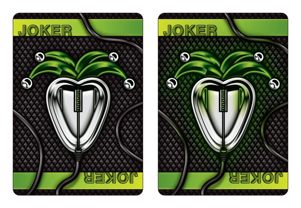
Check out the jokers. They are slightly different. One is a gaff. One is lights on and the other is lights off.
Thanks!

Thanks!
- Oswin
- Member

- Posts: 215
- Joined: Wed Oct 24, 2012 11:45 am
- Magician: Yes
- Decks Owned: 0
- Location: France
- Has thanked: 2 times
- Contact:
Re: Bicycle UnitedCardists Deck (Poll added & Pictures Add
No border !?
"Le temps passe, mais les oeufs durs !" - Daniel Prévost
- volantangel
- Moderator

- Posts: 3607
- Joined: Tue Nov 13, 2012 2:06 am
- Collector: Yes
- Player: Yes
- Decks Owned: 350
- Location: Singapore
- Has thanked: 219 times
- Been thanked: 297 times
Re: Bicycle UnitedCardists Deck (Poll added & Pictures Add
Pardon me, but what are the jokers supposed to be? I cant seem to make out what its supposed to be..
And having no borders would make the jokers stick out like a sore thumb on a bordered deck, wouldnt be very applicable even in normal games that requires jokers
And having no borders would make the jokers stick out like a sore thumb on a bordered deck, wouldnt be very applicable even in normal games that requires jokers
My Collection = Playing Cards + Photography
- cosmicsecret
- Member

- Posts: 874
- Joined: Tue Sep 25, 2012 1:01 am
- Cardist: Yes
- Collector: Yes
- Magician: Yes
- Decks Owned: 140
- Has thanked: 67 times
- Been thanked: 25 times
Re: Bicycle UnitedCardists Deck (Poll added & Pictures Add
Not at all! If you do not know that this feature is on the pips/values you do not notice it. Its subtle..very subtleMagikFingerz wrote:Wouldn't that make face-up fans messy once the cards are mixed?cosmicsecret wrote:What would be a easy but great addition : One way pips like on the Bicycle Professional / Skull & Bones and i read that the Legends deck had those too.
The difference is that one side of the pips and value is thin font and the other one in bold font.
Very easy to spot a turned card.
This is a strong but simple feature that could be added very easily without any great effort
- Attachments
-
- One handed fan of the Skull and Bones Back
- IMG_20130313_131847.jpg (660.83 KiB) Viewed 1452 times
- RandyButterfield
- ✔ VERIFIED Designer

- Posts: 597
- Joined: Tue Sep 25, 2012 12:55 pm
- Location: Indianapolis, IN
- Has thanked: 94 times
- Been thanked: 403 times
- Contact:
Re: Bicycle UnitedCardists Deck (Poll added & Pictures Add
I didn't think it was too abstract to spot that they were computer mice with a Jester's hat! It seems pretty clear to me.volantangel wrote:Pardon me, but what are the jokers supposed to be? I cant seem to make out what its supposed to be..
And having no borders would make the jokers stick out like a sore thumb on a bordered deck, wouldnt be very applicable even in normal games that requires jokers
As for not having borders. I figured the cardists would just leave the Jokers in the Tuck box and the Magicians would figure out a way to use it with the ON/OFF light Gaff aspect. As for card games that requires Jokers. Does anyone on the Forums actually play any card games that use the Joker cards?!! I guess I play too much Poker, because I'm used to leaving the Jokers with the Gaff cards in the Tuck box whenever a card game get's going. I could add a small white border, but it would definitely take away from the illusion that the mouse cord is wrapping in and out of the outer area.
thanks, Randy
- volantangel
- Moderator

- Posts: 3607
- Joined: Tue Nov 13, 2012 2:06 am
- Collector: Yes
- Player: Yes
- Decks Owned: 350
- Location: Singapore
- Has thanked: 219 times
- Been thanked: 297 times
Re: Bicycle UnitedCardists Deck (Poll added & Pictures Add
Haha now that you say it it makes more sense, but probably my mouse doesnt look like that lol..RandyButterfield wrote:I didn't think it was too abstract to spot that they were computer mice with a Jester's hat! It seems pretty clear to me.volantangel wrote:Pardon me, but what are the jokers supposed to be? I cant seem to make out what its supposed to be..
And having no borders would make the jokers stick out like a sore thumb on a bordered deck, wouldnt be very applicable even in normal games that requires jokers
As for not having borders. I figured the cardists would just leave the Jokers in the Tuck box and the Magicians would figure out a way to use it with the ON/OFF light Gaff aspect. As for card games that requires Jokers. Does anyone on the Forums actually play any card games that use the Joker cards?!! I guess I play too much Poker, because I'm used to leaving the Jokers with the Gaff cards in the Tuck box whenever a card game get's going. I could add a small white border, but it would definitely take away from the illusion that the mouse cord is wrapping in and out of the outer area.
thanks, Randy
There are still a few simple games that require jokers i guess, but nothing serious i guess, but yes its going to take away from the cord illusion, soooo lets see what the rest say
My Collection = Playing Cards + Photography
- RandyButterfield
- ✔ VERIFIED Designer

- Posts: 597
- Joined: Tue Sep 25, 2012 12:55 pm
- Location: Indianapolis, IN
- Has thanked: 94 times
- Been thanked: 403 times
- Contact:
Re: Bicycle UnitedCardists Deck (Poll added & Pictures Add
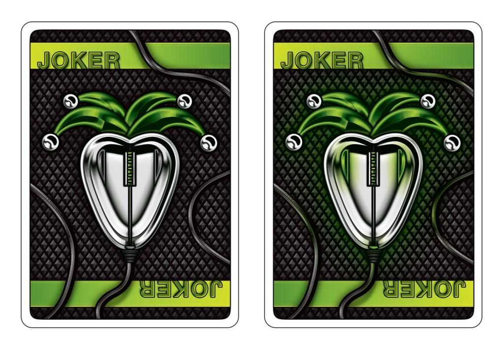
Added a white border. The cords look awful overlapping the border, so it's either this way or without the border.
thanks, Randy
thanks, Randy
- Attachments
-
- UCJokersB.jpg (427.62 KiB) Viewed 1342 times
-
Russell
Re: Bicycle UnitedCardists Deck (Poll added & Pictures Add
No border.
The joker can look different, keep your original design.
The joker can look different, keep your original design.
-
JokerzGamez
- Member

- Posts: 120
- Joined: Fri Jan 18, 2013 11:08 am
- Cardist: Yes
- Collector: Yes
- Location: UK
- Been thanked: 1 time
Re: Bicycle UnitedCardists Deck (Poll added & Pictures Add
Borders on the Jokers would be more convenient for magic, specifically sandwich routines. Whether the Jokers gaff would be obvious enough to use or not, Im not sure. I guess I would have to actually see them in my hands. You could try encorporating a reveal into the Jokers, maybe sticking with the light thing in someway 
"First rule of magic: always be the smartest guy in the room"
- Jesse Eisenberg, Now You See Me
- Jesse Eisenberg, Now You See Me
- MagikFingerz
- Site Admin

- Posts: 7812
- Joined: Mon Sep 24, 2012 7:32 pm
- Cardist: Yes
- Collector: Yes
- Player: Yes
- Magician: Yes
- White Whale: Sawdust and Delicious + uncuts
- Location: Norway
- Has thanked: 1808 times
- Been thanked: 1564 times
- Contact:
Re: Bicycle UnitedCardists Deck (Poll added & Pictures Add
Yeah, that would bother mecosmicsecret wrote:Not at all! If you do not know that this feature is on the pips/values you do not notice it. Its subtle..very subtleMagikFingerz wrote:Wouldn't that make face-up fans messy once the cards are mixed?cosmicsecret wrote:What would be a easy but great addition : One way pips like on the Bicycle Professional / Skull & Bones and i read that the Legends deck had those too.
The difference is that one side of the pips and value is thin font and the other one in bold font.
Very easy to spot a turned card.
This is a strong but simple feature that could be added very easily without any great effort
- UtterFool
- Member

- Posts: 269
- Joined: Mon Sep 24, 2012 11:03 pm
- Location: Vatican Holy See
- Been thanked: 34 times
Re: Bicycle UnitedCardists Deck (Poll added & Pictures Add
I play games that require the Joker.
The one I play most often though is Hand and Foot, which requires at least 7 decks, so I never use designer decks for that game.
In fact the only game I use designer decks for is Poker.
I like the look of the Joker, but the lack of border when the other cards have borders would probably kill my OCD.
Nonetheless Paul they look great.
"I have nothing to declare except my folly"
- cosmicsecret
- Member

- Posts: 874
- Joined: Tue Sep 25, 2012 1:01 am
- Cardist: Yes
- Collector: Yes
- Magician: Yes
- Decks Owned: 140
- Has thanked: 67 times
- Been thanked: 25 times
Re: Bicycle UnitedCardists Deck (Poll added & Pictures Add
MagikFingerz wrote:Yeah, that would bother mecosmicsecret wrote:Not at all! If you do not know that this feature is on the pips/values you do not notice it. Its subtle..very subtleMagikFingerz wrote:Wouldn't that make face-up fans messy once the cards are mixed?cosmicsecret wrote:What would be a easy but great addition : One way pips like on the Bicycle Professional / Skull & Bones and i read that the Legends deck had those too.
The difference is that one side of the pips and value is thin font and the other one in bold font.
Very easy to spot a turned card.
This is a strong but simple feature that could be added very easily without any great effort

-
BMPokerworld
Re: Bicycle UnitedCardists Deck (Poll added & Pictures Add
Here's a picture of the jokers with a border. Let me know if you like the border or borderless jokers better.
Thanks!

Thanks!
Re: Bicycle UnitedCardists Deck (Poll added & Pictures Add
Borderless, how the designer had it to begin with. I say keep with his vision. Everything has looked great so far
- cosmicsecret
- Member

- Posts: 874
- Joined: Tue Sep 25, 2012 1:01 am
- Cardist: Yes
- Collector: Yes
- Magician: Yes
- Decks Owned: 140
- Has thanked: 67 times
- Been thanked: 25 times
Re: Bicycle UnitedCardists Deck (Poll added & Pictures Add
As a magician i have to say - go with the borders , on the other side i would not use those jokers in magic.
The "gaff" is neat and i´m sure someone will use it but i prefer 2 identical jokers.
Never used a card reveal build in a joker to reveal a selected card.
As a cardist , i could care less about a joker
The "gaff" is neat and i´m sure someone will use it but i prefer 2 identical jokers.
Never used a card reveal build in a joker to reveal a selected card.
As a cardist , i could care less about a joker
- Magic_Orthodoxy
- Member

- Posts: 2447
- Joined: Fri Feb 22, 2013 6:16 pm
- Collector: Yes
- Magician: Yes
- Decks Owned: 1000
- Has thanked: 344 times
- Been thanked: 152 times
Re: Bicycle UnitedCardists Deck (Poll added & Pictures Add
what if the cable faded to white and the line was "missing" from that tiny section where the cable hits it?
Playing Card & Magic Reviews / https://www.youtube.com/magicorthodoxy
I give away FREE DECKS on INSTAGRAM every month https://www.instagram.com/magicorthodoxy/
I give away FREE DECKS on INSTAGRAM every month https://www.instagram.com/magicorthodoxy/
Who is online
Users browsing this forum: brownsl, felicityk, Google [Bot], juxtaposed, laitostarr777, shunterino, Thirdway Industries and 4 guests
