Page 5 of 14
Re: Bicycle UnitedCardists Deck (Poll added & Pictures Add
Posted: Tue Mar 05, 2013 11:29 am
by BiggerDee
Embossing and foil? Wow...I will need to raise more money. I guess that my kids can go to community college instead of a university...that will free up the college funds...

Sersiously though...embossing and foil! I can't want!
Re: Bicycle UnitedCardists Deck (Poll added & Pictures Add
Posted: Tue Mar 05, 2013 12:56 pm
by Magic_Orthodoxy
have we thrown out the one way back design? Any ideas for gaffs or jokers?
Re: Bicycle UnitedCardists Deck (Poll added & Pictures Add
Posted: Tue Mar 05, 2013 12:59 pm
by BMPokerworld
Magic_Orthodoxy wrote:have we thrown out the one way back design? Any ideas for gaffs or jokers?
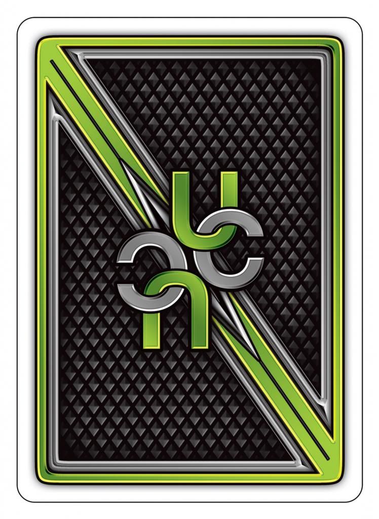
The UC Interlocking Logo will be the back design. Randy is working on the gaffs and jokers and will send them to me when he is done.
Thanks!
Re: Bicycle UnitedCardists Deck (Poll added & Pictures Add
Posted: Tue Mar 05, 2013 1:03 pm
by Magic_Orthodoxy
The UC Interlocking Logo will be the back design
Right, but at this point, it doesn't have a one-way feature
Re: Bicycle UnitedCardists Deck (Poll added & Pictures Add
Posted: Tue Mar 05, 2013 4:31 pm
by sms69x
CBJ wrote:AWESOME!
I like the spade pip on the tuck, not the diamond pip
Same!
Re: Bicycle UnitedCardists Deck (Poll added & Pictures Add
Posted: Tue Mar 05, 2013 7:04 pm
by dancards
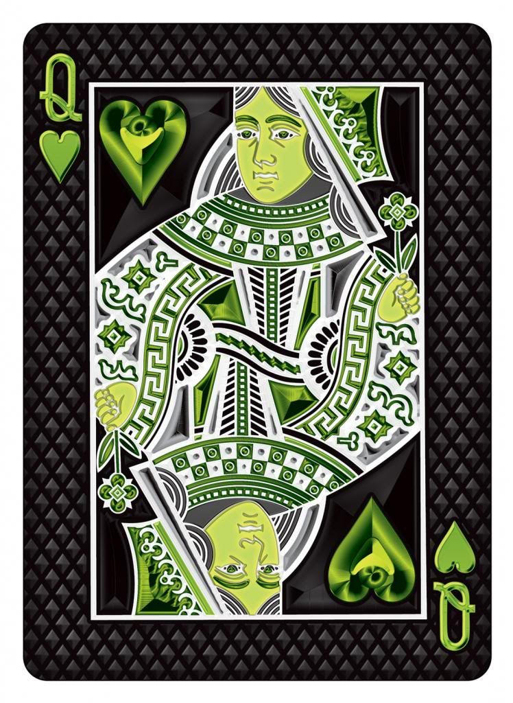
I like the court card colors but I don't like the back design, there is something about all that embossing that I don't like, if the name or initials are going to be used in the back design it would look more classy to do something similar to the Virginia Slims deck in black and green instead of huge letters IMO.
I like the 1st tuck case style with the Bicycle brand and spades symbol but I agree that the green bar side on the right is out of place in front of the box, it would look better on the side.
Also bmpokerworld plug in more than one place is annoying , try making it more discrete only at the bottom, I know Mike is sponsoring this but it should be a UC deck not a deck to promote bmpokerworld store.
Anyway, I'm going to buy the deck whatever you decide to do, even if you change the name of the deck to bmpokerworld.com but I just want to give my opinion.
Re: Bicycle UnitedCardists Deck (Poll added & Pictures Add
Posted: Tue Mar 05, 2013 7:21 pm
by Evan
These look incredible! I may have to buy more than I voted for! The box is stunning. I like the one with the spade best. I really like the green bar on the box. Awesome job Mike and Randy.
Re: Bicycle UnitedCardists Deck (Poll added & Pictures Add
Posted: Tue Mar 05, 2013 7:42 pm
by haydn13
yes
Re: Bicycle UnitedCardists Deck (Poll added & Pictures Add
Posted: Tue Mar 05, 2013 7:48 pm
by elcyciB
dancards wrote:I like the court card colors but I don't like the back design, there is something about all that embossing that I don't like, if the name or initials are going to be used in the back design it would look more classy to do something similar to the Virginia Slims deck in black and green instead of huge letters IMO.
I like the 1st tuck case style with the Bicycle brand and spades symbol but I agree that the green bar side on the right is out of place in front of the box, it would look better on the side.
Also bmpokerworld plug in more than one place is annoying , try making it more discrete only at the bottom, I know Mike is sponsoring this but it should be a UC deck not a deck to promote bmpokerworld store.
Anyway, I'm going to buy the deck whatever you decide to do, even if you change the name of the deck to bmpokerworld.com but I just want to give my opinion.
No problem with BMpokerworld on the side...one side usually has the factory, the other goes to the designer/sponsor...usually its someones name, in this case, its BMpokerworld...whats the problem?
Re: Bicycle UnitedCardists Deck (Poll added & Pictures Add
Posted: Tue Mar 05, 2013 11:26 pm
by FrenchFryNecromancer
RandyButterfield wrote:You know you're criticizing Bicycle's Court designs right? I'm pretty sure they have the hearts/diamonds with more fill color to differentiate them from the Black clubs/spades suits.
I am not criticizing Bicycle's Court design at all. I was saying the sections that are currently filled in (in green) on the hearts/diamonds could be white, and SOME of the white parts could be made green. It would result in more of a green "trim" look, instead of a green "fill" look. Not a big deal, just something I noticed.
RandyButterfield wrote:The white border on the Back design is definitely not the standard fat white border when printed to scale.
Awesome!!

Other Stuff:
As far as the ace of spades (which I think looks nice)..... would it be possible to have less text on the ace of spades? It almost seems like a paragraph, or a
wall of text.
Ideally, I think the Ace of Spades would be beautiful with almost no text, or at least much smaller font.
But... I understand there is this feeling of a NEED to identify the deck. All I can say is.... people are going to know what deck this is and where it came from. There will be no question. (Plus it will be on the tuck box). There is a temptation to put the name of the site all over the place.... but it might feel too heavy-handed and not minimalist enough.
Lastly...... and I might be in the minority here, but I don't care too much about the tuck box niceties and decorations like foil. I mean it is nice.... but if that same money can be somehow put more into the cards themselves..... then that is a plus to me. If there are options to get the better quality card stock or whatever.... I would rather THAT be the thing that makes the deck expensive, instead of the box. But, if there is no room to improve the cards themselves.... then I don't mind a nice tuckbox.

Re: Bicycle UnitedCardists Deck (Poll added & Pictures Add
Posted: Wed Mar 06, 2013 3:03 am
by ibrahimjaber
A MUST HAVE
Great Design
Re: Bicycle UnitedCardists Deck (Poll added & Pictures Add
Posted: Wed Mar 06, 2013 3:37 am
by MagikFingerz
elcyciB wrote:dancards wrote:Also bmpokerworld plug in more than one place is annoying , try making it more discrete only at the bottom, I know Mike is sponsoring this but it should be a UC deck not a deck to promote bmpokerworld store.
Anyway, I'm going to buy the deck whatever you decide to do, even if you change the name of the deck to bmpokerworld.com but I just want to give my opinion.
No problem with BMpokerworld on the side...one side usually has the factory, the other goes to the designer/sponsor...usually its someones name, in this case, its BMpokerworld...whats the problem?
Mike is going to be paying for the deck to be produced, not to mention that he pays to keep this site running. I could maybe see this being an issue if he had it in big bold letters on the front of the box, which by the way he would have been in his full rights to do had he wanted to.
Re: Bicycle UnitedCardists Deck (Poll added & Pictures Add
Posted: Wed Mar 06, 2013 6:18 am
by jasonffx
thin boarder please for amazing card fan
Re: Bicycle UnitedCardists Deck (Poll added & Pictures Add
Posted: Wed Mar 06, 2013 7:07 am
by chess
The first design with the spade is awesome. I like the green bar as well.
Re: Bicycle UnitedCardists Deck (Poll added & Pictures Add
Posted: Wed Mar 06, 2013 3:57 pm
by DaMan
Love the back. Tuck box is awesome. Though I think the green on the face cards could be more vibrant.
Re: Bicycle UnitedCardists Deck (Poll added & Pictures Add
Posted: Wed Mar 06, 2013 4:31 pm
by alric
Wow, I gotta say I'm impressed that Randy is able to pump something out so quick while working on his next custom deck at the same time! I have zero problem with plugging BMPokerWorld on the UC deck. I'm thinking there might not even be a UC if it weren't for BMP sponsoring UC, so its all good.
I'm all for thin borders to make cardists happy, and why not try to incorporate a scalloped edge instead of a straight edge on the borders to make fans and spreads even more interesting?
And since we have such a huge collector presence here at UC, why not go all out and fully bling out the tuck box with all the bells and whistles. Thick card stock, embossing and foil. One thing I really liked was the D&D Smoke reprint where the inside of the tuck box was lined in silver foil. How sick would it be if the inside of the UC tuck box was lined with green foil! I'd be willing to pay a premium to have that feature included.
Re: Bicycle UnitedCardists Deck (Poll added & Pictures Add
Posted: Wed Mar 06, 2013 7:17 pm
by DaMan
alric wrote:Wow, I gotta say I'm impressed that Randy is able to pump something out so quick while working on his next custom deck at the same time! I have zero problem with plugging BMPokerWorld on the UC deck. I'm thinking there might not even be a UC if it weren't for BMP sponsoring UC, so its all good.
I'm all for thin borders to make cardists happy, and why not try to incorporate a scalloped edge instead of a straight edge on the borders to make fans and spreads even more interesting?
And since we have such a huge collector presence here at UC, why not go all out and fully bling out the tuck box with all the bells and whistles. Thick card stock, embossing and foil. One thing I really liked was the D&D Smoke reprint where the inside of the tuck box was lined in silver foil. How sick would it be if the inside of the UC tuck box was lined with green foil! I'd be willing to pay a premium to have that feature included.
SHINY! mmmmmmm
*cough* I mean, I concur.
Re: Bicycle UnitedCardists Deck (Poll added & Pictures Add
Posted: Wed Mar 06, 2013 8:45 pm
by Sharpie
DaMan wrote:alric wrote:Wow, I gotta say I'm impressed that Randy is able to pump something out so quick while working on his next custom deck at the same time! I have zero problem with plugging BMPokerWorld on the UC deck. I'm thinking there might not even be a UC if it weren't for BMP sponsoring UC, so its all good.
I'm all for thin borders to make cardists happy, and why not try to incorporate a scalloped edge instead of a straight edge on the borders to make fans and spreads even more interesting?
And since we have such a huge collector presence here at UC, why not go all out and fully bling out the tuck box with all the bells and whistles. Thick card stock, embossing and foil. One thing I really liked was the D&D Smoke reprint where the inside of the tuck box was lined in silver foil. How sick would it be if the inside of the UC tuck box was lined with green foil! I'd be willing to pay a premium to have that feature included.
SHINY! mmmmmmm
*cough* I mean, I concur.
Was that a
Firefly reference?

Re: Bicycle UnitedCardists Deck (Poll added & Pictures Add
Posted: Thu Mar 07, 2013 1:38 am
by RandyButterfield
A Firefly Deck with art like this would be sweet!!
http://io9.com/5821107/art-nouveau-fire ... /gallery/1" onclick="window.open(this.href);return false;" onclick="window.open(this.href);return false;
I'm glad most people are liking the UC Tuck Box! Gaff an Ad Card are in progress, along with a couple minor changes to the AOS and Back (I added in a subtle one-way for the Magicians). I'll be a little sidetracked tomorrow night

so I might not have anything to show for a few days. I plan on hand-drawing the Joker over the weekend or next week.
Thanks, Randy
Re: Bicycle UnitedCardists Deck (Poll added & Pictures Add
Posted: Thu Mar 07, 2013 9:58 am
by lel
I really like how the deck's shaping up, but I feel the .com at the top of the tuck box there's a little out of place. I understand it's for consistency with the front, but I still feel it'll look strange from the top with just a .com there.
Re: Bicycle UnitedCardists Deck (Poll added & Pictures Add
Posted: Thu Mar 07, 2013 10:57 am
by MagikFingerz
lel wrote:I really like how the deck's shaping up, but I feel the .com at the top of the tuck box there's a little out of place. I understand it's for consistency with the front, but I still feel it'll look strange from the top with just a .com there.
I don't think it will look strange once you have the box in your hands, but I see your point. I don't mind it though.
Re: Bicycle UnitedCardists Deck (Poll added & Pictures Add
Posted: Fri Mar 08, 2013 8:51 am
by vasta41
I love it! All of it! Keep up the awesome work!! Can't wait for this!
Re: Bicycle UnitedCardists Deck (Poll added & Pictures Add
Posted: Fri Mar 08, 2013 10:31 am
by malanthrax
I love it. It makes me sad as this reminds me just how much the experts really know about setting up a perfect deck design versus myself. So many things to take into account. I have to say think they look amazing.
Re: Bicycle UnitedCardists Deck (Poll added & Pictures Add
Posted: Sat Mar 09, 2013 8:22 pm
by BMPokerworld
Check out the Gaff Card:

Re: Bicycle UnitedCardists Deck (Poll added & Pictures Add
Posted: Sat Mar 09, 2013 8:32 pm
by MagikFingerz
BMPokerworld wrote:Check out the Gaff Card:
Mark my words: There WILL be a future UC V2 deck where all of the face cards are like this.
NostraFingerz has spoken!
Re: Bicycle UnitedCardists Deck (Poll added & Pictures Add
Posted: Sat Mar 09, 2013 8:40 pm
by BMPokerworld
Here is the updated back design. It's a one way back for all you magicians out there:

Re: Bicycle UnitedCardists Deck (Poll added & Pictures Add
Posted: Sat Mar 09, 2013 8:46 pm
by CBJ
Man.. I can't tell where the one way mark is
Re: Bicycle UnitedCardists Deck (Poll added & Pictures Add
Posted: Sat Mar 09, 2013 8:53 pm
by RandyButterfield
CBJ wrote:Man.. I can't tell where the one way mark is
Look for the grey needles in the big silver spikes.
thanks, Randy
Re: Bicycle UnitedCardists Deck (Poll added & Pictures Add
Posted: Sun Mar 10, 2013 3:18 am
by Oswin
I really like the new update back design ! Well done !
Re: Bicycle UnitedCardists Deck (Poll added & Pictures Add
Posted: Sun Mar 10, 2013 12:58 pm
by walrus
Wow backs are looking very nice. I just got a Kindle fire HD so I can see things as they are.
What size would the run be on these. As others have said it will have limited appeal. I would like to
see you be able to make a few bucks on this for continued operation on both this forum and a
little money towards that sex change you have been wanting.
 Sersiously though...embossing and foil! I can't want!
