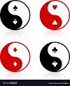
PROs: Great aces, phenomenal artwork, USPCC printing with decent pricing and amazing back. As much as I like the ying yang I don't like how it makes it a one-way back. But I think I like the ying yang there too much so I'll overlook that this one time!
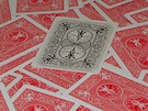
CONs: The tuck isn't awful but it's a bit underwhelming. Just a teeny tiny bit too much blank space on the courts. Though I wish it were "filled in" more it's not enough for me not to pledge.
dougfrye wrote:One thing we've received feedback about is adding colors to the card back. Here are some ideas. Please help us refine what we're doing?
Thanks,
Doug
IMO the color on the back is nice (especially the blue!) but unless it were sprinkled throughout other parts of the cards it might seem a bit out of place. Not to mention if the black deck gets unlocked then you no longer have the black and white thing going on. Sorta. But by no means am I the expert here! I defer to sprouts...
Oh, sorry for triple posting but I'm sure everyone here will tell you that your border rendering is too close for USPCC. But I'm still happy it's USPCC and Bicycle branded.
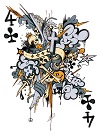
4.of.Clubs- We're going to offer a Kickstarter-exclusive seal for some tiers. A Standard deck refers to a white deck if black isn't unlocked or a choice between black and white if both are unlocked.
Vasta- Thanks! We're working with the USPCC template, so my suspicion is that it's how we captured the image that makes the border look too narrow. Good eye!
I appreciate the thoughts on the cardback color.
Doug
Hi Everyone,
For the standard and embossed decks we're going to stay with strictly black and white, but if the project goes very well we are looking at this with the potential for metallic inks and foil on the tuck. Here's an example of what it would look like...
My original thought was just to add a bit of color to the back, like outlining the dragon in green for example, or highlighting some of the background elements. I can see where that might be a bit tricky, however, and could change the whole feel of the card back. Also, see Vasta41's comment. Alternatively, I think any of the colored backs, even the black, makes a stronger impression than the original line drawing back.
The gold metallic ink looks awesome. There would be gold on the card back as well, correct? If it is indeed possible to pull it off, I would definitely be in for a limited edition deck. Just don't make it too expensive.
Setting my alarm right now for 6 AM Pacific Coast time.
You're killing me, Doug. For once I was up (6:00 AM PDT) and on the project page waiting for it to go live. Refreshed for an hour. Even did searches for new projects in case I was at the wrong place. Then thought to check here to see if there was any news. Sigh. Back to bed.
PS: I think the project is worth it so it's all good.
I'd gone back to bed, figuring the launch wouldn't be today. Luckily, I had to get up and I checked KS anyway and it was live. I got the 3 deck EB I wanted, backer #44. One of these days I'll figure out how to work KS. I really don't know how Pierre does it. Anyway, it looks like we are off to a great start. Best of luck, Doug.
Hi All- Here's the link to a 3D rendering of the black deck. We've got great momentum so far, thanks! https://youtu.be/uKzngJrBQuU" onclick="window.open(this.href);return false;