I've liked them since I saw them in the deck development thread but, this $15-$16 a deck pricing is just killing me. I've got to be A LOT more selective and curtail my spending. So, I'm afraid I'm going to have to pass on these and 95% of all new decks who follow a similar pricing structure.
Hello!
This message is to inform that the Brush Playing Cards are now LIVE on Kickstarter and there's a giveaway going through the curse of the campaign time on Instagram account @SirContsPCC where you can win 2 decks.
I would appreciate if you guys check out the project, buy a few decks and/or share it with you friends.
Thank you!
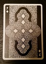
I really want to like them. The back is interesting.
BUT - to me the Aces look kinda 'hairy', and looking at the artistic process not one <<brush>> touched paper... when i originally saw the back and mane of the deck I thought it was a calligraphy / watercolour based deck.
And calling it "a new style of art" is E and D&D grade hyperbole. Which is a turn off for me.
montecarlojoe wrote:I really want to like them. The back is interesting.
BUT - to me the Aces look kinda 'hairy', and looking at the artistic process not one <<brush>> touched paper... when i originally saw the back and mane of the deck I thought it was a calligraphy / watercolour based deck.
And calling it "a new style of art" is E and D&D grade hyperbole. Which is a turn off for me.
Why was that a turn off?
It says "A new style of art, different to what your used to seeing in cards" meaning that there are no decks so far with that style. Most of the decks produced by the companies you mentioned are vectorize straight and curved lines forming shapes.
Hey guys, so I read some of you are concerned about the tuck box. The tuck I designed is supposed to have embossing all over the actual paper forming shapes fitting the style of the deck. These being without ink to create a texture feel. Also the grey line wrapping around the box its supposed to be foil to create this contrast between a matte nice texture feel to a sudden "shine"
I'm opened to suggestions. What are your ideas to make the tuck box better?
I've paid this price for other decks, but the cards really had to win me over.
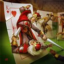
I do like the cards, but I have a couple problems - the heart looks like hairy testicles, and I can't unsee it now. Also, the court cards I think I "understand" rather than like. I'm not an artist, so grain of salt this because I can't design crap - but like they would fit great with the Rorschach cards that were kickstarted fairly recently, but I'm not sure I feel them in this theme.
I understand you have higher costs, if you can figure out a system that works for both of us I'll be back.
CContreras wrote:
I'm opened to suggestions. What are your ideas to make the tuck box better?
The first order of business is to change the back- you have such a nice back design. It should be on the back of the tuck. As for the front I'm not quite sure but there's too much blank space IMO. I'm always a fan of branding but if you don't want to/can't go with Legends branding may I suggest doing something a little more than just boxed Arial font? Maybe something that indicates how different the cards are on the inside. Just my thoughts.
montecarlojoe wrote:I really want to like them. The back is interesting.
BUT - to me the Aces look kinda 'hairy', and looking at the artistic process not one <<brush>> touched paper... when I originally saw the back and mane of the deck I thought it was a calligraphy / watercolour based deck.
And calling it "a new style of art" is E and D&D grade hyperbole. Which is a turn off for me.
Why was that a turn off?
It says "A new style of art, different to what your used to seeing in cards" meaning that there are no decks so far with that style. Most of the decks produced by the companies you mentioned are vectorize straight and curved lines forming shapes.
As I said it's the hyperbole - it's just a pet hate for me. Pencil tracing and abstraction of line isn't really new.
Again - if the brush deck had actually had a brush used to create the design the Brush deck might be a different story for me.
Aren't you obliged to submit vector designs for printing? They are used because they scale better than raster images.
montecarlojoe wrote:I really want to like them. The back is interesting.
BUT - to me the Aces look kinda 'hairy', and looking at the artistic process not one <<brush>> touched paper... when i originally saw the back and mane of the deck I thought it was a calligraphy / watercolour based deck.
And calling it "a new style of art" is E and D&D grade hyperbole. Which is a turn off for me.
Haha!! Yes, the Ace of Clubs certainly looks a bit dodgy.... I'll pass....