


Hi Nate, Thank you for pointing this out. Yes, they are remarkably similar. I guess on some level, I should be flattered. On closer examination, it literally looks like he took the feather pattern on the Curator Ace of Spades and flipped it. Thanks again.ecNate wrote:There's actually quite a bit I like here, although I wish some of the courts had a different look (good queens though). What kills this for me is that I am cutting back on buying decks and especially the color palette that was used. If a more bold color set was used along with the good EB price I might have been persuaded. I hope it funds though because there's still some good stuff here.
EDIT - just looked at this again and it is totally the teal color that just ruins this. No, it annihilates it into extinction. It's just washed out, tired looking, kind of like it needs a bug hug.If it doesn't fund, there's 90% of your problem IMHO.
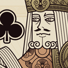
Side note, the AoS looks a LOT like the Curator one. Not saying it's a rip off because designs can be similar and perhaps never even saw Emmanuel's, but certainly the first thing I thought of. It is more bad ass though, I quite like it.


Do we like this border better?jerichoholic wrote:I agree, the borders need to be thinner.
Ohhh okay. I'm curious if that what others were referring too.jerichoholic wrote:We were referring to the borders on the back of the cards, at least I was.

Agreed.shermjack wrote:Yes, much better!
PrincessTrouble wrote:I would also change the rounded corners of your card backs to match the angle of the rounded corners of the card itself. I like symmetry.

I'm not talking about the court borders. I'm talking about the white borders on the back of the card. I think the corners of the white borders should match the angle/arc/curvature of the corners on the physical card.sprouts1115 wrote:PrincessTrouble wrote:I would also change the rounded corners of your card backs to match the angle of the rounded corners of the card itself. I like symmetry.
Sorry, The court borders and BackOfCard are two different animals, but they are somewhat related. Most of time the issue is the Color of the bleed borders Black vs White...

DO NOT get rid of the Greek key design.....!!!!!tanderle wrote:Ohhh okay. I'm curious if that what others were referring too.jerichoholic wrote:We were referring to the borders on the back of the cards, at least I was.
Users browsing this forum: Bing [Bot] and 7 guests