NYC: Playing Cards Relaunch live on KS

Find out about the latest and greatest playing cards hitting the market.
User avatar
chunksmyhero
Member
Member
Posts: 79
Joined: Sun Mar 01, 2015 11:07 am
Has thanked: 1 time
Been thanked: 12 times

NYC: Playing Cards Relaunch live on KS

Unread post by chunksmyhero »


Image

Image

Image

Image

Image

Image

Image
User avatar
Bikefanatic
Member
Member
Posts: 3109
Joined: Tue May 07, 2013 7:23 am
Collector: Yes
Player: Yes
Decks Owned: 333
Location: United States
Has thanked: 352 times
Been thanked: 424 times

Re: NYC: Playing Cards Relaunch live on KS

Unread post by Bikefanatic »

The front tuck/card back image looks congested. Maybe the courts would look better if they were split diagonally instead of just right over each other but looks like the deck will fund.
"When I like something, I buy. No matter who did it, how many were printed or how many (re)colors exist.

When I don't like something, I pass. No matter who did it, how many were printed or how many (re)colors exist."

-Lotrek

*MY PORTFOLIO52 PROFILE https://portfolio52.com/profile/26674

* MY SELLER REVIEW viewtopic.php?f=28&t=16586
User avatar
walrus
Moderator
Moderator
Posts: 2365
Joined: Mon Sep 24, 2012 6:02 pm
Has thanked: 44 times
Been thanked: 33 times

Re: NYC: Playing Cards Relaunch live on KS

Unread post by walrus »

It's a good topic but to me this missed the mark. A bit to simple compared to a lot of what I've seen in the recent past
User avatar
ecNate
Member
Member
Posts: 2099
Joined: Sat Mar 01, 2014 1:46 am
Collector: Yes
Player: Yes
Decks Owned: 400
Location: Wisconsin
Has thanked: 420 times
Been thanked: 440 times
Contact:

Re: NYC: Playing Cards Relaunch live on KS

Unread post by ecNate »

Well, I for one think this is a great improvement from the earlier version and was a must buy for me personally. Mostly because I love skyscraper and general urban architecture, especially early 1900s, but the EB didn't hurt. ;) I have mixed feelings on the unique pip shapes. In large format on the Aces they all look really cool and a neat idea and in the indices it mostly works, but some like the hearts especially look out of sorts when in a group on number cards and you lose detail when smaller sized. Perhaps it's better in person or maybe they should try making those standard, but then it would be different and I think they mostly look pretty neat. Removing the chromatic background or whatever also made a huge difference. I wish the tuck was improved though, probably mostly due to the color and I feel it's lazy to just slap the card back onto the front. I would rather have seen something special for the tuck.
User avatar
MagikFingerz
Site Admin
Site Admin
Posts: 7822
Joined: Mon Sep 24, 2012 7:32 pm
Cardist: Yes
Collector: Yes
Player: Yes
Magician: Yes
White Whale: Sawdust and Delicious + uncuts
Location: Norway
Has thanked: 1827 times
Been thanked: 1578 times
Contact:

Re: NYC: Playing Cards Relaunch live on KS

Unread post by MagikFingerz »

Bikefanatic wrote:The front tuck/card back image looks congested. Maybe the courts would look better if they were split diagonally instead of just right over each other but looks like the deck will fund.
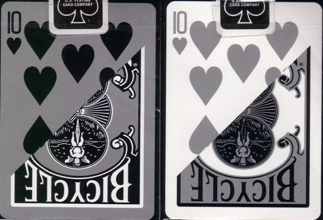
Agreed on both accounts. Definitely an improvement over the original one though, love the pips in particular!
- Tom

Check out my collection

My (abandoned and now severely outdated) Playing Card Wiki
User avatar
kudospop
Member
Member
Posts: 49
Joined: Sun Mar 22, 2015 12:11 am
Has thanked: 2 times
Been thanked: 4 times
Contact:

Re: NYC: Playing Cards Relaunch live on KS

Unread post by kudospop »

Really like the pips on this one.
Playing Card Blog: http://www.ramblerkudos.com" onclick="window.open(this.href);return false;
Instagram: https://instagram.com/ramblerkudos/" onclick="window.open(this.href);return false;" onclick="window.open(this.href);return false;
User avatar
ecNate
Member
Member
Posts: 2099
Joined: Sat Mar 01, 2014 1:46 am
Collector: Yes
Player: Yes
Decks Owned: 400
Location: Wisconsin
Has thanked: 420 times
Been thanked: 440 times
Contact:

Re: NYC: Playing Cards Relaunch live on KS

Unread post by ecNate »

I never look at decks critically enough and analyze, but taking a little more time now I see what bothers me about the pips is the arrangements on 6-10 is the unconventional layout. I think that really impacts my decision NOT to get additional decks to play with. I wonder if they would consider a change at this point. Also, the hearts look like they have an extracted tooth in them when they get too small and the detail is lost.

I still think this is 3x better than the first and I do like the pips larger. I'm still all in for one anyhow and am even ok with alternate printers to see this one happen with the improvements made so far.
User avatar
Gareth
Member
Member
Posts: 359
Joined: Tue Sep 25, 2012 7:32 am
Collector: Yes
Player: Yes
Location: Western Australia
Has thanked: 108 times
Been thanked: 59 times

Re: NYC: Playing Cards Relaunch live on KS

Unread post by Gareth »

ecNate wrote:I never look at decks critically enough and analyze, but taking a little more time now I see what bothers me about the pips is the arrangements on 6-10 is the unconventional layout.
Agree that the layout is disconcerting. (some might say refreshing, but when you're trying to show off the building designs, these oddities are just too distracting)

Looking at it more closely, the fact that on three suits the building on the King is that which is inset on the Ace, except on Hearts where it is the Jack's building on the Ace. That lack of consistency would probably annoy me too much if I pledged (... and opened, I guess ;) )
User avatar
undefinedknowledge
Deck Artist
Deck Artist
Posts: 20
Joined: Thu Jul 24, 2014 11:53 am
Has thanked: 3 times
Contact:

Re: NYC: Playing Cards Relaunch live on KS

Unread post by undefinedknowledge »

Hello Everyone,

First just want to say thanks to ecNate for reaching out to us. We are definitely into suggestions and totally willing to make changes. I think to start with we are going to upgrade the tuck and also change the layout of all the 6-10's. Was going to share the revamped tuck first... feel free to let us know what you think. Will probably post to the project page later tonight or tomorrow.

Thank you all for the feedback!
Andy

Image

Image
User avatar
MagikFingerz
Site Admin
Site Admin
Posts: 7822
Joined: Mon Sep 24, 2012 7:32 pm
Cardist: Yes
Collector: Yes
Player: Yes
Magician: Yes
White Whale: Sawdust and Delicious + uncuts
Location: Norway
Has thanked: 1827 times
Been thanked: 1578 times
Contact:

Re: NYC: Playing Cards Relaunch live on KS

Unread post by MagikFingerz »

Is there any particular reason you want to have the 10 of clubs on the back of the tuck?
- Tom

Check out my collection

My (abandoned and now severely outdated) Playing Card Wiki
User avatar
undefinedknowledge
Deck Artist
Deck Artist
Posts: 20
Joined: Thu Jul 24, 2014 11:53 am
Has thanked: 3 times
Contact:

Re: NYC: Playing Cards Relaunch live on KS

Unread post by undefinedknowledge »

MagikFingerz wrote:Is there any particular reason you want to have the 10 of clubs on the back of the tuck?
Good question. For the first tuck, we wanted to show a card that showed that the numbered cards had an alternate layout. I left it as the 10 of clubs however, simply to show that we are returning to a traditional layout. But there is no longer any reason other than we thought that the Chrysler building inside the Club pip was the most recognizable? Do you think it would be better to have a Court card on the back? I'm open to suggestions or other ideas for the back.

Andy
User avatar
MagikFingerz
Site Admin
Site Admin
Posts: 7822
Joined: Mon Sep 24, 2012 7:32 pm
Cardist: Yes
Collector: Yes
Player: Yes
Magician: Yes
White Whale: Sawdust and Delicious + uncuts
Location: Norway
Has thanked: 1827 times
Been thanked: 1578 times
Contact:

Re: NYC: Playing Cards Relaunch live on KS

Unread post by MagikFingerz »

Well, the most common thing to do is having the back design on the back of the tuck. An option could be to have a "legend" with the names of all the buildings on the courts, although this could be on an add card as well (if printing with EPCC you'd have to sacrifice a Joker).

In any case I don't think face cards have anything to do on the tuck, but that's just my opinion.
- Tom

Check out my collection

My (abandoned and now severely outdated) Playing Card Wiki
User avatar
Eoghann
Moderator
Moderator
Posts: 3467
Joined: Sat Jul 20, 2013 10:47 am
Collector: Yes
Player: Yes
Has thanked: 153 times
Been thanked: 428 times

Re: NYC: Playing Cards Relaunch live on KS

Unread post by Eoghann »

Or you could do half and half, like these:

Image
User avatar
undefinedknowledge
Deck Artist
Deck Artist
Posts: 20
Joined: Thu Jul 24, 2014 11:53 am
Has thanked: 3 times
Contact:

Re: NYC: Playing Cards Relaunch live on KS

Unread post by undefinedknowledge »

Thank you Tom and Eoghann... so maybe something like this? Or maybe just the full Card back on the back? Or is that overkill with the tuck design/colors, etc? attaching both...

Image

Image
User avatar
ecNate
Member
Member
Posts: 2099
Joined: Sat Mar 01, 2014 1:46 am
Collector: Yes
Player: Yes
Decks Owned: 400
Location: Wisconsin
Has thanked: 420 times
Been thanked: 440 times
Contact:

Re: NYC: Playing Cards Relaunch live on KS

Unread post by ecNate »

Wow, fast response and open to suggestions, I love it! Eoghanns' suggestion of the split back works really well here I think, especially since so much of the card backs is already on the front of the tuck. I would suggest going with 10oS or 10oC though because I really think the heart design doesn't pack the same punch when reduced in size compared to spades/clubs. The front is a huge improvement though, I wonder if you could also remove the card back from the background for a more clean look. I'm not sold on the yellow color, but a minor point. Mostly I'm glad you are willing to go back to standard pip layouts for all the number cards.

Side note, I'm glad your smiley logo dude is on the bottom. He's neat and all, but doesn't fit the theme so glad it wasn't forced.
User avatar
badpete69
Moderator
Moderator
Posts: 4327
Joined: Thu Sep 27, 2012 8:43 pm
Collector: Yes
Player: Yes
Decks Owned: 1500
Location: Seattle WA
Has thanked: 50 times
Been thanked: 730 times

Re: NYC: Playing Cards Relaunch live on KS

Unread post by badpete69 »

You know the more I look at this deck, the more it grows on me
User avatar
chach
Member
Member
Posts: 1999
Joined: Fri May 31, 2013 2:22 pm
Collector: Yes
Player: Yes
White Whale: Vietnam Era Secret Weapon
Decks Owned: 0
Location: Armpit of California
Has thanked: 237 times
Been thanked: 280 times
Contact:

Re: NYC: Playing Cards Relaunch live on KS

Unread post by chach »

If you have a court card for MSG featuring the Rangers, I'll back it for sure. =D
WTB/WTT: Vietnam Era Bicycle Secret Weapon Deck
User avatar
undefinedknowledge
Deck Artist
Deck Artist
Posts: 20
Joined: Thu Jul 24, 2014 11:53 am
Has thanked: 3 times
Contact:

Re: NYC: Playing Cards Relaunch live on KS

Unread post by undefinedknowledge »

Ok. So thank you all again for the input. Here are the latest tweaks, and I agree they all make the tuck and project look much better.

- tried to tone down the card back background from the front. Tried taking it out completely but couldn't commit to it's departure 100%. I did remove it completely from the lower half of the tuck.

- the yellow color. This was intended to be 'orange' however we all see slightly differently, have different monitors/displays. However, I did tweak the colors a bit to make it more of a true orange/dk blue combo. I was trying to play on the orange/blue complimentary color scheme. Which is incidentally the ny knicks colors (and the Islanders... sorry chach. No MSG either, maybe on second edition ;) )

- I went with the split look on the back. But I added some blue to the Card Backs (and tweaked the orange/yellow color), so i might just go all in and put the Card Back in full on the tuck back. Thoughts? I am including the updated card back below as well.

- all cards will now be traditional layout, this only really affects the 6-10s though, as 2-5s already are the normal layout.

- still contemplating changing the pips on the numbered cards. I will say that on our Video Game deck, we had similar pip designs, and they still came out quite sharp on the actual finished cards, even with the size reduction from the over-sized Ace to the medium pip, all the way to the small indices.

Thanks again for all the feedback and hope you guys like the changes.

Image

Image
User avatar
ecNate
Member
Member
Posts: 2099
Joined: Sat Mar 01, 2014 1:46 am
Collector: Yes
Player: Yes
Decks Owned: 400
Location: Wisconsin
Has thanked: 420 times
Been thanked: 440 times
Contact:

Re: NYC: Playing Cards Relaunch live on KS

Unread post by ecNate »

undefinedknowledge wrote: - still contemplating changing the pips on the numbered cards. I will say that on our Video Game deck, we had similar pip designs, and they still came out quite sharp on the actual finished cards, even with the size reduction from the over-sized Ace to the medium pip, all the way to the small indices.
MUCH improved in my opinion. As for the pips, I would rather they not be changed if you are fairly certain they won't lose the detail in person. Perhaps it's just the images onscreen and compression that makes it look less sharp here. I LOVE these unconventional pips that are super stylized, but still traditional basic shape. Keep them if you think they will come out OK.
User avatar
MagikFingerz
Site Admin
Site Admin
Posts: 7822
Joined: Mon Sep 24, 2012 7:32 pm
Cardist: Yes
Collector: Yes
Player: Yes
Magician: Yes
White Whale: Sawdust and Delicious + uncuts
Location: Norway
Has thanked: 1827 times
Been thanked: 1578 times
Contact:

Re: NYC: Playing Cards Relaunch live on KS

Unread post by MagikFingerz »

I think those are some solid changes you've made. Another thing that I noticed though: Why have white borders on the tuck? I would think it'd look better if you extended the front/sides/back to the edges/corners.

I do think the split is the way to go for the back of the tuck.
- Tom

Check out my collection

My (abandoned and now severely outdated) Playing Card Wiki
User avatar
undefinedknowledge
Deck Artist
Deck Artist
Posts: 20
Joined: Thu Jul 24, 2014 11:53 am
Has thanked: 3 times
Contact:

Re: NYC: Playing Cards Relaunch live on KS

Unread post by undefinedknowledge »

MagikFingerz wrote:I think those are some solid changes you've made. Another thing that I noticed though: Why have white borders on the tuck? I would think it'd look better if you extended the front/sides/back to the edges/corners.

I do think the split is the way to go for the back of the tuck.
Cool! Thanks Tom.

I made a mockup of the tuck without the white borders on the front/sides. Idk I guess I was just partial to the borders myself. But up for more feedback...

Image
User avatar
MagikFingerz
Site Admin
Site Admin
Posts: 7822
Joined: Mon Sep 24, 2012 7:32 pm
Cardist: Yes
Collector: Yes
Player: Yes
Magician: Yes
White Whale: Sawdust and Delicious + uncuts
Location: Norway
Has thanked: 1827 times
Been thanked: 1578 times
Contact:

Re: NYC: Playing Cards Relaunch live on KS

Unread post by MagikFingerz »

I think I'd rather have the front be all blue, but that might just be me. Also making the card on the back at least slightly bigger too, if not all the way to the edges. But in any case I think it looks cleaner without the white borders.
- Tom

Check out my collection

My (abandoned and now severely outdated) Playing Card Wiki
User avatar
undefinedknowledge
Deck Artist
Deck Artist
Posts: 20
Joined: Thu Jul 24, 2014 11:53 am
Has thanked: 3 times
Contact:

Re: NYC: Playing Cards Relaunch live on KS

Unread post by undefinedknowledge »

Posted an update to the KS project outlining the changes to all the backers, and just wanted to update here with our latest design decisions. After much debate, decided I was pretty partial to the white border on the front of the tuck, but scrapped the border on the sides. Also Tom I took your suggestions to make the card on the back bigger and extended it as far to the edge as seemed logical? Anyway, that's where we are at it seems. Other than that, I'll be busy redoing the 6-10s. Still 5 days left on the project, so if there is any more feedback I'm all ears. Thanks again everyone.

Image

Image
User avatar
shermjack
✔ VERIFIED Seller
✔ VERIFIED Seller
Posts: 1920
Joined: Mon Feb 23, 2015 7:39 pm
Collector: Yes
Has thanked: 1742 times
Been thanked: 1015 times
Contact:

Re: NYC: Playing Cards Relaunch live on KS

Unread post by shermjack »

I really like the changes and have backed because of it...glad you listed to the suggestions...nice job!
A deck a day helps keep the addiction at bay!

Check out my collection on Instagram @caratcasecreations
User avatar
undefinedknowledge
Deck Artist
Deck Artist
Posts: 20
Joined: Thu Jul 24, 2014 11:53 am
Has thanked: 3 times
Contact:

Re: NYC: Playing Cards Relaunch live on KS

Unread post by undefinedknowledge »

Thanks Shermjack, and thanks for backing the project as well.
Post Reply

Who is online

Users browsing this forum: Disenchanted_11, Google [Bot], HFMJ, Magisterrene and 24 guests