Strange head society - playing cards now live on KS
- EgorKlychnyk
- ✔ VERIFIED Designer
- Posts: 38
- Joined: Sun Sep 28, 2014 11:30 am
- Has thanked: 4 times
- Been thanked: 5 times
- Contact:
Strange head society - playing cards now live on KS
Hello guys. My name is Egor and want to present my new deck - Strange head society
This is my second project at KS, so I would like to hear your opinion for this one.
Previous project: https://www.kickstarter.com/projects/89 ... ying-cards" onclick="window.open(this.href);return false;" onclick="window.open(this.href);return false;" onclick="window.open(this.href);return false;" onclick="window.open(this.href);return false;
Thank you.
-
- Member
- Posts: 598
- Joined: Sat Feb 01, 2014 8:21 pm
- Collector: Yes
- Player: Yes
- Has thanked: 15 times
- Been thanked: 35 times
Re: Strange head society - playing cards (KS soon)
Somehow I could tell you did the Demon Deck from the tuck box.
The courts are too small and are those tentacles on the background?
I'm not liking the card back. I don't like how the candles on the corners are isolated from the whole design. You could probably get rid of the candles and expand on the back design.
I like the tuck box though. The back of the box is a tad empty but I can see it being a real killer with foil or other fancy things people use on tuck boxes.
- sprouts1115
- Deck Artist
- Posts: 1897
- Joined: Thu Oct 11, 2012 10:05 am
- Collector: Yes
- Decks Owned: 50
- Location: san antonio, tx, usa
- Has thanked: 98 times
- Been thanked: 113 times
- Contact:
Re: Strange head society - playing cards (KS soon)
EgorKlychnyk - Sorry, this whole deck is not pleasing to the eye. So on your back of card it looks like your going with a center element with double mirrored elements. It seems your corner element is a bit lacking. Beef that bitch up.
With your indices being with the all white background, it makes them seem typical and boring.
RussellSprouts
- EgorKlychnyk
- ✔ VERIFIED Designer
- Posts: 38
- Joined: Sun Sep 28, 2014 11:30 am
- Has thanked: 4 times
- Been thanked: 5 times
- Contact:
Re: Strange head society - playing cards (KS soon)
Everyone has their tastes)sprouts1115 wrote:EgorKlychnyk - Sorry, this whole deck is not pleasing to the eye. So on your back of card it looks like your going with a center element with double mirrored elements. It seems your corner element is a bit lacking. Beef that bitch up.
With your indices being with the all white background, it makes them seem typical and boring.
- EgorKlychnyk
- ✔ VERIFIED Designer
- Posts: 38
- Joined: Sun Sep 28, 2014 11:30 am
- Has thanked: 4 times
- Been thanked: 5 times
- Contact:
Re: Strange head society - playing cards (KS soon)
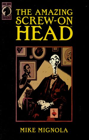
Yep) I love Mignola`s art))Firthetic wrote:The artwork of the courts look like it's inspired by Mike Mignola. Consider my interest piqued.
- Eoghann
- Moderator
- Posts: 3467
- Joined: Sat Jul 20, 2013 10:47 am
- Collector: Yes
- Player: Yes
- Has thanked: 153 times
- Been thanked: 428 times
Re: Strange head society - playing cards (KS soon)
Like you're style. Not completely sold on the tentacles because of the crazy amount of Cthulhu decks that have come and gone. So even if you're not going for a Cthulhu vibe, that's what I'm seeing.
Overall I like it.
Overall I like it.
- EgorKlychnyk
- ✔ VERIFIED Designer
- Posts: 38
- Joined: Sun Sep 28, 2014 11:30 am
- Has thanked: 4 times
- Been thanked: 5 times
- Contact:
Re: Strange head society - playing cards (KS soon)
What do you mean?Widdee wrote:Think the back on the standard deck looks far better than that of the unlimited.
- Eoghann
- Moderator
- Posts: 3467
- Joined: Sat Jul 20, 2013 10:47 am
- Collector: Yes
- Player: Yes
- Has thanked: 153 times
- Been thanked: 428 times
Re: Strange head society - playing cards (KS soon)
I think he saw the Kickstarter link to your previous project and assumed that was the current. As far as I understand SHS is only one deck, correct?
- EgorKlychnyk
- ✔ VERIFIED Designer
- Posts: 38
- Joined: Sun Sep 28, 2014 11:30 am
- Has thanked: 4 times
- Been thanked: 5 times
- Contact:
Re: Strange head society - playing cards (KS soon)
oh, i see.Eoghann wrote:I think he saw the Kickstarter link to your previous project and assumed that was the current. As far as I understand SHS is only one deck, correct?
Yes. I have some options, but don`t like it so much. And other one have just another color on backs.
- EgorKlychnyk
- ✔ VERIFIED Designer
- Posts: 38
- Joined: Sun Sep 28, 2014 11:30 am
- Has thanked: 4 times
- Been thanked: 5 times
- Contact:
-
- Member
- Posts: 598
- Joined: Sat Feb 01, 2014 8:21 pm
- Collector: Yes
- Player: Yes
- Has thanked: 15 times
- Been thanked: 35 times
Re: Strange head society - playing cards (KS soon)
I still don't get why the tentacles.
I don't like how the KoD head seems to be cut off by the top border. Maybe you can make him a bit shorter.
I didn't choose the pug life...
I don't like how the KoD head seems to be cut off by the top border. Maybe you can make him a bit shorter.
I didn't choose the pug life...
- Eoghann
- Moderator
- Posts: 3467
- Joined: Sat Jul 20, 2013 10:47 am
- Collector: Yes
- Player: Yes
- Has thanked: 153 times
- Been thanked: 428 times
Re: Strange head society - playing cards (KS soon)
Really liking it as previously stated, but Yashi makes a good point that the courts are riiiiiight on the edge of the frame.
I dunno if these would benefit from making them smaller, they're already pretty thin as it is.
- ecNate
- Member
- Posts: 2099
- Joined: Sat Mar 01, 2014 1:46 am
- Collector: Yes
- Player: Yes
- Decks Owned: 400
- Location: Wisconsin
- Has thanked: 420 times
- Been thanked: 440 times
- Contact:
Re: Strange head society - playing cards (KS soon)
I love the theme, quite a bit actually, but agree with comments about the tentacles and courts to edge of frame. I don't get the Cthulu thing at all so these are a bit distracting to me, could you make them more subtle in a lighter shade so it's more of a shadow image in the back (or just try without them at all). The back also is a bit disjointed and could use some re-work as mentioned. Lastly, the tuckbox should use a more dramatic image, I would use the 'strangest' and most wild one in the deck and use that. A sand timer doesn't scream strange to me like some of the others.
No matter what, I'm looking forward to this one. I love weird stuff!
My card collection ('in hand' only) on Portfolio52 (the playing card database)
My wishlist, contact me if you have one to sell, let's chat! (My marketplace review thread)
My card collection thread here at UC
♠️ ♦️ My currently featured deck from my collection at Portfolio 52: Vanity Fair No 41 ♥️ ♣️
As a UC member you are encouraged to contribute/join Portfolio52, the greatest card collection site (FacebookPage)!
- sprouts1115
- Deck Artist
- Posts: 1897
- Joined: Thu Oct 11, 2012 10:05 am
- Collector: Yes
- Decks Owned: 50
- Location: san antonio, tx, usa
- Has thanked: 98 times
- Been thanked: 113 times
- Contact:
Re: Strange head society - playing cards (KS soon)
EgorKluchnyk - Your "Joker" seems upside down. Usually, it's
J
O
K
E
R
The top left part of the card is important. People are looking for the rank and suit of the card; therefore, the "J" needs to be on the top. Have a Red and Black "J" it make it easy to identify the rank of the Jokers.
J
O
K
E
R
The top left part of the card is important. People are looking for the rank and suit of the card; therefore, the "J" needs to be on the top. Have a Red and Black "J" it make it easy to identify the rank of the Jokers.
RussellSprouts
- volantangel
- Moderator
- Posts: 3607
- Joined: Tue Nov 13, 2012 2:06 am
- Collector: Yes
- Player: Yes
- Decks Owned: 350
- Location: Singapore
- Has thanked: 219 times
- Been thanked: 297 times
Re: Strange head society - playing cards (KS soon)
Those are truly some strange heads...
My Collection = Playing Cards + Photography
- samurai007
- Member
- Posts: 291
- Joined: Thu Jan 03, 2013 2:49 am
- Has thanked: 8 times
- Been thanked: 12 times
Re: Strange head society - playing cards (KS soon)
I like the art and concept, including the tentacles. Looking forward to this deck!
-
- Member
- Posts: 598
- Joined: Sat Feb 01, 2014 8:21 pm
- Collector: Yes
- Player: Yes
- Has thanked: 15 times
- Been thanked: 35 times
Re: Strange head society - playing cards (KS soon)
Eoghann wrote:Really liking it as previously stated, but Yashi makes a good point that the courts are riiiiiight on the edge of the frame.
I dunno if these would benefit from making them smaller, they're already pretty thin as it is.
Smaller shouldn't mean thinner. I mean I see no harm in chipping off a bit of the KoD height so that the border can clearly be distinguished as a separate element. It might screw up the proportions a bit but I'm sure Egor can fix that.
- EgorKlychnyk
- ✔ VERIFIED Designer
- Posts: 38
- Joined: Sun Sep 28, 2014 11:30 am
- Has thanked: 4 times
- Been thanked: 5 times
- Contact:
Re: Strange head society - playing cards (KS soon)
Thank you. Good point.sprouts1115 wrote:EgorKluchnyk - Your "Joker" seems upside down. Usually, it's
J
O
K
E
R
The top left part of the card is important. People are looking for the rank and suit of the card; therefore, the "J" needs to be on the top. Have a Red and Black "J" it make it easy to identify the rank of the Jokers.
- EgorKlychnyk
- ✔ VERIFIED Designer
- Posts: 38
- Joined: Sun Sep 28, 2014 11:30 am
- Has thanked: 4 times
- Been thanked: 5 times
- Contact:
Re: Strange head society - playing cards (KS soon)
Maybe that option better. However in Infinity deck jokers rotated like my first option joker.
- dazzleguts
- Moderator
- Posts: 1499
- Joined: Mon Sep 24, 2012 4:32 pm
- Collector: Yes
- Player: Yes
- White Whale: Das Kartenspiel Des Oberdeutsc
- Decks Owned: 885
- Has thanked: 210 times
- Been thanked: 142 times
Re: Strange head society - playing cards (KS soon)
These do look Mignola inspired, but not as black and inky as Mignola.
I like the tentacles as a fill in the back. The association this has for me is with museums of the bizarre, where there are always tentacles.
Looks good Egor. These will be my first new deck in quite a while.
Love the jellyfish/umbrella in the belljar.
I like the tentacles as a fill in the back. The association this has for me is with museums of the bizarre, where there are always tentacles.
Looks good Egor. These will be my first new deck in quite a while.
Love the jellyfish/umbrella in the belljar.
- EgorKlychnyk
- ✔ VERIFIED Designer
- Posts: 38
- Joined: Sun Sep 28, 2014 11:30 am
- Has thanked: 4 times
- Been thanked: 5 times
- Contact:
Re: Strange head society - playing cards (KS soon)
Thank you)dazzleguts wrote:These do look Mignola inspired, but not as black and inky as Mignola.
I like the tentacles as a fill in the back. The association this has for me is with museums of the bizarre, where there are always tentacles.
Looks good Egor. These will be my first new deck in quite a while.
Love the jellyfish/umbrella in the belljar.
When i draw on paper, i use black ink and drawing looks like Mignola`s art. But photoshop a little bit different tool as for me.
- sprouts1115
- Deck Artist
- Posts: 1897
- Joined: Thu Oct 11, 2012 10:05 am
- Collector: Yes
- Decks Owned: 50
- Location: san antonio, tx, usa
- Has thanked: 98 times
- Been thanked: 113 times
- Contact:
Re: Strange head society - playing cards (KS soon)
EgorKlychnyk - Your indices feel like this. Enjoy!
RussellSprouts
- EgorKlychnyk
- ✔ VERIFIED Designer
- Posts: 38
- Joined: Sun Sep 28, 2014 11:30 am
- Has thanked: 4 times
- Been thanked: 5 times
- Contact:
- Eoghann
- Moderator
- Posts: 3467
- Joined: Sat Jul 20, 2013 10:47 am
- Collector: Yes
- Player: Yes
- Has thanked: 153 times
- Been thanked: 428 times
- Firthetic
- Member
- Posts: 339
- Joined: Sun Nov 18, 2012 10:45 am
- Collector: Yes
- Player: Yes
- Has thanked: 39 times
- Been thanked: 26 times
Re: Strange head society - playing cards (KS soon)
This may be an unpopular opinion but I think the courts could benefit from being one-way. It would help fill up the negative space that's being filled in by the Lovecraftian tentacles.
- Alyooola
- ✔ VERIFIED Seller
- Posts: 117
- Joined: Wed Mar 19, 2014 5:02 pm
- Location: Dallas, Texas
- Has thanked: 37 times
- Been thanked: 38 times
Re: Strange head society - playing cards (KS soon)
A quick update here - This will be a GW release. We are planning to launch the project early May
Alysha
I do marketing & other fun stuff @ http://gamblerswarehouse.com" onclick="window.open(this.href);return false;
Who is online
Users browsing this forum: Google [Bot], KGthePrince and 8 guests