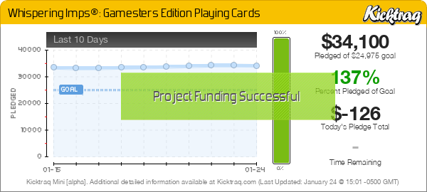
Hey everybody...just thought I'd share some photos of the Gamesters with all of you. Because it's a brand new deck (and not a recolor) I'll be going through Kickstarter to fund it. The KS page will go live on Monday, December 15th.
Enjoy,
-Chris


Totally agree. Please, let us know beforehand!lriefer wrote:Do you have a time for your Kickstarter Launch? Since I'll be at work, it would be great to know what time to make sure I'm in front of a computer to pledge. Thanks!


Custom courts in the sense that they are the same vintage squeezer courts (not standard Bicycle) that were used in the original Whispering Imps, along with altered color scheme and the four corner pip placements.volantangel wrote:Did i recall you saying that there will be custom courts for this deck ?


You're right, but these are at least part of a series and brand that isn't all simplistic designs made from two initials or a logo. I won't be getting these personally, but I know Chris had plans for these as part of the series in a way that made a lot of sense. And I'm pretty sure there's no plans to make these in new colors within the next 6 months.jerichoholic wrote:Looks great, i'll be getting this for sure.
Funny if this was a Madison deck everyone would be whining and complaining about it.

I could be mistaken, but this isn't a 'change' it's a different deck entirely to the original Imps - these are useful for poker peeking!sprouts1115 wrote:
You just made a major design change to your cards. You now have indices in each of the corners.

Guess I was number 2 then, when I got the confirm it said you and 1 other person had backed this project.badpete69 wrote:First in as usual

I agree, was shocked that I had gotten it, then I saw that it was upped to 4. Very nice, Chris. Thanks for that!badpete69 wrote:I saw Chris update the number of that pledge from 1 to 4, five minutes before live which was a nice thing to do


I agree with everything above.sprouts1115 wrote:@see_squared - Is it me or is the "K", "Q", and "J" have different size fonts. It seems the "Q" is a bit skinny. I think fonts should be consistent in most cases.
You just made a major design change to your cards. You now have indices in each of the corners. Tell ya the truth, I really don't think you need the rank of the card there anymore. It's unnecessary information. I not trying to give you a hard time, but do you think you might be rushing things a bit? You might want to step back and look at your new design. You have the rank of the card in there 5 times.
I also think your courts can be bigger. You have a lot of white space between your indices and your court border. Hell, you could fit another spade in there...
Users browsing this forum: Bing [Bot], Kage X, manu and 15 guests
