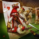


Courts do look good WITHOUT the horrible coloring.Fes wrote:I like the courts okay, I like the Jacks best. That bit of color makes them look pretty sharp. Tuck box is terrible, I don't like it. I hope they change that a bit. I think the card backs will look pretty sharp. Ace of hearts and ace of diamonds could use a little tweaking, they create an illusion for me of being a bit off, or they just are a bit off. Heart appears lopsided and diamond appears slightly bowed.
I'm backing them, I just hope they fix these minor things. Crisp the deck up a bit. The tuck box is so bad I may stash it and forget I even have them. I'm considering lowering my current pledge. I'll still back this though.

I didn't even see that. Always scroll down Fes, always scroll down.Levereno wrote: Also, Not sure what he was thinking when he was making the king of hearts? The king seems mutated with 2 arms popping out from the same side! It almost gives the illusion that someone is backstabbing the king.
He should seriously think about changing thatt.
no prob! You should notify him in the comments section to redo the card if you are planning on buying the deck. It would bring a big disappointment to all those 65 backers once they receive it.Fes wrote:I didn't even see that. Always scroll down Fes, always scroll down.Levereno wrote: Also, Not sure what he was thinking when he was making the king of hearts? The king seems mutated with 2 arms popping out from the same side! It almost gives the illusion that someone is backstabbing the king.
He should seriously think about changing thatt.
Good spot there, thanks for saving me some cash.


I see what you did there, Ahaha.volantangel wrote: Since this is choice playing cards, I choose not to support it. The only thing I think they changed from the first campaign is the printer. Sadly it's the artwork that needs changing
The artist hasn't done anything so he's content with what he has. Same art in two campaigns now, it is what it is and this cat isn't going to make any significant fixes. When they use the same art in two campaigns, I find they're pretty dedicated to it. I just looked at the initial KS and yep, that heart is indeed lopsided. No illusion there. Laziness or artistic choice? Either way best of luck to him, way to stick to his guns, all that.by volantangel
The only thing I think they changed from the first campaign is the printer. Sadly it's the artwork that needs changing
Haven't thought of it that way. But yeah, maybe.sprouts1115 wrote:@Levereno - I agree the QoD and QoC looks kind of off, but I do like the KoH. There might be a little truth in that mutant arm theory.
If you look at the first "Suicide King" dated 1680 by C. Hewson. Look at JoC to find the name of the artist.http://whiteknucklecards.com/earlystand ... n1680.html
Notice the other 2 kings have swords. What does the KoH have? Looks like a dagger. Assassins used daggers. The arm with the icepick is gold. It doesn't look like the KoH's other arm. So maybe Hewson's intention was for it to be the "Murdered King" Notice the KoH has a mustache. Today's KoH doesn't have one. He lost it along the way due to a smudge, but that another story.
I say it's laziness. Why only make the hearts lopsided? all other look porportionate, except hearts. It would make sense if other suites were porportionally altered as well. But only making the hearts lopside hmmmmm what purpose does that serve?Fes wrote:Can't post there anymore. Woke up all Zombie and stumbled around. Before the coffee was even finished I logged in and dropped the pledge entirely. Too many good decks coming and here, for me to even continue thinking about this one. No amount of commenting will change the Courts.
The artist hasn't done anything so he's content with what he has. Same art in two campaigns now, it is what it is and this cat isn't going to make any significant fixes. When they use the same art in two campaigns, I find they're pretty dedicated to it. I just looked at the initial KS and yep, that heart is indeed lopsided. No illusion there. Laziness or artistic choice? Either way best of luck to him, way to stick to his guns, all that.by volantangel
The only thing I think they changed from the first campaign is the printer. Sadly it's the artwork that needs changing
Users browsing this forum: armant96, Bing [Bot], EndersGame, krystalie, Zzzzi and 17 guests