


Go for it, man. I added the t-shirt, print and uncut to my pledge, which is not something I usually do as well!Eoghann wrote:I don't usually go for uncuts, but an honest price like that I can't help but support it. I do fear he's being a little TOO nice. That's a pretty marginal goal.


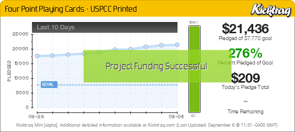
badpete69 wrote:By the way is that $7700 goal high enough. I always ask when it is a first project for someone, after all the stuff we have seen over the last 2 years. At $16000 we have a second color deck also. Seems a little low as a goal but who knows. I have asked Ben to stop by here when he has a chance as usual
If the minimum is reached you will NOT be profitable after fees and shipping (especially International). I love your pricing, I just think it will bite you unless you have another $3-4K in reserve to fully fund the project. Backing for now but will keep a close eye.FourPoint wrote:Hi All,
My name is Ben Vierck and I'm the creator of the Four Point deck. Thank you for the invitation to the forum and all the feedback so far.
To address what has been the biggest comment thread so far, the pricing and goals...
While this project is a business venture, it's always been more about creating a deck of cards that people will enjoy playing with than turning a huge profit. I wanted to offer a few rewards that were amazing deals, where I cut the margin really low - like the Uncut Sheet + 2 deck deal. Uncut sheets are cool, and I wanted more people to be able to buy it.
The same goes for the goal. If only the minimum is reached, it will not be hugely profitable. However, I'll be playing cards with a unique deck.


+10 for the beard!sinjin7 wrote:While the funding goal may appear a bit low, that may be due to the fact that we've been seeing some pretty bloated custom deck project recently that factor plenty of profit built into the funding goal. And even if it is low when you factor the high cost of international shipping, I think this deck will have enough appeal where he will fund pretty comfortably with sufficient margins to more than adequately cover those costs.
I, like most others here, find this to be a very well designed custom deck. I agree with Volantangel that the tuck box can use some amping up, but there is definitely enough here for me to enthusiastically pledge. Plus, the dude is rocking a seriously manly beard, gotta respect that.


That was the main selling point for me. Really like the court art. Not as nuts about the backs but there is plenty of meat on the bone in this deck overall to back it.Coastal Pete wrote:A different take on the court cards, almost cheeky. Cheers for the heads up on the sheet + 2 deck pledge. I missed seeing that!
I think its because the art is originally inked in black. Perhaps the creator can change them to red as well, but would the red courts have to change ? I definitely think its an area that is worth exploring ! Good spot there !samwisethegray wrote:Love the deck and the designs. Mostly, the ace cards, they all look great being over the top design like the ace of spades. One question, why is the ace of diamonds and hearts black on the card, and the corner suits/index are red?

I feel the same about the backs. I still pledged and that says a lot because I really like good backs and tucks. That's the reason I bought three Zeniths instead of one!Encarded wrote:The one thing keeping me from getting this one is that the main shapes of the back design use those smooth gradients, when everything else in the deck has shading done by hand drawn hatching and lines. That particular detail just breaks the entire theme for me personally, though I think everything else is great. Great work on the whole, but in my latest super-picky collector attitude something like that tips it into the negative.
I wish it the best of luck though, it's great artwork on the whole.
All the art was originally inked in black, and I decided to stay true to those original drawings in this 1st edition. I did explore many other color options, including having the all the diamond and heart courts in red. However, the pervading visual theme uses intricate black designs, white negative space and limited use of red. I feel like the red has more power when used with restraint (at least in this particular edition).Love the deck and the designs. Mostly, the ace cards, they all look great being over the top design like the ace of spades. One question, why is the ace of diamonds and hearts black on the card, and the corner suits/index are red?
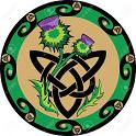
Part of this project was about creating something slightly visually different and I do realize it is unorthodox to mix gradients and solid inked shapes (like hatching or stippling). In this deck, all the human components (faces, hands) are rendered in smooth charcoal (gradient) and everything else in solid ink. I did this to create a tension between the two, the living and the inanimate. The impossible geometry (big shape on card back) is rendered smooth because it represents "life", having no beginning nor end. That is why the 4-pointed infinity symbol intertwines with the geometry, a sort of nod to time and life being intertwined.The one thing keeping me from getting this one is that the main shapes of the back design use those smooth gradients, when everything else in the deck has shading done by hand drawn hatching and lines. That particular detail just breaks the entire theme for me personally, though I think everything else is great. Great work on the whole, but in my latest super-picky collector attitude something like that tips it into the negative.

Users browsing this forum: Bing [Bot], Magisterrene, MSimonart, Strag and 8 guests