Just saw this on their Facebook, Zinfandel Mana V2 coming soon to kickstarter. I guess it's going to be wine coloured or something.


Yep busy is the first word that came to my mind ! Also I am not a fan of the box, i hope this is a work in progress.sinjin7 wrote:I loved the original Mana deck. There's a lot to like about this deck, but the back design seems slightly busy to me. Still, I'm looking forward to these and hope they're not ridiculously priced.


"Once you go black..."MagikFingerz wrote:To add on another nitpicky thing: I see no reason for one box to be black when both decks have white faces/borders.
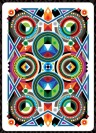
Yep, that's another inconsistency. A type of grape and a color doesn't really match. Chardonnay and Zinfandel would have worked, or simply indigo and violet.vasta41 wrote:The backs are beautiful! And I love the aces. But I agree with MF- the boxes seem a little out of place.. almost a deal breaker. Not too crazy about the names either. Individually they're fine but don't make much sense together. I think chardonay would be a better counter-part with zinfandel and a yellow theme. Or something of the sort.
This isn't a borderless design, borderless generally means it's full-bleed (e.g. Bees). Personally I like the "non-standard" borders, new things like that is done way too rarely.JokerzGamez wrote:To be perfectly honest, after seeing these decks, I would be spending my money on the original.
Not crazy about the crazy borderless designs or the colours, or the use of KS. However, I agree with PC; the gold A of S rocks! Also, if they keep the range of metallic inks on standard courts, Ill be in


Perhaps they'll make it a stretch goal if it's suggested to them?MagikFingerz wrote:How can he have that circular stamp/logo all over the project page and not thought of putting that on a coin?
Well, the "Indigo" deck is rather plain compared to the "Zinfandel" deck, frankly - but "EB - 3 of each" for me.vasta41 wrote:I'm glad they changed the tuck cases from that wax seal wine label thing to the regular Mana logo but the tucks still leave something to be desired. The names too- individualy, no problem at all but together, they go together as well as lamb and tuna fish (Big Daddy anyone?). But dispite the non-paired names and blah tuck front, I backed them. I loved the Oracle and the colors on the backs of these cards are beautiful.


Went in for 1 each plus the Oracle, which I didn't have. May add a few on but they do have a more bourgeois feel to them than the original.ratledge wrote:Well, the "Indigo" deck is rather plain compared to the "Zinfandel" deck, frankly - but "EB - 3 of each" for me.vasta41 wrote:I'm glad they changed the tuck cases from that wax seal wine label thing to the regular Mana logo but the tucks still leave something to be desired. The names too- individualy, no problem at all but together, they go together as well as lamb and tuna fish (Big Daddy anyone?). But dispite the non-paired names and blah tuck front, I backed them. I loved the Oracle and the colors on the backs of these cards are beautiful.
I like them, also. The really nicest deck back I've seen recently is the all-foil CARC "Exquisite" Ultra Rare Red - all fire red foil, the inverted blue (limited, but not "ultra"...) also looks clean and classy.vmagic wrote:Looks like they made add a Gold Oracle to complete the series, if not then he will have another project for that deck, but in my opinion it would be easier for him and easier on our wallets if he just had to ship us one package each.

Users browsing this forum: KGthePrince, Leo_card, Magisterrene and 9 guests