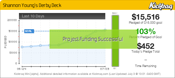
Shannon Young's Derby Deck (KS)

Find out about the latest and greatest playing cards hitting the market.
User avatar
badpete69
Moderator
Moderator
Posts: 4322
Joined: Thu Sep 27, 2012 8:43 pm
Collector: Yes
Player: Yes
Decks Owned: 1500
Location: Seattle WA
Has thanked: 50 times
Been thanked: 721 times

Shannon Young's Derby Deck (KS)

Unread post by badpete69 »


Image

Image

Image

Image
User avatar
Maddest Hammer
Member
Member
Posts: 354
Joined: Sat Mar 08, 2014 4:19 pm
Collector: Yes
Player: Yes
Decks Owned: 500
Location: San Antonio, TX
Has thanked: 86 times
Been thanked: 10 times

Re: Shannon Young's Derby Deck (KS)

Unread post by Maddest Hammer »

not a chance :?
will kidnap and torture your boss for a dollar...
User avatar
Diamond Back
Member
Member
Posts: 20
Joined: Wed May 28, 2014 9:36 pm
Collector: Yes
Player: Yes
Decks Owned: 1
Location: Minnesota

Re: Shannon Young's Derby Deck (KS)

Unread post by Diamond Back »

I like to how the deck uses gradients but I hate the card front. I guess the front doesn't really match the style of the back IMO.
User avatar
Mike Ratledge
Site Admin
Site Admin
Posts: 5496
Joined: Sat Nov 02, 2013 4:25 pm
Collector: Yes
Player: Yes
White Whale: OG USPCC Vanity Fair [mint]
Decks Owned: 7800
Location: Awendaw/McClellanville (Charleston county) S.C.
Has thanked: 1911 times
Been thanked: 760 times

Re: Shannon Young's Derby Deck (KS)

Unread post by Mike Ratledge »

huh? Sorry, insert quarter and play again...
>Mike<
"You can't please everyone, so you've got to please yourself"
They say "Ignorance is bliss". Obviously, some people are much happier than others...

Members are encouraged to
Show Us Your Cards!


Our UC2021 Decks entitled
"Odd Fellows"
by Lorenzo Gaggiotti / @Stockholm17
Coming soon: AKA
«Eighth Annual Decks»


UC members help maintain Portfolio52
THE Playing Card Database Online
Contact ecNate for details and access


UC2019 "Seventh Annual Decks"
by Montenzi Design
Funded 207% on KS: HERE


>>> UC Deck Sales <<<


Insert disclaimer here...
All information posted as fact is accurate at the time of posting to the best of my knowledge.
User avatar
Cbkimble
Moderator
Moderator
Posts: 2325
Joined: Mon Mar 31, 2014 11:16 am
Collector: Yes
Player: Yes
Decks Owned: 363
Has thanked: 115 times
Been thanked: 250 times

Re: Shannon Young's Derby Deck (KS)

Unread post by Cbkimble »

Mike Ratledge wrote:huh? Sorry, insert quarter and play again...
I think she might need a roll of quarters. Lol.
User avatar
chach
Member
Member
Posts: 1999
Joined: Fri May 31, 2013 2:22 pm
Collector: Yes
Player: Yes
White Whale: Vietnam Era Secret Weapon
Decks Owned: 0
Location: Armpit of California
Has thanked: 237 times
Been thanked: 280 times
Contact:

Re: Shannon Young's Derby Deck (KS)

Unread post by chach »

Opened it up expecting a deck based on horse racing, not roller derby. I'm kinda surprised actually that nobody has designed a horse racing deck yet w/ famous horses and jockeys throughout history. Phar Lap, Man O War, Barbaro, Sea Biscuit etc... could all be depicted.

Again, whoever runs with the idea, I get a cut. Though I'd settle for a few free decks... ;)
WTB/WTT: Vietnam Era Bicycle Secret Weapon Deck
User avatar
sprouts1115
Deck Artist
Deck Artist
Posts: 1897
Joined: Thu Oct 11, 2012 10:05 am
Collector: Yes
Decks Owned: 50
Location: san antonio, tx, usa
Has thanked: 98 times
Been thanked: 113 times
Contact:

Re: Shannon Young's Derby Deck (KS)

Unread post by sprouts1115 »

Damn. One sided courts. One sided back which need a lot of help. The QoD with the art into the cut border which makes the deck unplayable. The indexes seem a bit bigger which is good, if your going to kill the suit badge but the indexes need to be closer to the cut border. It's another Kickstarter that I wish they came here first before launching it. I like the font of the rank of the card, but that's about it....
RussellSprouts
LeacockDesign
Member
Member
Posts: 3
Joined: Tue Jun 03, 2014 7:56 pm

Re: Shannon Young's Derby Deck (KS)

Unread post by LeacockDesign »

Hi guys, I'm the designer of this deck and after reading a few of your comments, I thought I might ask your opinion about some of the technical aspects of the card design. Could you point me towards some examples of your ideal card layout? Where the type goes, and what traits to avoid?

I should point out that I'm the guy responsible for the type and graphic design on this deck, NOT the art. Since our campaign just began and we don't plan to complete all of the design until after it's over, there's an opportunity for us to address some of the design issues and have them fixed by the time we go to print. We are not, however, in a position to change anything stylistic about the art.

Thanks!

-Steve
Yashi
Member
Member
Posts: 598
Joined: Sat Feb 01, 2014 8:21 pm
Collector: Yes
Player: Yes
Has thanked: 15 times
Been thanked: 35 times

Re: Shannon Young's Derby Deck (KS)

Unread post by Yashi »

I strangely like this. I think the KoD is quite crudely drawn though.
User avatar
badpete69
Moderator
Moderator
Posts: 4322
Joined: Thu Sep 27, 2012 8:43 pm
Collector: Yes
Player: Yes
Decks Owned: 1500
Location: Seattle WA
Has thanked: 50 times
Been thanked: 721 times

Re: Shannon Young's Derby Deck (KS)

Unread post by badpete69 »

Steve

Welcome to the forums. I am the one that gave you the link in the comments. You will find plenty of advice here

Thanks for dropping by

Pierre
LeacockDesign
Member
Member
Posts: 3
Joined: Tue Jun 03, 2014 7:56 pm

Re: Shannon Young's Derby Deck (KS)

Unread post by LeacockDesign »

Thanks Pierre,

We appreciate your posts, I've been reading over the forum, seeing how deep the rabbit hole goes.
snsdmonkey
Member
Member
Posts: 174
Joined: Sun Apr 20, 2014 4:57 am
Has thanked: 2 times
Been thanked: 9 times

Re: Shannon Young's Derby Deck (KS)

Unread post by snsdmonkey »

I think potential deck artists confuse deck art with art. In my opinion there needs to be at least some sort of consistency between each card, unless of course you've got Black Rock decks which is from multiple artists. What I see here is just some artwork on cards, and that defeats the purpose so if one of your courts has a border, they should all have borders etc.

Also the back doesn't quite match the fronts...
LeacockDesign
Member
Member
Posts: 3
Joined: Tue Jun 03, 2014 7:56 pm

Re: Shannon Young's Derby Deck (KS)

Unread post by LeacockDesign »

Hey guys, back with some updates on the derby deck.

I went ahead and created a (very rough) mockup of the Queen of Diamonds with the border cut the same way as the rest of the courts, and I think I'm going to push for us to implement this change in the final printed deck. I find it more attractive than I expected to, and solving that problem with functionality just feels like the right move.

http://i.imgur.com/v0W15w0.jpg

I've attached some mockups of the number cards, curious if y'all have any comments/critiques.

http://i.imgur.com/FaFjhLN.jpg
http://i.imgur.com/W197pSk.jpg

I'm also working on a mockup with thinner margins, I'll post them when I've got them put together.

Thanks for your input, I appreciate it!
User avatar
Widdee
Member
Member
Posts: 995
Joined: Fri Nov 23, 2012 10:35 am
Has thanked: 12 times
Been thanked: 20 times

Re: Shannon Young's Derby Deck (KS)

Unread post by Widdee »

Yashi wrote:I strangely like this. I think the KoD is quite crudely drawn though.
Has somewhat of a pop-surrealist feel about it. I like it for that reason. Not crazy about all the white space on the backs. Would rather it match the courts in style and feel.
Post Reply

Who is online

Users browsing this forum: BaconWise, Bing [Bot], Evilgamer, manu and 8 guests