This is pretty bad to me. If the artist had put as much detail into the court heads as the rest, they might not be so bad. As they are right now, I dont see them making it even close any goal.
Eoghann wrote:Who's on getting the artist over here duty?
Haha Daniel since your in, you are it !
I'll go poke the beat - err - dino...
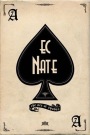
I didn't recognize the style, but it's the same guy that did the "Deck of Cards" (I don't remember the original name before they got the C&D order from lawyers).
>Mike<"You can't please everyone, so you've got to please yourself" They say "Ignorance is bliss". Obviously, some people are much happier than others...
Members are encouraged to Show Us Your Cards! ♠ ♥ ♣ ♦ Our UC2021 Decks entitled "Odd Fellows" by Lorenzo Gaggiotti / @Stockholm17
Coming soon: AKA
«Eighth Annual Decks» ♠ ♥ ♣ ♦ UC members help maintain Portfolio52
THE Playing Card Database Online
Contact ecNate for details and access ♠ ♥ ♣ ♦ UC2019 "Seventh Annual Decks"
by Montenzi Design
Funded 207% on KS: HERE ♠ ♥ ♣ ♦
>>> UC Deck Sales <<< Insert disclaimer here...
All information posted as fact is accurate at the time of posting to the best of my knowledge.
The designs are fine but I'm having trouble with the theme. What the hell is a royal dinosaur? To much of a stretch for me. Sounds like a Disney movie.
So I can name like, 4 things wrong with this deck...
(1) Some courts are full-bleed
(2) The super-thin borders on the back that might not be that thin when printed
(3) Court peek pips are not in the same position as the number cards' peek pips?
(4) The text on the back
But that's it! It's all fixable, if the designer is open to suggestions. I think the theme is unique, certainly more unique than the rush of Cthulus and Zombies and Minimalist decks...
My name's Reed and I'm one of the people behind the Royal Dinos design. Thanks so much for your interest! We'd love any and all feedback that can help us improve the project / art!
Godzillan: great suggestions! Do you have any more? I see what you're saying about the pips -- dumb mistake, I'll get on it soon -- thanks so much for pointing it out. We've been playing around with two of the court cards which have to be full bleed if we're going to fit the art in and keep it relatively similar sized. We're playing around with editing to avoid going off the edge. Lastly, what's your concern with text on the back? What's your reasoning? Thanks!
I LOVE the theme and the style, but I guess the source medium is what is holding me back. The pencil sketch look is a hard sell for me most of the time. Still a fun deck though and well done for what it is. Best of luck on this one, should have no problem getting funded with that goal. Hopefully the quality will be there.
I appreciate the idea that animated gifs reduce the number of photos, but the framerate is too quick for me to get a good look at the design. I'll break out a graphics editor later to dissect it because I'm intrigued, but it seems silly that I would need to do that. Would it be possible to link the gifs to a static image with the cards side-by-side? (Bonus for high res)
Ryz. Yes it would seem silly for you to do that but that is how the project creator set up his pics on his projects. If you have time to dissect all the pics feel free to go for it
Like the number cards, but the courts don't do it for me since it appears they use the same dinosaur for each color. Not a fan of the text on the courts either.
Pete, I know the preview post is directly pulling from KS. My request for slower frame rates/high res was directed at the creator three replies above mine. I'm unused to a free-for-all thread structure (rather than nested replies), and neglected to indicate my target audience. Sorry.
CBJ, thank you for slowing it down for me! I hope the creators will do something on the official KS page so that potential backers won't need to come here to see the frames more clearly.