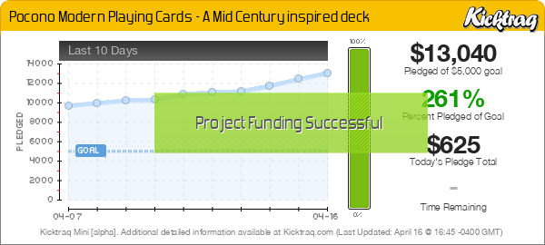
Pocono Modern Playing Cards
- MagikFingerz
- Site Admin
- Posts: 7811
- Joined: Mon Sep 24, 2012 7:32 pm
- Cardist: Yes
- Collector: Yes
- Player: Yes
- Magician: Yes
- White Whale: Sawdust and Delicious + uncuts
- Location: Norway
- Has thanked: 1808 times
- Been thanked: 1564 times
- Contact:
Re: Pocono Modern Playing Cards
I just don't understand this need to put text on back designs and courts that some people seem to have. It's usually just the name of the deck on the back, but also where the creator is from? And "Jack/Queen/King" on the court cards? Ugh...
Re: Pocono Modern Playing Cards
If I didn't have a connection to that area I would agree but for me that is a selling point. I do agree on the overstatement of the court carts being unneeded and looking wordy, it would be better filled in with trees or leaves.
- vasta41
- Card Oracle
- Posts: 5705
- Joined: Tue Sep 25, 2012 4:45 pm
- Location: Boston, MA
- Has thanked: 1556 times
- Been thanked: 1687 times
Re: Pocono Modern Playing Cards
I really like the style and colors of this deck.. but I think the tuck could use some work and it goes downhill from there. The back is gross (I 2nd what Tom said) and if I didn't already know about that place, I would also have no idea what's going on here. In summary, so close yet so far.
- th4mo
- Member
- Posts: 965
- Joined: Thu Jun 06, 2013 1:33 am
- Collector: Yes
- Player: Yes
- Location: Portland, OR
- Has thanked: 451 times
- Been thanked: 158 times
Re: Pocono Modern Playing Cards
Not a home run for me, either.
And while not technically "repeating courts", there does not seem to be a whole lot of variation between them...
Keep it Sizzlin'!
Re: Pocono Modern Playing Cards
You can totally picture a family in a wood cabin with the fire raging sitting around playing with these cards
- volantangel
- Moderator
- Posts: 3607
- Joined: Tue Nov 13, 2012 2:06 am
- Collector: Yes
- Player: Yes
- Decks Owned: 350
- Location: Singapore
- Has thanked: 219 times
- Been thanked: 297 times
Re: Pocono Modern Playing Cards
If they didn't have those repeating courts I'll be all over this. I love the style but drop the words and the back design can be more refined. Seem like this is a swing and a miss.th4mo wrote:Not a home run for me, either.
And while not technically "repeating courts", there does not seem to be a whole lot of variation between them...
My Collection = Playing Cards + Photography
- rjtomlinson1977
- ✔ VERIFIED Designer
- Posts: 627
- Joined: Fri Sep 13, 2013 8:34 am
- Decks Owned: 15
- Location: LeRoy, PA
- Has thanked: 1 time
- Been thanked: 116 times
- Contact:
Re: Pocono Modern Playing Cards
This is up in my neck of the woods. Excuse the pun. I like the deck overall but the tuck case needs work. Too many words for me.
Barclay Mountains Co.
- Bikefanatic
- Member
- Posts: 3086
- Joined: Tue May 07, 2013 7:23 am
- Collector: Yes
- Player: Yes
- Decks Owned: 333
- Location: United States
- Has thanked: 334 times
- Been thanked: 412 times
Re: Pocono Modern Playing Cards
The tuck looks nice with me. The card backs are awful. The orange, blue and black combo looks ok. The court animals look good but it's horrible they're repeated. They could of used 9 more different animals.
"When I like something, I buy. No matter who did it, how many were printed or how many (re)colors exist.
When I don't like something, I pass. No matter who did it, how many were printed or how many (re)colors exist."
-Lotrek
*MY PORTFOLIO52 PROFILE https://portfolio52.com/profile/26674
* MY SELLER REVIEW viewtopic.php?f=28&t=16586
When I don't like something, I pass. No matter who did it, how many were printed or how many (re)colors exist."
-Lotrek
*MY PORTFOLIO52 PROFILE https://portfolio52.com/profile/26674
* MY SELLER REVIEW viewtopic.php?f=28&t=16586
- Sparkz
- Member
- Posts: 334
- Joined: Tue Sep 17, 2013 10:49 am
- Collector: Yes
- Decks Owned: 1000
- Location: Illinois USA
- Has thanked: 100 times
- Been thanked: 125 times
- Contact:
Re: Pocono Modern Playing Cards
It was pointed out that this seems to be a promotional deck for the company (http://www.poconomodern.com/)
With that in mind, I kind of like it. Far cry from slapping your company name on a standard deck and calling it a day.
-
- Deck Artist
- Posts: 7
- Joined: Mon Mar 17, 2014 6:31 pm
Re: Pocono Modern Playing Cards
Hey All - I'm the Owner of Pocono Modern and the creator of this campaign. I really appreciate all the feedback and constructive criticism. With regard to the deck design Widdee is totally correct- It's not meant to be too serious and we actually tried to design it so that it would appeal to all ages - kids and adults alike. Also, because we designed the court cards as atypical, we wanted the system to be quickly legible. I have purchased cards from other campaigns and was frustrated by how difficult it was to actually play with the cards. We felt that by calling out the court cards with the names, it would be unique and retro. I can see how it could be conceived as distracting or annoying and perhaps we will revisit that before the final run. I also agree somewhat with the comments about the back. We had at least two dozen other options that were more geometric with no text, but there seemed to be a big disconnect between the front and the back. Perhaps we will take another look at that also. As this is our first deck design, we are always seeking to improve our work. Keep the comments coming and we will also let you know if and when we make some design updates. Thanks!
- Eoghann
- Moderator
- Posts: 3467
- Joined: Sat Jul 20, 2013 10:47 am
- Collector: Yes
- Player: Yes
- Has thanked: 153 times
- Been thanked: 428 times
Re: Pocono Modern Playing Cards
Absolutely love the retro style! I agree that the over abundance of text on that back is somewhat off putting but everything else I'm ok with, even the labeled courts..to some extent.
-
- Member
- Posts: 2423
- Joined: Mon Oct 01, 2012 3:11 pm
- Collector: Yes
- Player: Yes
- White Whale: None
- Decks Owned: 0
- Has thanked: 240 times
- Been thanked: 985 times
Re: Pocono Modern Playing Cards
Check again, they have specific pledges for US and non-US. In fact, the shipping for International is quite reasonable!vjose32 wrote:Only ships to US - pass!
- volantangel
- Moderator
- Posts: 3607
- Joined: Tue Nov 13, 2012 2:06 am
- Collector: Yes
- Player: Yes
- Decks Owned: 350
- Location: Singapore
- Has thanked: 219 times
- Been thanked: 297 times
Re: Pocono Modern Playing Cards
If these didnt have repeating courts ill probably be in for the $60 tierStrag wrote:Check again, they have specific pledges for US and non-US. In fact, the shipping for International is quite reasonable!vjose32 wrote:Only ships to US - pass!
My Collection = Playing Cards + Photography
- Widdee
- Member
- Posts: 995
- Joined: Fri Nov 23, 2012 10:35 am
- Has thanked: 12 times
- Been thanked: 20 times
Re: Pocono Modern Playing Cards
I agree with those who don't like the repeating courts. There's all sorts of other animals that could fill out the court sets- otter, beaver, eagle, hunting dog, mountain lion, mallard, etcetera. If you're going to do it, go the extra mile and make it totally unique. Heck, it's gotta go through the press one way or the other, make it count!
That said I really like the deck and am in for a couple. Will increase it if some tweaks are made.
Re: Pocono Modern Playing Cards
I think if more court cards are added , which would definitely improve the deck, that animal should be displayed that prominently live in that area. Blue heron, Woodpecker, Bald eagle, Cotton tail, Chipmunk, Flying squirrel,Porcupine, Opossum,Bobcat, Voles, Beaver, and Skunks..... would all work well. Also, all of Widdee's suggestions are viable.
- DragonSoul
- Member
- Posts: 352
- Joined: Mon Jun 24, 2013 8:43 pm
- Collector: Yes
- Location: Atlanta, GA
- Has thanked: 13 times
- Been thanked: 60 times
Re: Pocono Modern Playing Cards
I love the retro style as well. I'm o.k. with the tuck and I can even live with the backs because they do fit the theme. But, I wouldn't mine seeing some alternate designs. Maybe let the backers vote. However, I am not a fan of repeating courts and would really love to see more animals.
-
- Deck Artist
- Posts: 7
- Joined: Mon Mar 17, 2014 6:31 pm
Re: Pocono Modern Playing Cards - UPDATE
I wanted to thank you all again for the feedback and the support - we are definitely taking it all to heart and are going to be coming up with new designs for the BACK of the card which don't have any text. We are going to develop three or four designs and then let the backers vote - I am going to post an update on the campaign shortly. We are also coming up with some alternate court cards to keep things interesting. The only thing is that we want to keep the animals specific to the Pocono area, so stay tuned for those new designs as well. We want to make the deck as great as possible and I know we will get there! Thanks again.
- Eoghann
- Moderator
- Posts: 3467
- Joined: Sat Jul 20, 2013 10:47 am
- Collector: Yes
- Player: Yes
- Has thanked: 153 times
- Been thanked: 428 times
- Widdee
- Member
- Posts: 995
- Joined: Fri Nov 23, 2012 10:35 am
- Has thanked: 12 times
- Been thanked: 20 times
Re: Pocono Modern Playing Cards - UPDATE
All right!!! Thanks for your efforts, sounds fantastic.kkalashian wrote:I wanted to thank you all again for the feedback and the support - we are definitely taking it all to heart and are going to be coming up with new designs for the BACK of the card which don't have any text. We are going to develop three or four designs and then let the backers vote - I am going to post an update on the campaign shortly. We are also coming up with some alternate court cards to keep things interesting. The only thing is that we want to keep the animals specific to the Pocono area, so stay tuned for those new designs as well. We want to make the deck as great as possible and I know we will get there! Thanks again.
Re: Pocono Modern Playing Cards - UPDATE
I'm excited to hear this. I love animal decks but this one felt a little repetitive to me, with all the courts being the same. I look forward to seeing the new courts!kkalashian wrote:I wanted to thank you all again for the feedback and the support - we are definitely taking it all to heart and are going to be coming up with new designs for the BACK of the card which don't have any text. We are going to develop three or four designs and then let the backers vote - I am going to post an update on the campaign shortly. We are also coming up with some alternate court cards to keep things interesting. The only thing is that we want to keep the animals specific to the Pocono area, so stay tuned for those new designs as well. We want to make the deck as great as possible and I know we will get there! Thanks again.
- volantangel
- Moderator
- Posts: 3607
- Joined: Tue Nov 13, 2012 2:06 am
- Collector: Yes
- Player: Yes
- Decks Owned: 350
- Location: Singapore
- Has thanked: 219 times
- Been thanked: 297 times
Re: Pocono Modern Playing Cards
Ill be in if the new courts take on new animals done in the same style =)
My Collection = Playing Cards + Photography
-
- Deck Artist
- Posts: 7
- Joined: Mon Mar 17, 2014 6:31 pm
Re: Pocono Modern Playing Cards - New Backs
We just put the new back designs on our campaign (I was unable to figure out how to post them here so if someone could fill me in, I'd love to do that too) - we are going to have the supporters vote - We are also going to be doing new Court Cards to add to the existing - we did options with all different animals and thought they were too confusing but we will have four different versions of each animal which I think you will enjoy! We have taken your advice to heart and removed the text on the back (as well as the court cards coming out) and we have some more options to come. Thanks again for all your feedback! - Kraig
- Eoghann
- Moderator
- Posts: 3467
- Joined: Sat Jul 20, 2013 10:47 am
- Collector: Yes
- Player: Yes
- Has thanked: 153 times
- Been thanked: 428 times
Re: Pocono Modern Playing Cards - New Backs
When you're replying, instead of quick reply choose full editor. There you will see a UCIMG button. Press that and copy your image link in between both brackets.kkalashian wrote:We just put the new back designs on our campaign (I was unable to figure out how to post them here so if someone could fill me in, I'd love to do that too) - we are going to have the supporters vote - We are also going to be doing new Court Cards to add to the existing - we did options with all different animals and thought they were too confusing but we will have four different versions of each animal which I think you will enjoy! We have taken your advice to heart and removed the text on the back (as well as the court cards coming out) and we have some more options to come. Thanks again for all your feedback! - Kraig
Like this:
Code: Select all
[ucimg]www.image.jpg[/ucimg]
Went ahead and did it for you.
Personally, despite it being one way, I really like #4.
- MagikFingerz
- Site Admin
- Posts: 7811
- Joined: Mon Sep 24, 2012 7:32 pm
- Cardist: Yes
- Collector: Yes
- Player: Yes
- Magician: Yes
- White Whale: Sawdust and Delicious + uncuts
- Location: Norway
- Has thanked: 1808 times
- Been thanked: 1564 times
- Contact:
Re: Pocono Modern Playing Cards - New Backs
Or click the "Post Reply" button in the lower left cornerEoghann wrote:When you're replying, instead of quick reply choose full editor.
- MagikFingerz
- Site Admin
- Posts: 7811
- Joined: Mon Sep 24, 2012 7:32 pm
- Cardist: Yes
- Collector: Yes
- Player: Yes
- Magician: Yes
- White Whale: Sawdust and Delicious + uncuts
- Location: Norway
- Has thanked: 1808 times
- Been thanked: 1564 times
- Contact:
Re: Pocono Modern Playing Cards
Completely agree. Something's just not right with 1 and 2, the spyglass effect just looks a bit strange. And I don't like 4 at all, despite my past expressions of fondness for borderless designs.Widdee wrote:Three is the only true two-way and first impression I liked it best. Like the black borders on 2 and 3.
Number 3 is solid.
Who is online
Users browsing this forum: Bing [Bot], Fenrir, Google [Bot], juxtaposed and 3 guests