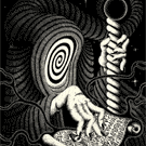
Black Requiem, Counterspell Edition - by Stockholm17
This one was hard to photograph for me. It’s so hard to make the black foil on the black tuck look nice in photos. It looks amazing irl, but I’m not sure my photos do it justice.
Also the (very nice) foil on the cards is hard to photograph because the angle at which the foil shines is the same angle at which the rest of the card shines. If the rest of the card had a matte surface finish, the foil would stand out much better in photos. But I guess that might affect how smoothly the cards handle. They feel great btw!
I don’t know how y’all feel about these photos, but I’m okay with them. I didn’t use a tripod for the photos of the cards, instead I just handheld the camera and used a wide aperture, which lead to a shallow depth of field. So parts of the cards are out of focus on purpose. If I got paid to do this, I’d try harder. But I kinda like this esthetic.


 @playingcardophile