Firstly: my strong suggestion is that you revisit your Kickstarter preview/banner image. Yes, the tuck turnaround looks cool, but there's no shortage of deck campaigns that can boast a neat tuck render and
literally not a damn thing else -
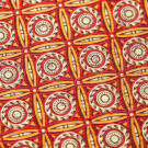
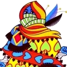
especially in the crowded subgenre of "Japan Cool" - and I almost doomscrolled right past yours because there's nothing in your campaign banner that shows this isn't yet another phone-it-in, low-effort JAB job from some schmuck with a free trial of Photoshop. Your campaign just hit goal; use the opportunity to update your banner and throw in some of your fantastic court art alongside the "FUNDED IN X HOURS!" blurb. You have the art assets to really jack up your "curb appeal" and you're kneecapping (er,
curbstomping?) yourselves by not using them.
Speaking of that tuck, though:
vasta41 wrote: ↑Tue Nov 10, 2020 12:46 pm
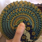
Again, we have another case of a very colorful deck inside a black tuck that has only 1 color[...]I just wish the tuck had more to it since it doesn't seem to do justice to the beautifully drawn cards on the inside.
Paul
beats this hobby horse to death because, like all small children, his favorite flavor is "
Superman" and his favorite color is "all of them." I
generally disagree (because he is wrong) and
generally let my disagreement pass unremarked (because I
love my son).
However.
If you,
hypothetically, were to float the idea of adding a
second foil color - to play up the neon-chic cyberpunk vibe, you understand - I would not,
in this specific instance and narrowly defined context, be aesthetically opposed to that. Foil's 'spensive, sure, so make it a stretch goal; you'll hit it. (Hell, at 250% of goal as of this writing, you might've hit it already.) It's a single-run KS-exclusive deck, so you may as well go big or go home. Really make it sing. (But please,
for the love of Tsundere Jesus, don't get so distracted by the tuck bling that you
forget to check your uncut proofs.)
Lastly - and I wondered this about your
Heroes of Japan campaign also - how did you source the Japanese text used for the deck? Are you consulting with somebody who knows the language? Forgive me for wording this bluntly, but some of the choices made feel, if not
quite "ill-advised white girl tattoo"-y, then certainly a little "Google Translate"-y. I'm particularly eyeing the characters selected for the backs and cards A-10; I'm not well-versed in premodern Japanese naming conventions, so without doing some research I'm not qualified to judge that.


 . Can't put my finger on it.
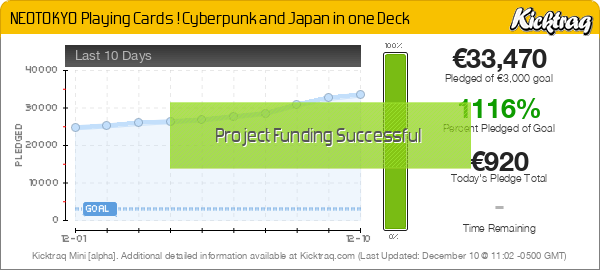
 Only 24 Hours Left


