Hey everyone,
since the first Temple of Eternity campaign failed last year I have been experimenting with different designs and I think I finally found something that makes me happy. In my deep dive into the topic I came across the Temple of Eternity in the "Parco dei Mostri" in Italy and immediately fell in love. I don't want to go to deep into it already, but let's say I listend to your feedback and there are way more details to discover this time. I would love to hear your thoughts and feedback.
Here a few test renders of the current work in progress status:
Temple of Eternity - Italy Edition
-
Sophisticarded

- Member

- Posts: 19
- Joined: Wed Sep 16, 2020 8:51 am
- Has thanked: 31 times
- Been thanked: 16 times
-
MagikFingerz

- Site Admin

- Posts: 7819
- Joined: Mon Sep 24, 2012 7:32 pm
- Cardist: Yes
- Collector: Yes
- Player: Yes
- Magician: Yes
- White Whale: Sawdust and Delicious + uncuts
- Location: Norway
- Has thanked: 1821 times
- Been thanked: 1575 times
- Contact:
Re: Temple of Eternity - Italy Edition
First of all, I would remove the title of the deck from the back design. Having it both on the front of the tuck box as well as the Ace of Spades is plenty enough, it doesn't add anything to the art of the back.
Second, and this is more subjective, but I'm personally not a fan of monochrome back designs, they're simply too boring. I would experiment with some color, gradients, highlighted elements or anything that breaks the monotony, and see how it works.
Third, another thing that makes the back design somewhat boring (to me), is the areas I've highlighted below in red. They're repeating patterns that take up a lot of space. I would get rid of those and move the columns out into the corners, then fill the space inside with some other artwork/pattern.
- Temple of Eternity back edit.jpg (253.67 KiB) Viewed 7499 times
-
Sophisticarded
- Member
- Posts: 19
- Joined: Wed Sep 16, 2020 8:51 am
- Has thanked: 31 times
- Been thanked: 16 times
Re: Temple of Eternity - Italy Edition
Thanks for the feedback. Good points. I will try around with all your suggestions.
I've been struggling with the outer frame for a while. I like the elements at the top and bottom because they come from the Temple of Eternity decoration, but maybe I should put something else in the middle to reduce the repetition. I will try around with a few new ideas.
I've been struggling with the outer frame for a while. I like the elements at the top and bottom because they come from the Temple of Eternity decoration, but maybe I should put something else in the middle to reduce the repetition. I will try around with a few new ideas.
-
Sophisticarded
- Member
- Posts: 19
- Joined: Wed Sep 16, 2020 8:51 am
- Has thanked: 31 times
- Been thanked: 16 times
Re: Temple of Eternity - Italy Edition
Hey, I collaborated with an artist to bring my vision to life in a more dynamic and artistic way.
This is the first draft that he did. (It is not the final artwork.)
What do you think about it?
This is the first draft that he did. (It is not the final artwork.)
What do you think about it?
- Attachments
-
-
Eric Lee
- Member
- Posts: 2507
- Joined: Thu Apr 05, 2018 5:11 am
- Collector: Yes
- Player: Yes
- White Whale: Korchma Taras Bulba
- Location: Malaysia
- Has thanked: 804 times
- Been thanked: 1018 times
Re: Temple of Eternity - Italy Edition
That's definitely a very impressive improvement. Definitely looks more deserving of the title "Temple of Eternity"
-
Sophisticarded
- Member
- Posts: 19
- Joined: Wed Sep 16, 2020 8:51 am
- Has thanked: 31 times
- Been thanked: 16 times
Re: Temple of Eternity - Italy Edition
We are currently trying to take away the comic look and achieve a more playing card feel. Here are some very rough cut together concepts:
- Attachments
-
-
-
-
- werhrtzjzujz9.PNG (679.45 KiB) Viewed 6739 times
-
Sophisticarded
- Member
- Posts: 19
- Joined: Wed Sep 16, 2020 8:51 am
- Has thanked: 31 times
- Been thanked: 16 times
Re: Temple of Eternity - Italy Edition
We are making progress, but I don't think we reached my vision yet. What do you think about the direction? Is it a good idea to keep perfecting this concept?
- Attachments
-
-
Sophisticarded
- Member
- Posts: 19
- Joined: Wed Sep 16, 2020 8:51 am
- Has thanked: 31 times
- Been thanked: 16 times
Re: Temple of Eternity - Italy Edition
I've now switched to Illustrator to vectorize everything and improve the concept. There are still a lot of details that need to be improved, but I am slowly but surely making progress. Here is another work in progress image:
- Attachments
-
-
Harvonsgard
- Member
- Posts: 9786
- Joined: Fri Mar 01, 2019 6:53 am
- Cardist: Yes
- Player: Yes
- White Whale: Your Mami
- Decks Owned: 420
- Location: Paro
- Has thanked: 1792 times
- Been thanked: 4608 times
Re: Temple of Eternity - Italy Edition
For my taste, the temple could still be worked on. It looks a bit disconnected from the rest, if that makes sense. The rest of the back design is very harmonic and well balanced imo. The disconnect of the temple, is not a flaw per se btw, if you wanna have the temple to stick out then I'd say it's fine.
-
Sophisticarded
- Member
- Posts: 19
- Joined: Wed Sep 16, 2020 8:51 am
- Has thanked: 31 times
- Been thanked: 16 times
Re: Temple of Eternity - Italy Edition
More harmony is actually one of my top priorities going forward. The temple should stand out but not be too incoherent. Thank you very much for your feedback, I really appreciate it. The design has already improved extremely through feedback. I love working with feedback and not having to guess if people like the design.
-
MagikFingerz
- Site Admin
- Posts: 7819
- Joined: Mon Sep 24, 2012 7:32 pm
- Cardist: Yes
- Collector: Yes
- Player: Yes
- Magician: Yes
- White Whale: Sawdust and Delicious + uncuts
- Location: Norway
- Has thanked: 1821 times
- Been thanked: 1575 times
- Contact:
Re: Temple of Eternity - Italy Edition
This might just be my taste, because I haven't seen many others comment on it before, but I feel like the top/bottom "row" of the back is superfluous. It's a bit of a pet peeve of mine, but I tend to think that the "frames" that traditional back designs often has, in general only takes away space from the "main" artwork without adding anything of substance. In this case, the "frame" is quite thin, which I like, but then the very top/bottom parts seem to almost be tacked on. Does this make sense?
Apart from that, the artwork of this back design is really good IMO. Balanced and coherent. Quite busy and intricate, but not too much that it becomes a mesh of line art that some designs do (in my eyes). Color scheme is also nice.
Re: temple standing out - I think it's hard to avoid this in this type of back design (ie the Rider Back-esque dual circles with a central element). It's not something that bothers me, particularly since it's so tied to the theme.
-
Sophisticarded
- Member
- Posts: 19
- Joined: Wed Sep 16, 2020 8:51 am
- Has thanked: 31 times
- Been thanked: 16 times
Re: Temple of Eternity - Italy Edition
I see your point, and I already agreed with you, which is why I removed the thick side frames. The top and bottom frames, however, are another matter as they are supposed to symbolize entablatures above the columns of a Roman temple. Or a later Italian building inspired by it.
Another connection for me is to the old Temple of Eternity design. This also had a larger top and bottom frame. Of course there is not much left of the old design, but especially the three-dimensionality is something I would like to work on further to create a little more connection to the original inspiration.
This was one of the goals for the original design:
Apart from the fact that a change there would destroy the complete balance of the design and I would have to rework a lot of it.
Thanks for your feedback.
This is especially important to me since I'm not really an artist and usually write design documents rather than work on execution in person.
For me, this project really is the attempt of a redemption
Another connection for me is to the old Temple of Eternity design. This also had a larger top and bottom frame. Of course there is not much left of the old design, but especially the three-dimensionality is something I would like to work on further to create a little more connection to the original inspiration.
This was one of the goals for the original design:
That's why I want to keep the style of the entrance with the entablatures. At the end of the day, of course, it's all a matter of taste, but for me, it's not just a filling element, it actually means something, and that was done by me on purpose. When I have worked out the three-dimensionality further, the image I have in my head may become clearer."We wanted to create the feeling of a magical temple from the past, with all its monumental entrances, intricate decorations and secret chambers surrounding the shrine of eternity in the heart of the card. That's why we chose to go for interlacing frames to convey dimensionality[...]"
Apart from the fact that a change there would destroy the complete balance of the design and I would have to rework a lot of it.
Thanks for your feedback.
It's good to hear that some of my design goals seem to be working."Balanced and coherent. Quite busy and intricate, but not too much that it becomes a mesh of line art that some designs do (in my eyes)."
This is especially important to me since I'm not really an artist and usually write design documents rather than work on execution in person.
For me, this project really is the attempt of a redemption
-
Sophisticarded
- Member
- Posts: 19
- Joined: Wed Sep 16, 2020 8:51 am
- Has thanked: 31 times
- Been thanked: 16 times
Re: Temple of Eternity - Italy Edition
This is just a little first look at what I am doing with the court cards right now. It is important to me that the cards are playable, but also have a custom touch to them. To achieve that I am combining the classic Arrco courts with some inspirations from the Italien Dal Negro Piemontesi courts. I also put a tiny reference to the theme into it, reworked the Arrco faces, changed the color scheme to fit the back design etc.
What do you think?
What do you think?
- Attachments
-
-
wingedpotato
- Member
- Posts: 738
- Joined: Thu Apr 20, 2017 2:45 pm
- Collector: Yes
- Player: Yes
- White Whale: Cardistry-Con Tally Ho 2018
- Decks Owned: 600
- Has thanked: 914 times
- Been thanked: 457 times
Re: Temple of Eternity - Italy Edition
That's a sharp looking king. The only thing I wonder about is the little bit of white under the beard & hair. On the one hand it makes the head look less "pasted on." On the other hand, it kind'a looks like you forgot to color it in. It is nice to see a comparison to see all the micro-improvements over the orginals.
-
Sophisticarded
- Member
- Posts: 19
- Joined: Wed Sep 16, 2020 8:51 am
- Has thanked: 31 times
- Been thanked: 16 times
Re: Temple of Eternity - Italy Edition
Thanks for the feedback. I used that on most of the characters because the Piemontesi cards show a bit more skin. It looks better on some of them. I think if you see them all it might feel a bit more natural.wingedpotato wrote: ↑Tue Dec 14, 2021 6:51 pm That's a sharp looking king. The only thing I wonder about is the little bit of white under the beard & hair. On the one hand it makes the head look less "pasted on." On the other hand, it kind'a looks like you forgot to color it in. It is nice to see a comparison to see all the micro-improvements over the orginals.
True the comparison is very helpful. I also did a comparison for the back design so you can see the development there.
I actually have another version of the back design, but I will work a bit more on it.
- Attachments
-
-
GandalfTheWhite

- Member
- Posts: 277
- Joined: Wed Sep 02, 2020 2:20 pm
- Collector: Yes
- Player: Yes
- Decks Owned: 56
- Has thanked: 318 times
- Been thanked: 128 times
Re: Temple of Eternity - Italy Edition
Sorry for the ignorance, what is the importance of the snake? Never liked snakes on card backs. Just my opinion and curious to know the meaning/inspiration of having snake on the back design.
-
Sophisticarded
- Member
- Posts: 19
- Joined: Wed Sep 16, 2020 8:51 am
- Has thanked: 31 times
- Been thanked: 16 times
Re: Temple of Eternity - Italy Edition
It's perfectly fine, don't worry.
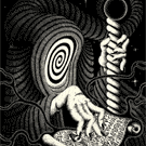
The snake represents the Ouroboros. Which is an ancient symbol depicting a serpent or dragon eating its own tail. It actually comes from ancient Egypt and then made its way into western tradition. The Ouroboros is often interpreted as a symbol for eternal cyclic renewal or a cycle of life, death, and rebirth.
Taking that I actually tried to make a triple eternity centerpiece.
1. The Ouroboros represents eternity.
2. The two Ouroboros (or Ouroboroi?) also build the classical 8 for infinity.
3. They are also two interlocking circles, which gives them the third meaning representing the never-ending path in loving another person. (Which is kind of connected to wedding rings etc. but could also be a symbol of eternal friendship.
4. The snake is one of the banner symbols of the Orsini family. Vicino Orsini was the founder of the Parco dei Mostri, the park where the Temple of Eternity stands.
Does that make sense? I will have to explain that again in the Kickstarter campaign hopefully coming next year and it is important to me that people understand the meaning even if they just scroll by.
-
Sophisticarded
- Member
- Posts: 19
- Joined: Wed Sep 16, 2020 8:51 am
- Has thanked: 31 times
- Been thanked: 16 times
Re: Temple of Eternity - Italy Edition
Hey everyone.
I am super busy with my day job right now, but I am still working on the Temple of Eternity.
After the last feedback, I continued to improve the back design and also tried around with a few approaches. (Not all of them are finished, but I think the idea comes across.)
I would love to get more feedback and opinions on those designs. (Image 1 is the improved version of the last design.)
- Attachments
-
-
MagikFingerz
- Site Admin
- Posts: 7819
- Joined: Mon Sep 24, 2012 7:32 pm
- Cardist: Yes
- Collector: Yes
- Player: Yes
- Magician: Yes
- White Whale: Sawdust and Delicious + uncuts
- Location: Norway
- Has thanked: 1821 times
- Been thanked: 1575 times
- Contact:
Re: Temple of Eternity - Italy Edition
I like 2 better than 1, just because of the proportions of the design elements. But I tend to like designs that break (at least some) conventions, which is why I think I prefer 3 over the others. Though it might be even better if you rework the "outer" elements (the top/bottom row and the top of the pillars), as it looks more like a background the center elements are blocking rather than something that complements the entire aesthetic.
Scrolling up, this has come a long way. Nice work!
Scrolling up, this has come a long way. Nice work!
-
wingedpotato
- Member
- Posts: 738
- Joined: Thu Apr 20, 2017 2:45 pm
- Collector: Yes
- Player: Yes
- White Whale: Cardistry-Con Tally Ho 2018
- Decks Owned: 600
- Has thanked: 914 times
- Been thanked: 457 times
-
Squiddle_Ink

- Member
- Posts: 158
- Joined: Sat Oct 03, 2020 5:39 pm
- Has thanked: 13 times
- Been thanked: 238 times
Re: Temple of Eternity - Italy Edition
I'm not sure how you would print 3 because those outer circles touch the edge of the card, usually this pushes the price of printing up when you print to edge and obviously causes issues with registration. I think it's worth it if your having flowing designs that meet up when you put cards together but just for the sake of the circles touching the edge I dont think it's worth it. And I don't think it will look as good as a solid colour or white border.
I do quite like the almond shape in 3 but id shrink the almond and it's contents and the two outer circles in so they are not touching the actual edge of the card.
Looks great though
I do quite like the almond shape in 3 but id shrink the almond and it's contents and the two outer circles in so they are not touching the actual edge of the card.
Looks great though
Stacey Jay Kelly - playing card designer @ Squiddle Ink // Instagram: https://bit.ly/3Uq4UWD // Webstore: https://squiddleinkshop.com/
-
Sophisticarded
- Member
- Posts: 19
- Joined: Wed Sep 16, 2020 8:51 am
- Has thanked: 31 times
- Been thanked: 16 times
Re: Temple of Eternity - Italy Edition
Hey everyone,
I, unfortunately, had to take a bit of a break. Now I am back and happy to continue working on this deck. The break was good for me and helped me look at the design with a fresh eye. I also printed a prototype version of the king of clubs and the back design which helped me even more.
This is the new version of the back design compared to the old version:
I tried to incorporate your feedback and stay true to my vision. In addition to that I reworked a lot of details that didn’t work out in the printed version. Including the level of detail on the Temple itself.
Harvonsgard I hope it does look more harmonic now.
MagikFingerz I am sorry, but I couldn’t get myself to remove the top/bottom row However, I did increase the size of the main artwork.
I also kept working on the number cards, the courts and recently started to work on the aces.
Wingedpotato I added some lines to the places where you can see the skin of the characters. In hope
that this solution avoids the feeling of an area that got forgotten.
Furthermore, I finally found a concept for the joker that makes me happy. The character sitting on the centerpiece of the back design is inspired by Vicino Orsini the founder of the Temple of Eternity in the "Parco dei Mostri".
I, unfortunately, had to take a bit of a break. Now I am back and happy to continue working on this deck. The break was good for me and helped me look at the design with a fresh eye. I also printed a prototype version of the king of clubs and the back design which helped me even more.
Harvonsgard I hope it does look more harmonic now.
MagikFingerz I am sorry, but I couldn’t get myself to remove the top/bottom row
I also kept working on the number cards, the courts and recently started to work on the aces.
that this solution avoids the feeling of an area that got forgotten.
Furthermore, I finally found a concept for the joker that makes me happy. The character sitting on the centerpiece of the back design is inspired by Vicino Orsini the founder of the Temple of Eternity in the "Parco dei Mostri".
-
Harvonsgard
- Member
- Posts: 9786
- Joined: Fri Mar 01, 2019 6:53 am
- Cardist: Yes
- Player: Yes
- White Whale: Your Mami
- Decks Owned: 420
- Location: Paro
- Has thanked: 1792 times
- Been thanked: 4608 times
Re: Temple of Eternity - Italy Edition
The made improvements do look good.
-
rousselle

- Site Admin
- Posts: 4914
- Joined: Thu Aug 01, 2013 11:35 pm
- Collector: Yes
- Player: Yes
- Magician: Yes
- Has thanked: 7808 times
- Been thanked: 2649 times
Who is online
Users browsing this forum: No registered users and 0 guests