The first of the Essential decks are coming along really nicely too. It's a classic deck, in an unusual colour scheme where we're experimenting with transparent foils for the tuck box to complement the metallics.
I also got my hands on this today, Jocu is absolutely killing it
Some of the face proportions are a little jarring to me, although it's hard for me to pinpoint exactly what is distracting about them. But I really like the simpler aesthetic of the courts overall. The real winners for me are the color palette and the tuck case - which passes the smell test with flying colors!
Today marks the general release of our deck Essential Lavender as well as the gilded edition of this months Inner Circle release Essential Calendula
For the first time non members can pick up the standard lavander edition at www.Jocu.cards whilst members can grab the new gilded variant. If you do so before Monday it will be included with this months package for sure.
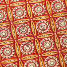
Too many of Jocu's decks have been monochrome, to my taste. Single color backs just doesn't bring out the design well enough IMO. Coming out of boxes that aren't monochrome just makes it that much more disappointing, classic T11-syndrome.
For a few months now a lot of the Cartamundi decks I've gotten have had extremely uneven finishing on the cards in the deck - anyone else noticed this? Look at the two comparison shots I took of the fronts and backs of cards in the deck