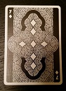
Price pending, I will be pledging for these. Some minor nit-picks: as mentioned above, I wish the courts weren't one-way. I don't mind the banner separating the two images in this particular design but simply adding an extra fold or ribbon and writing the text upside-down is not the solution. I've seen that done before and it doesn't look good- too busy. So maybe the design pictured is the best option... IDK. Like I said, minor issue.
The other issue, although minor also, is not something I expect to be changed but I really wish it were. And that is the tuck. I think the design is fine the way it is but I wish the "constellation oval" were much larger. I like when the deck titles are large and obvious.
Everything else is spot on- printer, artwork, backs, theme (I LOVE that it's just one deck). And even as-is, if the price is right on these I'm in!
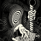
EDIT: I don't have access to Photoshop on the computer I'm currently on but here is an absolutely awful render of what I'm talking about:
Something like that.