Those are definitely some bold lines! Beautiful!!

Thank you @Decknowledgy
I tend to use very very thin lines, so working with bold lines was actually one of the most challenging parts to me

will certainly pick up a couple, looks simple ( tho im sure it wasnt to design ), different, definitely a must have for me....
i said different tho it giving me meadowlark vibes
Thanks!
As for the vibes... Maybe the Meadowlark deck is just recent and successful (so it’s stuck in your head)? Honestly, I've focused very much on Bicycle courts as a reference for the faces, but who knows... I mean: vibes are something very personal, I guess, and obviously I totally respect your point of view in any case.
 In short: Who am I for judging your vibes!
Hmm... not my cup of tea to be honest. Colour scheme indeed Meadowlark vibes and some similarities in court style aswell, which isn't bad but as written, not my prefered style.
On playing cards I tend to like thinner line work.
De gustibus

Thank you for joining the discussion anyway
I agree, that's the first thing I thought of. Still, I like it. Might be a little on the simple side, but I like it.
Happy you like it
Simple is not bad to me in this case 
Unfortunately this reminded me too much of Medowlark so I really wasn't able to get any enthusiasm going. Nice deck though.
I'll answer the second sentence (the glass half full?). Thank you


 .
.


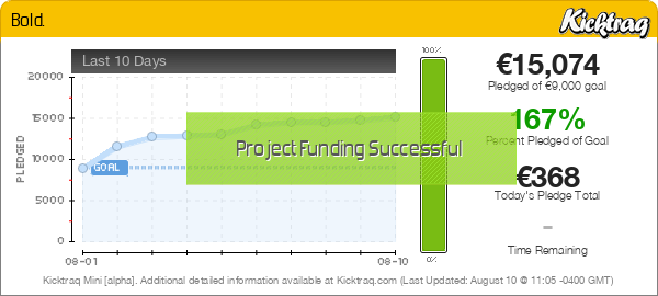
 Congrats on being funded.


 I'm happy to have finally surpassed the goal!