This thread is to introduce the deck I will be designing and publishing in 2020. As a nonsense writer and illustrator I create various projects and commit a lot of time and energy into their narrative and creative processes, so do not expect to create more than one every year or two years. Following my entry into the playing card design community with Culturae Animalis - a deck of luxury gold-gilded, full-bleed art playing cards dedicated to environmental sustainability and animal welfare (2019), I'm pleased to announce the beginning of my next playing card project.
Over the following half-a-year I will occasionally update this with artwork, and ideas, all prepared for your feedback and input. I want to involve the UC members from the beginning.
I am very proud of what I created with Culturae Animalis, and have approached this deck as a completely unique 'sister' deck. Much as with many sisters, its essence resonates the same passions and ethos, but it will stand alone and entirely fresh. I have taken all feedback given from my first project and incorporated in into this, the most significant difference being that this whole deck will be in full colour.
Thus far, the name of the deck and many other elements are yet to be decided. I have formed the concepts and inspirations, part of the narrative, and begun work on the pip art. Unlike Culturae Animalis, this deck will be entirely inspired by animals in Japanese society.
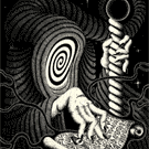
And I'm pleased you share with you the first part of pip art. This is the 9 - represented by the legendary nine-tailed fox (an idea arrived at from discussion with a community member and supporter of my first project), playing with a traditional Japanese 'drum' toy called a den-den daiko, used to calm young children and babies. As with Culturae Animalis, all artwork is hand-drawn, giving it an aged feel. All my work involves anthropomorphic animals much like Aesop's fables, used to tell a deeper commentary on human society and a direct message on how we must respect the natural world. Much of it is inspired by myth and legend. I am particularly fond of the colour pallet I have used to approach this deck design with. Though my style is in no way 'anime' the colour use is partly inspired by movies such as those by Studio Ghibli and others like 'The Wold Children Rain and Snow'.
I look forward to hearing your comments and working on this project alongside you all.
Welcome, and Enjoy!
Jack Brutus Penny - 2020
-
JackBrutusPenny

- ✔ VERIFIED Designer

- Posts: 190
- Joined: Mon Jul 29, 2019 4:48 pm
- Has thanked: 164 times
- Been thanked: 285 times
- Contact:
-
Harvonsgard
- Member

- Posts: 9785
- Joined: Fri Mar 01, 2019 6:53 am
- Cardist: Yes
- Player: Yes
- White Whale: Your Mami
- Decks Owned: 420
- Location: Paro
- Has thanked: 1792 times
- Been thanked: 4606 times
Re: Jack Brutus Penny - 2020
I see colour... I see Shiba Inu... fingers crossed for fully Japan this time *hopes in Otaku*. I'm very intrigued and keep an eye on you! 
-
JackBrutusPenny
- ✔ VERIFIED Designer
- Posts: 190
- Joined: Mon Jul 29, 2019 4:48 pm
- Has thanked: 164 times
- Been thanked: 285 times
- Contact:
Re: Jack Brutus Penny - 2020
This deck will indeed be fully Japan-themed. This is the legendary nine-tailed fox, but the head alone looks a little like a Shiba-inu!Harvonsgard wrote:I see colour... I see Shiba Inu... fingers crossed for fully Japan this time *hopes in Otaku*. I'm very intrigued and keep an eye on you!
-
Harvonsgard
- Member
- Posts: 9785
- Joined: Fri Mar 01, 2019 6:53 am
- Cardist: Yes
- Player: Yes
- White Whale: Your Mami
- Decks Owned: 420
- Location: Paro
- Has thanked: 1792 times
- Been thanked: 4606 times
Re: Jack Brutus Penny - 2020
My prayers were heard. Seems like kitsune worked as a charm  . Can't wait to see more.
-
scottbre
- Member
- Posts: 58
- Joined: Mon Jan 13, 2020 4:55 pm
- Has thanked: 26 times
- Been thanked: 35 times
Re: Jack Brutus Penny - 2020
This art is cool.
But I think it might benefit from some variance in vividness from the foreground to the background. (Such as fading the background out a bit and making the subject of the art more vivid) This would give the piece much more depth and make it less confusing to look at. As it stands, it is very colorful but flat and difficult to visually unpack.
But I think it might benefit from some variance in vividness from the foreground to the background. (Such as fading the background out a bit and making the subject of the art more vivid) This would give the piece much more depth and make it less confusing to look at. As it stands, it is very colorful but flat and difficult to visually unpack.
https://www.portfolio52.com/profile/19990/collection" onclick="window.open(this.href);return false;
-
STLBluesNut
- Member
- Posts: 2876
- Joined: Mon Sep 24, 2018 8:10 pm
- Has thanked: 1396 times
- Been thanked: 1016 times
Re: Jack Brutus Penny - 2020
I think it's looks great as it is. I enjoy the subject and the style. However, I think it could be better. Personally, I like bolder colors. I do like a suggestion above to separate the background an subject. I would not make the background anymore faded or washed out, I would just up the color boldness on the fox.
I look forward to seeing more! This already has the potential to be a great deck!
Sent from my S10+ using Tapatalk
I look forward to seeing more! This already has the potential to be a great deck!
Sent from my S10+ using Tapatalk
-
JackBrutusPenny
- ✔ VERIFIED Designer
- Posts: 190
- Joined: Mon Jul 29, 2019 4:48 pm
- Has thanked: 164 times
- Been thanked: 285 times
- Contact:
Re: Jack Brutus Penny - 2020
They were indeed, and more being posted soon!Harvonsgard wrote:My prayers were heard. Seems like kitsune worked as a charm
Thank you for the feedback! I understand, please also keep in mind the art isn't finished here yet, but your comments are appreciated and considered. I don't intend to 'blur' the background, partly because this is hand-coloured in my artist style that I have developed over years of experimentation (when I design the cards, I view them as playing card products but also canvases for my own art and so will never create for instance an 'anime' style or a photorealistic rendering, whether I can or not ). I often intentionally 'hide' the 'subject' in the artwork for various reasons, but I will certainly look more closely as creating distinction to guide the eye through the visual process. I intend to go back in more detail to add highlights in areas that may achieve this. Please do stay tuned in this thread and keep giving me your feedback and comments as we go, I appreciate the different perspectives!scottbre wrote:This art is cool.
But I think it might benefit from some variance in vividness from the foreground to the background. (Such as fading the background out a bit and making the subject of the art more vivid) This would give the piece much more depth and make it less confusing to look at. As it stands, it is very colorful but flat and difficult to visually unpack.
STLBluesNut wrote:I think it's looks great as it is. I enjoy the subject and the style. However, I think it could be better. Personally, I like bolder colors. I do like a suggestion above to separate the background an subject. I would not make the background anymore faded or washed out, I would just up the color boldness on the fox.
I look forward to seeing more! This already has the potential to be a great deck!
Thank you for the comment! I appreciate the kind words. It's funny, every time my wife sees the new design-work going on the main comment she makes is that she likes the pallet. It will change a little based on RGB to CYMK conversation and more. The pallet here was chosen to mirror the ukiyoe art that inspires it, often painted in forms of watercolour on thin paper materials or even in embroidery. The tones typically aren't 'vibrant', but have colours that punch through, in particular golds. I certainly agree that subject areas can pop more, and may address this with some pallet choices. Thank you for giving me something to think on, and please feel free to join me on this journey here, giving feedback at any point along the way!
- Attachments
-
- Oil painting
-
JackBrutusPenny
- ✔ VERIFIED Designer
- Posts: 190
- Joined: Mon Jul 29, 2019 4:48 pm
- Has thanked: 164 times
- Been thanked: 285 times
- Contact:
Re: Jack Brutus Penny - 2020
I wanted to just share another piece of the art in progress with the colour pallet. I decided to create this small swatch sheet for you to show you what I've chosen to work with because it has come up in your wonderful feedback so far.
The colour pallet is based on colours that are often used in traditional ukiyoe Japanese woodblock printing as well as Japanese silk prints and embroidery. The more matte pallet is also a personal preference of mine, feeling more natural and softer to the eye. I will try to create highlights through the contrast in colours. So lighter colours boarder darker shades and vice versa. I hope you like the art-style and with this image showing more, I hope you can see what I'm doing with the use of colour.
Please note - my purpose of creating this thread is to hear your opinions and bring you with me along the creative ride. I will be asking some specific questions and my decision will be based on your direct feedback when I do. I'm also very open to any comments regarding anything I post - but please don't be offended or feel shirked if I respond simply explaining why I chose to do it the way I did - I am balancing the product with the art. I never create my art (writing or illustrative) based on popular demand, I base everything on what inspires me and speaks to me, with the hopes that it speaks to others also. Not everyone, but hopefully enough get pleasure from what I do for it to be worthwhile. But the reason I want to involve the community in this thread is, for the most part, the product. To gauge what feature are expected/necessary and for what purposes. For instance, I haven't yet decided the name yet and will open that discussion here soon.
I am also keeping some design elements hushed at the moment because I want to prepare them enough to show you clearly what vision I am taking with this deck and how the artwork will create an approach to playing card face designs like you've not seen before.
Thank you for joining me on this trip and your comments are all welcome.
- Attachments
-
- Colour pallet
- colour pallet.jpg (618.98 KiB) Viewed 7473 times
-
Harvonsgard
- Member
- Posts: 9785
- Joined: Fri Mar 01, 2019 6:53 am
- Cardist: Yes
- Player: Yes
- White Whale: Your Mami
- Decks Owned: 420
- Location: Paro
- Has thanked: 1792 times
- Been thanked: 4606 times
Re: Jack Brutus Penny - 2020
This is what I personally expect from an artists.JackBrutusPenny wrote:I never create my art (writing or illustrative) based on popular demand, I base everything on what inspires me and speaks to me, with the hopes that it speaks to others also.
-
JackBrutusPenny
- ✔ VERIFIED Designer
- Posts: 190
- Joined: Mon Jul 29, 2019 4:48 pm
- Has thanked: 164 times
- Been thanked: 285 times
- Contact:
Re: Jack Brutus Penny - 2020
Hello Everyone,
With 2019 Deck of the Year Awards closing (fingers crossed for Culturae Animalis on my end) aside from the anticipation you may be twiddling your fingers and wondering what to do. So here is my first post asking for your direct input and discussion. Please let me know what you think, and please direct others and invite others to join in with the discussion also!
The Pips
I have been playing with ideas for the pips and want to hear your thoughts. Nothing is decided other than the colour pallet, so feel free to give feedback on any elements, ideally in terms of your 'preferences'. I will listen to all and use them to weigh my decisions in the design process (so please know, if I do not go with the element you liked it wasn't because I didn't think your opinion valid!).
Here is my sketch board.
1) Shows the colour pallet and how I will use one colour to outline and contain the other. Generally the lighter colour on the outside give a sense of illumination. The art follows the same style. The pips could be reasonably simple, as the art around them will not and will have a lot of mysteries to focus on and uncover. The designs could include a little more detail (such as here with a scene representing the rising sun (Japan) at different stages).
2) Slightly different forms to the pips, just a tad more interest in the uniqueness of the shapes. But here the main point is showing that all suits could be a different colour combination. I actually really like this and think it adds to the beauty, draws from the artwork even more closely, and doesn't detract from usability. However, I am using a pallet already and the orange blue combination here didn't sit comfortably enough with my eye.
3) Suit pips inspired more by the traditional Germanic suits. The pros are that the [red] heart and [black] leaf (spade) are so recognisable that there is no confusion as sometimes custom pips can create. The acorn is still a large part of Japanese seasonal imagery, and the bell can be a Japanese style bell, as often associated with cats (perfect for my work and this deck that will again include cats in Japan).
4) Entirely custom suits. This is actually most exciting for me. All these were inspired by the traditional card game of Japan - Hanafuda. The Hanafuda cards are themselves inspired by the months and seasonal plants and animals of Japan. I could make them red and black suits, or even add a little more colour detail. I could also try to shape them to feel similar to the traditional French/English suit pips.
I am leaning towards different colours for each, but keeping the heart and diamonds in redder tones and the spades and clubs in darker tones. I am also leaning towards the hanafuda idea but making them more similar in form to the suits we recognise. But I am intentionally undecided and opening the floor to you!
What do you think?
- Attachments
-
-
STLBluesNut
- Member
- Posts: 2876
- Joined: Mon Sep 24, 2018 8:10 pm
- Has thanked: 1396 times
- Been thanked: 1016 times
Re: Jack Brutus Penny - 2020
Perhaps I am boring but I prefer the #1 pips. I like custom pips and even different colors than red and black but prefer them to at least resemble regular pips in most cases.
I also selected #1 because, in general, I find I do not care for 4 color suits. The rest of the art on the cards and tuck has to be pretty amazing for me to overlook 4 color suits.
Perhaps blue and orange pips [emoji846]
Sent from my S10+ using Tapatalk
I also selected #1 because, in general, I find I do not care for 4 color suits. The rest of the art on the cards and tuck has to be pretty amazing for me to overlook 4 color suits.
Perhaps blue and orange pips [emoji846]
Sent from my S10+ using Tapatalk
-
BaconWise

- Member
- Posts: 1548
- Joined: Mon Jan 21, 2019 11:58 am
- Collector: Yes
- Player: Yes
- White Whale: Gold Arabesque
- Decks Owned: 225
- Has thanked: 2619 times
- Been thanked: 1314 times
Re: Jack Brutus Penny - 2020
I think the simple approach is best in this case. There will be a lot of design elements going on with your deck, so I think traditional pips with your brilliant coloring will suit this deck the best (get it? SUIT this deck.  )
)
#1 for me.
#1 for me.
"But why male models?"
Curio Playing Cards
Web: www.curioplayingcards.com
Instagram: @curio_playingcards
Facebook: Curio Playing Cards
Curio Playing Cards
Web: www.curioplayingcards.com
Instagram: @curio_playingcards
Facebook: Curio Playing Cards
-
Harvonsgard
- Member
- Posts: 9785
- Joined: Fri Mar 01, 2019 6:53 am
- Cardist: Yes
- Player: Yes
- White Whale: Your Mami
- Decks Owned: 420
- Location: Paro
- Has thanked: 1792 times
- Been thanked: 4606 times
Re: Jack Brutus Penny - 2020
For my personal liking the shapes of 2. and 3. (I'm biased, I grow up with German Suits ) are the best; love'em. The colours of 2. are as well my favorites of the given options.
4 is hard for me. I can't judge that without seeing it incorporated into the actual art work, my imagination so far says: doesn't work well.
For 1; the rising sun detail is neat but needs a well sized pip to work. Overall my least favorite option.
4 is hard for me. I can't judge that without seeing it incorporated into the actual art work, my imagination so far says: doesn't work well.
For 1; the rising sun detail is neat but needs a well sized pip to work. Overall my least favorite option.
-
JackBrutusPenny
- ✔ VERIFIED Designer
- Posts: 190
- Joined: Mon Jul 29, 2019 4:48 pm
- Has thanked: 164 times
- Been thanked: 285 times
- Contact:
Re: Jack Brutus Penny - 2020
Okay, thank you for the feedback. What do you think of the general shapes of the pips in 1 compared to 2? I trust the rest of the art will be pretty amazing so if I lean the way of four coloured suits it may just be enough for you to overlookSTLBluesNut wrote:Perhaps I am boring but I prefer the #1 pips. I like custom pips and even different colors than red and black but prefer them to at least resemble regular pips in most cases.
I also selected #1 because, in general, I find I do not care for 4 color suits. The rest of the art on the cards and tuck has to be pretty amazing for me to overlook 4 color suits.
Perhaps blue and orange pips [emoji846]
Sent from my S10+ using Tapatalk
I get it *nudge nudge*BaconWise wrote:I think the simple approach is best in this case. There will be a lot of design elements going on with your deck, so I think traditional pips with your brilliant coloring will suit this deck the best (get it? SUIT this deck.
#1 for me.
Thank you for the feedback. Perhaps I can try to make some in the concept of four for you to imagine more clearly. So you like the idea of different colours for the four suits?Harvonsgard wrote:For my personal liking the shapes of 2. and 3. (I'm biased, I grow up with German Suits
4 is hard for me. I can't judge that without seeing it incorporated into the actual art work, my imagination so far says: doesn't work well.
For 1; the rising sun detail is neat but needs a well sized pip to work and without it. Overall my least favorite option.
-
Harvonsgard
- Member
- Posts: 9785
- Joined: Fri Mar 01, 2019 6:53 am
- Cardist: Yes
- Player: Yes
- White Whale: Your Mami
- Decks Owned: 420
- Location: Paro
- Has thanked: 1792 times
- Been thanked: 4606 times
Re: Jack Brutus Penny - 2020
Definitely. I love diversity. There is nothing wrong with french suits in 2 colours. They are classic, timeless, elegant. But 99% of the decks in my collection feature them, so if that gets shaken up a bit, it is a plus in my book personally.JackBrutusPenny wrote:So you like the idea of different colours for the four suits?
-
Decknowledgy

- Member
- Posts: 2221
- Joined: Mon Dec 31, 2018 5:12 pm
- Collector: Yes
- Location: Scotland
- Has thanked: 1209 times
- Been thanked: 1275 times
- Contact:
Re: Jack Brutus Penny - 2020
I'm into no.2 for the refined shapes of the pips and the different colors between suits. It's more refreshing than the conventional traditional pips (no.1) and the color of the rim actually contrasts nicely. However, one feedback of the general coloration of the pips is that either the pips (as indices) could be darker or using contrasting colors against the card designs, so that the pips could pop out more from the cards than blend in too much. But overall the approach is looking sweet and tender!
My sequence: 2 > 3 > 1 > 4
My sequence: 2 > 3 > 1 > 4
"We look at the present through a rear-view mirror; we walk backwards into the future."
-- Marshall McLuhan (Media Theory Giant)
Decknowledgy™ (Ted)
Instagram Reviews: https://www.instagram.com/decknowledgy
♠ ♦ ※Portfolio 52※ ♥ ♣
-- Marshall McLuhan (Media Theory Giant)
Decknowledgy™ (Ted)
Instagram Reviews: https://www.instagram.com/decknowledgy
♠ ♦ ※Portfolio 52※ ♥ ♣
-
STLBluesNut
- Member
- Posts: 2876
- Joined: Mon Sep 24, 2018 8:10 pm
- Has thanked: 1396 times
- Been thanked: 1016 times
Re: Jack Brutus Penny - 2020
Yes, I do like the shapes of #2 better than #1 if they were 2 color suits. Yes, I was suggesting orange and blue as the color combination. It is my favorite.
Sent from my S10+ using Tapatalk
Sent from my S10+ using Tapatalk
-
BaconWise
- Member
- Posts: 1548
- Joined: Mon Jan 21, 2019 11:58 am
- Collector: Yes
- Player: Yes
- White Whale: Gold Arabesque
- Decks Owned: 225
- Has thanked: 2619 times
- Been thanked: 1314 times
Re: Jack Brutus Penny - 2020
In that case, I will be less useful and say you can take your pick of the lot because they are all fantastic. If they aren't competing against a detailed backdrop, I can see non-traditional pips working really well with the quirkiness of your artwork.JBP wrote:I get it *nudge nudge*
"But why male models?"
Curio Playing Cards
Web: www.curioplayingcards.com
Instagram: @curio_playingcards
Facebook: Curio Playing Cards
Curio Playing Cards
Web: www.curioplayingcards.com
Instagram: @curio_playingcards
Facebook: Curio Playing Cards
-
wingedpotato

- Member
- Posts: 738
- Joined: Thu Apr 20, 2017 2:45 pm
- Collector: Yes
- Player: Yes
- White Whale: Cardistry-Con Tally Ho 2018
- Decks Owned: 600
- Has thanked: 913 times
- Been thanked: 457 times
Re: Jack Brutus Penny - 2020
I'll be in the minority on this forum, but I really like the original hanafuda-inspired pips the best, but I'll be happy with whatever you choose.
-
JackBrutusPenny
- ✔ VERIFIED Designer
- Posts: 190
- Joined: Mon Jul 29, 2019 4:48 pm
- Has thanked: 164 times
- Been thanked: 285 times
- Contact:
Re: Jack Brutus Penny - 2020
Thank you everyone for your feedback. I will take what you are all saying on board and put together some slightly more refined images for you to see soon!
-
JackBrutusPenny
- ✔ VERIFIED Designer
- Posts: 190
- Joined: Mon Jul 29, 2019 4:48 pm
- Has thanked: 164 times
- Been thanked: 285 times
- Contact:
Re: Jack Brutus Penny - 2020
Dear All,
Your feedback has been much appreciated so far. Here is a mock-up of the pip design at the moment. Feel free to comment on the number font, the pip marks, and anything else.
Your feedback has been much appreciated so far. Here is a mock-up of the pip design at the moment. Feel free to comment on the number font, the pip marks, and anything else.
- Attachments
-
-
Bradius

- Moderator

- Posts: 5695
- Joined: Thu Sep 07, 2017 9:56 am
- Collector: Yes
- Player: Yes
- White Whale: I do not hunt whales
- Decks Owned: 4129
- Location: Texas
- Has thanked: 3196 times
- Been thanked: 3309 times
Re: Jack Brutus Penny - 2020
My advice is be true to your artistic vision. I loved your last deck and this one sounds very interesting. I'm definitely in again.
The Crazy Squirrel Deck Hunter - Hunt decks to extinction
-
rabbit-of-the-sun
- Member
- Posts: 11
- Joined: Sat Jan 11, 2020 12:32 pm
- Decks Owned: 1
- Location: New Orleans
- Has thanked: 8 times
- Been thanked: 6 times
Re: Jack Brutus Penny - 2020
I think it depends on what the artist intends to do--it's true that this type of art is almost like a puzzle, and the viewer has to sort out what is what and discover the picture instead of seeing it immediately. But, to me, that's part of the fun.scottbre wrote:This art is cool.
But I think it might benefit from some variance in vividness from the foreground to the background. (Such as fading the background out a bit and making the subject of the art more vivid) This would give the piece much more depth and make it less confusing to look at. As it stands, it is very colorful but flat and difficult to visually unpack.

"O take me with you, dropping behind the woods,
Far away, to the heart of light, the silence.
For I am ready to give you my breath, my life,
The shining circle of the sun, the sun and the rabbit."
~ Richard Adams, Watership Down
@rabbit_of_the_sun
-
Harvonsgard
- Member
- Posts: 9785
- Joined: Fri Mar 01, 2019 6:53 am
- Cardist: Yes
- Player: Yes
- White Whale: Your Mami
- Decks Owned: 420
- Location: Paro
- Has thanked: 1792 times
- Been thanked: 4606 times
Re: Jack Brutus Penny - 2020
Bridge size this time?
-
JackBrutusPenny
- ✔ VERIFIED Designer
- Posts: 190
- Joined: Mon Jul 29, 2019 4:48 pm
- Has thanked: 164 times
- Been thanked: 285 times
- Contact:
Re: Jack Brutus Penny - 2020
Thank you so much for the wonderful comment, I'm glad my work interests you so and appreciate your support!Bradius wrote:My advice is be true to your artistic vision. I loved your last deck and this one sounds very interesting. I'm definitely in again.
I'm glad the puzzles and hidden narratives of my illustrated and written work intrigues is able to draw you in!rabbit-of-the-sun wrote:I think it depends on what the artist intends to do--it's true that this type of art is almost like a puzzle, and the viewer has to sort out what is what and discover the picture instead of seeing it immediately. But, to me, that's part of the fun.
It seems that way, but it isn't. All will be revealed soon when I've an visual representation of the concept to share!Harvonsgard wrote:Bridge size this time?
-
JackBrutusPenny
- ✔ VERIFIED Designer
- Posts: 190
- Joined: Mon Jul 29, 2019 4:48 pm
- Has thanked: 164 times
- Been thanked: 285 times
- Contact:
Re: Jack Brutus Penny - 2020
Hey All,
Just a small update with another illustration reveal. The 3 of heart pip. Enjoy!
Just a small update with another illustration reveal. The 3 of heart pip. Enjoy!
- Attachments
-
-
saulriffel

- Member
- Posts: 81
- Joined: Fri Jan 24, 2020 9:11 am
- Cardist: Yes
- Collector: Yes
- Player: Yes
- White Whale: STEVE MINTY Z
- Decks Owned: 310
- Has thanked: 34 times
- Been thanked: 64 times
Re: Jack Brutus Penny - 2020
First of all, congrats on Culturae Animalis, was my favorite KS campaign so far and it was fun to follow all the steps of helping the animals and stretch goals.
About the pips, my favorite is the #2 and then #3, I like sharp pips, but all of them looks great, especially the colors, I really like four colors instead of two for art decks
About the pips, my favorite is the #2 and then #3, I like sharp pips, but all of them looks great, especially the colors, I really like four colors instead of two for art decks
att. Saul Riffel Instsgram: baloocards
-
JackBrutusPenny
- ✔ VERIFIED Designer
- Posts: 190
- Joined: Mon Jul 29, 2019 4:48 pm
- Has thanked: 164 times
- Been thanked: 285 times
- Contact:
Re: Jack Brutus Penny - 2020
Thank you for the kind comment Saulriffel. I was proud of what I made with Culturae Animalis and the campaign as a whole. I feel it represented me, my work and my intentions quite clearly and I was flattered by how well-received all of those were.saulriffel wrote:First of all, congrats on Culturae Animalis, was my favorite KS campaign so far and it was fun to follow all the steps of helping the animals and stretch goals.
About the pips, my favorite is the #2 and then #3, I like sharp pips, but all of them looks great, especially the colors, I really like four colors instead of two for art decks
I was leaning towards the original designed pips but it seems less popular and I appreciate that my work is generally so intricate and with such narrative that I don't want to alienate or confuse the matter. So now I'm certainly leaning towards the four coloured variants. It keeps the unique nature of the art deck, it works the whole pallet of the art elements of the cards into the central pip marking, and it allows me to play with a bit more of the story yet to be revealed. Still, ideas in progress but everyone's feedback or general following here helps!
-
JackBrutusPenny
- ✔ VERIFIED Designer
- Posts: 190
- Joined: Mon Jul 29, 2019 4:48 pm
- Has thanked: 164 times
- Been thanked: 285 times
- Contact:
Re: Jack Brutus Penny - 2020
The central pips have been drawn. Based on your feedback and the narrative of this deck, I have settled on the traditional suits but in four colours. The colours are all taken from the limited pallet for the rest of the art in the deck, and so compliment it nicely. I will go into more depth on it later but each suit will tell the story of the seasons across Japan. Hearts are spring, clubs are summer, diamonds are autumn, and spades are winter. This is related back to theories on the origins of suits from birth to the accumulation of wisdom with age.
- Attachments
-
-
Harvonsgard
- Member
- Posts: 9785
- Joined: Fri Mar 01, 2019 6:53 am
- Cardist: Yes
- Player: Yes
- White Whale: Your Mami
- Decks Owned: 420
- Location: Paro
- Has thanked: 1792 times
- Been thanked: 4606 times
Re: Jack Brutus Penny - 2020
I really like what I see. One thing comes to my mind though regarding gameplay; I don't know if the contrast between the details and the actual pips is high enough to make the cards easily recognizable.
Who is online
Users browsing this forum: No registered users and 5 guests