Inspired by the simple and graphic design of a traditional eye test chart, the 20/20 deck features a fun line up of quirky court cards, full of vibrant color and life. The 20/20 playing card decks are designed in a way that makes the cards a joy to look at and also very usable for any type of card game.
There was also a limited edition Signature Edition (only 200) that I believe is sold out:
Great tuck box. Great theme. Whimsical details and a lot of thought and fun within that deck. That said, I don't like the courts at all, not my style. Plus I would love to see a bit more on the jokers. Thouroughbread - a horse shoe. Equinox - simple symbol, Motorcycle - tattooed arm with a welding torch, Crayon - KWP head, 20/20 - KWP head with glasses...
Easy pass for me but I would still call it a pretty good deck.
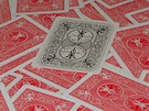
Once in a while there'll be a back design from KWP that doesn't work; this is one of them. This looks better to be a joker to me while the AoS eyesight examiner is better to elaborate as a back design.
"We look at the present through a rear-view mirror; we walk backwards into the future."
-- Marshall McLuhan (Media Theory Giant) Decknowledgy™ (Ted) Instagram Reviews:https://www.instagram.com/decknowledgy
Decknowledgy wrote: while the AoS eyesight examiner is better to elaborate as a back design.
Hmm... I like the idea of the back and the marking system. But you're right for a more artsy deck the examiner + further details could have been used and maybe different settings of that examiner as a marking system. That would leave us with the markings a bit more in the middle though...
Is there a way for subscribers to see upcoming tuck designs for future months? I still haven't seen a gilded tuck reveal. I heard from another person on IG that the tuck will be just a DS1 sleeve for gilded as well, but that wasn't straight from KWP. Thanks for any info
Decknowledgy wrote:Once in a while there'll be a back design from KWP that doesn't work; this is one of them. This looks better to be a joker to me while the AoS eyesight examiner is better to elaborate as a back design.
Oooooh. I didn't even notice the cardback at first. My eye refused to land on that image
All I can think is pizza box, honestly. I wish the design on the tuck carried to the cardbacks as a borderless design.
Somehow KWP decks are marketed so well that people are hypnotized to the point where they forget that the card backs are rarely shown as the first few images, anyone notice that? Apparently, KWP focuses more on the tuck and the faces.
Your idea of the tuck for the back design works for this deck as well
"We look at the present through a rear-view mirror; we walk backwards into the future."
-- Marshall McLuhan (Media Theory Giant) Decknowledgy™ (Ted) Instagram Reviews:https://www.instagram.com/decknowledgy
I am having a hard time understanding the issue on the card backs. That was a key feature of this deck. It was also a main reason that this deck had a demo release so folks could check out the marking system and make comments. I think the card backs are clever. Maybe I am hypnotized.
The Crazy Squirrel Deck Hunter - Hunt decks to extinction
Bradius wrote:I am having a hard time understanding the issue on the card backs. That was a key feature of this deck. It was also a main reason that this deck had a demo release so folks could check out the marking system and make comments. I think the card backs are clever. Maybe I am hypnotized.
These are two things, Brad
While marking speaks of the functionality of the back design, I'm commenting on the aesthetic point of view. Nothing wrong if you find the back design attractive, which wasn't where you're coming from when you mentioned the marking system~
"We look at the present through a rear-view mirror; we walk backwards into the future."
-- Marshall McLuhan (Media Theory Giant) Decknowledgy™ (Ted) Instagram Reviews:https://www.instagram.com/decknowledgy
Clever, and really a pretty nice looking and unique deck for a very reasonable price. Not sure though if I want any more reminders of this wretched year though!
I haven't slept for ten days, because that would be too long.
I just got the 20/20 Signature to go with my standard/limited/gilded/prototype set. I thought my 20/20 collection was complete and now this had to come out.
I was at work when the KWP email went out. I took a quick look at the page, saw that there were 300 of these suckers and got back to work, thinking I can buy a couple when I get home.
Wrong! A nearly year-old deck and it’s already sold out. At $7 a deck I should have known the sharks would be out in full force.
Exact same thing happened when the Arthurian and Robin Hood uncut sheets came out. I waited until I got home, I nabbed the Robin Hood, but missed out on the Arthurian which I wanted more.
Never again. No more waiting until I get home to pick up new releases. You KWP fans are ruthless.
hsbc wrote: ↑Wed Dec 02, 2020 6:10 pm
Wow, sold out already? Good thing I didn't want one
I know, right? I wouldn’t even want it if I didn’t already have the others. I didn’t think this set was all that popular so I thought I was safe.
It’s just white tuckbox with a sticker statement: “2020 sucks”
I am sure it could be better if the tuckbox retain the std design, with a graffiti-esch saying worst year (its just my idea)
laitostarr777 wrote: ↑Fri Dec 04, 2020 1:03 am
It’s just white tuckbox with a sticker statement: “2020 sucks”
I am sure it could be better if the tuckbox retain the std design, with a graffiti-esch saying worst year (its just my idea)
That actually sounds like that would look cool. Then Jackson would have to have priced them higher than $7 and they might not have sold out as fast. Win-win for me! I wonder if the Tempest TGW deck had anything to do with the pricing...