The Coven - Second Edition
- flashcards
- Member

- Posts: 728
- Joined: Mon Jan 19, 2015 9:02 pm
- Cardist: Yes
- Collector: Yes
- Decks Owned: 600
- Location: Corvallis, Oregon
- Has thanked: 192 times
- Been thanked: 185 times
- Contact:
Re: The Coven - Second Edition
The King of Hearts is super creepy. I love it. At first I was shocked and thought it was mistake and her hand was covering her mouth. Then when I realized what it was, I got a chill. I agree that this is one of the more creative versions I have seen. One question; is the hand using her fingernail to cut her throat? (Never thought I'd be writing that sentence.) If so, perhaps the nail should be longer. (A nine inch nail? Stop it. Who's saying that? Hey, you with the hand over your mouth. What are you doing hereeeeeeeeeeeeeeeeeeeeeeeee...)
Sorry. Just really getting into the vibe of the cards. Great job.
Sorry. Just really getting into the vibe of the cards. Great job.
- 52Ravens
- ✔ VERIFIED Designer

- Posts: 171
- Joined: Mon Jun 30, 2014 3:28 pm
- Collector: Yes
- Player: Yes
- Magician: Yes
- Decks Owned: 34
- Has thanked: 13 times
- Been thanked: 80 times
- Contact:
Re: The Coven - Second Edition
Thanks for the feedback. I do like the light version of these designs but I wanted to step away from the original deck so that the two where sperate from one another, and I think that the easiest way to do that was to completely change the contrast approach. Be sure to check out the project once it goes live, you may be temptedscottbre wrote:with the less refined-looking black and red, this deck would be a no go for me, unfortunately.
Yes and noflashcards wrote: is the hand using her fingernail to cut her throat?
- 52Ravens
- ✔ VERIFIED Designer

- Posts: 171
- Joined: Mon Jun 30, 2014 3:28 pm
- Collector: Yes
- Player: Yes
- Magician: Yes
- Decks Owned: 34
- Has thanked: 13 times
- Been thanked: 80 times
- Contact:
Re: The Coven - Second Edition
Hey!
Below is the number card example, click the image to make it larger. What do you guys think, standard layout or witch circle?
Thanks for any feedback

Below is the number card example, click the image to make it larger. What do you guys think, standard layout or witch circle?
Thanks for any feedback

- flashcards
- Member

- Posts: 728
- Joined: Mon Jan 19, 2015 9:02 pm
- Cardist: Yes
- Collector: Yes
- Decks Owned: 600
- Location: Corvallis, Oregon
- Has thanked: 192 times
- Been thanked: 185 times
- Contact:
Re: The Coven - Second Edition
I like the idea but you are going to have to add some real contrast for the pips and numbers. At first I thought these were the card backs. Only after zooming could I see the numbers in the corners and it took even longer to see the pips. Perhaps fade the background and really add contrast or a different color to the pips and numbers. As it is, it all blends together. Definitely a good concept however.
- Harvonsgard
- Member

- Posts: 9807
- Joined: Fri Mar 01, 2019 6:53 am
- Cardist: Yes
- Player: Yes
- White Whale: Your Mami
- Decks Owned: 420
- Location: Paro
- Has thanked: 1793 times
- Been thanked: 4634 times
Re: The Coven - Second Edition
+2
I thought it was an uncut showing the backs first. If you don't crank up the contrats those will be horrible to play with.
Witch circle for me.
I thought it was an uncut showing the backs first. If you don't crank up the contrats those will be horrible to play with.
Witch circle for me.
- MagikFingerz
- Site Admin

- Posts: 7830
- Joined: Mon Sep 24, 2012 7:32 pm
- Cardist: Yes
- Collector: Yes
- Player: Yes
- Magician: Yes
- White Whale: Sawdust and Delicious + uncuts
- Location: Norway
- Has thanked: 1836 times
- Been thanked: 1599 times
- Contact:
Re: The Coven - Second Edition
Echoing the others on the contrast issue. I like the circular pip layout the best 
- BaconWise
- Member

- Posts: 1569
- Joined: Mon Jan 21, 2019 11:58 am
- Collector: Yes
- Player: Yes
- White Whale: World of Sport - Elaine Lewis
- Decks Owned: 500
- Has thanked: 2643 times
- Been thanked: 1368 times
Re: The Coven - Second Edition
+1 - That circular layout is a real winner for me. Make the numbers and pips more visible against the dark background, and this will look amazing. Great updateMagikFingerz wrote:Echoing the others on the contrast issue. I like the circular pip layout the best
"But why male models?"
Curio Playing Cards
Web: www.curioplayingcards.com
Instagram: @curio_playingcards
Facebook: Curio Playing Cards
Curio Playing Cards
Web: www.curioplayingcards.com
Instagram: @curio_playingcards
Facebook: Curio Playing Cards
- 52Ravens
- ✔ VERIFIED Designer

- Posts: 171
- Joined: Mon Jun 30, 2014 3:28 pm
- Collector: Yes
- Player: Yes
- Magician: Yes
- Decks Owned: 34
- Has thanked: 13 times
- Been thanked: 80 times
- Contact:
Re: The Coven - Second Edition
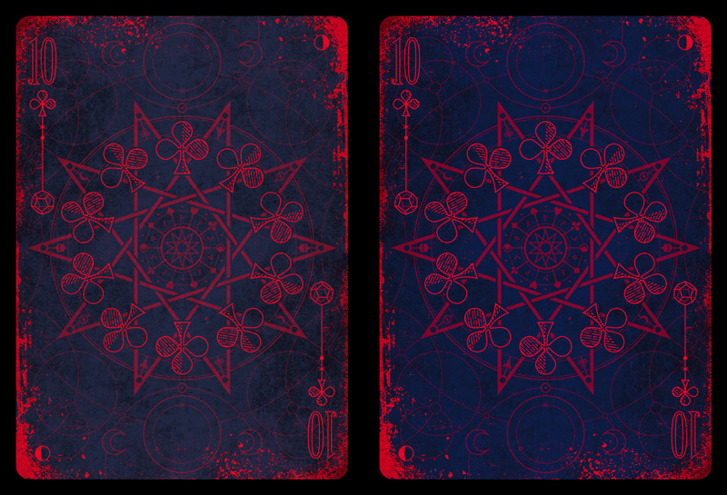
Hey, I totally see what you are all saying.
Believe it or not, as a full-time designer, I am actually colour blind, only slightly (I don't see everything in black and white) but I fail the eye tests where you to have to see a number in a circle of dots So in my defence I thought this was only me!
I've boosted the contrast and made the navy background a shade darker, below is a comparison. I wouldn't want to go too far with this as it will start to lose the original style I wanted. Keep in mind that these are low resolution images so the details should be a little clearer in print in 300dpi as opposed to the 72dpi you are currently viewing.
Let me know what you think, thanks

Believe it or not, as a full-time designer, I am actually colour blind, only slightly (I don't see everything in black and white) but I fail the eye tests where you to have to see a number in a circle of dots
I've boosted the contrast and made the navy background a shade darker, below is a comparison. I wouldn't want to go too far with this as it will start to lose the original style I wanted. Keep in mind that these are low resolution images so the details should be a little clearer in print in 300dpi as opposed to the 72dpi you are currently viewing.
Let me know what you think, thanks

- Harvonsgard
- Member

- Posts: 9807
- Joined: Fri Mar 01, 2019 6:53 am
- Cardist: Yes
- Player: Yes
- White Whale: Your Mami
- Decks Owned: 420
- Location: Paro
- Has thanked: 1793 times
- Been thanked: 4634 times
Re: The Coven - Second Edition
The right one is the updated version, right? Looks better and I do think it will be indeed better in print then now on the display. It's still risky though  . Fingers crossed.
- justplaycards
- Member

- Posts: 479
- Joined: Fri May 10, 2019 3:50 am
- Collector: Yes
- Player: Yes
- White Whale: Requiem Prototype 00
- Decks Owned: 250
- Location: UK
- Has thanked: 172 times
- Been thanked: 350 times
- Contact:
Re: The Coven - Second Edition
I understand you not wanting to ruin your design, but I have to agree with everyone else. Even in the new version the contrast might not be enough to make them easy to use. I really like the actual design though.
- 52Ravens
- ✔ VERIFIED Designer

- Posts: 171
- Joined: Mon Jun 30, 2014 3:28 pm
- Collector: Yes
- Player: Yes
- Magician: Yes
- Decks Owned: 34
- Has thanked: 13 times
- Been thanked: 80 times
- Contact:
Re: The Coven - Second Edition
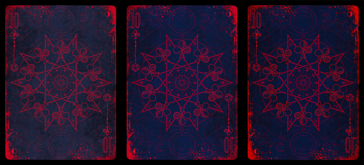
Once more with feeling 
The right one is the newest version. This is as dark as I dare, otherwise it may as well be black and red, but I think I can get away with this. Darker navy and dirt, more vibrant colours and a slightly stronger contrast. It's way better than it was, but I think this is the furthest I can push this without changing the colour scheme completely.
F*** it, let's do black and gold foil like everyone else

- Harvonsgard
- Member

- Posts: 9807
- Joined: Fri Mar 01, 2019 6:53 am
- Cardist: Yes
- Player: Yes
- White Whale: Your Mami
- Decks Owned: 420
- Location: Paro
- Has thanked: 1793 times
- Been thanked: 4634 times
Re: The Coven - Second Edition
Read the eBay on crack thread; white and gold is the high selling shit atm... 

In all seriousness though; it's way better than before.
In all seriousness though; it's way better than before.
- MagikFingerz
- Site Admin

- Posts: 7830
- Joined: Mon Sep 24, 2012 7:32 pm
- Cardist: Yes
- Collector: Yes
- Player: Yes
- Magician: Yes
- White Whale: Sawdust and Delicious + uncuts
- Location: Norway
- Has thanked: 1836 times
- Been thanked: 1599 times
- Contact:
Re: The Coven - Second Edition
Just a thought: Not increasing (or even decreasing) the contrast of the blood around the edges may help with visibility of the indices. They're heavier in ink, so they overshadow the number a bit.
-
scottbre
- Member

- Posts: 58
- Joined: Mon Jan 13, 2020 4:55 pm
- Has thanked: 26 times
- Been thanked: 35 times
Re: The Coven - Second Edition
I think it would look better if you faded everything except the numbers and pips quite a bit, so that the geometric patterns and the "blood spatter" around the edges are still visible but clearly in the background. It would add a lot more depth to the cards and also make them much easier to read.
https://www.portfolio52.com/profile/19990/collection" onclick="window.open(this.href);return false;
- 52Ravens
- ✔ VERIFIED Designer

- Posts: 171
- Joined: Mon Jun 30, 2014 3:28 pm
- Collector: Yes
- Player: Yes
- Magician: Yes
- Decks Owned: 34
- Has thanked: 13 times
- Been thanked: 80 times
- Contact:
Re: The Coven - Second Edition
Hey!
Stepping away from the number cards of a moment to share the back design, its been in the background of all the cards but this is it in all its full brightness. It's not going to win design of the year but it's on theme

Stepping away from the number cards of a moment to share the back design, its been in the background of all the cards but this is it in all its full brightness. It's not going to win design of the year but it's on theme

- Harvonsgard
- Member

- Posts: 9807
- Joined: Fri Mar 01, 2019 6:53 am
- Cardist: Yes
- Player: Yes
- White Whale: Your Mami
- Decks Owned: 420
- Location: Paro
- Has thanked: 1793 times
- Been thanked: 4634 times
Re: The Coven - Second Edition
Maybe it's just me but I read that ambigram as 69. 
It's definitely a nice back design. I like it a lot.
It's definitely a nice back design. I like it a lot.
- hsbc
- Moderator

- Posts: 6243
- Joined: Wed Sep 05, 2018 2:10 pm
- Cardist: Yes
- Collector: Yes
- Player: Yes
- White Whale: Grid 1 LE
- Decks Owned: 1500
- Location: ATL
- Has thanked: 10417 times
- Been thanked: 6862 times
- Harvonsgard
- Member

- Posts: 9807
- Joined: Fri Mar 01, 2019 6:53 am
- Cardist: Yes
- Player: Yes
- White Whale: Your Mami
- Decks Owned: 420
- Location: Paro
- Has thanked: 1793 times
- Been thanked: 4634 times
Re: The Coven - Second Edition
Nce indeedhsbc wrote:Harvonsgard wrote:69 ... nice
- 52Ravens
- ✔ VERIFIED Designer

- Posts: 171
- Joined: Mon Jun 30, 2014 3:28 pm
- Collector: Yes
- Player: Yes
- Magician: Yes
- Decks Owned: 34
- Has thanked: 13 times
- Been thanked: 80 times
- Contact:
Re: The Coven - Second Edition
Almost a year to the day that this feed was posted in . . . it was meant to be.
As a thank you, for those that have offered their helpful and constructive input, I'm posting the Kickstarter video here early.
I'm hoping that the project will be live in the next week, until then, enjoy the tease
As a thank you, for those that have offered their helpful and constructive input, I'm posting the Kickstarter video here early.
I'm hoping that the project will be live in the next week, until then, enjoy the tease
- Harvonsgard
- Member

- Posts: 9807
- Joined: Fri Mar 01, 2019 6:53 am
- Cardist: Yes
- Player: Yes
- White Whale: Your Mami
- Decks Owned: 420
- Location: Paro
- Has thanked: 1793 times
- Been thanked: 4634 times
Re: The Coven - Second Edition
Best of success for the campaign.
- justplaycards
- Member

- Posts: 479
- Joined: Fri May 10, 2019 3:50 am
- Collector: Yes
- Player: Yes
- White Whale: Requiem Prototype 00
- Decks Owned: 250
- Location: UK
- Has thanked: 172 times
- Been thanked: 350 times
- Contact:
Re: The Coven - Second Edition
That video is amazing... Well done. I am certainly in for a few of these Kirk. Can't wait.
-
brownsl
- Member

- Posts: 1931
- Joined: Wed Apr 17, 2019 3:20 pm
- Collector: Yes
- White Whale: UUSI Le Jeu De Tarot
- Decks Owned: 10000
- Has thanked: 1277 times
- Been thanked: 997 times
Who is online
Users browsing this forum: No registered users and 2 guests