This is the table of contents, and card rankings page for my reviews with links to all the reviews later in the thread.
Additionally, if you comment, you can also choose the next deck for me to review! Take a look at my collection here: https://www.portfolio52.com/profile/19751/collection.
And then shoot me a PM with up to 5 decks you would like me to review, in order of your preference. The only reason for doing 5 is so if I have duplicates or if a deck you choose is one I'm 'saving' for possible investment purposes.
Table of Contents
Page 1:
Bicycle Gentleman (2016: Blackout Brother & Gambler's Warehouse, USPCC)
Chronos - Player's Edition (2019: Oath Playing Cards)
Porcelain (2017: Shann Larsson, LPCC)
Aquila - Limited Edition (2014: Ade Suryana, Three of Clubs, LPCC)
Heretic Lux (2014: Lorenzo Gaggiotti, EPCC)
Tally-Ho Poker 9 Playing Cards (2011: USPCC)
Bicycle Tuatha De' Danann (2016: Culturlan Enterprises, USPCC)
Copag 310 - Blue (2018: Cartamundi)
Pagan - Black (2019: UUSI, EPCC)
Arrco Tahoe Red and Blue (2011: USPCC)
Next Up:
Luminosity (Standard and KSX editions)
Persian Empire - Royal Edition
Charlemagne (RPCS)
Odissea Minerva (Thirdway Industries, USPCC)
Ranking of Decks I've Reviewed:
Collector's Ranking
1. Pagan - Black (UUSI)
2. Bicycle Gentleman - White Edition (Gambler's Warehouse)
3. Heretic Lux (Expert Playing Card Company)
4. Aquila - Limited Edition (Three of Clubs)
5. Chronos - Player's Edition (Oath Playing Cards)
6. Arrco Tahoe (USPCC)
7. Porcelain (Legends Playing Card Company)
8. Tally-Ho Poker 9 Playing Cards (USPCC)
9. Bicycle Tuatha de' Danann (USPCC)
10. Copag 310 - Blue (Cartamundi)
Performance Ranking
1. Tally-Ho Poker 9 Playing Cards (USPCC)
2. Aquila - Limited Edition (Three of Clubs)
3. Bicycle Gentleman - White Edition (Gambler's Warehouse)
4. Pagan - Black (UUSI)
5. Arrco Tahoe (USPCC)
6. Copag 310 - Blue (Cartamundi)
7. Heretic Lux (Expert Playing Card Company)
8. Chronos - Player's Edition (Oath Playing Cards)
9. Bicycle Tuatha de' Danann (USPCC)
10. Porcelain (Legends Playing Card Company)
Overall Ranking
1. Pagan - Black (UUSI)
2. Aquila - Limited Edition (Three of Clubs)
3. Bicycle Gentleman - White Edition (Gambler's Warehouse)
4. Heretic Lux (Expert Playing Card Company)
5. Tally-Ho Poker 9 Playing Cards (USPCC)
6. Arrco Tahoe (USPCC)
7. Chronos - Player's Edition (Oath Playing Cards)
8. Porcelain (Legends Playing Card Company)
9. Copag 310 - Blue (Cartamundi)
10. Bicycle Tuatha de' Danann (USPCC)
My Deck Reviews (Most Recent - Arrco Tahoe, Pagan Black)
-
rgamble
- Member

- Posts: 28
- Joined: Mon Dec 23, 2019 9:59 pm
- Has thanked: 7 times
- Been thanked: 28 times
Re: My Deck Reviews
Feels somewhat daunting to attempt a review amongst such well known reviewers here. I'm going to approach this from a different perspective, using one thread with mini-reviews focused on the usual parts of a card deck (tuck box, backs, faces, handling) but also a couple of random things important to me.
So without further ado, my first review is:
Bicycle Gentleman (2016: Designed by Blackout Brother, distributed by Gambler's Warehouse, USPCC)
Two Sentence Summary:
One of the first 'premium' decks I ever purchased is also one of the most elegant in every respect. It's a deck I come back to not just to admire, but to perform with.
Tuck Box:
I have both the white standard edition, and the black gilded edition. I have not opened the latter.
The boxes are identical in appearance except for the base color (white vs black), and the seal on the black shows the deck number, in my case 198 / 350. To me, the design is perfect, particularly the fronts with a splash color of red for the white deck, and a splash of white for the black deck. The design is very slightly embossed, and the boxes themselves are sturdy.

The backs are almost a 1:1 representation of the card backs except the colors on the white deck (the back is gold compared to the red card backs), and I think on the black deck the color scheme is the same except the tuck box doesn't include the white border.

The sides are dominated by the card deck's logo with thin lines and text.

The interior of the deck box is an attractive light maroon color with some patterns and the deck name, although the detail is a bit tough to make out.

Card Backs:
Again, I only have the whites. Somewhat oddly, the gold of the tuck box is absent and the otherwise identical two-sided pattern is done in an attractive red. One of the things I really like here is the use of line thickness to make the back look simpler and more elegant at a first glance with the thick lines used sparingly. On further inspection there's complexity to find in the thinner lines. I actually think I like the red more than I would the gold.

Aces and Courts:
I'm not showing all of them. Only the Ace of Spades is enlarged and embellished. It's one of my very favorite Ace of Spades. I wish the other Aces had been embellished as well.
The courts are elegant, silhouetted, one color (black or red) and capture the feel of the roaring 20's through the 40's which the deck is themed upon. Perfect.

Number Cards:
The pips are very recognizable yet slightly modified with thin lines that drop down from them. I'm not sure I really like the triangles in the Clubs and Spades combined with the drop downs, but they still look quite attractive - and I only notice this when I look closely. I particularly like the drop downs from the suits on the edges, adding just that extra elegant touch.

Jokers & Gaff Cards:
There's a double backer (in the same color as the deck on both sides, a missed opportunity as I'd have liked to have seen a black and white double backer). And there's a two faced King and Queen of Hearts. The Jokers are different (one red, one black) and attractive.

Handling:
These shuffle great, handle great, and spread nicely (about the limits of my skills at the moment).
Triumph Reveal:
So, this is one of my very favorite effects in Magic, and the first thing I do with any new deck is to do a spread with one card turned over. I do a 'front side reveal' where all but one of the cards shows its back, and then a back side reveal. The white deck is only slightly above average. The cleanness of the edges help draw the eye to the card, but the predominance of white in the card backs makes the noticing of the turned over card a touch underwhelming. This is still better than many decks which are too busy for this effect to work well. The back reveal version is slightly worse to me, because the court cards have surface similarities to the card back when spread this way.


Tuck Box Grade: A+
Card Backs: A+
Aces: A-
Courts: A+
Number Cards: A
Jokers & Gaff Cards: B
Handling: A
Triumph Suitability Front Reveal: C+
Triumph Suitability Back Reveal: C
Performance Deck: A-
Collector's Deck: A+
Overall: A
So without further ado, my first review is:
Bicycle Gentleman (2016: Designed by Blackout Brother, distributed by Gambler's Warehouse, USPCC)
Two Sentence Summary:
One of the first 'premium' decks I ever purchased is also one of the most elegant in every respect. It's a deck I come back to not just to admire, but to perform with.
Tuck Box:
I have both the white standard edition, and the black gilded edition. I have not opened the latter.
The boxes are identical in appearance except for the base color (white vs black), and the seal on the black shows the deck number, in my case 198 / 350. To me, the design is perfect, particularly the fronts with a splash color of red for the white deck, and a splash of white for the black deck. The design is very slightly embossed, and the boxes themselves are sturdy.
The backs are almost a 1:1 representation of the card backs except the colors on the white deck (the back is gold compared to the red card backs), and I think on the black deck the color scheme is the same except the tuck box doesn't include the white border.
The sides are dominated by the card deck's logo with thin lines and text.
The interior of the deck box is an attractive light maroon color with some patterns and the deck name, although the detail is a bit tough to make out.
Card Backs:
Again, I only have the whites. Somewhat oddly, the gold of the tuck box is absent and the otherwise identical two-sided pattern is done in an attractive red. One of the things I really like here is the use of line thickness to make the back look simpler and more elegant at a first glance with the thick lines used sparingly. On further inspection there's complexity to find in the thinner lines. I actually think I like the red more than I would the gold.
Aces and Courts:
I'm not showing all of them. Only the Ace of Spades is enlarged and embellished. It's one of my very favorite Ace of Spades. I wish the other Aces had been embellished as well.
The courts are elegant, silhouetted, one color (black or red) and capture the feel of the roaring 20's through the 40's which the deck is themed upon. Perfect.
Number Cards:
The pips are very recognizable yet slightly modified with thin lines that drop down from them. I'm not sure I really like the triangles in the Clubs and Spades combined with the drop downs, but they still look quite attractive - and I only notice this when I look closely. I particularly like the drop downs from the suits on the edges, adding just that extra elegant touch.
Jokers & Gaff Cards:
There's a double backer (in the same color as the deck on both sides, a missed opportunity as I'd have liked to have seen a black and white double backer). And there's a two faced King and Queen of Hearts. The Jokers are different (one red, one black) and attractive.
Handling:
These shuffle great, handle great, and spread nicely (about the limits of my skills at the moment).
Triumph Reveal:
So, this is one of my very favorite effects in Magic, and the first thing I do with any new deck is to do a spread with one card turned over. I do a 'front side reveal' where all but one of the cards shows its back, and then a back side reveal. The white deck is only slightly above average. The cleanness of the edges help draw the eye to the card, but the predominance of white in the card backs makes the noticing of the turned over card a touch underwhelming. This is still better than many decks which are too busy for this effect to work well. The back reveal version is slightly worse to me, because the court cards have surface similarities to the card back when spread this way.
Tuck Box Grade: A+
Card Backs: A+
Aces: A-
Courts: A+
Number Cards: A
Jokers & Gaff Cards: B
Handling: A
Triumph Suitability Front Reveal: C+
Triumph Suitability Back Reveal: C
Performance Deck: A-
Collector's Deck: A+
Overall: A
-
rgamble
- Member
- Posts: 28
- Joined: Mon Dec 23, 2019 9:59 pm
- Has thanked: 7 times
- Been thanked: 28 times
Re: My Deck Reviews
Chronos - Player's Edition (2019: Oath Playing Cards)
Two Sentence Summary:
The newest (as of this post) 'premium' deck I've purchased is a beautiful work somewhere between ornate and elegant. The stock and finish make it somewhat difficult to perform certain magic flourishes and cardistry moves, but it handles well in most respects.
Tuck Box:
The colors in my picture are a bit off for the tuck box. The gold is much shinier, and the kind of light grey blue part of the clock in the picture is actually pure white. The deck box is embossed to a greater 'depth' than many, and is very attractive. In spite of the fewer number of lines than, for instance, my last reviewed deck, the front doesn't quite match my definition for elegance. It's also not truly 'ornate' in my mind so it falls somewhere in between. The word that comes to mind is 'bold', with thick lines, often with a bit of simple adornments to them.
Additionally there's some black embossing on the black background in a couple of places that feels a bit too subtle for an otherwise bold design.

The back is a one to one match with the card backs except for a higher level of shine on the gold, and represents the interior of a watch or clock. I feel as though another color or some white may have made the design pop a bit more.

The sides work well with the front and back with a relatively simple, bold gold frame around white text.

The bottom shows the deck # (325 / 500 in my case).

The interior is plain black, but the embossing shows the patterns on the interior for a nice effect.

Card Backs:
As stated earlier, these are almost exactly a 1:1 representation of the tuck box's back, with slightly less shine for the gold and no embossing. This means that some of the detail is picked out better on the card backs, and so doing a 'card hiding on the back of the tuck box' effect won't be perfect, but most spectators probably wouldn't notice. The slightly sharper look to the lines of the pattern on the back of the cards and the muted gold actually makes them quite a bit more attractive in my opinion than the tuck box's back. Note that the texture in the picture looks much more pronounced than it does to the naked eye where it really looks uniformly matte black and gold.

Aces and Courts:
The face cards have an off white speckled with gold texture to them.
The Ace of Spades is enlarged and embellished and looks very much like the card back in style with an ornate pattern in predominantly gold interspersed with black. I feel like the gold is a touch too prominent, making it harder to see the features than it should. The other aces have an enlarged pip, so I've pictured them as well. It's a slightly more cluttered style than I like, with two gold edges sandwiching a bit of the pip on the outside.

The courts are unique, although very recognizable. The main embellishments are a bit of clockwork style for the clothing. The weaponry and expressions are also subtly different. The color scheme of dark gold, black and red is used on all court cards. Again, gold comes off as the primary color, and it given the slightly darker red than usual on playing cards, the effect is to make the court cards look dark and somewhat... 'muddy'? Casting about for the right word but that's what came to mind. Still, I like the design of the courts which is why they rate a bit higher for me than might be expected based on my comments.

Number Cards:
The pips are unique but very recognizable. The pip style has already been remarked upon when discussing the Aces with the double lined, embellished gold border sandwiching the outer portion of the pips. I guess the thought that comes to mind looking at them is 'tapestry'. As also mentioned, they somehow look a touch fuzzy to my eye even though there's no actual color bleed. The numbers are an unusual 'tall' font, and in some places of the font where the number is particularly thin, the gold replaces the color itself rather than simply outlining it, making them look a bit off to my eye. It's fair to say that the number cards do very little for me - and the clubs for some reason make me think of bees. I don't find them bad, or even overly distracting - and they're fine for magic routines in that they're immediately obvious, they just don't really match the feel of the rest of the deck to me and use a style that's not my favorite.

Jokers & Gaff Cards:
There are no gaff cards. The two Jokers simply have an hourglass - the black (only in the 'Joker' text on the side of the card) showing a mostly full hourglass, and the red showing one that's finished. These are simple, but with some subtle detailing and I rather like them. I wish there had been a touch of additional color somewhere in them though.

Handling:
These are a very light card stock, they shuffle well - especially overhand shuffles, and are nicely flexible for some types of handling. On the negative side, they don't spread and fan particularly easily.
Triumph Reveal:
You'll notice two things in the pictures below. The contrast between the off white faces and the black backs makes Triumph effects obvious. I like the front reveal slightly less than the back reveal because the front side of the card looks oddly 'empty' with that large value. The other thing you'll notice is how uneven the spread is. These had to be done one card at a time for me, because I couldn't get anything close to a good looking spread using my usual methods. My grade reflects the fact that even though the contrast makes it an above average looking Triumph, I simply would never do it due to the handling characteristics of a spread.


Tuck Box Grade: A-
Card Backs: A
Aces: B+
Courts: B+
Number Cards: C
Jokers: B
Gaff Cards: N/A
Handling: B-
Triumph Suitability Front Reveal: F
Triumph Suitability Back Reveal: F
Performance Deck: C-
Collector's Deck: B+
Overall: B-
Two Sentence Summary:
The newest (as of this post) 'premium' deck I've purchased is a beautiful work somewhere between ornate and elegant. The stock and finish make it somewhat difficult to perform certain magic flourishes and cardistry moves, but it handles well in most respects.
Tuck Box:
The colors in my picture are a bit off for the tuck box. The gold is much shinier, and the kind of light grey blue part of the clock in the picture is actually pure white. The deck box is embossed to a greater 'depth' than many, and is very attractive. In spite of the fewer number of lines than, for instance, my last reviewed deck, the front doesn't quite match my definition for elegance. It's also not truly 'ornate' in my mind so it falls somewhere in between. The word that comes to mind is 'bold', with thick lines, often with a bit of simple adornments to them.
Additionally there's some black embossing on the black background in a couple of places that feels a bit too subtle for an otherwise bold design.
The back is a one to one match with the card backs except for a higher level of shine on the gold, and represents the interior of a watch or clock. I feel as though another color or some white may have made the design pop a bit more.
The sides work well with the front and back with a relatively simple, bold gold frame around white text.
The bottom shows the deck # (325 / 500 in my case).
The interior is plain black, but the embossing shows the patterns on the interior for a nice effect.
Card Backs:
As stated earlier, these are almost exactly a 1:1 representation of the tuck box's back, with slightly less shine for the gold and no embossing. This means that some of the detail is picked out better on the card backs, and so doing a 'card hiding on the back of the tuck box' effect won't be perfect, but most spectators probably wouldn't notice. The slightly sharper look to the lines of the pattern on the back of the cards and the muted gold actually makes them quite a bit more attractive in my opinion than the tuck box's back. Note that the texture in the picture looks much more pronounced than it does to the naked eye where it really looks uniformly matte black and gold.
Aces and Courts:
The face cards have an off white speckled with gold texture to them.
The Ace of Spades is enlarged and embellished and looks very much like the card back in style with an ornate pattern in predominantly gold interspersed with black. I feel like the gold is a touch too prominent, making it harder to see the features than it should. The other aces have an enlarged pip, so I've pictured them as well. It's a slightly more cluttered style than I like, with two gold edges sandwiching a bit of the pip on the outside.
The courts are unique, although very recognizable. The main embellishments are a bit of clockwork style for the clothing. The weaponry and expressions are also subtly different. The color scheme of dark gold, black and red is used on all court cards. Again, gold comes off as the primary color, and it given the slightly darker red than usual on playing cards, the effect is to make the court cards look dark and somewhat... 'muddy'? Casting about for the right word but that's what came to mind. Still, I like the design of the courts which is why they rate a bit higher for me than might be expected based on my comments.
Number Cards:
The pips are unique but very recognizable. The pip style has already been remarked upon when discussing the Aces with the double lined, embellished gold border sandwiching the outer portion of the pips. I guess the thought that comes to mind looking at them is 'tapestry'. As also mentioned, they somehow look a touch fuzzy to my eye even though there's no actual color bleed. The numbers are an unusual 'tall' font, and in some places of the font where the number is particularly thin, the gold replaces the color itself rather than simply outlining it, making them look a bit off to my eye. It's fair to say that the number cards do very little for me - and the clubs for some reason make me think of bees. I don't find them bad, or even overly distracting - and they're fine for magic routines in that they're immediately obvious, they just don't really match the feel of the rest of the deck to me and use a style that's not my favorite.
Jokers & Gaff Cards:
There are no gaff cards. The two Jokers simply have an hourglass - the black (only in the 'Joker' text on the side of the card) showing a mostly full hourglass, and the red showing one that's finished. These are simple, but with some subtle detailing and I rather like them. I wish there had been a touch of additional color somewhere in them though.
Handling:
These are a very light card stock, they shuffle well - especially overhand shuffles, and are nicely flexible for some types of handling. On the negative side, they don't spread and fan particularly easily.
Triumph Reveal:
You'll notice two things in the pictures below. The contrast between the off white faces and the black backs makes Triumph effects obvious. I like the front reveal slightly less than the back reveal because the front side of the card looks oddly 'empty' with that large value. The other thing you'll notice is how uneven the spread is. These had to be done one card at a time for me, because I couldn't get anything close to a good looking spread using my usual methods. My grade reflects the fact that even though the contrast makes it an above average looking Triumph, I simply would never do it due to the handling characteristics of a spread.
Tuck Box Grade: A-
Card Backs: A
Aces: B+
Courts: B+
Number Cards: C
Jokers: B
Gaff Cards: N/A
Handling: B-
Triumph Suitability Front Reveal: F
Triumph Suitability Back Reveal: F
Performance Deck: C-
Collector's Deck: B+
Overall: B-
-
rgamble
- Member
- Posts: 28
- Joined: Mon Dec 23, 2019 9:59 pm
- Has thanked: 7 times
- Been thanked: 28 times
Re: My Deck Reviews
Porcelain (2017: Shann Larsson, Legends Playing Cards)
Two Sentence Summary:
This is a smooth handling deck that fans and spreads beautifully for cardistry purposes though I have a feeling it's a one trick pony there. It's not well suited for magic tricks or poker night due to the unrecognizable court cards and poor color separation between the black and red suits, and is lacking that extra something to elevate the deck beyond a curiosity.
Tuck Box:
The tuck box is very unusual in that the designs on the front and back are half of the King of Hearts and Queen of Hearts respectively. I'm not sure I've seen that done on other tuck boxes, but it works here because the designs are so unusual in appearance and fit the vibe that the deck is going for. The predominant colors (other than white) are shades of blue, gold, and a greyish/cream. There's a border around each design and then four smaller boxes in each corner with a design that means nothing to me. The oddity here is that each of these boxes has a different style of line around it than the main box's border, and they stick out just a bit over the larger box, offending my OCD tendencies on close inspection. Nevertheless, the overall effect is interesting and eye catching in a not-unpleasant way. There is also a very slight embossing of the artwork.


The sides are where you'll find the design on the back of the cards - well, a portion of the design at least. This is where the title of the deck comes through the most on the tuck box, looking very much like porcelain dishes or bowls.

The interior is un-embellished in any way and is simply white. The tops and bottoms of the box are not all that noteworthy, although the top does note that the deck uses an Emerald Finish. I'm pointing this out because as I'm typing, I'm looking at a few cards I left 'free' of the deck, which have bowed considerably. When I noticed this, I took a few other cards from a variety of decks to test, and they've remained perfectly flat.
Card Backs:
The card backs continue the color scheme of the tuck in blues and gold. Oddly, the embossing is much more noticeable on the card backs than on the tuck box itself, and these are one of the highlights of the deck. An interesting oddity here is there are some almost invisible embossings in the middle and the upper right and lower left of the card backs in what are otherwise empty spaces. I do feel as though coloring those in would have made the card backs too busy, but it feels like an odd design choice. Unfortunately for me, the pattern doesn't really intrigue me in any respect so while it's attractive, it doesn't really feel memorable to me.

These are borderless cards, and the spread is beautiful - the Emerald finish at least does this perfectly (even if I don't).

Face Cards:
The card faces have a slightly off white background with completely unique pips, font, and designs for the Courts. The main problem here, as you'll see, is that the pips are dark gold (for the 'red' suits) or dark grey (for the 'black' suits) and due to the different look of the pips they are definitely not immediately obvious as to suit of a card as most other decks. The pictures actually show stronger contrast than there actually is to the naked eye.
Jokers, Aces and Courts:
The Jokers are almost identical (the lighting in the picture makes one look darker than the other, but that's not the case). It becomes a game of "what's different" and a casual observer would probably not notice this (given that I actually typed "The Jokers are identical" when I began this sentence). What this image is representing, you would have to ask the artist. One thing I wish had been included would have been a card that tells what the Jokers and Courts represent.
The Aces are unusual in that each has a the same main pattern in the same dark blue color - that of a flower. The only difference is in 5 lines (in the color of the suit) ending in the suit pip itself - as if on the ends of pistils or stamen on a flower. These are subtle enough that I didn't actually notice this until I wrote this review.

The courts are unique, and wholly unrecognizable to those used to the normal courts - not a bad thing, just a statement that you probably won't want to use these for magic or poker. I like these designs more than anything else in the deck I think, particularly the ones which use more shades of gold like the Queen of Diamonds and Jack of Hearts shown below. I'm pretty sure these represent different animals and mythological beasts, but again would have liked a list of what each represented.

Number Cards:
The pips are unique and except in the case of diamonds, different enough that it takes me longer to categorize them than usual. This is especially the case for the Spades and Hearts which appear to be the same design except for the stem. Suffice it to say, the number cards are my least favorite part of the deck - colorless, too austere and too much empty space.

Gaff Cards:
There are no gaff cards.
Handling:
These are a light card stock, they shuffle well, and are nicely flexible for some types of handling. They spread like a dream. My biggest worry is the way they seem to bow quite quickly when taken out of the tuck box. They do seem to quickly go back to flat again, but I've never seen this type of thing in other decks.
Triumph Reveal:
As can probably be guessed from the rest of the review, these have the opposite problem from the Chronos deck. They spread beautifully, but the predominance of white in the card backs makes the reveal of a card facing the opposite way much less interesting and immediately impactful than many (most) other decks. The card front reveal works a touch better since the break in the pattern is at least somewhat obvious if not exciting.


Tuck Box Grade: B-
Card Backs: B
Aces: C-
Courts: B+
Number Cards: D-
Jokers: B
Gaff Cards: N/A
Handling: A
Triumph Suitability Front Reveal: D+
Triumph Suitability Back Reveal: D
Performance Deck: D-
Collector's Deck: C
Overall: C-
Two Sentence Summary:
This is a smooth handling deck that fans and spreads beautifully for cardistry purposes though I have a feeling it's a one trick pony there. It's not well suited for magic tricks or poker night due to the unrecognizable court cards and poor color separation between the black and red suits, and is lacking that extra something to elevate the deck beyond a curiosity.
Tuck Box:
The tuck box is very unusual in that the designs on the front and back are half of the King of Hearts and Queen of Hearts respectively. I'm not sure I've seen that done on other tuck boxes, but it works here because the designs are so unusual in appearance and fit the vibe that the deck is going for. The predominant colors (other than white) are shades of blue, gold, and a greyish/cream. There's a border around each design and then four smaller boxes in each corner with a design that means nothing to me. The oddity here is that each of these boxes has a different style of line around it than the main box's border, and they stick out just a bit over the larger box, offending my OCD tendencies on close inspection. Nevertheless, the overall effect is interesting and eye catching in a not-unpleasant way. There is also a very slight embossing of the artwork.
The sides are where you'll find the design on the back of the cards - well, a portion of the design at least. This is where the title of the deck comes through the most on the tuck box, looking very much like porcelain dishes or bowls.
The interior is un-embellished in any way and is simply white. The tops and bottoms of the box are not all that noteworthy, although the top does note that the deck uses an Emerald Finish. I'm pointing this out because as I'm typing, I'm looking at a few cards I left 'free' of the deck, which have bowed considerably. When I noticed this, I took a few other cards from a variety of decks to test, and they've remained perfectly flat.
Card Backs:
The card backs continue the color scheme of the tuck in blues and gold. Oddly, the embossing is much more noticeable on the card backs than on the tuck box itself, and these are one of the highlights of the deck. An interesting oddity here is there are some almost invisible embossings in the middle and the upper right and lower left of the card backs in what are otherwise empty spaces. I do feel as though coloring those in would have made the card backs too busy, but it feels like an odd design choice. Unfortunately for me, the pattern doesn't really intrigue me in any respect so while it's attractive, it doesn't really feel memorable to me.
These are borderless cards, and the spread is beautiful - the Emerald finish at least does this perfectly (even if I don't).
Face Cards:
The card faces have a slightly off white background with completely unique pips, font, and designs for the Courts. The main problem here, as you'll see, is that the pips are dark gold (for the 'red' suits) or dark grey (for the 'black' suits) and due to the different look of the pips they are definitely not immediately obvious as to suit of a card as most other decks. The pictures actually show stronger contrast than there actually is to the naked eye.
Jokers, Aces and Courts:
The Jokers are almost identical (the lighting in the picture makes one look darker than the other, but that's not the case). It becomes a game of "what's different" and a casual observer would probably not notice this (given that I actually typed "The Jokers are identical" when I began this sentence). What this image is representing, you would have to ask the artist. One thing I wish had been included would have been a card that tells what the Jokers and Courts represent.
The Aces are unusual in that each has a the same main pattern in the same dark blue color - that of a flower. The only difference is in 5 lines (in the color of the suit) ending in the suit pip itself - as if on the ends of pistils or stamen on a flower. These are subtle enough that I didn't actually notice this until I wrote this review.
The courts are unique, and wholly unrecognizable to those used to the normal courts - not a bad thing, just a statement that you probably won't want to use these for magic or poker. I like these designs more than anything else in the deck I think, particularly the ones which use more shades of gold like the Queen of Diamonds and Jack of Hearts shown below. I'm pretty sure these represent different animals and mythological beasts, but again would have liked a list of what each represented.
Number Cards:
The pips are unique and except in the case of diamonds, different enough that it takes me longer to categorize them than usual. This is especially the case for the Spades and Hearts which appear to be the same design except for the stem. Suffice it to say, the number cards are my least favorite part of the deck - colorless, too austere and too much empty space.
Gaff Cards:
There are no gaff cards.
Handling:
These are a light card stock, they shuffle well, and are nicely flexible for some types of handling. They spread like a dream. My biggest worry is the way they seem to bow quite quickly when taken out of the tuck box. They do seem to quickly go back to flat again, but I've never seen this type of thing in other decks.
Triumph Reveal:
As can probably be guessed from the rest of the review, these have the opposite problem from the Chronos deck. They spread beautifully, but the predominance of white in the card backs makes the reveal of a card facing the opposite way much less interesting and immediately impactful than many (most) other decks. The card front reveal works a touch better since the break in the pattern is at least somewhat obvious if not exciting.
Tuck Box Grade: B-
Card Backs: B
Aces: C-
Courts: B+
Number Cards: D-
Jokers: B
Gaff Cards: N/A
Handling: A
Triumph Suitability Front Reveal: D+
Triumph Suitability Back Reveal: D
Performance Deck: D-
Collector's Deck: C
Overall: C-
-
rgamble
- Member
- Posts: 28
- Joined: Mon Dec 23, 2019 9:59 pm
- Has thanked: 7 times
- Been thanked: 28 times
Re: My Deck Reviews
Aquila - Limited Edition (2014: Ade Suryana, Three of Clubs, LPCC)
Two Sentence Summary:
One of my newest and already one of my favorite decks that I own both for performances and for admiring. The color scheme is perfect in my eyes, and while everything is unique, it's easy to instantly recognize suit and value.
Tuck Box:
This is perhaps the deck's weakest point, mostly due to a missed opportunity. The box itself is well made, but the color scheme unnecessarily makes it difficult to read. The predominant color is somewhere between wood and bronze, with gold embossed letters and design. It's possible to get a good angle to show more contrast due to light reflecting off the gold embossing, but I feel a better color scheme could have been chosen. In fact, I much prefer the look of the mock up used on the Kickstarter page for the limited edition although it looks less 'expensive'.
On the front, you get the deck name in big letters across the top, and 'Limited Edition' across the bottom. Then there's a symbol in the middle. The missed opportunity here is that there's a filigree band down the left side of the deck which is merely embossed, not colored. It provides a bit of texture but unless you look very closely you don't see the beautiful pattern. I'm not sure how both a colored filigree and the gold embossing could co-exist, but I feel like that would have elevated the deck box. Alternatively, they could have made a slip band in the same spot perhaps with the pattern on it.

On the back of the tuck box, you get the same design that's on the card backs even though the color scheme is different. Again, depending on the angle the design can either look beautiful or very hard to make out.

The sides have the branding information framed by two embellished lines, with two gold lines at the top and bottom of the sides. Very nicely done, except for the color scheme.


The top of the tuck box has the same kind of pattern of lines above and below the text and says "Diamond Finish". The bottom is mostly text with the Three of Clubs and Kardify branding followed by other information that is frankly very hard to make out.
The flap is nicely sized and has a palace, some horizontal lines and the phrase "Trust Everybody but Cut the Cards".
The interior of the deck box is dark brown, and the embossing effect shows through but otherwise it's plain.
Card Backs:
So, normally I prefer two colors with a splash of a third, or different shadings of at least one of the colors. There are exceptions, and this is one of them. The main reason I like the card back design so much is the rich, chocolate brown with the clean, sharp white lines that pick out the design. The different thicknesses of the lines help pick out some of the details, and the border frame is beautiful and more complex than it appears at first glance. The card border is white and very thin, which I love.

Face Cards:
These are completely unique - pips, coloring, courts, Aces, font - with a white background, and in spite of this everything is instantly recognizable to me. These are the stars of the deck. The font is the same as in the new Chronos deck by Oath, but without the border of those cards. Additionally the font is a bit smaller, and just works much better on these cards.
Aces and Courts:
The Ace of Spades is simply stunning, and the other three Aces have an enlarged pip in the center to show off the beautiful designs. The shapes are wholly traditional, but the colors chosen - dark brown and wine red - perfectly complement each other while remaining distinct. The white patterns inside the pips and the frames of the pips are perfect. I'm also rarely a fan of watermarks, but this is the exception that proves the rule. Somehow they made watermarks that complement rather than compete with the rest of the card, and as everything else in my eyes on the fronts, they're perfect.

The Courts are beautiful as well. Here, the watermarks are darker but obscured, except in the corners, by the gorgeous courts. These are pretty traditional looking courts, but with the same kind of color choices as the rest of the deck, clothing differences, and altered faces. The red lipstick on the Queens is perfect, and overall I can't fault these designs at all except that the large pips in the corners are obscured a bit by the darker watermark. Since the smaller 'identification' pips are to the side of these, on white underneath of the card values, this isn't really an issue for performances.

Number Cards:
Number cards often feel like afterthoughts in a deck. While nothing in them is different from what's already been seen in the Aces or Courts (pips, watermark, font), I like these as much as any of the other cards. Perfectly sized beautiful pips that work great with the watermarks.

Jokers & Gaff Cards:
I hesitate to call this section Jokers & Gaff cards because the two cards closest to Jokers are halves of a larger picture with no word for Joker on either card but the deck name and 2014 on a banner below. There's an ad card and a single Gaff card: the Queen of Clubs holding a revealed 5 of Hearts. Given that I love the Queens, she makes up for the otherwise unexciting extras.

Handling:
These shuffle well, handle great, and fan and spread nicely. They are a touch heavy in feel and I'm finding I prefer lighter and thinner cards but they aren't so heavy as to really bother me.
Triumph Reveal:
The triumph effect is strong here, due to the thin borders on the backs and the contrasting dark/white back/front pattern. I think I like the face reveal better than the back reveal, but both are immediately obvious. It may not be as striking as with some bold color backs, but I'm happy to use these decks in a routine that includes the triumph effect.


Tuck Box Grade: B+
Card Backs: A
Aces: A+
Courts: A+
Number Cards: A+
Jokers & Gaff Cards: B
Handling: A-
Triumph Suitability Front Reveal: A-
Triumph Suitability Back Reveal: B+
Performance Deck: A
Collector's Deck: A
Overall: A
Two Sentence Summary:
One of my newest and already one of my favorite decks that I own both for performances and for admiring. The color scheme is perfect in my eyes, and while everything is unique, it's easy to instantly recognize suit and value.
Tuck Box:
This is perhaps the deck's weakest point, mostly due to a missed opportunity. The box itself is well made, but the color scheme unnecessarily makes it difficult to read. The predominant color is somewhere between wood and bronze, with gold embossed letters and design. It's possible to get a good angle to show more contrast due to light reflecting off the gold embossing, but I feel a better color scheme could have been chosen. In fact, I much prefer the look of the mock up used on the Kickstarter page for the limited edition although it looks less 'expensive'.
On the front, you get the deck name in big letters across the top, and 'Limited Edition' across the bottom. Then there's a symbol in the middle. The missed opportunity here is that there's a filigree band down the left side of the deck which is merely embossed, not colored. It provides a bit of texture but unless you look very closely you don't see the beautiful pattern. I'm not sure how both a colored filigree and the gold embossing could co-exist, but I feel like that would have elevated the deck box. Alternatively, they could have made a slip band in the same spot perhaps with the pattern on it.
On the back of the tuck box, you get the same design that's on the card backs even though the color scheme is different. Again, depending on the angle the design can either look beautiful or very hard to make out.
The sides have the branding information framed by two embellished lines, with two gold lines at the top and bottom of the sides. Very nicely done, except for the color scheme.
The top of the tuck box has the same kind of pattern of lines above and below the text and says "Diamond Finish". The bottom is mostly text with the Three of Clubs and Kardify branding followed by other information that is frankly very hard to make out.
The flap is nicely sized and has a palace, some horizontal lines and the phrase "Trust Everybody but Cut the Cards".
The interior of the deck box is dark brown, and the embossing effect shows through but otherwise it's plain.
Card Backs:
So, normally I prefer two colors with a splash of a third, or different shadings of at least one of the colors. There are exceptions, and this is one of them. The main reason I like the card back design so much is the rich, chocolate brown with the clean, sharp white lines that pick out the design. The different thicknesses of the lines help pick out some of the details, and the border frame is beautiful and more complex than it appears at first glance. The card border is white and very thin, which I love.
Face Cards:
These are completely unique - pips, coloring, courts, Aces, font - with a white background, and in spite of this everything is instantly recognizable to me. These are the stars of the deck. The font is the same as in the new Chronos deck by Oath, but without the border of those cards. Additionally the font is a bit smaller, and just works much better on these cards.
Aces and Courts:
The Ace of Spades is simply stunning, and the other three Aces have an enlarged pip in the center to show off the beautiful designs. The shapes are wholly traditional, but the colors chosen - dark brown and wine red - perfectly complement each other while remaining distinct. The white patterns inside the pips and the frames of the pips are perfect. I'm also rarely a fan of watermarks, but this is the exception that proves the rule. Somehow they made watermarks that complement rather than compete with the rest of the card, and as everything else in my eyes on the fronts, they're perfect.
The Courts are beautiful as well. Here, the watermarks are darker but obscured, except in the corners, by the gorgeous courts. These are pretty traditional looking courts, but with the same kind of color choices as the rest of the deck, clothing differences, and altered faces. The red lipstick on the Queens is perfect, and overall I can't fault these designs at all except that the large pips in the corners are obscured a bit by the darker watermark. Since the smaller 'identification' pips are to the side of these, on white underneath of the card values, this isn't really an issue for performances.
Number Cards:
Number cards often feel like afterthoughts in a deck. While nothing in them is different from what's already been seen in the Aces or Courts (pips, watermark, font), I like these as much as any of the other cards. Perfectly sized beautiful pips that work great with the watermarks.
Jokers & Gaff Cards:
I hesitate to call this section Jokers & Gaff cards because the two cards closest to Jokers are halves of a larger picture with no word for Joker on either card but the deck name and 2014 on a banner below. There's an ad card and a single Gaff card: the Queen of Clubs holding a revealed 5 of Hearts. Given that I love the Queens, she makes up for the otherwise unexciting extras.
Handling:
These shuffle well, handle great, and fan and spread nicely. They are a touch heavy in feel and I'm finding I prefer lighter and thinner cards but they aren't so heavy as to really bother me.
Triumph Reveal:
The triumph effect is strong here, due to the thin borders on the backs and the contrasting dark/white back/front pattern. I think I like the face reveal better than the back reveal, but both are immediately obvious. It may not be as striking as with some bold color backs, but I'm happy to use these decks in a routine that includes the triumph effect.
Tuck Box Grade: B+
Card Backs: A
Aces: A+
Courts: A+
Number Cards: A+
Jokers & Gaff Cards: B
Handling: A-
Triumph Suitability Front Reveal: A-
Triumph Suitability Back Reveal: B+
Performance Deck: A
Collector's Deck: A
Overall: A
-
hsbc

- Moderator

- Posts: 6095
- Joined: Wed Sep 05, 2018 2:10 pm
- Cardist: Yes
- Collector: Yes
- Player: Yes
- White Whale: Grid 1 LE
- Decks Owned: 1500
- Location: ATL
- Has thanked: 9770 times
- Been thanked: 6662 times
-
rgamble
- Member
- Posts: 28
- Joined: Mon Dec 23, 2019 9:59 pm
- Has thanked: 7 times
- Been thanked: 28 times
Re: My Deck Reviews
Now that I have a commenter, I'd like to add the following.
If you comment, you can also choose the next deck for me to review! Take a look at my collection here: https://www.portfolio52.com/profile/19751/collection.
And then shoot me a PM with up to 5 decks you would like me to review, in order of your preference. The only reason for doing 5 is so if I have duplicates or if a deck you choose is one I'm 'saving' for possible investment purposes.
-
rgamble
- Member
- Posts: 28
- Joined: Mon Dec 23, 2019 9:59 pm
- Has thanked: 7 times
- Been thanked: 28 times
Re: My Deck Reviews
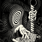
Heretic - Lux (2014: Lorenzo Gaggiotti, EPCC)
Two Sentence Summary:
A lot of different and unusual design elements merge to make a unique and mostly coherent beautiful deck of cards. The handling is also quite good, and the deck is one I'd be happy to perform with, especially given one interesting design element especially suited for magic.
Tuck Box:
The tuck box is primarily made up of cream and dark gold to brown colors with intricate patterns. The fronts and backs are slightly embossed. There are a number of unique elements to it which elevate it beyond other tuck boxes I've seen.
The front has a number of design elements that could well have looked incoherent if the designer hadn't been so accomplished. As it is, I feel the front captures the feel of mystery and perhaps gothic style they were going for, perfectly. I'm a huge fan of the color scheme.

The back is, except for a couple of small elements, a 1:1 representation of the card backs. The red, numbered seal (2489/4400 for me) holds an enlarged outer flap closed, so once opened, the deck box doesn't have the same look as other tuck boxes. The design is repeated on the flap so that while closed it also looks like the complete card back. Interestingly, the bottom circle is cut along the top curve.... and I just figured out why. So you can tuck the flap under it. I'm glad I do these reviews, I often learn something interesting, or in this case useful! I'm too lazy to take the extra picture now, but suffice it to say, the box looks great once the flap is secured.

The sides are unusual in that there is no lettering, merely a brown bar with some color variation that is actually quite attractive.

The bottom is black with brand information. The top has the same kind of pattern as on the sides, with the word "LUX" in the middle. The interior of the deck box is cream colored with a man's head and some symbology and latin words coming from it on the enlarged flap, a diagram of a hand and some more latin words on the inside front, and a diagram of perhaps an eclipse or mirror on the inside back - again with latin words. I have a feeling there's some sort of puzzle with this deck, but I don't have the time to figure it out unfortunately!


Card Backs:
Beautiful, and a touch darker with some changes to the design of the two circles at the top and bottom of the back, compared to the tuck box. I kind of feel like the ideal darkness would have been between the tuck box's coloring and the card backs, and I think I like the top and bottom circles of the tuck box just a touch more than the card backs. There's one further change which is extremely subtle. I'll leave it to the reader to discover it, with the following hint. The tuck box back is a two way design. The card backs are a one way design but it's so subtle that if these were used for magic tricks utilizing that element, a spectator would likely never even think to notice it.

Card Faces:
The card faces are cream colored in a parchment or perhaps marble type of pattern. Everything is unique and non-standard, but somehow it still feels easy to immediately recognize the suit and value of the card. The courts will be the biggest impediment to magic tricks as far as this goes, but even then there are many worse decks than this one in that regard.
Aces and Courts:
A beautiful Ace of Spades, and three other Aces with larger pips than the other cards set the tone for the rest of the deck. The elegant pips have arcane symbology behind them but drawn lightly enough that they enhance rather than obscure. I particularly like the very thin border at the edge of the pips which are otherwise pretty traditionally shaped. I also like the slightly darker red than seen on other cards. One thing I kind of wish though is that the red pips completely masked the design they overlay - it's a very minor thing, but since the black obviously completely obscures the symbology behind them, it would have been nice to be consistent. Still, some of my favorite Aces.

The courts are extremely nice, with a couple of small missteps in my eyes making this element the weakest of the deck I think. The images of the courts themselves are great. They aren't traditional - no suicide king, the Jack of Hearts is female, etc - but they're beautiful. The main issue I have is the background. The patterns on both the clothing of the courts and the background are complex, and make the cards look too busy. Additionally, the large pips in the corners are hard to see at a glance, except in the case of the diamonds which have a drop shadow that sets them off well. The hearts have a subtler drop shadow, and the black suits have none. The fonts here and throughout are fine, they match the feel of the deck, although I wish the corner pips had been a touch bigger.

Number Cards:
Following the look of the Aces, the pips overlay arcane symbology - simpler versions of those seen on the Ace cards. The pips are in very non-standard layouts which may or may not be a problem to some. I didn't find it to be an issue and very much like the clean look of these cards, although there are some cases where the 'white space' would look very odd without the additional texturing and background symbology.

Jokers & Gaff Cards:
There's a double backer, three Jokers - two showing a red or a black silhouette of a woman and man respectively, and the third showing a red skeleton inside a black silhouette. Arcane symbology and latin phrases runneth rampant. Yet they come off as elegant, again in spite of design elements that would look like a mish-mash in less talented hands. There is also a vaguely illuminati feeling card with... y'know, I'm not even going to try to describe it. But it does look very cool.

Handling:
My overhand shuffles aren't as clean with these as other decks, they seem to clump a touch more here and in spreads and fans, but the latter look beautiful when done well. Riffle shuffles are fine however. Overall the deck feels pretty heavy when handling it as well.
Triumph Reveal:
The front reveal spread looks very nice with the impression of a continuous light gold or pale yellow band the whole length. But the actual revealed card is a touch too subtle for me. The back reveal is a bit more obvious, but the cards spread much less easily this way with clumps more prevalent. I doubt I would ever do the back reveal Triumph effect.


Tuck Box Grade: A+
Card Backs: A+
Aces: A+
Courts: A-
Number Cards: A
Jokers & Gaff Cards: A-
Handling: B
Triumph Suitability Front Reveal: B-
Triumph Suitability Back Reveal: C-
Performance Deck: B-
Collector's Deck: A+
Overall: A-
Two Sentence Summary:
A lot of different and unusual design elements merge to make a unique and mostly coherent beautiful deck of cards. The handling is also quite good, and the deck is one I'd be happy to perform with, especially given one interesting design element especially suited for magic.
Tuck Box:
The tuck box is primarily made up of cream and dark gold to brown colors with intricate patterns. The fronts and backs are slightly embossed. There are a number of unique elements to it which elevate it beyond other tuck boxes I've seen.
The front has a number of design elements that could well have looked incoherent if the designer hadn't been so accomplished. As it is, I feel the front captures the feel of mystery and perhaps gothic style they were going for, perfectly. I'm a huge fan of the color scheme.
The back is, except for a couple of small elements, a 1:1 representation of the card backs. The red, numbered seal (2489/4400 for me) holds an enlarged outer flap closed, so once opened, the deck box doesn't have the same look as other tuck boxes. The design is repeated on the flap so that while closed it also looks like the complete card back. Interestingly, the bottom circle is cut along the top curve.... and I just figured out why. So you can tuck the flap under it. I'm glad I do these reviews, I often learn something interesting, or in this case useful! I'm too lazy to take the extra picture now, but suffice it to say, the box looks great once the flap is secured.
The sides are unusual in that there is no lettering, merely a brown bar with some color variation that is actually quite attractive.
The bottom is black with brand information. The top has the same kind of pattern as on the sides, with the word "LUX" in the middle. The interior of the deck box is cream colored with a man's head and some symbology and latin words coming from it on the enlarged flap, a diagram of a hand and some more latin words on the inside front, and a diagram of perhaps an eclipse or mirror on the inside back - again with latin words. I have a feeling there's some sort of puzzle with this deck, but I don't have the time to figure it out unfortunately!
Card Backs:
Beautiful, and a touch darker with some changes to the design of the two circles at the top and bottom of the back, compared to the tuck box. I kind of feel like the ideal darkness would have been between the tuck box's coloring and the card backs, and I think I like the top and bottom circles of the tuck box just a touch more than the card backs. There's one further change which is extremely subtle. I'll leave it to the reader to discover it, with the following hint. The tuck box back is a two way design. The card backs are a one way design but it's so subtle that if these were used for magic tricks utilizing that element, a spectator would likely never even think to notice it.
Card Faces:
The card faces are cream colored in a parchment or perhaps marble type of pattern. Everything is unique and non-standard, but somehow it still feels easy to immediately recognize the suit and value of the card. The courts will be the biggest impediment to magic tricks as far as this goes, but even then there are many worse decks than this one in that regard.
Aces and Courts:
A beautiful Ace of Spades, and three other Aces with larger pips than the other cards set the tone for the rest of the deck. The elegant pips have arcane symbology behind them but drawn lightly enough that they enhance rather than obscure. I particularly like the very thin border at the edge of the pips which are otherwise pretty traditionally shaped. I also like the slightly darker red than seen on other cards. One thing I kind of wish though is that the red pips completely masked the design they overlay - it's a very minor thing, but since the black obviously completely obscures the symbology behind them, it would have been nice to be consistent. Still, some of my favorite Aces.
The courts are extremely nice, with a couple of small missteps in my eyes making this element the weakest of the deck I think. The images of the courts themselves are great. They aren't traditional - no suicide king, the Jack of Hearts is female, etc - but they're beautiful. The main issue I have is the background. The patterns on both the clothing of the courts and the background are complex, and make the cards look too busy. Additionally, the large pips in the corners are hard to see at a glance, except in the case of the diamonds which have a drop shadow that sets them off well. The hearts have a subtler drop shadow, and the black suits have none. The fonts here and throughout are fine, they match the feel of the deck, although I wish the corner pips had been a touch bigger.
Number Cards:
Following the look of the Aces, the pips overlay arcane symbology - simpler versions of those seen on the Ace cards. The pips are in very non-standard layouts which may or may not be a problem to some. I didn't find it to be an issue and very much like the clean look of these cards, although there are some cases where the 'white space' would look very odd without the additional texturing and background symbology.
Jokers & Gaff Cards:
There's a double backer, three Jokers - two showing a red or a black silhouette of a woman and man respectively, and the third showing a red skeleton inside a black silhouette. Arcane symbology and latin phrases runneth rampant. Yet they come off as elegant, again in spite of design elements that would look like a mish-mash in less talented hands. There is also a vaguely illuminati feeling card with... y'know, I'm not even going to try to describe it. But it does look very cool.
Handling:
My overhand shuffles aren't as clean with these as other decks, they seem to clump a touch more here and in spreads and fans, but the latter look beautiful when done well. Riffle shuffles are fine however. Overall the deck feels pretty heavy when handling it as well.
Triumph Reveal:
The front reveal spread looks very nice with the impression of a continuous light gold or pale yellow band the whole length. But the actual revealed card is a touch too subtle for me. The back reveal is a bit more obvious, but the cards spread much less easily this way with clumps more prevalent. I doubt I would ever do the back reveal Triumph effect.
Tuck Box Grade: A+
Card Backs: A+
Aces: A+
Courts: A-
Number Cards: A
Jokers & Gaff Cards: A-
Handling: B
Triumph Suitability Front Reveal: B-
Triumph Suitability Back Reveal: C-
Performance Deck: B-
Collector's Deck: A+
Overall: A-
-
Harvonsgard
- Member
- Posts: 9787
- Joined: Fri Mar 01, 2019 6:53 am
- Cardist: Yes
- Player: Yes
- White Whale: Your Mami
- Decks Owned: 420
- Location: Paro
- Has thanked: 1792 times
- Been thanked: 4608 times
Re: My Deck Reviews
Great reviews indeed. Would love to see your thoughts on the Copag 310 and the Arrco Tahoe. Plus the Collector in me would love to see Uusi Pagan Black, Luminosity and Bicycle Persian Empire Royal Edition reviewed.
-
rgamble
- Member
- Posts: 28
- Joined: Mon Dec 23, 2019 9:59 pm
- Has thanked: 7 times
- Been thanked: 28 times
Re: My Deck Reviews
Thank you! Just broke open the Arrco Tahoes today. I'll add those to the list! Next review probably not until Friday due to crazier schedule.Harvonsgard wrote:Great reviews indeed. Would love to see your thoughts on the Copag 310 and the Arrco Tahoe. Plus the Collector in me would love to see Uusi Pagan Black, Luminosity and Bicycle Persian Empire Royal Edition reviewed.
-
rgamble
- Member
- Posts: 28
- Joined: Mon Dec 23, 2019 9:59 pm
- Has thanked: 7 times
- Been thanked: 28 times
Re: My Deck Reviews
Tally-Ho Poker 9 Playing Cards - Blue & Red (2018: USPC)
Two Sentence Summary:
This is a standard, affordable deck of cards designed for the performer. There are some design elements that nevertheless stand out for me, and I prefer how they feel to Bicycle decks so far.
Tuck Box:
The tuck box is pretty attractive for a standard, cheap deck of cards and it holds up well to handling.
The front is actually relatively complex, although dominated by the name of the deck and the original designer (A. Dougherty). The fonts change in type and size (even within single words for size), but somehow it all hangs together in what I find to be a fairly attractive front. I don't have a preference between the red and blue for the front.

The back is a 1:1 representation of the card backs, allowing for magic tricks where a card is 'hidden' in plain sight on the tuck box - although it does say 'Original Circle Back' in small letters underneath so an extremely observant spectator might catch you out. This actually annoys me a bit, that they added the text, so I'm dropping the tuck box grade from a C+ to a C. Since I love the backs of the cards, I like the back of the tuck box. Here I probably prefer the blues slightly.

The sides and top are simple blue/red boxes framed by a blue/red line. All contain fairly standard information as does the box bottom which just has text. I didn't take any pictures of the sides. The interior of the tuck box is plain white.
Card Backs:
For a performance deck these are almost perfect. I actually would have preferred a bit less busyness in the design except for the circle which is perfect. The busy background on the parts around the big circle and the smaller circles could have been toned down a touch perhaps to set them off more, but of course this design is the same as the original one. The relatively thin white border is great. I certainly like these better than standard Bicycle Rider backs.

Card Faces:
Except for the Ace of Spades, these are the standard pips, fonts, courts and Aces you've seen a million times. I'm still showing them just because someone just collecting cards and not using them to perform/play with, might not actually have seen these. From now on, if I use the term 'bog standard', I mean these. This isn't a bad thing at all for a performer, as they're clear and easy to read and instantly recognize for most spectators.
Aces and Courts:
I saw someone call this their favorite Ace of Spades. It certainly is in the 'performance' category of cards for me, and is a very nice Ace. It's probably nowhere close to my favorite, looking somewhat busy particularly with the text on the top and bottom.

The courts as mentioned, are standard.

Number Cards:
The number cards as mentioned, are standard.

Jokers & Gaff Cards:
There are no gaff cards. There's a poker hand ranking card and an ad card. The Jokers are a Black and White, and a color, version of the same image, a young man ready to go horseback riding - I believe. Cool image overall but nothing spectacular.

Handling:
I like these a lot. They don't feel light or heavy in my hand, they shuffle great and fan or spread great in both directions. I cracked open a new pack and compared to one I'd used for awhile and to be honest, the handling isn't that different.
Triumph Reveal:
I only did these reveals with the blue cards, but the reds are quite similar with the black suits standing out better for the red backs, and the red suits standing out better for the blue backs. These are nice and obvious reveals, helped by the narrow-ish white border and darker colors of the backs. The spread itself is like butter.


Tuck Box Grade: C
Card Backs: B-
Aces: C+
Courts: C
Number Cards: C
Jokers & Gaff Cards: C
Handling: A+
Triumph Suitability Front Reveal: A-
Triumph Suitability Back Reveal: A-
Performance Deck: A+
Collector's Deck: D (simply due to availability being unlimited - I like some elements better than many decks I consider collection decks)
Overall: B+
Two Sentence Summary:
This is a standard, affordable deck of cards designed for the performer. There are some design elements that nevertheless stand out for me, and I prefer how they feel to Bicycle decks so far.
Tuck Box:
The tuck box is pretty attractive for a standard, cheap deck of cards and it holds up well to handling.
The front is actually relatively complex, although dominated by the name of the deck and the original designer (A. Dougherty). The fonts change in type and size (even within single words for size), but somehow it all hangs together in what I find to be a fairly attractive front. I don't have a preference between the red and blue for the front.
The back is a 1:1 representation of the card backs, allowing for magic tricks where a card is 'hidden' in plain sight on the tuck box - although it does say 'Original Circle Back' in small letters underneath so an extremely observant spectator might catch you out. This actually annoys me a bit, that they added the text, so I'm dropping the tuck box grade from a C+ to a C. Since I love the backs of the cards, I like the back of the tuck box. Here I probably prefer the blues slightly.
The sides and top are simple blue/red boxes framed by a blue/red line. All contain fairly standard information as does the box bottom which just has text. I didn't take any pictures of the sides. The interior of the tuck box is plain white.
Card Backs:
For a performance deck these are almost perfect. I actually would have preferred a bit less busyness in the design except for the circle which is perfect. The busy background on the parts around the big circle and the smaller circles could have been toned down a touch perhaps to set them off more, but of course this design is the same as the original one. The relatively thin white border is great. I certainly like these better than standard Bicycle Rider backs.
Card Faces:
Except for the Ace of Spades, these are the standard pips, fonts, courts and Aces you've seen a million times. I'm still showing them just because someone just collecting cards and not using them to perform/play with, might not actually have seen these. From now on, if I use the term 'bog standard', I mean these. This isn't a bad thing at all for a performer, as they're clear and easy to read and instantly recognize for most spectators.
Aces and Courts:
I saw someone call this their favorite Ace of Spades. It certainly is in the 'performance' category of cards for me, and is a very nice Ace. It's probably nowhere close to my favorite, looking somewhat busy particularly with the text on the top and bottom.
The courts as mentioned, are standard.
Number Cards:
The number cards as mentioned, are standard.
Jokers & Gaff Cards:
There are no gaff cards. There's a poker hand ranking card and an ad card. The Jokers are a Black and White, and a color, version of the same image, a young man ready to go horseback riding - I believe. Cool image overall but nothing spectacular.
Handling:
I like these a lot. They don't feel light or heavy in my hand, they shuffle great and fan or spread great in both directions. I cracked open a new pack and compared to one I'd used for awhile and to be honest, the handling isn't that different.
Triumph Reveal:
I only did these reveals with the blue cards, but the reds are quite similar with the black suits standing out better for the red backs, and the red suits standing out better for the blue backs. These are nice and obvious reveals, helped by the narrow-ish white border and darker colors of the backs. The spread itself is like butter.
Tuck Box Grade: C
Card Backs: B-
Aces: C+
Courts: C
Number Cards: C
Jokers & Gaff Cards: C
Handling: A+
Triumph Suitability Front Reveal: A-
Triumph Suitability Back Reveal: A-
Performance Deck: A+
Collector's Deck: D (simply due to availability being unlimited - I like some elements better than many decks I consider collection decks)
Overall: B+
-
rgamble
- Member
- Posts: 28
- Joined: Mon Dec 23, 2019 9:59 pm
- Has thanked: 7 times
- Been thanked: 28 times
Tuatha De' Danann
Bicycle Celtic Myth (2016: USPCC)
Two Sentence Summary:
If you're big on Celtic mythology and want to learn a new card game that early Celts played, this deck might be for you. I find it falls flat in both the card performance and card collection aspects for me.
Tuck Box:
The tuck box is probably my favorite part of the deck. The background is a dark green that borders on grey and the overall look of the deck box is well integrated. One thing I liked was the Gaelic language used almost everywhere except for 'Bicycle' and some information on the bottom of the tuck (duplicated in both English and Gaelic).
The front of the tuck box used a dark red, cream and light green color scheme that I find attractive enough. The Heart pip in the center is difficult to recognize as such until you see the cards, and the figure itself is overly complex and a bit garish to my eyes.

The back is a close to 1:1 representation of the card backs, except with an additional border in the main background color of the deck box (green/grey). The interesting thing is that I actually like the back of the tuck box better than the back of the cards, as the more muted color border with the white line in the middle of it, creates a more interesting look and feel than the simpler card back which extends the brighter green all the way to the edges.

The sides and top (not shown) have similar styling with thin red lines above and below Gaelic words in kind of a golden-orange hue. The problem here is each of the sides/top uses different font sizes and typography. And one side only includes symbols bracketing the words. So it really feels something of a mish-mash of styles.


Card Backs:
As alluded to, I really wish these had used the tuck box back. Instead, the primary green color extends all the way to the edge in a pretty wide border. The artwork is lovely enough, but a few too many colors have been used for my taste, and the fact that a large portion of this design uses different shades of green makes it not set off from the back enough for my tastes. I wonder what this would have looked like with the same background as on the front of the cards. I have a feeling I would have preferred that a lot more

Card Faces:
Everything is custom, from the cream with a very light tinge of green background that gets subtly brighter towards the center of the card, to the pips, font and especially courts.
Aces and Courts:
These just don't do it for me. The Ace of Spades is the best in my eyes. The Ace of Clubs looks the most traditional but the color scheme of multiple but all dark colors isn't attractive to me. The same problem occurs with the Ace of Diamonds, and the Ace of Hearts is an eyesore for me. Another weirdness is that the fonts used for the 'A' in the corners are different from the diamonds and spades to the hearts and clubs. And both are hard to read at a glance.

The courts are better in my opinion, mostly because the background of the card allows for more contrast with the darker colors used to provide a bit more interest in the figures. The 'frame' for the courts does have the effect of making the actual figures a bit too small for my tastes. And there's little consistency in some areas, for instance notice that three of the courts show mostly the head and shoulders, while the King of Spades is 'zoomed out' a bit more, making the scale look different. The King and Queen fonts are fine but the Jack is tough on the eyes when trying to identify the card at a glance.

Number Cards:
These are just bad in my eyes. The one saving grace is that the font for the numbers and the much simplified - especially the hearts - pips on the corners, do make the card more recognizable. These might be the only deck of cards I'm aware of (besides a sister deck to these that I also have - what can I say, I've gotten better at knowing what I'll like) where the pips are differently sized depending on the value of the card. So lower value cards have bigger pips. Additionally, some of the cards have different pip sizes on the SAME card (7 of hearts). And the hearts actually have a much different color scheme than the Ace of Hearts. Just a really incoherent set of choices.

Jokers & Gaff Cards:
There are no gaff cards. There is a link to an ancient Celtic card game and a poem excerpt on two cards. The Jokers are two different images, again in dissimilar styles - one a 2 D figure, the other a 3D cartoonish flaming horse thingy with the 4 pips scattered around it.

Handling:
Ok, so these are USPC and they handle just fine. But... I'll never use these decks in a performance so it doesn't really matter. And for some reason they seem a touch rougher and flimsier than standard Bicycle decks. Maybe they use a poorer quality control or some such? Or maybe I'm just biased against them so it extends to my perception of their performance.
Triumph Reveal:
Worst Triumph reveal EVER!! Ok, actually these are pretty good. Here the green color extending to the border on the card back combined with readable and large fonts with recognizable corner pips, helps. Plus the spread is attractive with the yellow/orange middle bow. If the colors were just a bit more muted I think I could like this quite a bit so I'm really torn on the grades to give this. I do think I like the front reveal better.


Tuck Box Grade: D+
Card Backs: D
Aces: D-
Courts: D+
Number Cards: F
Jokers & Gaff Cards: D- (F for the jokers, makbe a D or D+ for the poem fragment of the ancient celt game I might look up after this review).
Handling: A-
Triumph Suitability Front Reveal: B
Triumph Suitability Back Reveal: B-
Performance Deck: D+
Collector's Deck: D-
Overall: D
Two Sentence Summary:
If you're big on Celtic mythology and want to learn a new card game that early Celts played, this deck might be for you. I find it falls flat in both the card performance and card collection aspects for me.
Tuck Box:
The tuck box is probably my favorite part of the deck. The background is a dark green that borders on grey and the overall look of the deck box is well integrated. One thing I liked was the Gaelic language used almost everywhere except for 'Bicycle' and some information on the bottom of the tuck (duplicated in both English and Gaelic).
The front of the tuck box used a dark red, cream and light green color scheme that I find attractive enough. The Heart pip in the center is difficult to recognize as such until you see the cards, and the figure itself is overly complex and a bit garish to my eyes.
The back is a close to 1:1 representation of the card backs, except with an additional border in the main background color of the deck box (green/grey). The interesting thing is that I actually like the back of the tuck box better than the back of the cards, as the more muted color border with the white line in the middle of it, creates a more interesting look and feel than the simpler card back which extends the brighter green all the way to the edges.
The sides and top (not shown) have similar styling with thin red lines above and below Gaelic words in kind of a golden-orange hue. The problem here is each of the sides/top uses different font sizes and typography. And one side only includes symbols bracketing the words. So it really feels something of a mish-mash of styles.
Card Backs:
As alluded to, I really wish these had used the tuck box back. Instead, the primary green color extends all the way to the edge in a pretty wide border. The artwork is lovely enough, but a few too many colors have been used for my taste, and the fact that a large portion of this design uses different shades of green makes it not set off from the back enough for my tastes. I wonder what this would have looked like with the same background as on the front of the cards. I have a feeling I would have preferred that a lot more
Card Faces:
Everything is custom, from the cream with a very light tinge of green background that gets subtly brighter towards the center of the card, to the pips, font and especially courts.
Aces and Courts:
These just don't do it for me. The Ace of Spades is the best in my eyes. The Ace of Clubs looks the most traditional but the color scheme of multiple but all dark colors isn't attractive to me. The same problem occurs with the Ace of Diamonds, and the Ace of Hearts is an eyesore for me. Another weirdness is that the fonts used for the 'A' in the corners are different from the diamonds and spades to the hearts and clubs. And both are hard to read at a glance.
The courts are better in my opinion, mostly because the background of the card allows for more contrast with the darker colors used to provide a bit more interest in the figures. The 'frame' for the courts does have the effect of making the actual figures a bit too small for my tastes. And there's little consistency in some areas, for instance notice that three of the courts show mostly the head and shoulders, while the King of Spades is 'zoomed out' a bit more, making the scale look different. The King and Queen fonts are fine but the Jack is tough on the eyes when trying to identify the card at a glance.
Number Cards:
These are just bad in my eyes. The one saving grace is that the font for the numbers and the much simplified - especially the hearts - pips on the corners, do make the card more recognizable. These might be the only deck of cards I'm aware of (besides a sister deck to these that I also have - what can I say, I've gotten better at knowing what I'll like) where the pips are differently sized depending on the value of the card. So lower value cards have bigger pips. Additionally, some of the cards have different pip sizes on the SAME card (7 of hearts). And the hearts actually have a much different color scheme than the Ace of Hearts. Just a really incoherent set of choices.
Jokers & Gaff Cards:
There are no gaff cards. There is a link to an ancient Celtic card game and a poem excerpt on two cards. The Jokers are two different images, again in dissimilar styles - one a 2 D figure, the other a 3D cartoonish flaming horse thingy with the 4 pips scattered around it.
Handling:
Ok, so these are USPC and they handle just fine. But... I'll never use these decks in a performance so it doesn't really matter. And for some reason they seem a touch rougher and flimsier than standard Bicycle decks. Maybe they use a poorer quality control or some such? Or maybe I'm just biased against them so it extends to my perception of their performance.
Triumph Reveal:
Worst Triumph reveal EVER!! Ok, actually these are pretty good. Here the green color extending to the border on the card back combined with readable and large fonts with recognizable corner pips, helps. Plus the spread is attractive with the yellow/orange middle bow. If the colors were just a bit more muted I think I could like this quite a bit so I'm really torn on the grades to give this. I do think I like the front reveal better.
Tuck Box Grade: D+
Card Backs: D
Aces: D-
Courts: D+
Number Cards: F
Jokers & Gaff Cards: D- (F for the jokers, makbe a D or D+ for the poem fragment of the ancient celt game I might look up after this review).
Handling: A-
Triumph Suitability Front Reveal: B
Triumph Suitability Back Reveal: B-
Performance Deck: D+
Collector's Deck: D-
Overall: D
-
rgamble
- Member
- Posts: 28
- Joined: Mon Dec 23, 2019 9:59 pm
- Has thanked: 7 times
- Been thanked: 28 times
Copag 310 (2018: Cartamundi)
Copag 310 - Blue (2018: Cartamundi)
Two Sentence Summary:
These are solid handling alternatives to the USPCC universe of basic playing cards to use in card games or magic routines. These aren't collector's decks by any stretch of the imagination, but I'm glad they're in my collection.
Tuck Box:
The tuck box is bicolor: white background and a dark blue for the design elements. Technically you could call it quad-color if you include the red cartamundi seal and black lettering on the bottom of the tuck.
The front has the deck name and some of the back design elements reorganized with the colors reversed from how they actually appear on the card backs. Attractive enough but too bare bones and almost monotonous (not enough varying of density of design elements to break up the front). This is a Tuck that I will quickly forget about once I'm done using it.

The tuck back is, finally in my reviews, a true 1:1 representation of the card backs. The coloring is the same, the size of the back pattern is the same, and there are no bits of unnecessary text to break up the illusion if so used in a card trick. Even better, there's no seal (or at least wasn't on my box), so you could use a brand new deck with no issues if it requires hiding a card on the tuck box. The design is attractive if not particularly memorable.

The sides are more similar to the tuck box front than the back and provide information on the cards. The 'exciting' part is probably the "True Linen B9 Finish" shown in the figure below, Cartamundi's attempt to match the handling of the USPCC decks.

The top just has the brand name 'COPAG' and next to it the heart in a spade symbol seen on the front of the tuck box. Colors are reversed for both the name and the symbol. The bottom has the red cartamundi seal and some deck information in simple text. The interior is unadorned in any way.
Card Backs:
Since this is the same as the tuck box back, there's not much to say that I didn't there. The borders are thicker than I usually like for a card back, appearing perhaps a millimeter or so wider all around than Bicycle decks. The blue feels almost a touch too dark for my tastes and perhaps a touch too dense of a pattern of the thin white lines. There's nothing on the card backs to make me dislike them, but nothing to make me really remember them. Obviously this isn't necessarily a bad thing when it comes to magic tricks, but I find the standard Bicycle backs more memorable, and in fact most of the other 'basic' decks I own (Tally-Ho's, Blue Ribbon, Arrcos, etc) have a more interesting look and feel to me.

Card Faces:
The card faces are almost as if you had taken standard Bicycle cards and made them a bit chunkier in appearance. The fonts, the pips, the courts are all a bit thicker/wider in appearance to my eyes. The boxes around the courts are thicker, the font is thicker and a bit wider in comparison to the height, and the pips are wider. This all gives a slightly less elegant look to the cards. The main positive is that everything is almost as immediately identifiable as a Bicycle deck.
Aces and Courts:
The Ace of Spades is slightly enlarged and embellished compared to the others. But it's as if someone said "Eh, too much effort to make it cool, let's just do the bare bones..". And I get it, this deck is really designed as a bare bones but great handling poker/magic deck. But I kind of feel like the deck should have at least a Bicycle level of attractiveness unless your handling is simply a step above.. The rest of the Aces are basic.

The courts are, as mentioned above, as if the Bicycle courts ate a few more cheeseburgers and less vegetables. Plus they all kind of look sleepy eyed. Not an improvement in my eyes.

Number Cards:
These are plain jane. Again with somewhat wider pips and fonts. And the main pips on some of the cards come a touch too close to the numbers and suits on the corners for my taste.

Jokers & Gaff Cards:
There's a double backer, a blank faced card, and two jokers. The Jokers may be the most interesting visual element of the whole deck: identical but with nice use of color and pose.

Handling:
These do handle very nicely, but I don't really see much of a difference overall between these and USPCC decks. They seem a touch lighter in spite of also being thicker - some of the thickest cards I've seen, and perhaps fan and spread more smoothly out of the box compared to Bicycle Standards. They shuffle great but for some reason I often can't lift the bottom card of the deck from the table as easily as other decks when riffle shuffling. Maybe they lie too flat!
Triumph Reveal:
The front reveal spread is very obvious and the spread itself is quite smooth. The look isn't all that memorable due to the design elements but the point is really for the spectator to immediately see it, so I can live with it. The back reveal feels a bit less obvious to me, but they often do. And overall I find it far less interesting since I like the backs more than the fronts.


Tuck Box Grade: D+ (D except for the perfect 1:1 card back)
Card Backs: D+
Aces: D
Courts: D
Number Cards: D-
Jokers & Gaff Cards: B-
Handling: A+
Triumph Suitability Front Reveal: A
Triumph Suitability Back Reveal: A-
Performance Deck: B+ (The lackluster graphics just don't make me excited when using this deck)
Collector's Deck: F
Overall: D+
Two Sentence Summary:
These are solid handling alternatives to the USPCC universe of basic playing cards to use in card games or magic routines. These aren't collector's decks by any stretch of the imagination, but I'm glad they're in my collection.
Tuck Box:
The tuck box is bicolor: white background and a dark blue for the design elements. Technically you could call it quad-color if you include the red cartamundi seal and black lettering on the bottom of the tuck.
The front has the deck name and some of the back design elements reorganized with the colors reversed from how they actually appear on the card backs. Attractive enough but too bare bones and almost monotonous (not enough varying of density of design elements to break up the front). This is a Tuck that I will quickly forget about once I'm done using it.
The tuck back is, finally in my reviews, a true 1:1 representation of the card backs. The coloring is the same, the size of the back pattern is the same, and there are no bits of unnecessary text to break up the illusion if so used in a card trick. Even better, there's no seal (or at least wasn't on my box), so you could use a brand new deck with no issues if it requires hiding a card on the tuck box. The design is attractive if not particularly memorable.
The sides are more similar to the tuck box front than the back and provide information on the cards. The 'exciting' part is probably the "True Linen B9 Finish" shown in the figure below, Cartamundi's attempt to match the handling of the USPCC decks.
The top just has the brand name 'COPAG' and next to it the heart in a spade symbol seen on the front of the tuck box. Colors are reversed for both the name and the symbol. The bottom has the red cartamundi seal and some deck information in simple text. The interior is unadorned in any way.
Card Backs:
Since this is the same as the tuck box back, there's not much to say that I didn't there. The borders are thicker than I usually like for a card back, appearing perhaps a millimeter or so wider all around than Bicycle decks. The blue feels almost a touch too dark for my tastes and perhaps a touch too dense of a pattern of the thin white lines. There's nothing on the card backs to make me dislike them, but nothing to make me really remember them. Obviously this isn't necessarily a bad thing when it comes to magic tricks, but I find the standard Bicycle backs more memorable, and in fact most of the other 'basic' decks I own (Tally-Ho's, Blue Ribbon, Arrcos, etc) have a more interesting look and feel to me.
Card Faces:
The card faces are almost as if you had taken standard Bicycle cards and made them a bit chunkier in appearance. The fonts, the pips, the courts are all a bit thicker/wider in appearance to my eyes. The boxes around the courts are thicker, the font is thicker and a bit wider in comparison to the height, and the pips are wider. This all gives a slightly less elegant look to the cards. The main positive is that everything is almost as immediately identifiable as a Bicycle deck.
Aces and Courts:
The Ace of Spades is slightly enlarged and embellished compared to the others. But it's as if someone said "Eh, too much effort to make it cool, let's just do the bare bones..". And I get it, this deck is really designed as a bare bones but great handling poker/magic deck. But I kind of feel like the deck should have at least a Bicycle level of attractiveness unless your handling is simply a step above.. The rest of the Aces are basic.
The courts are, as mentioned above, as if the Bicycle courts ate a few more cheeseburgers and less vegetables. Plus they all kind of look sleepy eyed. Not an improvement in my eyes.
Number Cards:
These are plain jane. Again with somewhat wider pips and fonts. And the main pips on some of the cards come a touch too close to the numbers and suits on the corners for my taste.
Jokers & Gaff Cards:
There's a double backer, a blank faced card, and two jokers. The Jokers may be the most interesting visual element of the whole deck: identical but with nice use of color and pose.
Handling:
These do handle very nicely, but I don't really see much of a difference overall between these and USPCC decks. They seem a touch lighter in spite of also being thicker - some of the thickest cards I've seen, and perhaps fan and spread more smoothly out of the box compared to Bicycle Standards. They shuffle great but for some reason I often can't lift the bottom card of the deck from the table as easily as other decks when riffle shuffling. Maybe they lie too flat!
Triumph Reveal:
The front reveal spread is very obvious and the spread itself is quite smooth. The look isn't all that memorable due to the design elements but the point is really for the spectator to immediately see it, so I can live with it. The back reveal feels a bit less obvious to me, but they often do. And overall I find it far less interesting since I like the backs more than the fronts.
Tuck Box Grade: D+ (D except for the perfect 1:1 card back)
Card Backs: D+
Aces: D
Courts: D
Number Cards: D-
Jokers & Gaff Cards: B-
Handling: A+
Triumph Suitability Front Reveal: A
Triumph Suitability Back Reveal: A-
Performance Deck: B+ (The lackluster graphics just don't make me excited when using this deck)
Collector's Deck: F
Overall: D+
-
rgamble
- Member
- Posts: 28
- Joined: Mon Dec 23, 2019 9:59 pm
- Has thanked: 7 times
- Been thanked: 28 times
Pagan - Black Limited Edition
Pagan - Black (2019: UUSI, EPCC)
Two Sentence Summary:
This deck is simply sublime, as well and being truly unique. In spite of this, it has a number of features which make it worthy of being not just a collector's deck, but also a performance deck.
Tuck Box:
The tuck box has a minimalist approach as far as the number of design elements, but it can hardly be called plain. Almost the entire box is covered in the pattern seen on the card backs with just a couple of minor breaks in the flow. This makes for a unique look, but without the amazing pattern and subtle use of colors it wouldn't come off nearly as well.
The front uses the pattern as described above with an elegant looking box in the middle that holds the stylized representation of a branch. No branding, no words. I love it. Note that the gold is much shinier than in the photos I took, although nowhere near overwhelming.

The back is a 1:1 representation of the card backs, with another box that's covered by the seal - both extend to the top as well. I actually don't know what's in the box.. ("What's in the box????") but the seal is attractive enough to not distract from the overall pattern.

The sides are unadorned except for the main pattern that extends seamlessly across the front and back. The top has the same pattern plus the other half of the box that the seal covers. The flap itself is good sized, and continues the pattern plus box, although nothing is in the frame. The side flaps also have the same pattern as the rest of the box. The interior is plain black.

Card Backs:
The card backs are borderless and have the same pattern found on the tuck boxes. They create great fans and spreads, and close inspection reveals subtle details in both the pattern coloration which I really like. To me they need _something_ else to move from the excellent level to 'wow!' but I really like the pattern and overall look. There are some slights used in magic where these backs would be a benefit, but the tricks I do often use face up and face down cards, and these would make some of those tricks more difficult.

Card Faces:
The background is kind of a weathered parchment/paper. The colors are traditional black and red for the suits, but shaded and weathered in appearance also. The pips are mostly traditional - the clubs departing the most perhaps but not radically so - and easy to recognize. The font and pips used to identify the cards in the corners are just about perfect in size and shape for my eye, making the cards immediately identifiable in spreads.
I accidentally discovered that a 'vertical' spread creates an interesting look which is something relatively unique as far as I know.

Aces and Courts:
I love these. The Ace of Spades has an enlarged pip compared to the other three, and a leafless branch in front of it. Each of the other three aces has an enlarged pip as well, and a circle of vegetation around them. The vegetation is thin and muted in colors for the most part, letting the pip shine. But the circle complements and elevates the whole look. These are some of my favorite Aces.

The courts are beautiful. My one complaint is that the picture sometimes blends into or obscures the large pip in the two corners, but this is a very minor complaint. Each drawing is beautiful, each suit has a unique theme, and the courts work with the rest of the imagery to solidify the deck into one coherent work of art.

Number Cards:
The number cards don't quite measure up to the rest of the deck, I feel as if there perhaps should have been some hint of vegetation along the lines of the Ace cards but more subtle. By no means are these bad cards, they're quite attractive and easy to read. The shading of the pips and the weathered feel of the background elevate them above many other decks. I feel that in some cards the pips are too widely separated (the 4's for instance), but overall I do like these cards.

Jokers & Gaff Cards:
There are no gaff cards. The Joker cards are beautiful. They're mirrored images of a female satyr like creature (I know satyrs are usually depicted as males, so not sure what to call the creature depicted) draped by vegetation. The color of the symbols in the corners are also different between the cards (red and black). From what I'm aware, this is the only element on the cards that has changed from the previous Pagan decks.

Handling:
I'm coming to enjoy handling Expert Playing Card Company's decks. These slide, shuffle, spread and fan perfectly. The weight of the full deck feels great to me as well.
Triumph Reveal:
The front reveal itself is pretty much perfect due to the borderless back and ease and smoothness of spreading. However, as is usually the case with cards with different colors for the front and back at the edge, an attentive spectator could easily see the white edge of the turned over card before they're spread. This means I likely would only use this effect if the triumph reveal was done as a prediction where I take the deck out of a card box and immediately spread it. The back reveal is less dramatic, but certainly quite obvious.


Tuck Box Grade: A
Card Backs: A
Aces: A+
Courts: A+
Number Cards: A-
Jokers & Gaff Cards: A
Handling: A+
Triumph Suitability Front Reveal: A+
Triumph Suitability Back Reveal: A
Performance Deck: A- (Handling is great, the borderless design would make some of my staple types of tricks more difficult to perform, but I could see creating new narratives around the tricks for the theme of the deck)
Collector's Deck: A+
Overall: A
Two Sentence Summary:
This deck is simply sublime, as well and being truly unique. In spite of this, it has a number of features which make it worthy of being not just a collector's deck, but also a performance deck.
Tuck Box:
The tuck box has a minimalist approach as far as the number of design elements, but it can hardly be called plain. Almost the entire box is covered in the pattern seen on the card backs with just a couple of minor breaks in the flow. This makes for a unique look, but without the amazing pattern and subtle use of colors it wouldn't come off nearly as well.
The front uses the pattern as described above with an elegant looking box in the middle that holds the stylized representation of a branch. No branding, no words. I love it. Note that the gold is much shinier than in the photos I took, although nowhere near overwhelming.
The back is a 1:1 representation of the card backs, with another box that's covered by the seal - both extend to the top as well. I actually don't know what's in the box.. ("What's in the box????") but the seal is attractive enough to not distract from the overall pattern.
The sides are unadorned except for the main pattern that extends seamlessly across the front and back. The top has the same pattern plus the other half of the box that the seal covers. The flap itself is good sized, and continues the pattern plus box, although nothing is in the frame. The side flaps also have the same pattern as the rest of the box. The interior is plain black.
Card Backs:
The card backs are borderless and have the same pattern found on the tuck boxes. They create great fans and spreads, and close inspection reveals subtle details in both the pattern coloration which I really like. To me they need _something_ else to move from the excellent level to 'wow!' but I really like the pattern and overall look. There are some slights used in magic where these backs would be a benefit, but the tricks I do often use face up and face down cards, and these would make some of those tricks more difficult.
Card Faces:
The background is kind of a weathered parchment/paper. The colors are traditional black and red for the suits, but shaded and weathered in appearance also. The pips are mostly traditional - the clubs departing the most perhaps but not radically so - and easy to recognize. The font and pips used to identify the cards in the corners are just about perfect in size and shape for my eye, making the cards immediately identifiable in spreads.
I accidentally discovered that a 'vertical' spread creates an interesting look which is something relatively unique as far as I know.
Aces and Courts:
I love these. The Ace of Spades has an enlarged pip compared to the other three, and a leafless branch in front of it. Each of the other three aces has an enlarged pip as well, and a circle of vegetation around them. The vegetation is thin and muted in colors for the most part, letting the pip shine. But the circle complements and elevates the whole look. These are some of my favorite Aces.
The courts are beautiful. My one complaint is that the picture sometimes blends into or obscures the large pip in the two corners, but this is a very minor complaint. Each drawing is beautiful, each suit has a unique theme, and the courts work with the rest of the imagery to solidify the deck into one coherent work of art.
Number Cards:
The number cards don't quite measure up to the rest of the deck, I feel as if there perhaps should have been some hint of vegetation along the lines of the Ace cards but more subtle. By no means are these bad cards, they're quite attractive and easy to read. The shading of the pips and the weathered feel of the background elevate them above many other decks. I feel that in some cards the pips are too widely separated (the 4's for instance), but overall I do like these cards.
Jokers & Gaff Cards:
There are no gaff cards. The Joker cards are beautiful. They're mirrored images of a female satyr like creature (I know satyrs are usually depicted as males, so not sure what to call the creature depicted) draped by vegetation. The color of the symbols in the corners are also different between the cards (red and black). From what I'm aware, this is the only element on the cards that has changed from the previous Pagan decks.
Handling:
I'm coming to enjoy handling Expert Playing Card Company's decks. These slide, shuffle, spread and fan perfectly. The weight of the full deck feels great to me as well.
Triumph Reveal:
The front reveal itself is pretty much perfect due to the borderless back and ease and smoothness of spreading. However, as is usually the case with cards with different colors for the front and back at the edge, an attentive spectator could easily see the white edge of the turned over card before they're spread. This means I likely would only use this effect if the triumph reveal was done as a prediction where I take the deck out of a card box and immediately spread it. The back reveal is less dramatic, but certainly quite obvious.
Tuck Box Grade: A
Card Backs: A
Aces: A+
Courts: A+
Number Cards: A-
Jokers & Gaff Cards: A
Handling: A+
Triumph Suitability Front Reveal: A+
Triumph Suitability Back Reveal: A
Performance Deck: A- (Handling is great, the borderless design would make some of my staple types of tricks more difficult to perform, but I could see creating new narratives around the tricks for the theme of the deck)
Collector's Deck: A+
Overall: A
-
rgamble
- Member
- Posts: 28
- Joined: Mon Dec 23, 2019 9:59 pm
- Has thanked: 7 times
- Been thanked: 28 times
Arrco Tahoe
Arrco Tahoe Club Playing Cards - Red & Blue (2011: USPCC)
Two Sentence Summary:
This is a performance deck with some collectible qualities to it, not least of which is price. It uneasily straddles that line, as I don't think the handling justifies a higher price for a performance deck and it looks a bit mundane for a collectible deck.
Tuck Box:
The tuck box is a replica of the original for the most part. This is of course the collectible aspect, replicating an older well regarded performance deck as closely as possible. The tuck box is sturdy with a simple performance deck style design. The interesting element when comparing the two colors is that each has red and blue in the color of the respective backs, and the colors are switched. So the red deck has red almost everywhere except for the blue for the spade on the front and the frame on the sides. The blue deck is reversed. Note that I have not broken the seal on the blue deck, so I'll only be showing the cards from the red deck.
The front is simple, with one of the cleaner designs I've seen, easy to read, but not extremely memorable to me. As mentioned, the color of the card back dominates the front except for the reverse color for the spade symbol and the word CLUB.

The back is a 1:1 representation of the card backs, allowing for magic tricks where a card is 'hidden' in plain sight on the tuck box. I prefer the blue back better. Interestingly, the seals are opposite colors, and they show the box number out of 2500. Obviously you have to remove the seal to do the card on the tuck box back in a performance.

The sides are simple blue/red boxes reversed from the main deck color (blue for the red deck, red for the blue deck) with standard information.

The top and bottom edges are continuations of the front with small text and a spade on the bottom, and "Tahoe No. 84" bordered by a thin white line at the top. The tuck box flaps have the words 1st and Ed for 1st Edition and the interior is plain white.

Card Backs:
The card backs are attractive. They're two way but the left/right is not mirrored providing some interest. It's a bit of a mish-mash looked at closely, but the elements work well together at a glance. I like the somewhat muted colors compared to brighter ones on some other decks. My main complaint is the very wide white border. Again, a matter of a millimeter perhaps, but they're wider than even the Copag's reviewed recently. I show only the red back here, but one of the gaff cards has a double sided blue back that you can see later. I like the look of that one better, unsurprisingly since I said the same thing for the tuck box back.

Card Faces:
The font looks close to if not the same as bicycle decks. The pips are the same size but a bit less nuanced. Straight lines for diamonds, slightly less changes in curvature on the other pips. To my eye they aren't as interesting. These are replicas, so you can't fault the designer for this, just calling em as I see em.
Aces and Courts:
The Ace of Spades is simple but nice enough with an enlarged and somewhat embellished pip. The rest of the aces have a single standard sized and colored pip.

The courts are close to standard but with changes to the clothing representing the deck theme more. The faces to me seem a bit surprised/doe eyed compared to the standard courts.

Number Cards:
The number cards, other than the pip shapes are standard in size, color and arrangement. I like the pips less than bicycle standard.

Jokers & Gaff Cards:
The jokers are black and white laughing clown faces and don't do much for me. The two gaff cards are double backers in the red deck. One shows a red back, the other a blue back.

Handling:
These fan and spread quite nicely, as well as shuffle easily and smoothly. They feel pretty standard in weight and thickness.
Triumph Reveal:
These feel a lot like the Tally-Ho's to me in how the Triumph reveal looks, although I don't like the larger border as much. I prefer the front reveal to the back reveal.


Tuck Box Grade: C-
Card Backs: C
Aces: D+
Courts: C-
Number Cards: D+
Jokers & Gaff Cards: C+
Handling: A+
Triumph Suitability Front Reveal: A-
Triumph Suitability Back Reveal: B+
Performance Deck: A-
Collector's Deck: C+
Overall: B
Two Sentence Summary:
This is a performance deck with some collectible qualities to it, not least of which is price. It uneasily straddles that line, as I don't think the handling justifies a higher price for a performance deck and it looks a bit mundane for a collectible deck.
Tuck Box:
The tuck box is a replica of the original for the most part. This is of course the collectible aspect, replicating an older well regarded performance deck as closely as possible. The tuck box is sturdy with a simple performance deck style design. The interesting element when comparing the two colors is that each has red and blue in the color of the respective backs, and the colors are switched. So the red deck has red almost everywhere except for the blue for the spade on the front and the frame on the sides. The blue deck is reversed. Note that I have not broken the seal on the blue deck, so I'll only be showing the cards from the red deck.
The front is simple, with one of the cleaner designs I've seen, easy to read, but not extremely memorable to me. As mentioned, the color of the card back dominates the front except for the reverse color for the spade symbol and the word CLUB.
The back is a 1:1 representation of the card backs, allowing for magic tricks where a card is 'hidden' in plain sight on the tuck box. I prefer the blue back better. Interestingly, the seals are opposite colors, and they show the box number out of 2500. Obviously you have to remove the seal to do the card on the tuck box back in a performance.
The sides are simple blue/red boxes reversed from the main deck color (blue for the red deck, red for the blue deck) with standard information.
The top and bottom edges are continuations of the front with small text and a spade on the bottom, and "Tahoe No. 84" bordered by a thin white line at the top. The tuck box flaps have the words 1st and Ed for 1st Edition and the interior is plain white.
Card Backs:
The card backs are attractive. They're two way but the left/right is not mirrored providing some interest. It's a bit of a mish-mash looked at closely, but the elements work well together at a glance. I like the somewhat muted colors compared to brighter ones on some other decks. My main complaint is the very wide white border. Again, a matter of a millimeter perhaps, but they're wider than even the Copag's reviewed recently. I show only the red back here, but one of the gaff cards has a double sided blue back that you can see later. I like the look of that one better, unsurprisingly since I said the same thing for the tuck box back.
Card Faces:
The font looks close to if not the same as bicycle decks. The pips are the same size but a bit less nuanced. Straight lines for diamonds, slightly less changes in curvature on the other pips. To my eye they aren't as interesting. These are replicas, so you can't fault the designer for this, just calling em as I see em.
Aces and Courts:
The Ace of Spades is simple but nice enough with an enlarged and somewhat embellished pip. The rest of the aces have a single standard sized and colored pip.
The courts are close to standard but with changes to the clothing representing the deck theme more. The faces to me seem a bit surprised/doe eyed compared to the standard courts.
Number Cards:
The number cards, other than the pip shapes are standard in size, color and arrangement. I like the pips less than bicycle standard.
Jokers & Gaff Cards:
The jokers are black and white laughing clown faces and don't do much for me. The two gaff cards are double backers in the red deck. One shows a red back, the other a blue back.
Handling:
These fan and spread quite nicely, as well as shuffle easily and smoothly. They feel pretty standard in weight and thickness.
Triumph Reveal:
These feel a lot like the Tally-Ho's to me in how the Triumph reveal looks, although I don't like the larger border as much. I prefer the front reveal to the back reveal.
Tuck Box Grade: C-
Card Backs: C
Aces: D+
Courts: C-
Number Cards: D+
Jokers & Gaff Cards: C+
Handling: A+
Triumph Suitability Front Reveal: A-
Triumph Suitability Back Reveal: B+
Performance Deck: A-
Collector's Deck: C+
Overall: B
Who is online
Users browsing this forum: No registered users and 7 guests