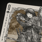
I couldn't find Nicolai Aroei I tried different spells too
This gives you better imagination of how tuck box will look (gold will added later), we are trying to get some renders as well.


"There's nothing new under the sun."Harvonsgard wrote:In such chases I love to quote a Canadian graffiti artist: "Don't think you are an innovator, because thousands of people did this before."
As humans we are not an island and true originality is rarer than people believe it is. We are always inspired by things surrounding us wether willingly or subconscious. Express yourself in the way you want, without the fear to look too similar to someone else.


They are both the same, except there is no render for Number 3.scottbre wrote:Definitely, Number 4. (Not sure what the difference between that and F are)
Yes that's very true, I was thinking to replace it with something else, maybe pips? or another phrase?Harvonsgard wrote:Definitely get rid of the of the "Made in USA" on the card back. If you go with USPC and I bought a deck, I know where it was made and don't need literally every card to tell me that.
For the backs; I personally like A but it is not enough colour in your deck to make it a success and speaking to a broader audience, imo. Therefore scrape that one. B has more depth but the same problem. C would be dope if the red would be hot foil, which isn't an option I guess. That leaves us with D, E, F. I like E the most.
I don't bother the tuck box that much since - well, it's the tuck box and ad copy fits there imo. On the card back it leaves the impression that you didn't really know what to put there (the pips leave that impression, too, to be honest but they are a better alternative compared to ad copy).ehsanziaf wrote:Is the pips on top annoying as well? if I duplicate them at bottom to replace with the phrase.
Even on tuck box I'm not very satisfied with phrases, both front and back along with one sides mentions "made in usa", we might replace one with something else.
+1 to all of this.Harvonsgard wrote:I don't bother the tuck box that much since - well, it's the tuck box and ad copy fits there imo. On the card back it leaves the impression that you didn't really know what to put there (the pips leave that impression, too, to be honest but they are a better alternative compared to ad copy).ehsanziaf wrote:Is the pips on top annoying as well? if I duplicate them at bottom to replace with the phrase.
Even on tuck box I'm not very satisfied with phrases, both front and back along with one sides mentions "made in usa", we might replace one with something else.
I know that a lot of folks are against text/writing on the card backs in general, I'm not one of them, but it has to be something relevant to the theme for me and not ad copy.
If you add a quote about war or something you run the risk of being cheesy or it might rub folks the wrong way. To avoid that, I would simply extend the pattern of the back design there. The circles with the MMXX and 2020 could simply left empty, imo. Or go with MMXX in both and make it two way (MMXX - XXWW).


Ha, I was reading through this and don't get me wrong - the deck and discussion were keeping my interest - but the multi-quote reply opened my eyes. Immediately..wait, we can do that? Fantastic!MagikFingerz wrote:Honestly, just seeing that someone can do a multi-quote reply is, for me, a huge confidence boost in their ability to do anything else
Users browsing this forum: No registered users and 0 guests