Lol. They do kind of look like Gio boobs yeahRichK wrote:Looks like Gio designed the coin. Cleavage! [emoji38]
Sent from my Galaxy 8 using Tapatalk

Lol. They do kind of look like Gio boobs yeahRichK wrote:Looks like Gio designed the coin. Cleavage! [emoji38]


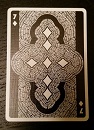
Aye ( ♡ )( ♡ )Bradius wrote:Well, not to leave the topic of boobs. Did anyone check out Lorenzo's Queen of Hearts in the House of the Rising Spades deck?


Are you holding out on us, old man?Bradius wrote:I received my double-deck set yesterday. Just one set though.

Thank you very much for your kind words! As for the English, we had to use the official translation of the Collodi Foundation... I don' t know why it was wackyMerlebird wrote:My Pinocchios Sapphire and Vermilion arrived today - a very pleasant, very beautiful surprise. I tried to take a couple pictures but deleted them in frustration; there is just too much subtlety in the colors to do them justice in a digital photograph. The Taiwanese printers and Cartamundi may be gaining on them in other respects, but for metallic inks you really can't beat USPCC.
Some thought has obviously been put into the non-metallic inks as well. Vermilion's palette could easily have come out feeling too harsh for its fairytale theme if a "true" red was used; instead the red suits are done in a rose red, ever-so-slightly tinged toward pink. If my eyes do not deceive me, the "black" suits of Sapphire are not a true black either: in contrast to Vermilion, they appear to be brown-black. (I had to take the ten of clubs out of both decks to compare them.)
There are a couple rough spots in the English text on the cards, most noticeably on Vermilion's ace of clubs. But it doesn't detract from them too much; hell, if anything it might add a bit to their retro charm, though I admit I've got a soft spot for cute Engrish. Definitely a pair of decks I'm happy to add to my collection.
I wondered if it might be something like that. Strictly conjecture, but my guess would be that the "official" English version sanctioned by the foundation is one of the earlier English translations produced, possibly the earliest, and perhaps one approved by a close surviving relative of Collodi's. That seems to be how these things usually go, and I would understand a certain sentimental attachment to a particular translation under such circumstances. But I at least wish they would fix the grammatical errors...Conturbia wrote:As for the English, we had to use the official translation of the Collodi Foundation... I don' t know why it was wackymaybe it was done intentionally..
Good news for the folks who missed the KS campaign!Conturbia wrote:Just to be informative: Sapphire and Vermilion are now sold at Murphy's (that is the only approved reseller) and will be sold at the same price on our store very soon. We will have, in addition, some cool bundles with the Collodi Edition.
My personal opinion is that the blue is better (brighter flash on the metallic backs, more interesting color scheme, stronger designs, etc.). But the red's no slouch by any means.Bikefanatic wrote:If I were to get one, it'll be the red.

The cards are the "classic" ones, @Harvonsgard is right. I have always wanted to make a gilded edition of the Pinocchio decks for a bunch of reasons. On the one hand, the gilded edition was just never made. As the Vermilion and Sapphire tuck boxes are the first I have ever designed (*my first time designing packaging items and my very first time with hot foil), I had the strong desire to reinterpret them again, after 3+ years of experience with packs in general and playing cards in particular.


Users browsing this forum: Google Feedfetcher, Magisterrene, manu, Pyramid.ink, wingedpotato and 7 guests