TwoPiece wrote:Right now, my only feedback is that I don't like the different sized pips on the number cards.
Thank you for your comments, are the pips indexes? Do you understand you correctly? If yes, then it is still testing, we select the optimal size and color. Because of the black and white card, bright red looks bad. We are looking for a suitable, for this still try everything.
Sorry, if something is not entirely clear, I am from Ukraine, I use a translator to build sentences.
I don't know if I'll buy this deck - I'm not the biggest fan of (what to call them?) scenic- or vignette-style courts, as opposed to portrait courts - but I'm loving the designs of the pips, and the experimentation with pip layout. Some feedback:
I agree with 2pc that all non-index pips (those in what you called "digital maps," I believe?) should be the same size. Otherwise the design doesn't "read" as well visually.
No visible grid lines in the final pip layouts, please. If you're doing it correctly the negative space between the pips should provide enough compositional structure that you don't need an external scaffold to bring it all together. This is strong enough without it:
I also like the layouts you've shown in your latest post. The ten you posted earlier will need some work, though; crowding the last pip into that middle space breaks the structure. Try playing around a bit and seeing what you can come up with.
The red you've chosen may be too bright. Try darkening it and making the hue a bit more brownish, or even adding just a touch of blue. Evoking blood (which is red-brown outside the body) or organs/offal (which have a sort of brownish-purple cast) will enhance your theme.
These are all only my opinions, of course. Others (yourself included) may disagree with me vehemently, as we're wont to do.
I don't like the Spade pips that look like Hearts.
If you're going to flip the pips on the number cards, like the 9, keep the top half of the card upright, not mixed up and down. The top pip on 9 should be upright, not upside down. And all be big.
Thank you all for the clarifications and poravki. He took into account all the points, both in the direction of pips, and 10. That is what happened, using example 10. If there are comments, I will listen, it is important for me!
JuFiN wrote:Option two except make those spades in the middle upright and not on their side.
Thanks for the advice. We have already tried all the options, it’s impossible to insert them vertically in order to save the symmetry. Peak will generally look bad
I like this design for the 10. The pips are clear, well defined, and based on the other photos, they dont bleed together and turn to pip-mush. With them touching or close together, my first reaction is that they arent pips, but decoration.
The jack gets a little more complicated. The first being the size of the image. Even with the red, the lower index seems to disappear. I find my eye keeps wandering down to that corner because of the jumble of color and lines. As for the color. I like a brighter red for this. Having a darker red blends too much with the linework to me. There just is not enough contrast.
If there was a background like an old parchment or paper texture, the darker red would be the way to go as it would add to the overall feeling of the deck. Mbe a LE aged deck
macstrat wrote:I like this design for the 10. The pips are clear, well defined, and based on the other photos, they dont bleed together and turn to pip-mush. With them touching or close together, my first reaction is that they arent pips, but decoration.
The jack gets a little more complicated. The first being the size of the image. Even with the red, the lower index seems to disappear. I find my eye keeps wandering down to that corner because of the jumble of color and lines. As for the color. I like a brighter red for this. Having a darker red blends too much with the linework to me. There just is not enough contrast.
If there was a background like an old parchment or paper texture, the darker red would be the way to go as it would add to the overall feeling of the deck. Mbe a LE aged deck
Thank you very much for the assessment, honestly went over what I could))). Now we beat such options for the background:
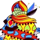
I like the back on the black cards, mbe dial the opacity of the red BG back a bit. Mbe bring it down to 10-12%