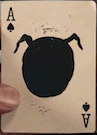
ust finally noticed the latest tease on these from Natalia Silva. Potential for sure.


I agree. It almost looks like an Elite deck. I don't like how the front and back of tuck are so similar. But everything else looks great. Here's hoping for MetalLuxe (even as a stretch goal)?shaitani wrote:I'm not a fan of the text that appears on the tuck or the card backs, they look like afterthoughts. But literally everything else looks amazing, especially the court (Guinevere?). Can't wait to see more.

rousselle wrote:You are a fussy, picky guy.
Lotrek wrote:Given the number of morons produced in the world every day, a pessimist is actually a well informed realist.
Räpylätassu wrote:"Tyhmyydestä sakotetaan." You get fined for being stupid.

Likewise, but I may be in for a few of these & Yes, this deck is just crying out to be gold foiledTwoPieceFeed wrote:I haven't backed any of Natalia's previous campaigns but these look really, really good.


Hi,rousselle wrote:One thing I just noticed: the shading effect on the card back seems the same both on the tuck and the card back, implying that it's part of the design and not something being done to enhance the render.
I really don't like it when the back has a faux shading/shining effect like that.
Natalia? Is the back a solid gold color on top of a solid black background, or are you shading the gold part to simulate a shine effect?
My 2 cents? I would rather pay $25 for a USPCC MetalLuxe deck than $15 for an NPCC deck.NataliaSilva2015 wrote:Hey Everyone!
Thank you so much for all your comments! I really appreciate this!
This deck will be with gold foil and embossing on the box, but I can't decide which printing company to choose. I usually print all my big projects with USPCCC, but they would charge a fortune for gold foil/embossing.
NPCC and EPCC are 2 other options. Which one do you prefer? I would love to hear your opinion!
Thank you so much!
Natalia
Yeah I would also prefer USPCC. I also like EPCC but not NPCC.vasta41 wrote:My 2 cents? I would rather pay $25 for a USPCC MetalLuxe deck than $15 for an NPCC deck.NataliaSilva2015 wrote:Hey Everyone!
Thank you so much for all your comments! I really appreciate this!
This deck will be with gold foil and embossing on the box, but I can't decide which printing company to choose. I usually print all my big projects with USPCCC, but they would charge a fortune for gold foil/embossing.
NPCC and EPCC are 2 other options. Which one do you prefer? I would love to hear your opinion!
Thank you so much!
Natalia


I can agree with you here, sure the cards are fine to gameplay and the boxes are quite good. But the thing that bugs me is the prices they charge. For an ok deck to play I don't pay more than $3- $4, but NPCC charges the same values as USPCC when they product is lightyears behind them... So yeah, NPCC is crap, when you weight the price charged and the product delivered. Their decks should be in the price range of $5 - $8 and not the $10-$13 they practice...Räpylätassu wrote:Still, NPCC is nowhere near as bad as some people say, completely fine for normal gameplay, does not feel "off" when you look the cards in your hands. They also get nowhere enough recognition for the excellent tuck boxes they have put out, one of the best in that regard.
I can't even remember what my first NPCC deck was, the handling was such utter crap I threw them away and I swore I'd never buy an NPCC deck again. But after several months, some people on this forum started to say NPCC was improving and the quality of the finish was not so bad anymore. I decided to give NPCC another chance and pledged for the Midgard decks since the artwork was so nice. NPCC improved . . . from utter crap to disappointingly inadequate. It was fine for normal gameplay for about 3 hours and then they started to clump and stick to the point they were unpleasant to even shuffle. Now granted, my weekly poker nights last 5 hours and even a USPCC deck is pretty beat up by the end of the night, but at least they last the 5 hours and are in still usable condition afterwards. And forget about any cardistry application with NPCC.Räpylätassu wrote:NPCC is nowhere near as bad as some people say, completely fine for normal gameplay.
If you feel comfortable doing so, I would love to see the price comparisons with the two companys. As in: you could do A for $$$ with USPCC or A+B+C for $$ with EPCC.NataliaSilva2015 wrote:Thank you so much everyone for your comments and suggestions! I really appreciate each and every opinion!
I totally agree that when you put so much time, effort, and love into your design......you want to see a beautiful, high quality product at the end.
I like USPCC but it will be crazy expensive even just to print gold foil/embossed tuck case. With EPCC (in Taiwan) I could afford to add more luxury elements to the deck. hmmmm.....not sure yet.
Thank you so much EVERYONE for your help!!!
Kind regards,
Natalia

Users browsing this forum: Bing [Bot] and 5 guests