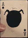
The Knight is the most devastating and unpredictable piece on the board. It is the only piece capable of escaping its opponents by leaping over them.
Daniel Madison and Chris Ramsay have teamed up to bring you one of the most elegant and refined decks to ever come out of USPCC.
A crushed stock, coupled with a smooth finish and traditional cut, make this deck feel as good as it looks.
A few surprises lie within the simplistic and classic matt white and gold foil tuck. These hidden features embody the aesthetics and practicality which appeal to magicians, gamblers and chess players alike.
Metallic Gold ink coupled with original art work from the insanely creative mind of Oban Jones brings this iconic piece of design to life before your very eyes.
I do really like the back design and can't help but feel that -- if the courts had to be redrawn (of course, they'll actually mostly be re-used, but whatever) -- then wouldn't have been more in aid of the deck's theme to have used chess masters??
"Finding it... that's not the hard part. It's letting go."
"One makes a trip by day, but by night one sets out on a journey." -Moominmamma
I dream of a world where wars are fought only by having dance offs. I also dream that a Finnish playing card designer would exist. The former seems more likely to happend.
Money can't buy you happiness, but it can buy you a penguin. Have you ever met a sad person with a penguin?
Are lobsters mermaids to scorpions?
"I did not hit her, it's not true, it's bullsh*t, I did not hit her, I did naaaht! Oh hai Mark!"
If the same attention to detail that was spent on the AoS inside the tuck was spent on the courts and outside of the tuck, they'd have an awesome deck here! But as it is it's still not bad. I have to give them credit for coming up with a cool theme which is something E hasn't done in YEARS. But I love how they just couldn't help themselves- they FINALLY make a Madison-free deck but just HAD to integrate him somehow by making him a court
I'll agree with that. Too many times there is too much effort put into designing the inside of the tuck and not enough on the cards. D&D have decks guilty of this too.
RichK wrote:N00b question: What is "crushed stock" vs other stocks? Guess I'm asking about all other stocks too. Thanks.
All USPC stocks are crushed together so by default every card stock is a crushed stock. USPC takes two rolls of paper, adds a thin coat of glue and crushes them together to a certain thickness. Bee stock is thicker than Bike stock which were the only two stocks that USPC really made previous to the latest which is Thin Crush (used in Blue Choice Playing Cards from Penguin Magic this year) and it is thinner than Bike stock. All stocks will vary in thickness to some degree due to the process of creating a deck of playing cards. On this deck in particular it's more than likely this is Bike stock, it's what's usually found on E decks. If it's Thin Crush then you will be able to notice a difference of about 3-4 cards worth of thickness across the deck.
TL:DR It's completely up to you. We can still be friends. I actually like playing cards. We live in interesting times.
RichK wrote:N00b question: What is "crushed stock" vs other stocks? Guess I'm asking about all other stocks too. Thanks.
All USPC stocks are crushed together so by default every card stock is a crushed stock. USPC takes two rolls of paper, adds a thin coat of glue and crushes them together to a certain thickness. Bee stock is thicker than Bike stock which were the only two stocks that USPC really made previous to the latest which is Thin Crush (used in Blue Choice Playing Cards from Penguin Magic this year) and it is thinner than Bike stock. All stocks will vary in thickness to some degree due to the process of creating a deck of playing cards. On this deck in particular it's more than likely this is Bike stock, it's what's usually found on E decks. If it's Thin Crush then you will be able to notice a difference of about 3-4 cards worth of thickness across the deck.
I think vasta has it spot-on: they just can't help themselves. Besides the court faces, they had to mark them. Bottom left/upper right different orders of the pieces identifies the rank. Just odd that the man who advertises he was almost being killed cheating for realZ keeps pumping out marked decks.
Anyways - stock is very nice, love the traditional cut and the gold-for-red works for me. Not sure why the "hidden feature" of marking would appeal to a chess player, though (or how they're "iconic").
Those of you who have already passed on these are way ahead of the curve!
...so, I guess they never did give out a prize for that 'change our motto' contest from years ago....i will propose a new one anyways:
ellusionist: we just can't help ourselves
Did they provide you with a guide to the marking system? Or, is this a "figure it out on your own?"
I'll definitely pick one up too because I liked the first ones a lot, but I'm wondering if red is the right color for this deck...
Knights has this edge of subtlety to it, of cleanliness. It seems odd to have a bright flashy red on white. I think silver might have been a better choice.
Damn, that tuck actually looks amazing. Gold on red works. I hope I'm wrong about the red on white for the cards though.
I know a lot of people didn't like that the Knights were marked or the courts put the creators faces on them, but if you can look past that, Knights are probably my favorite deck from Ellusionist.
Looks like foiled backs... and only $10 each! What's the catch??
Once again Daniel Madison & Chris Ramsay have teamed up to bring you the second entry in the Knights saga.
A crushed stock, coupled with a smooth finish, red foil backs and a traditional cut make his deck feel as good as it looks.
A few surprises lie within the simplistic and classic matte red and gold foil tuck. These hidden features embody the aesthetics and practicality which appeal to magicians, gamblers and chess players alike.
vasta41 wrote:Looks like foiled backs... and only $10 each! What's the catch??
Once again Daniel Madison & Chris Ramsay have teamed up to bring you the second entry in the Knights saga.
A crushed stock, coupled with a smooth finish, red foil backs and a traditional cut make his deck feel as good as it looks.
A few surprises lie within the simplistic and classic matte red and gold foil tuck. These hidden features embody the aesthetics and practicality which appeal to magicians, gamblers and chess players alike.
Something seems amiss here. Ellusionist, the creators of over-hyped nonsense, make a deck with a supposed foil back and only mention it in passing within once sentence? And then on top of it only charge $10 without so much as even hinting to us how good of a deal it is? That doesn't sound like them. But one thing does have me concerned- the lack of the term 'Metalluxe.' If the backs truly are foiled then why wouldn't they mention Metalluxe? It just doesn't add up.
I wonder if it's red metallic ink rather than red foil on the backs. I ordered a couple, so I guess I'll see soon enough. But I'm preparing to be disappointed with no foil.
PrincessTrouble wrote:I wonder if it's red metallic ink rather than red foil on the backs. I ordered a couple, so I guess I'll see soon enough. But I'm preparing to be disappointed with no foil.
If that's the case then the statement I quoted from my e-mail is a blatant lie by them. It clearly states that the backs are foiled. sinjin, our resident lawyer: can you please chime in here?
Far from sinjin as a lawyer but their page says "crushed stock, smooth finish, tradiutioinal cut, red foil backs".
I recall Theory11 not too long ago releasing a deck with full foiling on the back at the $10 price point.
I'm as cynical as the next guy (probably more; I think the next guy is just pretending), but I'm expecting this to be exactly what they are promising, and totally worth the price of admission. Boo-ya.
When I saw the Instagram video, I thought they weren't, as Madison flips the corners and they seem all the same, but the description implies otherwise.
JS
Every deck I open makes your sealed one more valuable. You're welcome.