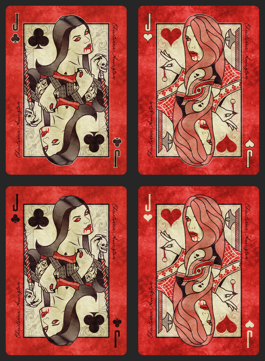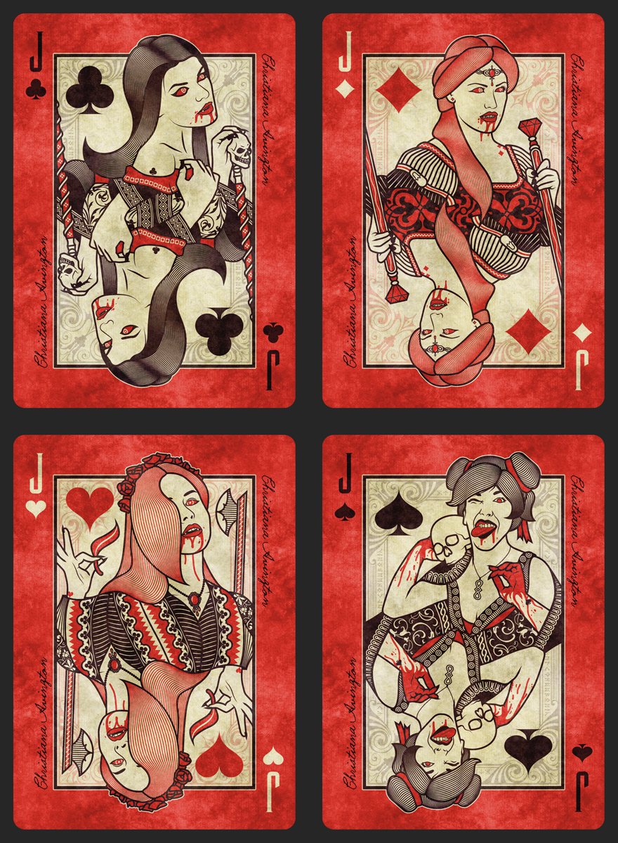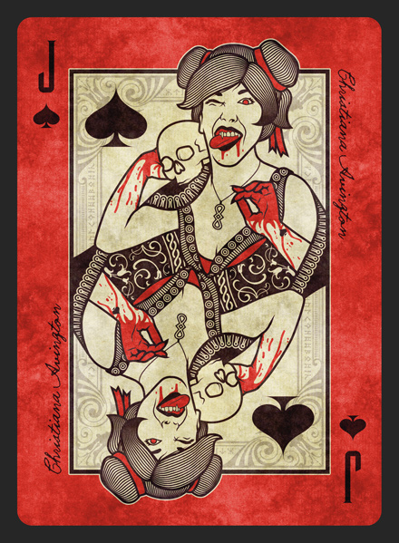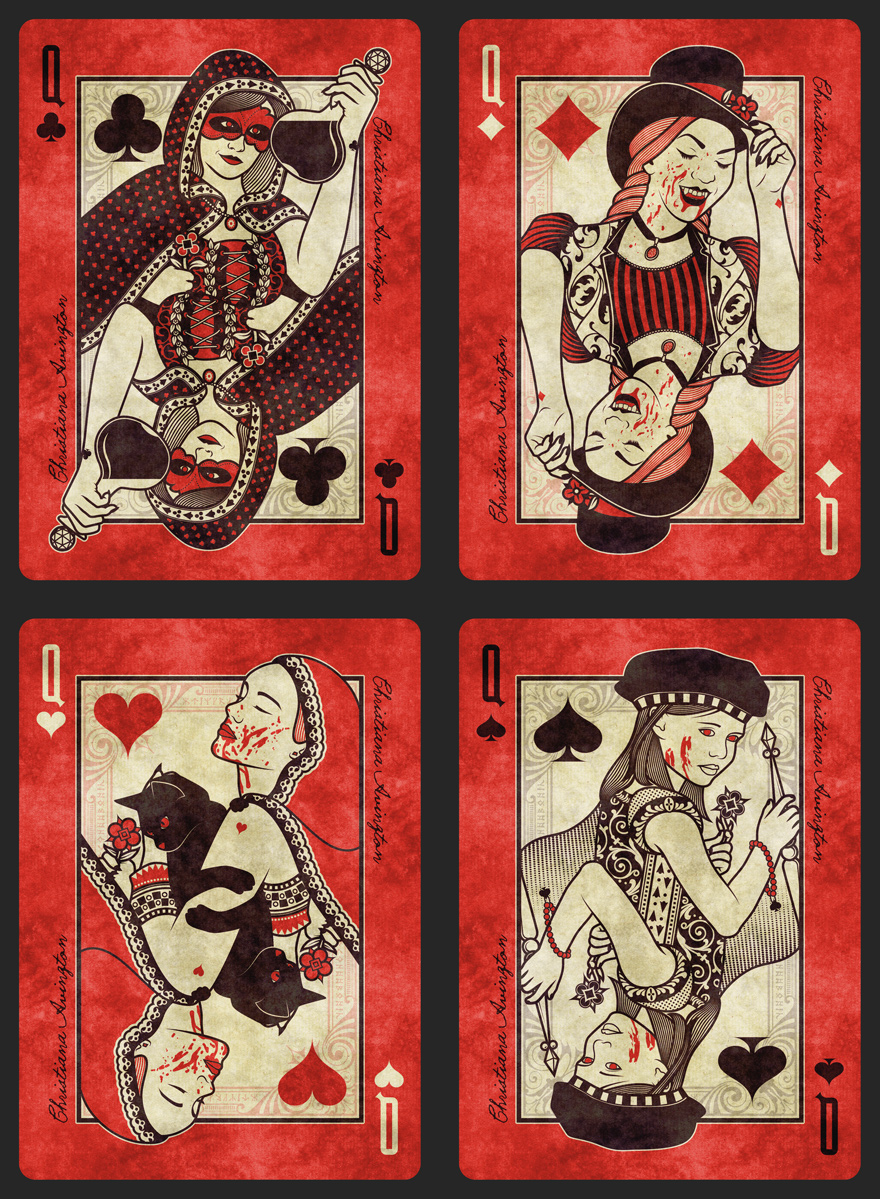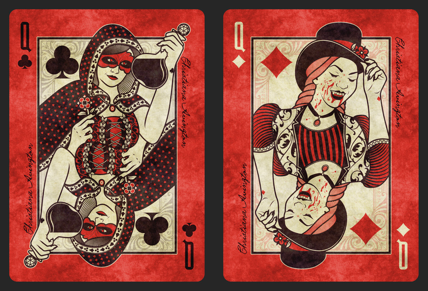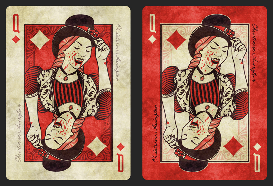

I'm back once again for you all to cast your eyes over the design process of Volume 2 of the Sisterhood of Blood playing cards. More of the same regarding style but with a couple of tweaks. All new courts, back and case design to step it away from Volume 1, but not too far that they don't feel part of the same series.
The court cards are close to final layouts and I'm about ready to get some feedback. But before I start showing sets of Jack, Queens and Kings, I wanted to start with the below, red or no red?
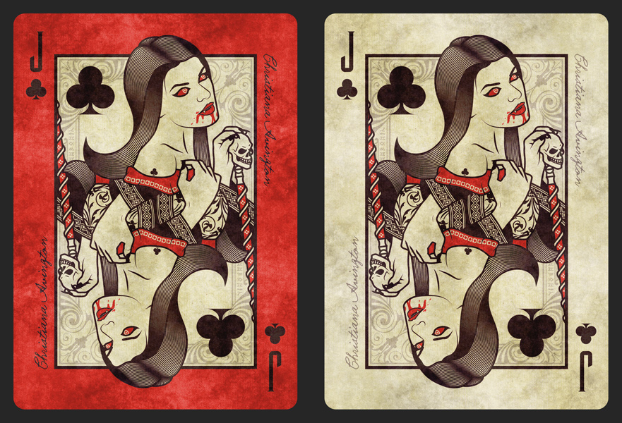
My main two concerns are that the red could make it hard to read the black pips and that they could look too similar to Lorenzo's Requiem with the red and cream/paper. What do you guys think?
As always, all constructive feedback is gratefully appreciated and often rewarded with being able to name these beautiful creatures.