rousselle wrote:I'm sure I'm the only person here who had this happen, but it took me a while to realize that the tuck box is shaped like an old fashioned eraser.
This deck is so fantastically creepy I absolutely love it. Not sure why it isn't funding, he even added a standard tuck within days of hearing complaints. The courts aren't overly custom, but the subtle removal of the eyes is so perfectly off putting. And the jokers really are the stars having stolen all the eyes, it's funny but also still proper creepy. I'm sure it's not an issue of quality given the printer, so I'm just a bit confused I guess. I guess the tuck is a bit repetitive would love to see a cool design with one big creepy embossed eye on the front.
Any one who chose to pass on this one care to share with me why? I want this deck to fund so bad!
Maybe the people who aren't interested the the prism tuck don't know about the standard one. I would like for it to fund too. Jay, you come up with great Joker concepts. The piñata in the Mexico deck and now the eyes with this one.
"When I like something, I buy. No matter who did it, how many were printed or how many (re)colors exist.
When I don't like something, I pass. No matter who did it, how many were printed or how many (re)colors exist."
Thank you all so much for your support and kind words my friends ! Kickstarter can be a tough gig, with only a few days left we can only wish for the best
Bikefanatic, Jokers are my favorite, so I always aim to make them unique
I thought about this for a while and here's what I came up with in a semi-ordered list:
While I appreciate playing card and tuck innovations I'm not keen on the prism tuck. It's cool but for me, unpractical and therefore I don't think it should even be an option.
The standard tuck is also very lackluster. It's not bad but it's certainly not good. The jokers are so awesome and drawn with such nice detail I would expect the front of the tuck to have similar artwork rather than the monotonous diamond eyes all over.
$14 for one deck with no embossing, foil, or other bells and whistles? USPCC or not, way too high.
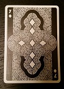
Lastly I think the aces need more. The AoD is okay but the other three should also stand out IMO. I understand that the courts and pips are standard-ish with minor adjustments and I don't mind that. But the AoS, AoC and AoH should at least have bigger center pips if not more.
Overall I still like the deck but the reasons above are why I'm not pledging.
I agree that standard tuck is a bit plain, I think that is because the prism shape necessitated the repetitive design to work. I don't think any other art would really work with the custom shape, and it fits perfectly. The issue is that when transferred to the standard shape the tuck looks pretty plain.
Vasta, First you didn't pledge because the prism tuck didn't work for you. I make a standard tuck and then you don't pledge because there are no more early bird tiers available. Now, you have 3 more reasons why not to pledge...... I give up
Again folks, thank you to all who have pledged and supported this campaign. No matter the end result, I am grateful for you all
JayLosa wrote:Vasta, First you didn't pledge because the prism tuck didn't work for you. I make a standard tuck and then you don't pledge because there are no more early bird tiers available. Now, you have 3 more reasons why not to pledge...... I give up
What can I say- you've got me there! I guess what it really comes down to for me is the ratio of cost vs. worth. I can't justify (based on the reasons I previously mentioned) spending $14 on this deck right now. Still a great deck but just not worth the price for me.