RichK wrote:guru,
I agree with shermjack that the colors don't need to match the theme. I'm sure you're working in CMKY bu the pictures you posted look way too bright and are painful t look at. I liked the vines and wavy lines you had on your previous try. I also agree with juFiN that you seem to be going backwards and removing and changing elements that worked to something inferior.
Sorry for the harsh opinions.
Hey Rich..don't feel bad. It is always good to get diverse viewpoints.
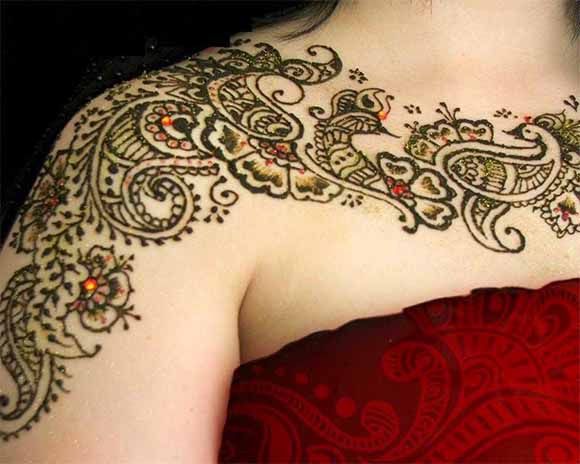
I've uploaded new images to the post now, and it is not that bright as they were looking earlier. Vines & wavy lines were not going well with the other cards and that's why they were removed. But, you'd be glad to know that design is being used in the back card now. The inspiration for the illustrations has been taken from numerous sources like street art, folk art, mehndi/henna tattoos etc. And, I believe the print will be on a bit darker side to what you see on your screen. Anyways, thanks to you and others for the comments till now.